<?xml version="1.0" encoding="UTF-8"?>
<!DOCTYPE html PUBLIC "-//W3C//DTD XHTML 1.1//EN" "http://www.w3.org/TR/xhtml11/DTD/xhtml11.dtd">
<html xmlns="http://www.w3.org/1999/xhtml" xml:lang="en">
<head>
<meta content="text/html; charset=UTF-8" http-equiv="content-type" />
<meta http-equiv="Content-Language" content="en" />
<meta name="generator" content="Pressbooks 5.9.4" />
<meta name="pb-authors" content="Digital Education Strategies, The Chang School" />
<meta name="pb-editors" content="Pauline Ricablanca" />
<meta name="pb-translators" content="" />
<meta name="pb-reviewers" content="" />
<meta name="pb-illustrators" content="" />
<meta name="pb-contributors" content="Greg Gay and Igor Karasyov" />
<meta name="pb-title" content="Web Accessibility for Developers" />
<meta name="pb-language" content="en-ca" />
<meta name="pb-cover-image" content="https://pressbooks.library.ryerson.ca/wafd/wp-content/uploads/sites/57/2018/11/wad_cover.jpg" />
<meta name="pb-subtitle" content="Essential Skills for Web Developers" />
<meta name="pb-publisher" content="The Chang School, Ryerson University" />
<meta name="pb-publisher-city" content="Toronto" />
<meta name="pb-publication-date" content="1551312000" />
<meta name="pb-primary-subject" content="UMW" />
<meta name="pb-book-license" content="cc-by-sa" />
<meta name="pb-about-140" content="Essential Skills for Web Developers" />
<meta name="pb-about-50" content="Web Accessibility for Developers is a technical resource aimed primarily at programmers. Learn how to develop accessible interactivity on the Web and gain expertise using WAI-ARIA, a W3C specification that enables optimal use of assistive technologies, like screen readers, when navigating the Web." />
<meta name="pb-copyright-year" content="2019" />
<meta name="pb-copyright-holder" content="Ryerson University, The Chang School" />
<meta name="pb-hashtag" content="#waiaria #a11y #accessibility" />
<meta name="pb-series-title" content="Digital Accessibility from Novice to Expert" />
<meta name="pb-additional-subjects" content="UMW" />
<meta name="pb-keywords-tags" content="accessibility , WAI-ARIA, web applications" />
<meta name="pb-bisac-subject" content="COM060160, COM070000, COM051270, COM051260" />
<title>Web Accessibility for Developers</title>
</head>
<body lang='en' >
<div id="half-title-page"><h1 class="title">Web Accessibility for Developers</h1></div>
<div id="title-page"><h1 class="title">Web Accessibility for Developers</h1><h2 class="subtitle">Essential Skills for Web Developers</h2><h3 class="author">Digital Education Strategies, The Chang School</h3><h3 class="author">Greg Gay and Igor Karasyov</h3><h4 class="publisher">The Chang School, Ryerson University</h4><h5 class="publisher-city">Toronto</h5></div>
<div id="copyright-page"><div class="ugc">
<div class="license-attribution"><p><img src="https://pressbooks.library.ryerson.ca/wafd/wp-content/themes/pressbooks-book/packages/buckram/assets/images/cc-by-sa.svg" alt="Icon for the Creative Commons Attribution-ShareAlike 4.0 International License" /></p><p>Web Accessibility for Developers by Ryerson University, The Chang School is licensed under a <a rel="license" href="https://creativecommons.org/licenses/by-sa/4.0/">Creative Commons Attribution-ShareAlike 4.0 International License</a>, except where otherwise noted.</p></div>
</div></div>
<div id="toc"><h1>Contents</h1><ul><li class="front-matter introduction"><a href="#front-matter-introduction"><span class="toc-chapter-title">Introduction</span></a></li><li class="front-matter introduction post-introduction"><a href="#front-matter-getting-the-most-out-of-this-book"><span class="toc-chapter-title">Getting the Most Out of This Book</span></a></li><li class="front-matter introduction post-introduction"><a href="#front-matter-who-should-read-this-book"><span class="toc-chapter-title">Who Should Read This Book</span></a></li><li class="front-matter miscellaneous post-introduction"><a href="#front-matter-accessibility-statement"><span class="toc-chapter-title">Accessibility Statement</span></a></li><li class="part"><a href="#part-background">Background</a></li><li class="chapter standard"><a href="#chapter-types-of-disabilities-and-barriers"><span class="toc-chapter-title">Types of Disabilities and Barriers</span></a></li><li class="chapter standard"><a href="#chapter-why-learn-about-accessible-web-development"><span class="toc-chapter-title">Why Learn About Accessible Web Development</span></a></li><li class="chapter standard"><a href="#chapter-aoda-background"><span class="toc-chapter-title">AODA Background</span></a></li><li class="chapter standard"><a href="#chapter-about-wcag-and-wai-aria"><span class="toc-chapter-title">About WCAG and WAI-ARIA</span></a></li><li class="part"><a href="#part-slug-1-course-introduction">1. Introduction</a></li><li class="chapter standard"><a href="#chapter-objectives-and-activities"><span class="toc-chapter-title">Objectives and Activities</span></a></li><li class="chapter standard"><a href="#chapter-submitting-coding-assignments-and-using-github"><span class="toc-chapter-title">Submitting Coding Assignments and Using GitHub</span></a></li><li class="chapter standard"><a href="#chapter-activity-1-how-to-submit-assignments"><span class="toc-chapter-title">Activity 1: How to Submit Assignments</span></a></li><li class="chapter standard"><a href="#chapter-introduction-to-the-jquery-plugin"><span class="toc-chapter-title">Introduction to the jQuery Plugin</span></a></li><li class="chapter standard"><a href="#chapter-other-wai-aria-libraries"><span class="toc-chapter-title">Other WAI-ARIA Libraries</span></a></li><li class="chapter standard"><a href="#chapter-chromevox-screen-reader-install-and-setup"><span class="toc-chapter-title">ChromeVox Screen Reader Install and Setup</span></a></li><li class="chapter standard"><a href="#chapter-activity-2-set-up-and-use-chromevox"><span class="toc-chapter-title">Activity 2: Set Up and Use ChromeVox</span></a></li><li class="chapter standard"><a href="#chapter-wai-aria-and-html-5"><span class="toc-chapter-title">WAI-ARIA and HTML 5</span></a></li><li class="chapter standard"><a href="#chapter-self-test-1"><span class="toc-chapter-title">Self-Test 1</span></a></li><li class="part"><a href="#part-slug-2-introduction-to-wai-aria">2. Introduction to WAI-ARIA</a></li><li class="chapter standard"><a href="#chapter-objectives-and-activities-2"><span class="toc-chapter-title">Objectives and Activities</span></a></li><li class="chapter standard"><a href="#chapter-what-is-wai-aria"><span class="toc-chapter-title">What is WAI-ARIA?</span></a></li><li class="chapter standard"><a href="#chapter-roles-states-and-properties"><span class="toc-chapter-title">Roles, States, and Properties</span></a></li><li class="chapter standard"><a href="#chapter-static-vs-dynamic-wai-aria"><span class="toc-chapter-title">Static vs. Dynamic WAI-ARIA</span></a></li><li class="chapter standard"><a href="#chapter-browser-and-screen-reader-support-for-wai-aria"><span class="toc-chapter-title">Browser and Screen Reader Support for WAI-ARIA</span></a></li><li class="chapter standard"><a href="#chapter-graceful-degradation-vs-progressive-enhancement"><span class="toc-chapter-title">Graceful Degradation vs. Progressive Enhancement</span></a></li><li class="chapter standard"><a href="#chapter-validating-wai-aria"><span class="toc-chapter-title">Validating WAI-ARIA</span></a></li><li class="chapter standard"><a href="#chapter-wai-aria-taxonomy"><span class="toc-chapter-title">WAI-ARIA Taxonomy</span></a></li><li class="chapter standard"><a href="#chapter-activity-3-wai-aria-scavenger-hunt"><span class="toc-chapter-title">Activity 3: WAI-ARIA Scavenger Hunt</span></a></li><li class="chapter standard"><a href="#chapter-self-test-2"><span class="toc-chapter-title">Self-Test 2</span></a></li><li class="part"><a href="#part-slug-3-basic-wai-aria">3. Basic WAI-ARIA</a></li><li class="chapter standard"><a href="#chapter-objectives-and-activities-3"><span class="toc-chapter-title">Objectives and Activities</span></a></li><li class="chapter standard"><a href="#chapter-wai-aria-landmarks"><span class="toc-chapter-title">WAI-ARIA Landmarks</span></a></li><li class="chapter standard"><a href="#chapter-common-static-wai-aria"><span class="toc-chapter-title">Common Static WAI-ARIA</span></a></li><li class="chapter standard"><a href="#chapter-wai-aria-alert-and-message-dialogs"><span class="toc-chapter-title">WAI-ARIA Alert and Message Dialogs</span></a></li><li class="chapter standard"><a href="#chapter-using-tabindex"><span class="toc-chapter-title">Using Tabindex</span></a></li><li class="chapter standard"><a href="#chapter-keyboard-interaction"><span class="toc-chapter-title">Keyboard Interaction</span></a></li><li class="chapter standard"><a href="#chapter-application-and-presentation-roles"><span class="toc-chapter-title">Application and Presentation Roles</span></a></li><li class="chapter standard"><a href="#chapter-live-regions"><span class="toc-chapter-title">Live Regions</span></a></li><li class="chapter standard"><a href="#chapter-activity-4-wai-aria-landmarks-and-alerts"><span class="toc-chapter-title">Activity 4: WAI-ARIA Landmarks and Alerts</span></a></li><li class="chapter standard"><a href="#chapter-self-test-3"><span class="toc-chapter-title">Self-Test 3</span></a></li><li class="part"><a href="#part-chapter-4-interactive-wai-aria-basic">4. Interactive WAI-ARIA (Basic)</a></li><li class="chapter standard"><a href="#chapter-objectives-and-activities-4"><span class="toc-chapter-title">Objectives and Activities</span></a></li><li class="chapter standard"><a href="#chapter-toggle-buttons-activity-example"><span class="toc-chapter-title">Toggle Buttons (Activity Example)</span></a></li><li class="chapter standard"><a href="#chapter-suggestion-boxes"><span class="toc-chapter-title">Suggestion Boxes</span></a></li><li class="chapter standard"><a href="#chapter-activity-5-accessible-suggestion-box"><span class="toc-chapter-title">Activity 5: Accessible Suggestion Box</span></a></li><li class="chapter standard"><a href="#chapter-tooltips"><span class="toc-chapter-title">Tooltips</span></a></li><li class="chapter standard"><a href="#chapter-activity-6-accessible-tooltips"><span class="toc-chapter-title">Activity 6: Accessible Tooltips</span></a></li><li class="chapter standard"><a href="#chapter-progress-bars"><span class="toc-chapter-title">Progress Bars</span></a></li><li class="chapter standard"><a href="#chapter-activity-7-accessible-progress-bar"><span class="toc-chapter-title">Activity 7: Accessible Progress Bar</span></a></li><li class="part"><a href="#part-chapter-5-interactive-wai-aria-intermediate">5. Interactive WAI-ARIA (Intermediate)</a></li><li class="chapter standard"><a href="#chapter-objectives-and-activities-5"><span class="toc-chapter-title">Objectives and Activities</span></a></li><li class="chapter standard"><a href="#chapter-sliders"><span class="toc-chapter-title">Sliders</span></a></li><li class="chapter standard"><a href="#chapter-activity-8-accessible-slider"><span class="toc-chapter-title">Activity 8: Accessible Slider</span></a></li><li class="chapter standard"><a href="#chapter-accordions"><span class="toc-chapter-title">Accordions</span></a></li><li class="chapter standard"><a href="#chapter-activity-9-accessible-accordion"><span class="toc-chapter-title">Activity 9: Accessible Accordion</span></a></li><li class="chapter standard"><a href="#chapter-tab-panels"><span class="toc-chapter-title">Tab Panels</span></a></li><li class="chapter standard"><a href="#chapter-activity-10-accessible-tab-panel"><span class="toc-chapter-title">Activity 10: Accessible Tab Panel</span></a></li><li class="chapter standard"><a href="#chapter-carousels"><span class="toc-chapter-title">Carousels</span></a></li><li class="chapter standard"><a href="#chapter-activity-11-accessible-carousel"><span class="toc-chapter-title">Activity 11: Accessible Carousel</span></a></li><li class="part"><a href="#part-chapter-6-interactive-wai-aria-advanced">6. Interactive WAI-ARIA (Advanced)</a></li><li class="chapter standard"><a href="#chapter-objectives-and-activities-6"><span class="toc-chapter-title">Objectives and Activities</span></a></li><li class="chapter standard"><a href="#chapter-menu-bars"><span class="toc-chapter-title">Menu Bars</span></a></li><li class="chapter standard"><a href="#chapter-activity-12-accessible-menu-bar"><span class="toc-chapter-title">Activity 12: Accessible Menu Bar</span></a></li><li class="chapter standard"><a href="#chapter-tree-menus"><span class="toc-chapter-title">Tree Menus</span></a></li><li class="chapter standard"><a href="#chapter-activity-13-accessible-tree-navigation"><span class="toc-chapter-title">Activity 13: Accessible Tree Navigation</span></a></li><li class="chapter standard"><a href="#chapter-sortable-lists"><span class="toc-chapter-title">Sortable Lists</span></a></li><li class="chapter standard"><a href="#chapter-activity-14-accessible-sortable-list"><span class="toc-chapter-title">Activity 14: Accessible Sortable List</span></a></li><li class="back-matter appendix"><a href="#back-matter-book-recap"><span class="toc-chapter-title">Book Recap</span></a></li><li class="back-matter miscellaneous"><a href="#back-matter-web-accessibility-for-developers-toolkit"><span class="toc-chapter-title">Web Accessibility for Developers Toolkit</span></a></li><li class="back-matter miscellaneous"><a href="#back-matter-answer-key-self-tests"><span class="toc-chapter-title">Answer Key: Self-Tests</span></a></li><li class="back-matter miscellaneous"><a href="#back-matter-acknowledgements"><span class="toc-chapter-title">Acknowledgements</span></a></li></ul></div>
<div class="front-matter introduction" id="front-matter-introduction" title="Introduction"><div class="front-matter-title-wrap"><h3 class="front-matter-number">1</h3><h1 class="front-matter-title">Introduction</h1></div><div class="ugc front-matter-ugc"><h2><a id="learning-outcomes"></a>Learning Outcomes</h2> <p>Welcome to Web Accessibility for Developers. We are glad that you are here and are taking the time to learn some very important, marketable developer skills!</p> <p>By the time you complete this book, you should be able to:</p> <ul><li>Test web interactivity with a screen reader to ensure accessibility.</li> <li>Identify the differences between static and dynamic WAI-ARIA.</li> <li>Describe both graceful degradation and progressive enhancement development methods.</li> <li>State when and when not to use WAI-ARIA.</li> <li>Explain the limitations of WAI-ARIA.</li> <li>Apply WAI-ARIA landmarks and live regions to web content.</li> <li>Create accessible progress bars, suggestion boxes, and tooltips with WAI-ARIA.</li> <li>Build accessible sliders, accordions, tab panels, and carousels with WAI-ARIA.</li> <li>Implement effective design patterns for accessible menu bars, tree menus, and sortable lists with WAI-ARIA.</li> </ul> <hr /> <h2><a></a>Suggested Prerequisites</h2> <p><strong><i>This book is intended for web developers</i></strong>.<br /> To get the most out of this book, you should have the following prerequisite knowledge:</p> <ul><li><strong>JavaScript</strong>: You should have a functional understanding of the JavaScript scripting language and be familiar with using jQuery and jQuery plugins. Though you can follow along with basic knowledge of JavaScript and jQuery, it will be easier to understand if you are comfortable writing (or, at least, copying and pasting) JavaScript code and making adjustments.</li> <li><strong>HTML</strong>: You should have at least a functional understanding of HTML 5. Though most of the HTML in this book will be provided, you’ll need to understand how it is used to produce the widgets you’ll be working on.</li> <li><strong>Git Version Control</strong>: We strongly recommend a GitHub account (and a basic understanding of how it is used) in order to participate in the activities found in this book. Details will be provided in the book if you need to set up an account, and basic Git commands will be covered.</li> </ul> <hr /> <h2><a></a>Suggested Technology</h2> <p>You will need the following applications to complete the activities in this book:</p> <ul><li><strong>ChromeVox Screen Reader</strong>: Required for testing assignment submissions prior to submitting.</li> <li><strong>FireFox Developer Edition</strong>: Optional, but includes the FireBug Developer Tools, which are more helpful for debugging than the default developer tools included with various browsers.</li> <li><strong>Git</strong>: (Optional) Though you can edit activity files and send them to a web server, you’ll be better off installing Git or a Git Client and working from your own local development environment.</li> <li><strong>Plain Text Editor</strong>: Required for editing HTML and JavaScript, which is much easier with a good, colour-coded text editor, such as Visual Studio Code, Sublime Text, or Atom.</li> </ul> <hr /> <h2><a></a>Suggested Readings</h2> <div style="margin: 1em 0;padding: 1em;border: 1px solid #ddd;border-left: 10px solid #0000ff"><p><strong>Suggested Reading:</strong></p> <ul><li><a href="https://www.w3.org/TR/wai-aria-1.1/">Accessible Rich Internet Applications (WAI-ARIA) 1.1</a></li> <li><a href="https://www.w3.org/TR/wai-aria-practices-1.1/">WAI-ARIA Authoring Practices 1.1</a></li> </ul> </div> <p>You might also look ahead to the next version by reviewing <a href="https://w3c.github.io/aria/">WAI-ARIA 1.2</a>, currently available as an editor’s draft.</p> <p>These readings are more references than they are readings. At a minimum, scan through these documents to understand what they contain and refer back to them when you encounter scenarios where WAI-ARIA could or should be used.</p> <hr /> <h2><a id="disclaimer"></a>Disclaimer</h2> <p>The information presented in this book is for instructional purposes only and should not be construed as legal advice on any particular issue, including compliance with relevant laws. We specifically disclaim any liability for any loss or damage any participant may suffer as a result of the information contained. Furthermore, successful completion of activities in this book does not result in formal accreditation or recognition within or for any given field or purpose.</p> </div></div>
<div class="front-matter introduction post-introduction" id="front-matter-getting-the-most-out-of-this-book" title="Getting the Most Out of This Book"><div class="front-matter-title-wrap"><h3 class="front-matter-number">2</h3><h1 class="front-matter-title">Getting the Most Out of This Book</h1></div><div class="ugc front-matter-ugc"> <p>We highly recommend reading this book online. While the book is available for download in various formats (ePub, HTML, and PDF), the interactive elements in the readings and activities are best viewed here in Pressbooks.</p> <p>Throughout the book, you’ll see the various coloured boxes described below to help you organize how you engage with the content.</p> <h2>Toolkit</h2> <p>Throughout the book, we identify&nbsp; items that should be added to your&nbsp;<strong>WAI-ARIA Developer Toolkit</strong>, which&nbsp;you will collect during the course of the book. These items will include links to resource documents and online tools used during development activities, as well as software or browser plugins that you may need to install.</p> <p>These will be identified in a green Toolkit box like the following:</p> <div style="margin: 1em 0;padding: 1em;border: 1px solid #ddd;border-left: 10px solid #3c3"><strong>Toolkit:</strong>&nbsp;Provides useful tools and resources for your future reference.</div> <h2>Key Points</h2> <p>Important or notable information is highlighted and labelled in Key Point boxes such as the one that follows. These will include “must know” information, as well as less obvious considerations and interesting points.</p> <div style="margin: 1em 0;padding: 1em;border: 1px solid #ddd;border-left: 10px solid #f66"><strong>Key Point: </strong>Essential information and interesting points.</div> <h2>Try This</h2> <p>Brief activities are highlighted in in the Try This boxes. These&nbsp;<span style="text-align: initial;text-indent: 1em;font-size: 1em">activities are designed to get you thinking or give you firsthand experience with something you’ve just read about.</span></p> <div style="margin: 1em 0;padding: 1em;border: 1px solid #ddd;border-left: 10px solid #b9f"><strong>Try This: </strong>Usually a quick activity to help you understand a topic being discussed.</div> <h2>Suggested Reading</h2> <div>Links listed in these Suggested Reading boxes act more as references than readings. At a minimum, scan through these documents to understand what they contain and refer back to them when you encounter scenarios where WAI-ARIA could or should be used.</div> <div style="margin: 1em 0;padding: 1em;border: 1px solid #ddd;border-left: 10px solid #0000ff"><strong>Suggested Reading:</strong> Links to various web resources for <em><strong>optional</strong></em> reading on the topics being discussed.</div> <h2>Activity Elements</h2> <p>When the widget coding activities are introduced in Chapter 4, each of the elements in the example activity are described using the Activity Element box.</p> <div style="margin: 1em 0;padding: 1em;border: 1px solid #ddd;border-left: 10px solid #0be"><strong>Activity Element:</strong> A brief description of each section of an activity.</div> <h2>Self-Tests</h2> <p>The first few chapters include Self-Tests, which will help reinforce key topics discussed in a unit. For questions that have multiple answers, be sure to select all the correct answers and none of&nbsp;incorrect answers in order for the question to be marked “correct.” Multiple answer questions can be challenging, and they typically require a thorough understanding of the topic in question to answer correctly. Questions will only reference topics covered in the book itself. They will not test your knowledge of content referred to on external resource sites that may be linked from the book.</p> <div style="margin: 1em 0;padding: 1em;border: 1px solid #ddd;border-left: 10px solid #b9f"><strong>Try This: </strong>Skip ahead to the end of the book and <a href="#back-matter-book-recap">read through the Book Recap</a>&nbsp;for a high-level summary of the topics covered in the book.</div> </div></div>
<div class="front-matter introduction post-introduction" id="front-matter-who-should-read-this-book" title="Who Should Read This Book"><div class="front-matter-title-wrap"><h3 class="front-matter-number">3</h3><h1 class="front-matter-title">Who Should Read This Book</h1></div><div class="ugc front-matter-ugc"><p><em><strong>Web developers should read this book.</strong></em></p> <p>As much as we would like to teach WAI-ARIA to everyone — including how it is used to make web interactivity accessible to people with disabilities — the topic is very much a technical one. While you do not necessarily need to be a web developer to understand where and when WAI-ARIA should be used, in order to implement it, you must be able to write code or, at a very minimum, be able to read code and understand what it is doing.</p> <p>Non–web developers can still benefit from the information provided in this book, but they will likely find the activities very challenging without the prerequisite background knowledge. This background knowledge is beyond the scope of this book, so we will not be able to help with basic HTML formatting or JavaScript programming. The focus here is on using WAI-ARIA, not on using HTML and JavaScript.</p> <p>If you are not currently interested in code details but still want to learn about web accessibility or if you want to go beyond coding, we recommend two ebooks that are based on our less technically focused courses on the same subject.</p> <div style="margin: 1em 0;padding: 1em;border: 1px solid #ddd;border-left: 10px solid #0000ff"><p><strong>Suggested Reading:</strong></p> <ul><li><a href="https://pressbooks.library.ryerson.ca/dabp/">Digital Accessibility as a Business Practice</a></li> <li><a href="https://pressbooks.library.ryerson.ca/pwaa/">Professional Web Accessibility Auditing Made Easy</a></li> </ul> </div> </div></div>
<div class="front-matter miscellaneous post-introduction" id="front-matter-accessibility-statement" title="Accessibility Statement"><div class="front-matter-title-wrap"><h3 class="front-matter-number">4</h3><h1 class="front-matter-title">Accessibility Statement</h1></div><div class="ugc front-matter-ugc"><p>Though we attempt to make all elements of the book conform with international accessibility guidelines, we must acknowledge a few accessibility issues that are out of our control or are done on purpose to demonstrate barriers.</p> <ul><li>Some external resources may not conform with accessibility guidelines.</li> <li>Though possible to navigate the JSFiddle code samples embedded in the book, JSFiddle itself is a complex interface that can be difficult to navigate with a screen reader. Working in JSFiddle is not a requirement for the book but has been provided as a place to experiment with the code samples provided.</li> <li>The rendered JSFiddle embedded examples found under the result tab are intentionally made inaccessible.</li> <li>Prior to each embedded JSFiddle is a hidden bypass link to skip over the fiddle iframe.</li> <li>The JSFiddle interface will extend beyond the width of a mobile screen and, thus, require scrolling.</li> <li>Throughout the widget descriptions in chapters 4 to 6, we present code examples embedded from PasteBin. Though the code itself is readable with a screen reader, the highlighted solutions they contain are not distinguishable from other code in these samples when listening with a screen reader. Where possible, we have described the changes in the text preceding these code samples.</li> <li>The GitHub website, which contains the activity files used with activities in the book and is relatively accessible, can be difficult to navigate and use with a screen reader.</li> <li>Third-party video content may not be captioned or may be captioned poorly.</li> </ul> </div></div>
<div class="part " id="part-background"><div class="part-title-wrap"><h3 class="part-number">I</h3><h1 class="part-title">Background</h1></div></div>
<div class="chapter standard" id="chapter-types-of-disabilities-and-barriers" title="Types of Disabilities and Barriers"><div class="chapter-title-wrap"><h3 class="chapter-number">1</h3><h2 class="chapter-title">Types of Disabilities and Barriers</h2></div><div class="ugc chapter-ugc"><p>In order to understand why web accessibility is necessary, it is helpful to have a basic understanding of the range of disabilities and their related barriers with respect to the consumption of web content.</p> <div style="margin: 1em 0;padding: 1em;border: 1px solid #ddd;border-left: 10px solid #f66"><strong>Key Point:</strong> Those who have taken our other courses will have encountered this content already. Read again or skim for a refresher.</div> <p>Not all people with disabilities encounter barriers on the Web, and <strong>those with different types of disabilities encounter different types of barriers</strong>. For instance, if a person is in a wheelchair they may encounter no barriers at all in web content. A person who is blind will experience different barriers than a person with limited vision. Different types of disabilities and some of their commonly associated barriers are described here.</p> <p>Watch the following video to see how students with disabilities experience the Internet.</p> <p><strong>Video: <a href="https://youtu.be/BEFgnYktC7U" rel="noopener">Experiences of Students with Disabilities</a> </strong>(1:59)</p> <div class="textbox interactive-content interactive-content--oembed"><img src="https://i.ytimg.com/vi/BEFgnYktC7U/hqdefault.jpg" alt="Thumbnail for the embedded element &quot;Experiences of Students with Disabilities&quot;" title="Experiences of Students with Disabilities" /> <p>A YouTube element has been excluded from this version of the text. You can view it online here: <a href="https://pressbooks.library.ryerson.ca/wafd/?p=813#pb-interactive-content" title="Experiences of Students with Disabilities">https://pressbooks.library.ryerson.ca/wafd/?p=813</a> </p> </div> <p><span class="small">© Jared Smith. Released under the terms of a Standard YouTube License. All rights reserved.</span></p> <p>In this video, David Berman talks about types of disabilities and their associated barriers.</p> <p><strong>Video: <a href="https://www.youtube.com/watch?v=ZzZNacNCrbM" rel="noopener">Web Accessibility Matters: Difficulties and Technologies: Avoiding Tradeoffs</a></strong> (9:52)</p> <div class="textbox interactive-content interactive-content--oembed"><img src="https://i.ytimg.com/vi/Wl9PGvTDVQ8/hqdefault.jpg" alt="Thumbnail for the embedded element &quot;Web Accessibility Matters: Difficulties and Technologies: Avoiding Tradeoffs&quot;" title="Web Accessibility Matters: Difficulties and Technologies: Avoiding Tradeoffs" /> <p>A YouTube element has been excluded from this version of the text. You can view it online here: <a href="https://pressbooks.library.ryerson.ca/wafd/?p=813#pb-interactive-content" title="Web Accessibility Matters: Difficulties and Technologies: Avoiding Tradeoffs">https://pressbooks.library.ryerson.ca/wafd/?p=813</a> </p> </div> <p><span class="small">© davidbermancom. Released under the terms of a Standard YouTube License. All rights reserved.</span></p> <h2>People Who Are Blind</h2> <p>People who are blind tend to face many barriers in web content, given the visual nature of the Web. They will often use a screen reader to access their computer or device and may use a refreshable Braille display to convert text to Braille.</p> <p>Common barriers for this group include:</p> <ul><li>Visual content that has no text alternative</li> <li>Functional elements that cannot be controlled with a keyboard</li> <li>Overly complex or excessive amounts of content</li> <li>Inability to navigate within a page of content</li> <li>Content that is not structured</li> <li>Inconsistent navigation</li> <li>Time limits (insufficient time to complete tasks)</li> <li>Unexpected actions (e.g., redirect when an element receives focus)</li> <li>Multimedia without audio description</li> </ul> <p>For a quick look at how a person who is blind might use a screen reader like JAWS to navigate the Web, watch the following video.</p> <p><strong>Video: <a href="https://www.youtube.com/watch?v=-GPNTctdezg" rel="noopener">Accessing the web using screen reading software</a> </strong>(3:07)</p> <div class="textbox interactive-content interactive-content--oembed"><img src="https://i.ytimg.com/vi/-GPNTctdezg/hqdefault.jpg" alt="Thumbnail for the embedded element &quot;Accessing the web using screen reading software&quot;" title="Accessing the web using screen reading software" /> <p>A YouTube element has been excluded from this version of the text. You can view it online here: <a href="https://pressbooks.library.ryerson.ca/wafd/?p=813#pb-interactive-content" title="Accessing the web using screen reading software">https://pressbooks.library.ryerson.ca/wafd/?p=813</a> </p> </div> <p><span class="small">© rscnescotland. Released under the terms of a Standard YouTube License. All rights reserved.</span></p> <h2>People with Low Vision</h2> <p>People with low vision are often able to see web content if it is magnified. They may use a screen magnification program to increase the size and contrast of the content to make it more visible. They are less likely to use a screen reader than a person who is blind, though, in some cases they will. People with low vision may rely on the magnification or text customization features in their web browser, or they may install other magnification or text reading software.</p> <p>Common barriers for this group include:</p> <ul><li>Content sized with absolute measures so is not resizable</li> <li>Inconsistent navigation</li> <li>Images of text that degrade or pixelate when magnified</li> <li>Low contrast (inability to distinguish text from background)</li> <li>Time limits (insufficient time to complete tasks)</li> <li>Unexpected actions (e.g., redirect when an element receives focus)</li> </ul> <p>See the following video for a description of some of the common barriers for people with low vision.</p> <p><strong>Video: <a href="https://www.youtube.com/watch?v=wUwap8vuMkU" rel="noopener">Creating an accessible web (AD) </a></strong>(4:39)</p> <div class="textbox interactive-content interactive-content--oembed"><img src="https://i.ytimg.com/vi/wUwap8vuMkU/hqdefault.jpg" alt="Thumbnail for the embedded element &quot;Creating an accessible web (AD)&quot;" title="Creating an accessible web (AD)" /> <p>A YouTube element has been excluded from this version of the text. You can view it online here: <a href="https://pressbooks.library.ryerson.ca/wafd/?p=813#pb-interactive-content" title="Creating an accessible web (AD)">https://pressbooks.library.ryerson.ca/wafd/?p=813</a> </p> </div> <p><span class="small">© Centre for Inclusive Design. Released under the terms of a Standard YouTube License. All rights reserved.</span></p> <h2>People Who Are Deaf or Hard of Hearing</h2> <p>For most people who are deaf the greatest barrier on the Web is audio content that is presented without text-based alternatives. They encounter relatively few barriers on the Web otherwise. Those who are deaf and blind will face many more barriers, including those described for people who are blind. For those who communicate with American Sign Language (ASL) or other sign languages, such as langue de Signes Quebecoise (LSQ), the written language of a website may produce barriers similar to those faced when reading in a second language.</p> <p>Common barriers for this group include:</p> <ul><li>Audio without a transcript</li> <li>Multimedia without captions or a transcript</li> <li>Lack of ASL interpretation (for ASL/Deaf community)</li> </ul> <h2>People with Mobility-Related Disabilities</h2> <p>Mobility-related disabilities are quite varied. As mentioned earlier, one could be limited to a wheelchair for getting around and face no significant barriers in web content. Those who have limited use of their hands or who have fine motor impairments that limit their ability to target elements in web content with a mouse pointer may not use a mouse at all. Instead, they might rely on a keyboard or perhaps their voice to control movement through web content along with switches to control mouse clicks.</p> <p>Common barriers for this group include:</p> <ul><li>Clickable areas that are too small</li> <li>Functional elements that cannot be controlled with a keyboard</li> <li>Time limits (insufficient time to complete tasks)</li> </ul> <h2>People with Some Types of Learning or Cognitive Disabilities</h2> <p>Learning and cognitive-related disabilities can be as varied as mobility-related disabilities, perhaps more so. These disabilities can range from a mild reading-related disability to very severe cognitive impairments that may result in limited use of language and difficulty processing complex information. For most of the disabilities in this range, there are some common barriers and others that only affect those with more severe cognitive disabilities.</p> <p>Common barriers for this group include:</p> <ul><li>Use of overly complex/advanced language</li> <li>Inconsistent navigation</li> <li>Overly complex or excessive amounts of content</li> <li>Time limits (insufficient time to complete tasks)</li> <li>Unstructured content (no visible headings, sections, topics, etc.)</li> <li>Unexpected actions (e.g., redirect when an element receives focus)</li> </ul> <p>More specific disability-related issues include:</p> <ul><li>Reading: text justification (inconsistent spacing between words)</li> <li>Reading: images of text (not readable with a text reader)</li> <li>Visual: visual content with no text description</li> <li>Math: images of math equations (not readable with a math reader)</li> </ul> <h2>Everyone</h2> <p>While we generally think of barriers in terms of access for people with disabilities, there are some barriers that impact all types of users, though these are often thought of in terms of usability. Usability and accessibility go hand-in-hand. Adding accessibility features improves usability for others. Many people, including those who do not consider themselves to have a specific disability (such as those over the age of 50) may find themselves experiencing typical age-related loss of sight, hearing, or cognitive ability. Those with varying levels of colour blindness may also fall into this group.</p> <p>Some of these usability issues include:</p> <ul><li>Link text that does not describe the destination or function of the link</li> <li>Overly complex content</li> <li>Inconsistent navigation</li> <li>Low contrast</li> <li>Unstructured content</li> </ul> <p>To learn more about disabilities and associated barriers, read the following:</p> <div style="margin: 1em 0;padding: 1em;border: 1px solid #ddd;border-left: 10px solid #0000ff"><strong>Suggested Reading:</strong> <a href="http://www.w3.org/WAI/intro/people-use-web/">How People with Disabilities Use the Web</a></div> </div></div>
<div class="chapter standard" id="chapter-why-learn-about-accessible-web-development" title="Why Learn About Accessible Web Development"><div class="chapter-title-wrap"><h3 class="chapter-number">2</h3><h2 class="chapter-title">Why Learn About Accessible Web Development</h2></div><div class="ugc chapter-ugc"><div style="margin: 1em 0;padding: 1em;border: 1px solid #ddd;border-left: 10px solid #f66"><strong>Key Point:</strong> Those who have taken our other courses, or read our other books, will have read through this content already. Read again or skim for a refresher.</div> <h2>Curb Cuts</h2> <p>Curb cuts are a great example of universal design. Originally, curb cuts were added to sidewalks to accommodate those in wheelchairs, so they could access the road from the sidewalk and vice versa. However, curb cuts are helpful for many people — not just those in wheelchairs — including a person pushing a baby stroller, a cyclist, or an elderly person using a walker. The addition of a smooth gradient ramp allows anyone, who may have difficulty stepping or who may be pushing something, to smoothly enter the sidewalk via a ramp, rather than having to climb a curb. Although curb cuts were initially designed to help those in wheelchairs, they have come to benefit many more people.</p> <p>From a web accessibility perspective, most of the accessibility features you might add to a website will have that so-called “curb cut effect.” For example, the text description one might include with an image to make the image&#8217;s meaning accessible to a person who is blind also makes it possible for search engines to index the image and make it searchable. It allows a person on a slow Internet connection to turn images off and still get the same information. Or, it allows a person using a text-based browser (on a cell phone for instance) to access the same information as those using a typical visual browser. Virtually every such feature that might be put in place in web content to accommodate people with disabilities will improve access and usability for everyone else.</p> <div style="margin: 1em 0;padding: 1em;border: 1px solid #ddd;border-left: 10px solid #f66"><strong>Key Point:</strong> Think of accommodations to improve web accessibility for people with disabilities as “curb cuts.” These accommodations will very likely improve usability for <em>everyone</em>.</div> <h2>The Business Case for Web Accessibility</h2> <p><strong>Video: <a href="https://www.youtube.com/watch?v=jZySw1HSR0Y" rel="noopener">The Business Case for Accessibility</a></strong> (3:29)</p> <div class="textbox interactive-content interactive-content--oembed"><img src="https://i.ytimg.com/vi/jZySw1HSR0Y/hqdefault.jpg" alt="Thumbnail for the embedded element &quot;The Business Case for Accessibility&quot;" title="The Business Case for Accessibility" /> <p>A YouTube element has been excluded from this version of the text. You can view it online here: <a href="https://pressbooks.library.ryerson.ca/wafd/?p=818#pb-interactive-content" title="The Business Case for Accessibility">https://pressbooks.library.ryerson.ca/wafd/?p=818</a> </p> </div> <p>Karl Groves wrote an interesting series of articles in 2011 and 2012 that looked at the reality of business arguments for web accessibility. He points out that any argument needs to answer affirmatively at least one of the following questions:</p> <ol><li>Will it make us money?</li> <li>Will it save us money?</li> <li>Will it reduce risk?</li> </ol> <p>He outlines a range of potential arguments for accessibility:</p> <ul><li><strong>Improved search engine optimization:</strong> Customers will be able to find your site more easily because search engines can index it more effectively.</li> <li><strong>Improved usability:</strong> Customers will have a more satisfying experience, thus spend more on or return more often to your site.</li> <li><strong>Reduced website costs:</strong> Developing to standard reduces bugs and interoperability issues, reducing development costs and problems integrating with other systems.</li> <li><strong>People with disabilities have buying power:</strong> They won’t spend if they have difficulty accessing your site; they will go to the competition that <em>does</em> place importance on accessibility.</li> <li><strong>Reduced resource utilization:</strong> Building to standard reduces use of resources.</li> <li><strong>Support for low bandwidth:</strong> If your site takes too long to load, people will go elsewhere.</li> <li><strong>Social responsibility:</strong> Customers will come if they see you doing good for the world and you are thinking of people with disabilities as full citizens.</li> <li><strong>Support for aging populations:</strong> Aging populations also have money to spend and will come to your site over the less accessible, less usable competition.</li> <li><strong>Reduced legal risk:</strong> You may be sued if you prevent equal access for citizens/customers or discriminate against people with disabilities.</li> </ul> <p>What accessibility really boils down to is “quality of work,” as Groves states. When approaching web accessibility, you may be better off not thinking so much in terms of reducing the risk of being sued or losing customers because your site takes too long to load. Rather, if the work that you do is quality work, then the website you present to your potential customers is a quality website.</p> <p>If you’d like to learn more about business cases, here are a few references:</p> <div style="margin: 1em 0;padding: 1em;border: 1px solid #ddd;border-left: 10px solid #0000ff"><p><strong>Suggested Reading:</strong></p> <ul><li><a href="http://www.w3.org/WAI/bcase/">Developing a Web Accessibility Business Case for Your Organization (W3C)</a></li> <li><a href="http://www.karlgroves.com/2011/04/13/chasing-the-accessibility-business-case-part-1/">Chasing the Web Accessibility Business Case (Karl Groves, 2012), Part 1</a></li> <li><a href="http://www.karlgroves.com/2011/09/22/chasing-the-accessibility-business-case-part-2/">Chasing the Web Accessibility Business Case (Karl Groves, 2012), Part 2</a></li> <li><a href="http://www.karlgroves.com/2012/01/27/chasing-the-accessibility-business-case-conclusion/">Chasing the Web Accessibility Business Case (Karl Groves, 2012), Conclusion</a></li> <li><a class="" title="" href="https://www.akamai.com/us/en/about/news/press/2009-press/akamai-reveals-2-seconds-as-the-new-threshold-of-acceptability-for-ecommerce-web-page-response-times.jsp" target="">2 Seconds as the New Threshold of Acceptability for eCommerce Web Page Response Times (Akamai, 2009)</a></li> <li><a title="Releasing constraints: the impacts of increased accessibility on Ontario&#96;s economy" href="http://martinprosperity.org/releasing-constraints-the-impacts-of-increased-accessibility-on-ontarios-economy/">Releasing Constraints: The Impacts of Increased Accessibility on Ontario&#8217;s Economy (Summary)</a></li> <li><a href="http://martinprosperity.org/media/ReleasingConstraints_June22.pdf">Releasing Constraints: Projecting the Economic Impacts of Increased Accessibility in Ontario (Full Report)</a></li> </ul> </div> </div></div>
<div class="chapter standard" id="chapter-aoda-background" title="AODA Background"><div class="chapter-title-wrap"><h3 class="chapter-number">3</h3><h2 class="chapter-title">AODA Background</h2></div><div class="ugc chapter-ugc"><p><strong>Video: <a href="https://www.youtube.com/watch?v=KWLO80DDW3s" rel="noopener">AODA Background</a> </strong>(3:05)</p> <div class="textbox interactive-content interactive-content--oembed"><img src="https://i.ytimg.com/vi/KWLO80DDW3s/hqdefault.jpg" alt="Thumbnail for the embedded element &quot;AODA Background&quot;" title="AODA Background" /> <p>A YouTube element has been excluded from this version of the text. You can view it online here: <a href="https://pressbooks.library.ryerson.ca/wafd/?p=820#pb-interactive-content" title="AODA Background">https://pressbooks.library.ryerson.ca/wafd/?p=820</a> </p> </div> <p>For those reading this book from Ontario, Canada, we’ll provide occasional references to the Accessibility for Ontarians with Disabilities Act (AODA). For those reading this book from outside Ontario, you might compare AODA’s web accessibility requirements with those in your local area. They will be similar in many cases and likely based on the W3C WCAG 2.0 Guidelines. The goal in Ontario is for all obligated organizations to meet the Level AA accessibility requirements of WCAG 2.0 by 2021, which, ultimately, is the goal of most international jurisdictions.</p> <p>The AODA provided the motivation to create this book. All businesses and organizations in Ontario with more than 50 employees (and all public sector organizations) are now required by law to make their websites accessible to people with disabilities (currently at WCAG 2.0 Level A). Many businesses still don&#8217;t know what needs to be done in order to comply with the new rules. This book hopes to fill some of that need.</p> <p>The AODA has its roots in the Ontario Human Rights Code, introduced in 1990. It essentially made it illegal to discriminate based on disability (among other forms of discrimination). The development of the AODA began in earnest in 1994 with the emergence of the Ontarians with Disabilities Act (ODA). Its aim was to legislate the removal and prevention of barriers that inhibit people with disabilities from participating as full members of society, improving access to employment, goods and services, and facilities. The act was secured as law in 2001.</p> <p>With the election of a new government in 2003, the movement that brought us the ODA sought to strengthen the legislation. The Accessibility Standards Advisory Council was established and the AODA was passed as law in 2005, and, in July 2011, the Integrated Accessibility Standards Regulation (IASR) brought together the five standards of the AODA covering Information and Communication, Employment, Transportation, and Design of Public Spaces, in addition to the original Customer Service standard.</p> <p>The AODA sets out to make Ontario fully accessible by 2025, with an incremental roll-out of accessibility requirements over a period of 20 years. These requirements span a whole range of accessibility considerations — from physical spaces to customer service, the Web, and much more.</p> <p>Our focus here is on access to the Web. The timeline set out in the AODA requires government and large organizations to remove all barriers in web content between 2012 and 2021. The timeline for these requirements is outlined in the table below. Any new or significantly updated information posted to the Web must comply with the given level of accessibility by the given date. This includes both Internet and Intranet sites.  Any content developed prior to January 1, 2012, is exempt.</p> <p><!--start new --></p> <table style="height: 255px;" class="addborder"><tbody><tr style="height: 10px"><td style="height: 10px;width: 105.062px"></td> <th style="height: 10px;width: 509.062px">Level A</th> <th style="height: 10px;width: 232.062px">Level AA</th> </tr> <tr style="height: 130px"><th style="height: 130px;width: 105.062px">Government</th> <td style="height: 130px;width: 509.062px"><ul><li>January 1, 2012 (except live captions and audio description)</li> </ul> </td> <td style="height: 130px;width: 232.062px"><ul><li>January 1, 2016 (except live captions and audio description)</li> <li>January 1, 2020 (including live captions and audio description)</li> </ul> </td> </tr> <tr style="height: 86px"><th style="height: 86px;width: 105.062px">Designated Organizations*</th> <td style="height: 86px;width: 509.062px"><ul><li>Beginning January 1, 2014, <strong>new</strong> websites and significantly refreshed websites must meet Level A (except live captions and audio description)</li> </ul> </td> <td style="height: 86px;width: 232.062px"><ul><li>January 1, 2021 (except live captions and audio description)</li> </ul> </td> </tr> <tr style="height: 29px"><td style="height: 29px;width: 874.062px" colspan="3">*Designated organizations means every municipality and every person or organization as outlined in the Public Service of Ontario Act 2006 Reg. 146/10, or private companies or organizations with 50 or more employees, in Ontario.</td> </tr> </tbody> </table> <p><!--end --><br /> For more about the AODA you can review the following references:</p> <div style="margin: 1em 0;padding: 1em;border: 1px solid #ddd;border-left: 10px solid #0000ff"><p><strong>Suggested Reading:</strong></p> <ul><li style="list-style-type: none"><ul><li><a href="http://accessibilitynews.ca/acnews/coaac/history/oda_history.php">History of the Ontarians with Disabilities Act.(ODA)  (David Lepofsky)</a></li> <li><a href="http://www.ontario.ca/laws/regulation/r11191#BK15">Integrated Accessibility Standards Regulation </a></li> <li><a href="http://www.ontario.ca/laws/regulation/100146">Reg. 146/10: Public Bodies and Commission Public Bodies &#8211; Definitions</a></li> </ul> </li> </ul> </div> </div></div>
<div class="chapter standard" id="chapter-about-wcag-and-wai-aria" title="About WCAG and WAI-ARIA"><div class="chapter-title-wrap"><h3 class="chapter-number">4</h3><h2 class="chapter-title">About WCAG and WAI-ARIA</h2></div><div class="ugc chapter-ugc"><p>Before we get into the main part of the book, some background information on the relevant W3C specifications will help provide some context for why developers should learn to use WAI-ARIA when they are developing custom interactivity for the Web.</p> <h1>WCAG</h1> <p>The <strong>Web Content Accessibility Guidelines</strong> (i.e., WCAG 2.0 and the recent WCAG 2.1, pronounced <em>wuh-kag</em>) is the primary specification adopted around the world and describes how web content should be created so it will be accessible to people with disabilities. WAI-ARIA can help developers create content that conforms with recommendations in WCAG. WCAG is covered in more detail in another book, so we will just provide a basic introduction here. For those who are not already familiar with WCAG, follow the link to the W3C WCAG Specification for details.</p> <div style="margin: 1em 0;padding: 1em;border: 1px solid #ddd;border-left: 10px solid #0000ff"><p><strong>Suggested Reading:</strong></p> <ul><li><a href="https://www.w3.org/TR/WCAG20/">The Web Content Accessibility Guidelines (WCAG 2.0)</a></li> <li><a href="https://www.w3.org/TR/WCAG21/">The Web Content Accessibility Guidelines (WCAG 2.1)</a></li> </ul> </div> <p>WCAG revolves around four principles that help group guidelines with common characteristics. The acronym <strong>POUR</strong> can be used to remember the principles, described below.</p> <p>Content must be:</p> <ol><li><strong>Perceivable</strong>: It must be possible to perceive web content through multiple senses so that those who have lost a sense are able to perceive the content through another sense. Some good examples of making content perceivable are alternative text with images, so people who are blind can perceive images, and captions with audio or video, so people who are deaf are able to perceive sounds and speech.</li> <li><strong>Operable</strong>: Content needs to operate with both a mouse and a keyboard. There are many people who are unable to use a mouse effectively or not at all. When content is not keyboard operable, most people who are blind (among others) will experience barriers. Some good examples include using onKeyPress alongside onClick for JavaScript, and using both :hover and :focus in CSS so effects are possible with both mouse and keyboard.</li> <li><strong>Understandable</strong>: Content needs to be understood by a range of people, which includes people with cognitive disabilities, sensory disabilities, people reading in a second language, and even typical able users. Some good examples include making link text meaningful (“click here” tells one nothing about the link&#8217;s destination) and consistent navigation elements (so users only have to learn the navigation structure of a website once).</li> <li><strong>Robust</strong>: Content needs to work across multiple platforms, and it needs to continue to work into the future as technology evolves. This generally means developing content based on standards. And, when non-standard uses of HTML etc. are provided, a standard version is available as a backup. Some uses of WAI-ARIA fall into this category of guidelines.</li> </ol> <p>WCAG also introduces conformance levels. Conformance levels can be thought of in terms of their importance toward removing barriers with Level A being the most important. It is helpful to think of levels as things you must do, should do, and could do.</p> <ul><li><strong>Level A:</strong> These issues <em><strong>must</strong></em> be resolved or some group will not be able to access the content. The issues at this level represent significant barriers that may not be overcome with workarounds. An example of a Level A barrier is missing alternative text to describe an image. There is little a person who is blind can do on their own to understand the content of an image without a text description.</li> <li><strong>Level AA:</strong> These issues <em><strong>should</strong></em> be resolved or some group will find it difficult to access or use the content. These issues can often be circumvented with some effort but will make using or understanding web content more effortful. An example of a Level AA barrier is not being able to follow the focus of the cursor when navigating through content with a keyboard. For a person with low vision navigating with a keyboard, or a fully able keyboard user for that matter, navigating through content can be very difficult if he or she cannot see where the cursor is located and is unable to tell when to press the Enter key to activate a link or button.</li> <li><strong>Level AAA:</strong> These issues <em><strong>could</strong></em> be resolved to improve usability for all groups. Web content may be technically accessible, but usability can be improved by resolving these issues. An example of a Level AAA barrier would be presenting acronyms or abbreviations without providing their full wording. For a person who is blind, an acronym pronounced by a screen reader may sound like gibberish. For a fully able user who is not familiar with a short form, an acronym or abbreviation may have no useful meaning, at least not without having to search out the meaning elsewhere.</li> </ul> <p><strong>Level AA is the generally accepted level of conformance most websites should aim for</strong>, with perhaps a few Level AAA items addressed. Very few websites will comply at Level AAA, apart from the most basic of sites. Level AAA compliance is generally unattainable, and in some cases undesirable.</p> <p>The following suggested readings provide links to additional WCAG related resources.</p> <div style="margin: 1em 0;padding: 1em;border: 1px solid #ddd;border-left: 10px solid #0000ff"><p><strong>Suggested Reading: </strong></p> <ul><li><a href="https://www.w3.org/TR/UNDERSTANDING-WCAG20/Overview.html">Understanding WCAG 2.0 (see Success Criteria and Techniques)</a></li> <li><a href="https://www.w3.org/WAI/WCAG21/quickref/?versions=2.0#qr-text-equiv-all">How to Meet WCAG 2</a></li> </ul> </div> <h1>WAI-ARIA</h1> <p>This book focuses on the WAI-ARIA specification and how it is used to ensure interactive web content is accessible to people with disabilities. The acronyms stand for <strong>Web Accessibility Initiative</strong>, the W3C subgroup that developed the specification, and <strong>Accessible Rich Internet Applications</strong>, the specification itself. It is typically referred to as WAI-ARIA, rather than ARIA, to distinguish it from other uses of the acronym. WAI-ARIA can be used to help developers create widgets, applications, and web interactivity in general that meet WCAG recommendations.</p> <p>The WAI-ARIA specification was initially released as a recommendation in March 2014 (WAI-ARIA 1.0). WAI-ARIA 1.1 was released in December 2017, and is the current stable version, with WAI-ARIA 1.2 in the works, available as an editor’s draft.</p> <p>WAI-ARIA itself is not a solution on its own for making interactive web content accessible. It is generally used with JavaScript, which dynamically injects WAI-ARIA attributes into HTML to provide <a href="https://www.merriam-webster.com/dictionary/semantics">semantics</a> that are recognized by assistive technologies and understandable by end users. For example, if a series of nested lists are assembled as a menu, WAI-ARIA menu attributes can be added to replace the list semantics with menu semantics.</p> <p>For now introduce yourself to WAI-ARIA, if you are not already familiar, by scanning over the specification to develop a general understanding of why it is needed, how it is used, and when to use it. We will go into much more detail as we proceed through the book.</p> <div style="margin: 1em 0;padding: 1em;border: 1px solid #ddd;border-left: 10px solid #0000ff"><p><strong>Suggested Reading: </strong></p> <ul><li><a href="https://www.w3.org/TR/wai-aria-1.1/">Accessible Rich Internet Application (WAI-ARIA 1.1)</a></li> <li><a href="https://www.w3.org/TR/wai-aria-1.2/">WAI-ARIA 1.2 Editor&#8217;s Draft</a></li> </ul> </div> </div></div>
<div class="part " id="part-slug-1-course-introduction"><div class="part-title-wrap"><h3 class="part-number">II</h3><h1 class="part-title">1. Introduction</h1></div></div>
<div class="chapter standard" id="chapter-objectives-and-activities" title="Objectives and Activities"><div class="chapter-title-wrap"><h3 class="chapter-number">5</h3><h2 class="chapter-title">Objectives and Activities</h2></div><div class="ugc chapter-ugc"> <div class="colorBox objectives"><h2>Objectives</h2> <p><img src="http://pressbooks.library.ryerson.ca/wafd/wp-content/uploads/sites/57/2018/12/checklist.png" alt="" class="size-full wp-image-157 alignright" width="150" height="152" srcset="https://pressbooks.library.ryerson.ca/wafd/wp-content/uploads/sites/57/2018/12/checklist.png 150w, https://pressbooks.library.ryerson.ca/wafd/wp-content/uploads/sites/57/2018/12/checklist-65x66.png 65w" /></p> <p>By the end of this unit, you will be able to:</p> <ul><li>Save a local copy of the activity files</li> <li>If you are using this book as part of a course, get set up to submit assignments, on <a href="https://github.com">GitHub</a>, <a href="https://raw.githack.com">raw.githack.com</a>, or your own web server (optional)</li> </ul> <h2>Activities</h2> <ul><li>Set up a site for future activity assignments and submit a URL to it (optional)</li> </ul> </div> </div></div>
<div class="chapter standard" id="chapter-submitting-coding-assignments-and-using-github" title="Submitting Coding Assignments and Using GitHub"><div class="chapter-title-wrap"><h3 class="chapter-number">6</h3><h2 class="chapter-title">Submitting Coding Assignments and Using GitHub</h2></div><div class="ugc chapter-ugc"><p><strong>Note: </strong>If you are using this book as part of a course, please read on. Otherwise, submitting coding assignments is not required.</p> <hr /> <p>Most assignments in this book are various inaccessible web page widgets that we will ask you to make accessible by rewriting their code (HTML, CSS, or JavaScript). If you are using this book as part of a course, you will need the link to a live web page with your solution. Before the code is reviewed, the page will be checked for accessibility (using ChromeVox and other tools).</p> <p>It is your decision where you want to host the pages that you will submit for review. If you have your own domain and server space, you can upload completed assignments there and submit the URL. Another option is to submit the URL of a file on GitHub to <a href="https://raw.githack.com">GitHack</a> (<a href="https://raw.githack.com">https://raw.githack.com</a>), then submit the URL to the output it generates as your assignment submission.</p> <p>Feel free to <a href="https://github.com/learnaria/learnaria.github.io">download the activity files</a> from our repository now, or if you are going to use GitHub, keep reading for instructions how to fork it to your own account.</p> <p>If you don’t have a website, we recommend using GitHub as your platform for submitting assignments. Below we describe GitHub and GitHub Pages. If you are familiar with using GitHub or you have your own web server, you can skip the rest of this page, or just scan it.</p> <h2>Set Up a GitHub Account</h2> <p>If you do not already have one, you should create a GitHub account. For any developer, it is an invaluable tool for sharing and collaborating on code development. A GitHub account is free. Though you can download the activity files from GitHub, then unzip them and work from a local directory on your hard drive, we recommend creating a fork of the activity files to your own account, and cloning your fork into a local directory.  Follow the link below to set up an account, then read on.</p> <div style="margin: 1em 0; padding: 1em; border: 1px solid #ddd; border-left: 10px solid #3c3;"><strong>Toolkit:</strong> <a href="https://github.com/join">Join GitHub</a></div> <h2>Set Up a Local Git Environment</h2> <p>Depending on the operating system you are using, there are specific versions of Git for each platform. You may choose to use a Git client, or you may choose to use Git from the command line. Here we will present command line options. If you choose to use a client, see the documentation associated with the client for details on cloning, committing, pulling, and pushing.</p> <p>If you are going to use a client, instead of working from a command line, for Windows and Mac users, we suggest installing SourceTree. GitHub Desktop is a good alternative if you prefer to use an Open Source client. Feel free to choose another Git client if you like.</p> <div style="margin: 1em 0; padding: 1em; border: 1px solid #ddd; border-left: 10px solid #3c3;"><strong>Toolkit:</strong> Download <a href="https://www.sourcetreeapp.com/">SourceTree</a>, or <a href="https://desktop.github.com/">GitHub Desktop</a> if you need a desktop Git client application.</div> <p>For Linux users you can use your system’s package manager to install Git for command line use. On Ubuntu for instance, at the command prompt you can run <code>apt-get</code> as the root user to install Git:</p> <p><i>#&gt; <strong>sudo apt-get install git</strong></i></p> <div style="margin: 1em 0; padding: 1em; border: 1px solid #ddd; border-left: 10px solid #0000ff;"><strong>Suggested Reading:</strong> For more about <a href="https://www.digitalocean.com/community/tutorials/how-to-install-git-on-ubuntu-14-04">Git setup on Ubuntu</a> see the tutorial on DigitalOcean:</div> <p>If you are using another Linux distribution, use Google to find details on installing Git on your version of Linux.</p> <div style="margin: 1em 0; padding: 1em; border: 1px solid #ddd; border-left: 10px solid #0000ff;"><strong>Suggested Reading:</strong> For details on installing Git, <a href="https://git-scm.com/book/en/v2/Getting-Started-Installing-Git">see the GitBook.</a></div> <h2>Assignment Submissions via GitHub</h2> <p>Most of the assignments for this book require submitting a URL to a publicly accessible version of the widgets that are the focus of the book activities.</p> <p>
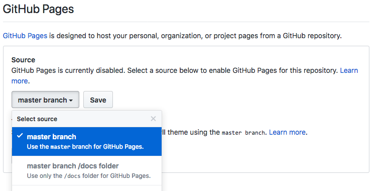
If you need a place to post your activity assignments, GitHub Pages can be a good option. Or, you may just prefer to use GitHub Pages to organize your files, so they are not cluttering your web server. You will create a fork of the activity files (<a href="https://github.com/learnaria/learnaria.github.io">learnaria.github.io</a>), rename the repository to create your own version, and either upload it to a site of your choosing, or use GitHub Pages. The GitHub Pages option is outlined here.</p> <div style="margin: 1em 0; padding: 1em; border: 1px solid #ddd; border-left: 10px solid #0000ff;"><strong>Suggested Reading:</strong> <a href="https://pages.github.com/">Using GitHub Pages.</a></div> <p>If you choose to use GitHub Pages, follow these steps to create a copy of the files under your own GitHub account.</p> <ol><li style="list-style-type: none;"><ol><li>Logged into GitHub, find your way to <a href="https://GitHub.com/learnaria/learnaria.github.io">the activity files</a>, and fork that repository. The fork button is at the top right of the GitHub screen while viewing a repository. This creates a copy of the repository under your own GitHub account where you will work from.</li> <li>After you have forked the activity files, go into the settings for that repository and change the name from learnaria.github.io to [username].github.io, where username is your GitHub account username. This will automatically create your GitHub Pages website at <strong><em>https://[username].github.io</em></strong>.</li> <li>Now you will want to create a clone of your forked activity files repository on your computer, through which you will do your work. From the command line issue the following command to create a clone of the forked version of the activity files you created, where [username] is your GitHub account username. You can also copy the https link from a field that opens when you click on the “Clone or download” button in your repo.<i style="text-align: initial; font-size: 1em;">#&gt;</i><strong style="text-align: initial; font-size: 1em;"><i>git clone </i></strong></li> <li>If you are using SourceTree, click on “+ New Repository” and choose “Clone from URL” and enter the above URL into the “Source URL” field. Set the “Destination Path” to your preferred work directory.</li> </ol> </li> </ol> <div style="margin: 1em 0; padding: 1em; border: 1px solid #ddd; border-left: 10px solid #0000ff;"><strong>Suggested Reading:</strong> <a href="https://help.github.com/articles/cloning-a-repository/">Cloning a repository.</a></div> <p>You should now have a copy of the activity files available locally that you can edit and commit back as your assignment updates, which become part of your GitHub Pages website.</p> <p>Note that it can take a few seconds or a minute for changes committed to your GitHub Pages repository to actually show up on the website.</p> <h3>If You Already Have a GitHub Pages Site</h3> <p>To add the files to an existing GitHub Pages site, open the settings for the forked repository you created. In the GitHub Pages section shown in the screenshot below, choose the Source (typically, the master branch) and click Save. This will create a subdirectory under your existing GitHub Pages site with the name of the forked repository (i.e., <a href="https://github.com/learnaria/learnaria.github.io">learnaria.github.io</a>).</p> <p>You may want to rename the repository to something shorter (e.g., learnaria) before enabling it in GitHub Pages. This would produce a URL to the activity files something like:</p> <p><strong>https://[username].github.io/learnaria/</strong></p> <div class="wp-caption alignnone" id="attachment_158" aria-describedby="caption-attachment-158" style="width: 781px"><img src="http://pressbooks.library.ryerson.ca/wafd/wp-content/uploads/sites/57/2018/12/githubpages_2.png" alt="screenshot of the GitHub Pages settings" class="wp-image-158 size-full" width="781" height="380" srcset="https://pressbooks.library.ryerson.ca/wafd/wp-content/uploads/sites/57/2018/12/githubpages_2.png 781w, https://pressbooks.library.ryerson.ca/wafd/wp-content/uploads/sites/57/2018/12/githubpages_2-300x146.png 300w, https://pressbooks.library.ryerson.ca/wafd/wp-content/uploads/sites/57/2018/12/githubpages_2-768x374.png 768w, https://pressbooks.library.ryerson.ca/wafd/wp-content/uploads/sites/57/2018/12/githubpages_2-65x32.png 65w, https://pressbooks.library.ryerson.ca/wafd/wp-content/uploads/sites/57/2018/12/githubpages_2-225x109.png 225w, https://pressbooks.library.ryerson.ca/wafd/wp-content/uploads/sites/57/2018/12/githubpages_2-350x170.png 350w" /><div class="wp-caption-text" id="caption-attachment-158"><strong>Figure: </strong>A screenshot of the GitHub Pages settings</div></div> <h2>Basic Git Commands</h2> <p>You do not need to be an expert Git user, but you should know a few basic commands if you are working from a command prompt. The commands you’ll likely use are the following</p> <div style="border: 1px solid black; padding: 1em;"><p><strong>git status</strong>  (displays a list of changed and untracked files)</p> <p><strong>git add</strong> [filename] (prepares a files for committing)</p> <p><strong>git commit</strong> -m “[message]” (describe the nature of the commit)</p> <p><strong>git push</strong> [origin master] (sends the committed change to your GitHub repository master branch)</p> <p><strong>git diff</strong> [filename] (shows the changes in a file)</p> </div> <p>Of course there are many other potential commands, but these are the most common. If you are using a Git client, like SourceTree, these commands will be clickable in the UI buttons and menus. For more about using Git from the command line, see the Git Book.</p> <div style="margin: 1em 0; padding: 1em; border: 1px solid #ddd; border-left: 10px solid #0000ff;"><strong>Suggested Reading:</strong> <a href="https://git-scm.com/book/en/v2">The Git Book.</a></div> <h3>What the Activity Files Look Like</h3> <p>Here is what to expect once you have successfully set up the activity files. You&#8217;ll note that the widgets are inaccessible. Your job throughout the book will be to fix the accessibility of each widget.</p> <div style="height: 500px; width: 100%; overflow: hidden;"><div class="textbox interactive-content"><span class="interactive-content__icon"></span> <p>An interactive or media element has been excluded from this version of the text. You can view it online here:<br /> <a href="https://pressbooks.library.ryerson.ca/wafd/?p=172#pb-interactive-content" title="learnaria.github.io">https://pressbooks.library.ryerson.ca/wafd/?p=172</a> </p> </div> </div> <p><!--https://learnaria.github.io --></p> </div></div>
<div class="chapter standard" id="chapter-activity-1-how-to-submit-assignments" title="Activity 1: How to Submit Assignments"><div class="chapter-title-wrap"><h3 class="chapter-number">7</h3><h2 class="chapter-title">Activity 1: How to Submit Assignments</h2></div><div class="ugc chapter-ugc"> <h2><img src="http://pressbooks.library.ryerson.ca/wafd/wp-content/uploads/sites/57/2018/12/activity_sm.png" alt="" class="size-full wp-image-152 alignright" width="150" height="158" srcset="https://pressbooks.library.ryerson.ca/wafd/wp-content/uploads/sites/57/2018/12/activity_sm.png 150w, https://pressbooks.library.ryerson.ca/wafd/wp-content/uploads/sites/57/2018/12/activity_sm-65x68.png 65w" />How to Submit Assignments</h2> <p>If you are submitting assignments, the first task in the book is to get setup to submit assignments. This can be done through&nbsp;<a href="https://pages.github.com/">GitHub Pages</a> (recommended), another public location on the Web, or on&nbsp;<a href="https://raw.githack.com">GitHack</a>.</p> <p>Refer back to <a href="#chapter-1-2-submitting-coding-assignments-and-using-github">Using GitHub in this Book</a> for details on getting set up with GitHub Pages.</p> <h3>Alternatives to GitHub Pages</h3> <ul><li>If you choose not to use GitHub Pages for your assignments, submit the URL to the index.html file of your copy of the activity files at an alternate location where you have set up your files.</li> <li>Or, submit the URL to the index.html file of your GitHub repository generated through <a href="https://raw.githack.com">raw.githack.com</a>.</li> </ul> <h2>Requirements</h2> <p>If you are taking a course that uses this textbook, your instructor will provide information on how and where to submit the URLs to your various assignment submissions.</p> <h2>Grading Rubric</h2> <div><table class="addborder" title="" cellpadding="0" style="border-spacing: 0px;"><thead><tr><th style="width: 727.062px;">Criteria</th> <th style="width: 86.0625px;">Points</th> </tr> </thead> <tbody><tr><td style="width: 727.062px;">URL to Course Files:<br /> URL submitted to your copy of all the course files either in GitHub Pages or on a web server of your choosing.</td> <td style="width: 86.0625px;">10.0 pts</td> </tr> <tr><td style="width: 727.062px;">Total Points:</td> <td style="width: 86.0625px;">10.0</td> </tr> </tbody> </table> </div> </div></div>
<div class="chapter standard" id="chapter-introduction-to-the-jquery-plugin" title="Introduction to the jQuery Plugin"><div class="chapter-title-wrap"><h3 class="chapter-number">8</h3><h2 class="chapter-title">Introduction to the jQuery Plugin</h2></div><div class="ugc chapter-ugc"> <p>Though we have chosen to focus the book around jQuery, much of what you’ll learn in this book will be applicable to JavaScript in general and to other JavaScript frameworks you may be using in your work. Much of the effort in the book will be on creating device independent code (works with keyboard and mouse) and using script to inject WAI-ARIA into HTML as needed to dynamically manage roles, states, and properties of various interactive widgets and applications you’ll be introduced to.</p> <p>Throughout the book you will be building a jQuery-ARIA plugin. We will first provide some background in the first few chapters, then introduce static WAI-ARIA, then move into building the plugin in <a href="#chapter-4-1-objectives-and-activities">Chapter 4</a> up until the end of the book.</p> <p>As you go through the book you will be building pieces of the library one widget at a time. At the end of the book, when you have submitted all of the assignments, we will provide you with a link to the full library that you can continue to use and build upon.</p> <h2>Disclaimer</h2> <p>When creating this book and the jQuery plugin, we have optimized plugin widgets to work with ChromeVox, the screen reader you’ll be introduced to shortly. You may find some inconsistencies in functionality and presentation when using <a href="https://www.nvaccess.org/">NVDA</a> or <a href="https://www.freedomscientific.com/Products/Blindness/JAWS">JAWS</a> (i.e., other screen readers). Compatibility or limitations across screen readers will be discussed throughout the activities within the book.</p> </div></div>
<div class="chapter standard" id="chapter-other-wai-aria-libraries" title="Other WAI-ARIA Libraries"><div class="chapter-title-wrap"><h3 class="chapter-number">9</h3><h2 class="chapter-title">Other WAI-ARIA Libraries</h2></div><div class="ugc chapter-ugc"><p>Though we’ll focus on using the open source WAI-ARIA jQuery library we have created for this book, there are a couple other resources you can review that provide similar capabilities.</p> <div style="margin: 1em 0;padding: 1em;border: 1px solid #ddd;border-left: 10px solid #3c3"><strong>Toolkit:</strong> <a href="https://hanshillen.github.io/jqtest/">jQuery UI Accessibility Enhancements</a>. Developed by Hans Hillen at the Paciello Group.</div> <div style="margin: 1em 0;padding: 1em;border: 1px solid #ddd;border-left: 10px solid #3c3"><strong>Toolkit:</strong> <a href="https://de.ryerson.ca/wa/aria/mootools/Accessible_MooTools_Widgets.html">Accessible MooTools Widgets</a>. Developed by Fraunhofer as part of an AEGIS project (no longer available through the creator).</div> <p>The above libraries have been pulled apart and set up as individual demos. These demos can be found through The Chang School’s Distance Education website, as part of a set of resources for a local workshop run at the university.</p> <div style="margin: 1em 0;padding: 1em;border: 1px solid #ddd;border-left: 10px solid #3c3"><strong>Toolkit:</strong> <a href="https://de.ryerson.ca/wa/aria/">WAI-ARIA Workshop Resources</a></div> <p>Another great resource for WAI-ARIA code and examples is the W3C’s WAI-ARIA Authoring Practices site. Within the documentation are many demonstrations of how WAI-ARIA can be used. We will typically follow the best practices recommended by W3C, though, we may vary from those on occasion when more practical solutions are possible. These variations will be documented in the code comments.</p> <div style="margin: 1em 0;padding: 1em;border: 1px solid #ddd;border-left: 10px solid #3c3"><p><strong>Toolkit:</strong></p> <ul><li><a href="https://www.w3.org/TR/wai-aria-practices">WAI-ARIA Authoring Practices 1.1</a></li> <li><a href="https://www.w3.org/TR/WCAG20-TECHS/aria">ARIA Techniques for WCAG 2.0</a></li> <li><a href="https://www.w3.org/TR/aria-in-html/">Using WAI-ARIA</a></li> </ul> </div> </div></div>
<div class="chapter standard" id="chapter-chromevox-screen-reader-install-and-setup" title="ChromeVox Screen Reader Install and Setup"><div class="chapter-title-wrap"><h3 class="chapter-number">10</h3><h2 class="chapter-title">ChromeVox Screen Reader Install and Setup</h2></div><div class="ugc chapter-ugc"><p>We introduce you to ChromeVox early on, so you&#8217;ll have an opportunity to practice using the screen reader we will be using throughout the book. It will be a key tool in your toolkit that you’ll use to test your work, and it will be the tool the instructors use when marking assignments.</p> <p>Though there are other more popular screen readers, like <a href="https://www.freedomscientific.com/Products/Blindness/JAWS">JAWS</a> and <a href="https://www.nvaccess.org/">NVDA</a> to name a couple, for day-to-day screen reader testing, ChromeVox (particularly the ChromeVox Plugin for the Chrome web browser) is our screen reader of choice because it is simple to install and configure, easy to use, free and open source, and works across computer platforms.</p> <p>Another reason ChromeVox works well for accessibility testing is its good support for WAI-ARIA. WAI-ARIA is still a relatively new technology, and, as of mid-2018, it is still being supported inconsistently across available browsers and screen readers. When developing for the Web, do use WAI-ARIA as it is intended to be used as documented in the WAI-ARIA specification and test it with ChromeVox. You will still want to test with JAWS or perhaps NVDA for production testing, as these are more likely to be used by blind users. For this book, however, we will only be using ChromeVox.</p> <p>While a relatively small number of screen reader users currently use ChromeVox, it is a highly effective tool for developers when testing web content. Also, ChromeVox is tailored to work with features of <a href="https://www.google.com/drive/">Google Drive</a>, so even for users of other screen readers, ChromeVox may be preferable when working with Google Docs, Sheets, and Slides, etc.</p> <div style="margin: 1em 0;padding: 1em;border: 1px solid #ddd;border-left: 10px solid #3c3"><strong>Toolkit:</strong> Visit the Chrome store while using the Chrome web browser to install the <a href="https://chrome.google.com/webstore/detail/chromevox/kgejglhpjiefppelpmljglcjbhoiplfn"><strong>ChromeVox screen reader</strong></a>. It will be a key element of your Toolkit.</div> <h2>How to Set Up the ChromeVox Screen Reader</h2> <ol><li>Open the Chrome web browser (<a href="https://www.google.com/chrome/">install Chrome</a>, if needed).</li> <li>Type “Chromevox” into Chrome&#8217;s address bar, or into Google search.</li> <li>Follow the ChromeVox link to the Chrome Web Store (the first link in the search results).</li> <li>Click the “Add to Chrome” button.</li> <li>In the dialog box that opens, click “Add extension.”</li> <li>Now installed, find the ChromeVox icon near the top right of Chrome to review its options.</li> <li>In the Options, set the ChromeVox modifier key to Alt or Ctrl or both (referred to here as CVox).</li> <li>In the Options, choose your preferred voice from the Voices menu.</li> <li>Done, turn ChromeVox on or off by pressing and holding the modifier key then pressing the letter &#8220;A&#8221; twice (i.e., CVox + A + A).</li> </ol> <p>If you would rather see ChromeVox installed, the video below describes how to install and begin using ChromeVox.</p> <p><strong>Video: <a href="https://www.youtube.com/watch?v=MC8reXDktM8" rel="noopener">Installing ChromeVox</a></strong></p> <div class="textbox interactive-content interactive-content--oembed"><img src="https://i.ytimg.com/vi/MC8reXDktM8/hqdefault.jpg" alt="Thumbnail for the embedded element &quot;Installing ChromeVox&quot;" title="Installing ChromeVox" /> <p>A YouTube element has been excluded from this version of the text. You can view it online here: <a href="https://pressbooks.library.ryerson.ca/wafd/?p=190#pb-interactive-content" title="Installing ChromeVox">https://pressbooks.library.ryerson.ca/wafd/?p=190</a> </p> </div> <h2>ChromeVox Testing and Associated Key Commands</h2> <div style="margin: 1em 0;padding: 1em;border: 1px solid #ddd;border-left: 10px solid #3c3"><strong>Toolkit:</strong> Download the <a href="http://pressbooks.library.ryerson.ca/wafd/wp-content/uploads/sites/57/2018/12/ChromeVox_Key_Commands.docx">ChromeVox_Key_Commands</a> file (Word), outlined in the table below, print it or keep it nearby when completing the first few activities.</div> <div style="margin: 1em 0;padding: 1em;border: 1px solid #ddd;border-left: 10px solid #f66"><p><strong>Key Point: </strong>Be sure you <strong>have the modifier key set</strong> in ChromeVox Options, or you are going to have difficulty with the activities.</p> <p>*The ChromeVox modifier key (i.e., Cvox)  is set in Chrome’s Settings &gt; Extensions &gt; ChromeVox &gt; Options, typically set to Alt or Ctrl.</p> </div> <div style="margin: 1em 0;padding: 1em;border: 1px solid #ddd;border-left: 10px solid #f66"><strong>Key Point: </strong>When you are navigating with ChromeVox, it will add its own highlighting around elements when they receive focus. Test for focus visibility (WCAG 2 Guideline 2.4.7) when ChromeVox is not running. For a complete list of key commands see the ChromeVox Options, accessible through the ChromeVox button that gets added to Chrome in the top right corner of the browser during installation. Default commands are listed and can be changed if needed.</div> <table class="addborder"><tbody><tr><th><strong>Task</strong></th> <th><strong>Task Description</strong></th> <th><strong>Keyboard Command</strong></th> </tr> <tr><td>Toggle ChromeVox On/Off</td> <td>To turn ChromeVox on or off without having to go into the ChromeVox Settings</td> <td>Cvox+A+A</td> </tr> <tr><td>Stop Reading</td> <td>Stop ChromeVox from reading</td> <td>Ctrl</td> </tr> <tr><td>Default Reading</td> <td>When a web page loads, ChromeVox will read the element that takes focus on the page. Use the Cvox+Arrow keys to read through content. Listen to the spoken output and note any inconsistencies from what one might expect to hear based on what is visible on the screen.</td> <td>Cvox+Up and Down Arrows</td> </tr> <tr><td>Tab Navigation</td> <td>When a page has loaded, press the Tab key to navigate through operable elements of the page like links and forms. Listen to the output when these elements are in focus, and note any elements that are clickable but not focusable with the keyboard. <p>Also listen for hidden elements such as bypass links or other elements that are not visible but are read aloud by ChromeVox.</p></td> <td>Tab, Shift + Tab</td> </tr> <tr><td>Navigate through Headings</td> <td>Step through all the headings on a page. Note whether all headings are announced as expected. Note the heading level announced. Are they sequenced to create semantic structure (i.e., nested in the proper order)?</td> <td>Cvox+L+H then Up/Down Arrows</td> </tr> <tr><td>Navigate through Landmarks</td> <td>Step through the landmarks, key navigation points on a page. Are all areas of the page contained in a landmarked region? Note any missing landmarks.</td> <td>Cvox+L+; (semi-colon) then Up/Down Arrows</td> </tr> <tr><td>List Links</td> <td>List the links and navigate through them using the Arrow keys, listen for meaningfulness, or listen for context when links are otherwise meaningless.</td> <td>Cvox+L+L then Up/Down Arrows</td> </tr> <tr><td>Navigate through Forms</td> <td>Navigate to forms on a page, then press the Tab or F keys to listen to each of the fields. Are fields announced effectively, including required fields?</td> <td>Cvox+L+F then Up/Down Arrows</td> </tr> <tr><td>Navigate through Tables</td> <td>Navigate to Tables on a page, press Enter to go to a table, press Up/Down Arrow keys to move through cells in sequence (left to right, top to bottom), press Ctrl+Alt+Arrow to move to adjacent cells, press Ctrl+Alt and 5 on the number pad to list column and row headers where applicable. Note whether header cells are read or not. Are Fieldset labels announced, where applicable?</td> <td>Cvox+L+T then Up/Down Arrows then Enter to select Table <p>Cvox+Arrow to move within table</p> <p>Cvox+TH to announce headers</p></td> </tr> </tbody> </table> </div></div>
<div class="chapter standard" id="chapter-activity-2-set-up-and-use-chromevox" title="Activity 2: Set Up and Use ChromeVox"><div class="chapter-title-wrap"><h3 class="chapter-number">11</h3><h2 class="chapter-title">Activity 2: Set Up and Use ChromeVox</h2></div><div class="ugc chapter-ugc"> <h2>Set Up and Use ChromeVox</h2> <div style="margin: 1em 0; padding: 1em; border: 1px solid #ddd; border-left: 10px solid #f66;"><p><strong>Key Point: </strong></p> <ul><li><strong>If you are blind</strong> and use a screen reader other than ChromeVox, complete the activity using your preferred screen reader. Be sure to state the name of the screen reader you are using.</li> <li><strong>If you are not blind</strong>, regardless of whether you use another screen reader to test accessibility for instance, please use ChromeVox. What’s important is how ChromeVox interacts with the activity files you will be updating in the activities of this book.</li> </ul> </div> <p><img src="http://pressbooks.library.ryerson.ca/wafd/wp-content/uploads/sites/57/2018/12/activity_sm.png" alt="" class="size-full wp-image-152 alignright" width="150" height="158" srcset="https://pressbooks.library.ryerson.ca/wafd/wp-content/uploads/sites/57/2018/12/activity_sm.png 150w, https://pressbooks.library.ryerson.ca/wafd/wp-content/uploads/sites/57/2018/12/activity_sm-65x68.png 65w" />In this activity, you will navigate through a website using only a keyboard. Describe how the screen reader behaves. For a challenge, navigate with your monitor turned off (or darkened so you can’t see what you are doing). The aim of this exercise is to discover how WAI-ARIA is making elements on the page understandable by listening alone, and to introduce screen reader review into your website testing regimen.</p> <p>Refer back to <a title="ChromeVox Screen Reader Install and Setup" href="#chapter-1-5-chromevox-screen-reader-install-and-setup">ChromeVox Screen Reader Install and Setup</a> and set up ChromeVox, if you have not already.</p> <h2>Requirements</h2> <p>Open the <a href="https://de.ryerson.ca/wa/showcase/">Web Accessibility Auditing Showcase</a> website.</p> <p>Navigate the <strong>homepage only</strong> with your monitor darkened and without using your mouse.&nbsp;Describe what the screen reader announces as you pass through the following elements:</p> <ul><li>Left side menu</li> <li>Carousel at the top of the content area of the page</li> <li>Accordion on the right</li> <li>Tab panel in the centre of the page</li> <li>Landmarks present on the page (list them)</li> </ul> <p>Also, answer the following questions:</p> <ul><li>Are you able to navigate effectively?</li> <li>What difficulties did you experience, if any?</li> <li>What could be improved, if anything, to make navigation more effective?</li> </ul> <h2>Grading Rubric</h2> <div><table class="addborder" title="" cellpadding="0" style="border-spacing: 0px;"><thead><tr><th>Criteria</th> <th>Points</th> </tr> </thead> <tbody><tr><td>Good descriptions provided for each element listed</td> <td>5.0 pts</td> </tr> <tr><td>Three questions answered effectively</td> <td>5.0 pts</td> </tr> <tr><td>Total Points:</td> <td>10.0</td> </tr> </tbody> </table> </div> </div></div>
<div class="chapter standard" id="chapter-wai-aria-and-html-5" title="WAI-ARIA and HTML 5"><div class="chapter-title-wrap"><h3 class="chapter-number">12</h3><h2 class="chapter-title">WAI-ARIA and HTML 5</h2></div><div class="ugc chapter-ugc"><p>WAI-ARIA was released as a complement to HTML5. Its main purpose is to give developers more freedom to build custom web content, web applications, and interface controls created with HTML, JavaScript, and Ajax. WAI-ARIA provides a framework for adding semantics that make it possible for assistive technology users to understand and operate these custom elements.</p> <p>Most HTML has built-in semantics and does not generally need WAI-ARIA. However, when HTML is being used in a non-standard way, like making a button out of a <code>&lt;div&gt;</code>, then WAI-ARIA can be added to that <code>&lt;div&gt;</code> to make it appear as a button to a screen reader by adding the following: Add the role of “button” (i.e., <code>role="button"</code>), add a null tabindex value (i.e., <code>tabindex="0"</code>), which makes it focusable, then define its state using the <code>aria-pressed</code> attribute, which is updated with JavaScript when the button is pressed. In the case of an actual <code>&lt;button&gt;</code> element, these properties are all already defined, so there is no need to use WAI-ARIA.</p> <pre class="brush: xml; light: true; title: ; notranslate" title="">

&lt;div role=&quot;button&quot; aria-pressed=&quot;false&quot; tabindex=&quot;0&quot;&gt;Press Me&lt;/div&gt;

</pre> <p>Though WAI-ARIA is typically used with HTML5, it can also be used with XHTML and HTML4. You may find, however, that <a href="https://validator.w3.org/">HTML validators</a> see WAI-ARIA as broken markup in older versions of HTML, but don’t worry about that. Any WAI-ARIA related errors that a validator might identify in older HTML can generally be ignored (assuming it has been used correctly). By now though, you should be using HTML5. If you are retrofitting older code, then go ahead and add WAI-ARIA to it.  If you are developing something new, then go with HTML5.</p> </div></div>
<div class="chapter standard" id="chapter-self-test-1" title="Self-Test 1"><div class="chapter-title-wrap"><h3 class="chapter-number">13</h3><h2 class="chapter-title">Self-Test 1</h2></div><div class="ugc chapter-ugc"><p><img src="http://pressbooks.library.ryerson.ca/wafd/wp-content/uploads/sites/57/2018/12/quiz.png" alt="" width="150" height="111" class="size-full wp-image-159 alignright" srcset="https://pressbooks.library.ryerson.ca/wafd/wp-content/uploads/sites/57/2018/12/quiz.png 150w, https://pressbooks.library.ryerson.ca/wafd/wp-content/uploads/sites/57/2018/12/quiz-65x48.png 65w" /><br /> Complete the following questions to test your understanding of some key lessons in the Introduction and Chapter 1.</p> <div class="textbox interactive-content"><span class="interactive-content__icon"></span> <p>An interactive or media element has been excluded from this version of the text. You can view it online here:<br /> <a href="https://pressbooks.library.ryerson.ca/wafd/?p=205#pb-interactive-content" title="Unit 1 Quiz">https://pressbooks.library.ryerson.ca/wafd/?p=205</a> </p> </div> </div></div>
<div class="part " id="part-slug-2-introduction-to-wai-aria"><div class="part-title-wrap"><h3 class="part-number">III</h3><h1 class="part-title">2. Introduction to WAI-ARIA</h1></div></div>
<div class="chapter standard" id="chapter-objectives-and-activities-2" title="Objectives and Activities"><div class="chapter-title-wrap"><h3 class="chapter-number">14</h3><h2 class="chapter-title">Objectives and Activities</h2></div><div class="ugc chapter-ugc"> <div class="colorBox objectives"><h2>Objectives</h2> <p><img src="http://pressbooks.library.ryerson.ca/wafd/wp-content/uploads/sites/57/2018/12/checklist.png" alt="" width="150" height="152" class="size-full wp-image-157 alignright" srcset="https://pressbooks.library.ryerson.ca/wafd/wp-content/uploads/sites/57/2018/12/checklist.png 150w, https://pressbooks.library.ryerson.ca/wafd/wp-content/uploads/sites/57/2018/12/checklist-65x66.png 65w" />By the end of this unit, you will be able to:</p> <ul><li>Explain how WAI-ARIA works</li> <li>Distinguish between static vs. dynamic WAI-ARIA</li> <li>Identify WAI-ARIA roles, states, and properties</li> <li>Recognize browser and screen reader support for WAI-ARIA</li> <li>Compare and contrast graceful degradation vs progressive enhancement</li> <li>Outline the WAI-ARIA taxonomy</li> </ul> <h2>Activities</h2> <ul><li>WAI-ARIA Scavenger Hunt (Showcase)</li> </ul> </div> </div></div>
<div class="chapter standard" id="chapter-what-is-wai-aria" title="What is WAI-ARIA?"><div class="chapter-title-wrap"><h3 class="chapter-number">15</h3><h2 class="chapter-title">What is WAI-ARIA?</h2></div><div class="ugc chapter-ugc"> <div class="textbox"><p><strong>W3C definition of WAI-ARIA </strong></p> <p>“WAI-ARIA provides a framework for adding attributes to identify features for user interaction, how they relate to each other, and their current state.”</p> <p style="text-align: left">Source: <a href="https://www.w3.org/WAI/intro/aria">W3C</a></p> </div> <div style="border: 1px solid black;padding: 1em"><p>WAI-ARIA provides web authors with the following:</p> <ul><li>Roles to describe the type of widget presented, such as “menu”, “treeitem”, “slider”, and “progressmeter”</li> <li>Roles to describe the structure of the web page, such as headings, regions, and tables (grids)</li> <li>Properties to describe the state widgets are in, such as “checked” for a check box, or “haspopup” for a menu.</li> <li>Properties to define live regions of a page that are likely to get updates (such as stock quotes), as well as an interruption policy for those updates — for example, critical updates may be presented in an alert dialog box and incidental updates occur within the page</li> <li>Properties for drag-and-drop that describe drag sources and drop targets</li> <li>A way to provide keyboard navigation for the web objects and events, such as those mentioned above</li> </ul> <p style="text-align: left">Source: <a href="https://www.w3.org/WAI/intro/aria">W3C</a></p> </div> <p>Some elements of the framework can be used on their own to add accessibility to web content (e.g., landmarks). More often, they are combined with scripting that is used to dynamically add or remove WAI-ARIA attributes depending on the context.</p> <p>WAI-ARIA provides semantics for custom widgets and web applications that can be understood by assistive technologies (ATs) and conveyed to users in a “human understandable” form. For example, HTML list markup might be used to create a navigation bar with menus and submenus. Without WAI-ARIA a screen reader would simply recognize the navigation bar as a collection of nested lists. Adding WAI-ARIA menu attributes (e.g., menubar, menu, menuitem, aria-haspopup, aria-expanded) can give the nested list a whole new meaning, more easily understood as a means of navigation than the list would be understood.</p> <div class="textbox"><p><strong>W3C definition of semantics</strong></p> <p>“The meaning of something as understood by a human, defined in a way that computers can process a representation of an <a href="https://www.w3.org/TR/2017/REC-wai-aria-1.1-20171214/#dfn-object">object</a>, such as <a href="https://www.w3.org/TR/2017/REC-wai-aria-1.1-20171214/#dfn-element">elements</a> and <a href="https://www.w3.org/TR/2017/REC-wai-aria-1.1-20171214/#dfn-attribute">attributes</a>, and reliably represent the object in a way that various humans will achieve a mutually consistent understanding of the object.”</p> <p>Source: <a href="https://www.w3.org/TR/personalization-semantics-1.0/#dfn-semantic">W3C</a></p> </div> <p>This definition of semantics in programming is much like the common definition of the word: “the meaning, or an interpretation of the meaning” (dictionary.com). Semantics in the context of web accessibility refers to the defining of meaning as it applies to functional elements of web content, and how that functionality is conveyed to assistive technology users, especially, screen reader users.</p> <h2>When and When Not to Use WAI-ARIA</h2> <p>WAI-ARIA is supposed to be used when semantics are required to make a web application or widget understandable. For example, if you are using a <code>&lt;div&gt;</code> to create a checkbox, along with some scripting you can assign the WAI-ARIA role “checkbox” to that <code>&lt;div&gt;</code> to make it appear as a checkbox.</p> <p>That said though, when there is a native HTML element available, like a checkbox, it is almost always better to use the native version than creating your own. The native version will already have all the associated semantics by default. Since the native versions are standardized, they are more likely to be supported across browsers and assistive technologies.</p> <p>For native HTML elements, it is not necessary to use WAI-ARIA. For an HTML <code>&lt;form&gt;</code> element for instance, there is no need to include <code>role="form"</code> with the element. There are a few exceptions to this rule, however. For some of the newer HTML5 elements, like <code>&lt;nav&gt;</code> and <code>&lt;main&gt;</code> for instance, it does not hurt to include the WAI-ARIA equivalent <code>role="navigation"</code> and <code>role="main"</code> in these elements for the time being, to accommodate some of the inconsistent support for these elements across browsers and ATs. HTML validators will still give you warnings about the redundant roles, but you can safely ignore these.</p> <p>You should also be careful when using WAI-ARIA with HTML elements that already have semantics. For example, if you use <code>&lt;h3 role="button"&gt;something&lt;/h3&gt;</code>, the semantics associated with the heading will be overridden, thus, potentially breaking the structure of a document. In a case like this, a better approach would be to wrap the heading in a <code>&lt;div&gt;</code> then assign <code>role="button"</code> to the <code>&lt;div&gt;</code> to preserve the structural semantics of the heading, as seen in the examples below.</p> <p>&nbsp;</p> <div style="height: 175px;width: 100%;overflow: hidden"><div class="textbox interactive-content"><span class="interactive-content__icon"></span> <p>An interactive or media element has been excluded from this version of the text. You can view it online here:<br /> <a href="https://pressbooks.library.ryerson.ca/wafd/?p=259#pb-interactive-content" title="pb-deUrVMmF">https://pressbooks.library.ryerson.ca/wafd/?p=259</a> </p> </div> </div> </div></div>
<div class="chapter standard" id="chapter-roles-states-and-properties" title="Roles, States, and Properties"><div class="chapter-title-wrap"><h3 class="chapter-number">16</h3><h2 class="chapter-title">Roles, States, and Properties</h2></div><div class="ugc chapter-ugc"><p>The semantics described earlier are created by adding roles, states, and properties to HTML elements.</p> <h2>Roles</h2> <div class="textbox"><p><strong>W3C definition of roles</strong></p> <p>“Main indicator of type. This <a href="https://www.w3.org/TR/2017/REC-wai-aria-1.1-20171214/#dfn-semantics">semantic</a> association allows tools to present and support interaction with the object in a manner that is consistent with user expectations about other objects of that type.”</p> <p style="text-align: left">Source: <a href="https://www.w3.org/TR/WCAG21/#dfn-roles">W3C</a></p> </div> <p>Examples of roles include menu, alert, banner, tree, tabpanel, textbox, and so on. Once assigned to an element, roles <em>must not</em> change over time or with user input. If, for instance, you wanted to change from a “menubar” while viewing in full screen mode to a toggle “menu” when viewed on a mobile device, the entire block of markup would change, rather than switching menubar for menu.</p> <p>Roles are categorized into six groupings. Here are the groups with a few examples of each type:</p> <ul><li>Abstract role (not to be used by authors in content, the base for the WAI-ARIA ontology)</li> <li>Widget roles (e.g., button, link, menuitem)</li> <li>Document structure roles (e.g., article, feed, list, table)</li> <li>Landmark roles (e.g., banner, navigation, main, complementary)</li> <li>Live region roles (e.g., alert, log, timer)</li> <li>Window roles (e.g., alertdialog, dialog)</li> </ul> <p>Roles are typically added to HTML elements using the role attribute as follows. In the example below, an unordered list is given a role of <code>menubar</code>. Typically, this is used when creating a horizontal navigation bar across the top of a user interface. Each list item is given a role of <code>menuitem</code>.</p> <div style="height:150px;width:100%;overflow:hidden"><div class="textbox interactive-content"><span class="interactive-content__icon"></span> <p>An interactive or media element has been excluded from this version of the text. You can view it online here:<br /> <a href="https://pressbooks.library.ryerson.ca/wafd/?p=267#pb-interactive-content" title="2.3">https://pressbooks.library.ryerson.ca/wafd/?p=267</a> </p> </div> </div> <div style="margin: 1em 0;padding: 1em;border: 1px solid #ddd;border-left: 10px solid #0000ff"><strong>Suggested Reading:</strong> Here is the <a href="https://www.w3.org/TR/2017/REC-wai-aria-1.1-20171214/#role_definitions">full list of roles</a> in WAI-ARIA 1.1.</div> <h2>States</h2> <div class="textbox"><p><strong>W3C definition of states </strong></p> <p>“A state is a dynamic <a href="https://www.w3.org/TR/2017/REC-wai-aria-1.1-20171214/#dfn-property">property</a> expressing characteristics of an <a href="https://www.w3.org/TR/2017/REC-wai-aria-1.1-20171214/#dfn-object">object</a> that may change in response to user action or automated processes. States do not affect the essential nature of the object, but represent data associated with the object or user interaction possibilities. See: <a href="https://www.w3.org/TR/2017/REC-wai-aria-1.1-20171214/#statevsprop">clarification of states versus properties</a>.”</p> <p>Source: <a href="https://www.w3.org/TR/WCAG21/#dfn-states">W3C</a></p> </div> <p>States are used along with roles, typically, to define its functional status. States are much like properties, though they typically change while an application or widget is being used (e.g., <code>aria-checked</code> changes between true and false). Properties typically do not change (e.g., <code>aria-labelledby</code> keeps the same value). States and properties are all “aria-” prefixed, unlike roles.</p> <p>Here are a few examples of states:</p> <ul><li>aria-busy</li> <li>aria-checked</li> <li>aria-expanded</li> <li>aria-disabled</li> <li>aria-hidden</li> </ul> <h2>Properties</h2> <div class="textbox"><p><strong>W3C definition of properties</strong></p> <p>“<a href="https://www.w3.org/TR/2017/REC-wai-aria-1.1-20171214/#dfn-attribute">Attributes</a> that are essential to the nature of a given <a href="https://www.w3.org/TR/2017/REC-wai-aria-1.1-20171214/#dfn-object">object</a>, or that represent a data value associated with the object. A change of a property may significantly impact the meaning or presentation of an object. Certain properties (for example, <a href="https://www.w3.org/TR/2017/REC-wai-aria-1.1-20171214/#aria-multiline">aria-multiline</a>) are less likely to change than <a href="https://www.w3.org/TR/2017/REC-wai-aria-1.1-20171214/#dfn-state">states</a>, but note that the frequency of change difference is not a rule. A few properties, such as <a href="https://www.w3.org/TR/2017/REC-wai-aria-1.1-20171214/#aria-activedescendant">aria-activedescendant</a>, <a href="https://www.w3.org/TR/2017/REC-wai-aria-1.1-20171214/#aria-valuenow">aria-valuenow</a>, and <a href="https://www.w3.org/TR/2017/REC-wai-aria-1.1-20171214/#aria-valuetext">aria-valuetext</a> are expected to change often. See <a href="https://www.w3.org/TR/2017/REC-wai-aria-1.1-20171214/#statevsprop">clarification of states versus properties</a>.”</p> <p>Source: <a href="https://www.w3.org/TR/WCAG21/#dfn-states">W3C</a></p> </div> <p>Properties, as mentioned above, are much like states in how they are used along with roles. However, unlike states that change, properties <em>tend</em> to remain the same (though this is not a rule). Intuitively, you may notice the changing nature of states listed above, and the static nature of properties listed below.</p> <p>Here are a few examples of properties:</p> <ul><li>aria-describedby</li> <li>aria-atomic</li> <li>aria-autocomplete</li> <li>aria-colcount</li> <li>aria-colspan</li> <li>aria-controls</li> </ul> <div style="margin: 1em 0;padding: 1em;border: 1px solid #ddd;border-left: 10px solid #0000ff"><strong>Suggested Reading:</strong>  See the WAI-ARIA Specification for a <a href="https://www.w3.org/TR/2017/REC-wai-aria-1.1-20171214/#states_and_properties">full list of states and properties.</a></div> </div></div>
<div class="chapter standard" id="chapter-static-vs-dynamic-wai-aria" title="Static vs. Dynamic WAI-ARIA"><div class="chapter-title-wrap"><h3 class="chapter-number">17</h3><h2 class="chapter-title">Static vs. Dynamic WAI-ARIA</h2></div><div class="ugc chapter-ugc"><p>Even if you don’t use JavaScript, there is a good amount you can do with static WAI-ARIA to improve the accessibility of a website or web application. You may have already gathered from the discussion of states and properties that some WAI-ARIA can be written right into the HTML of a web page (e.g., properties and landmarks). Others need to be dynamically updated based on user input or context (e.g., states and some properties).</p> <p>Some of the static WAI-ARIA attributes you are likely to use are listed below, with their descriptions from W3C.</p> <h2>Global Static Properties</h2> <ul><li><strong>aria-describedby</strong>: Identifies the element (or elements) that describes the object.</li> <li><strong>aria-labelledby</strong>: Identifies the element (or elements) that labels the current element.</li> <li><strong>aria-label</strong>: Defines a string value that labels the current element.</li> <li><strong>aria-controls</strong>: Identifies the element (or elements) whose contents or presence are controlled by the current element.</li> <li><strong>aria-owns</strong>: Identifies an element (or elements) in order to define a visual, functional, or contextual parent/child relationship between DOM elements where the DOM hierarchy cannot be used to represent the relationship.</li> <li><strong>aria-details</strong>: Identifies the element that provides a detailed, extended description for the object.</li> </ul> <p>Below is an example of some of these attributes in action. Though this example would need some scripting to handle the submenu opening and closing, and dynamically updating <span class="no-hyphens"><code>aria-expanded</code> to false when the submenu is closed, and update the active element referenced in <code>aria-activedescendant</code></span>, you can get an idea of the semantics that are being applied to make the nested list announce itself as a menu. Watch or listen to the screen reader output in the video that follows the code box below to understand how the WAI-ARIA attributes are read. Examine the code in the code box to understand what WAI-ARIA is being used to produce that output.</p> <div style="height:510px;width:100%;overflow:hidden"><div class="textbox interactive-content"><span class="interactive-content__icon"></span> <p>An interactive or media element has been excluded from this version of the text. You can view it online here:<br /> <a href="https://pressbooks.library.ryerson.ca/wafd/?p=272#pb-interactive-content" title="2.4">https://pressbooks.library.ryerson.ca/wafd/?p=272</a> </p> </div> </div> <h2>How Does the Above Markup Work?</h2> <ol><li>Navigating with the Tab key, focus first goes to the <code>"menu_container"</code> div, which is made keyboard focusable with the <code>tabindex="0"</code> attribute.</li> <li>There the screen reader reads the content of the “chooser” div, identified by <code>aria-details</code>, describing what the menu is used for. This div is hidden from view but available to screen readers. This div could be made visible to make it available for everyone.</li> <li>Next, the “offerings” UL receives focus, also made focusable with <code>tabindex="0"</code>.</li> <li>There, the screen reader reads the content of the “navhowto” div, identified by <code>aria-describedby</code>, explaining how to navigate the menu. This div is hidden from view for most users.</li> <li>Next, using the Arrow keys as instructed by the “navhowto” div, the ‘Home’ <code>menuitem</code> takes focus, announcing “menubar expanded with submenu, Home, menu”. Probably a little more verbose in this case than it needs to be, but that’s how ChromeVox handles menu items.</li> <li>Using the Down Arrow key, focus is moved to the “Courses” menu item, announcing “Courses, menu expanded with submenu.” The <span class="no-hyphens"><code>aria-haspopup</code> attribute is what causes a screen reader to announce a submenu. <code>aria-expanded="true"</code></span> causes the screen reader to announce that the menu is expanded.</li> <li>Using the Down Arrow, focus moves into the submenu, announcing “Menu with two items, Economics, menuitem 1 of two.” The submenu is announced as a menu of its own, identified by adding <code>role="menu"</code> to the UL containing the two submenu items.</li> <li>Finally, using the Down Arrow, the screen reader announces “Computer Science, menuitem two of two.”</li> </ol> <p>Here&#8217;s a video that shows how ChromeVox would read out the menu described above:</p> <p><strong>Video: <a href="https://www.youtube.com/watch?v=-DKpnLU4KnU target=_blank" rel="noopener noreferrer">Example Menu with WAI-ARIA</a> </strong>(0:33)</p> <div class="textbox interactive-content interactive-content--oembed"><img src="https://i.ytimg.com/vi/-DKpnLU4KnU/hqdefault.jpg" alt="Thumbnail for the embedded element &quot;Example Menu with WAI-ARIA&quot;" title="Example Menu with WAI-ARIA" /> <p>A YouTube element has been excluded from this version of the text. You can view it online here: <a href="https://pressbooks.library.ryerson.ca/wafd/?p=272#pb-interactive-content" title="Example Menu with WAI-ARIA">https://pressbooks.library.ryerson.ca/wafd/?p=272</a> </p> </div> <p>Most of the WAI-ARIA elements described in the above series of steps can be used statically by typing the attributes right into the HTML. The <code>aria-activedescendant</code> would typically be dynamically updated with script as the menuitems are selected. The <code>aria-expanded</code> would also be updated dynamically switching between true and false when the submenu is toggled opened or closed.</p> <p>Here are some more static WAI-ARIA attributes, which we’ll look at in a little more detail later in the book.</p> <h2>Widget Static Attributes</h2> <ul><li><strong>aria-haspopup</strong>: Indicates the availability and type of interactive popup element, such as menu or dialog, that can be triggered by an element.</li> <li><strong>aria-modal</strong>: Indicates whether an element is modal when displayed</li> <li><strong>aria-readonly</strong>: Indicates that the element is not editable but is otherwise operable.</li> <li><strong>aria-required</strong>: Indicates that user input is required on the element before a form may be submitted.</li> </ul> <h2>Live Static Regions</h2> <ul><li><strong>aria-live</strong>: Indicates that an element will be updated and describes the types of updates the user agents, assistive technologies, and user can expect from the live region.</li> <li><strong>aria-atomic</strong>: Indicates whether assistive technologies will present all, or only parts of, the changed region based on the change notifications defined by the aria-relevant attribute.</li> <li><strong>aria-relevant</strong>: Indicates what notifications the user agent will trigger when the accessibility tree within a live region is modified.</li> </ul> <div style="margin: 1em 0;padding: 1em;border: 1px solid #ddd;border-left: 10px solid #3c3"><strong>Toolkit: </strong>For a full list of roles, see section 1 in the <a href="http://whatsock.com/training/matrices/">The ARIA Role Matrices.</a></div> </div></div>
<div class="chapter standard" id="chapter-browser-and-screen-reader-support-for-wai-aria" title="Browser and Screen Reader Support for WAI-ARIA"><div class="chapter-title-wrap"><h3 class="chapter-number">18</h3><h2 class="chapter-title">Browser and Screen Reader Support for WAI-ARIA</h2></div><div class="ugc chapter-ugc"><p>Because WAI-ARIA is relatively new, its support across browsers and assistive technologies is still somewhat inconsistent. That should not, however, discourage you from using it. Be aware that workarounds may be needed in some cases, at least for the short term as browsers and assistive technologies progress to implement support for the full WAI-ARIA specification.</p> <p>For now, it is advisable to test WAI-ARIA implementations across multiple browsers and screen readers.</p> <p>Look over the following references and add them to your Toolkit.</p> <div style="margin: 1em 0;padding: 1em;border: 1px solid #ddd;border-left: 10px solid #3c3"><p><strong>Toolkit:</strong></p> <ul><li><a href="https://www.powermapper.com/tests/screen-readers/aria/">WAI-ARIA Screen Reader Compatibility</a> (Dec 27, 2017) Note: This resource does not include ChromeVox.</li> <li><a href="https://caniuse.com/#feat=wai-aria">WAI-ARIA Browser Compatibility</a></li> <li><a href="https://developer.paciellogroup.com/blog/2017/04/aria-alert-support/">ARIA Alert Support</a></li> <li><a href="https://www.w3.org/WAI/WCAG20/Techniques/ua-notes/aria#ARIA11">User Agent Support Notes for ARIA Techniques</a></li> </ul> </div> </div></div>
<div class="chapter standard" id="chapter-graceful-degradation-vs-progressive-enhancement" title="Graceful Degradation vs. Progressive Enhancement"><div class="chapter-title-wrap"><h3 class="chapter-number">19</h3><h2 class="chapter-title">Graceful Degradation vs. Progressive Enhancement</h2></div><div class="ugc chapter-ugc"><p>Given the range of support for WAI-ARIA across current screen readers and browsers, strategies like graceful degradation and progressive enhancement are useful for accommodating varying implementations and ensuring that tools developed with WAI-ARIA are accessible regardless of support.</p> <p>Depending on your situation, one development method may be preferable over the other, though in general progressive enhancement is preferred over graceful degradation. That is, creating base functionality that works for everyone is preferred, rather than providing enhancements when they are supported by the browser and/or assistive technology. Graceful degradation, on the other hand, starts with the enhancement, then provides alternatives where the enhancements are not supported. While they may sound equivalent, the latter typically requires less effort, even though it is more of a Band-Aid solution to correct an incompatibility. The former takes a little more effort and is more about providing enhancements when they are supported while always providing a base functionality that works for everyone.</p> <h2>Definitions</h2> <p>In his article, &#8220;Graceful degradation versus progressive enhancement,” Christian Heilman provides some useful definitions that help distinguish between the two methods:</p> <div class="textbox" style="text-align: left">“<strong>Graceful degradation</strong> – Providing an alternative version of your functionality or making the user aware of shortcomings of a product as a safety measure to ensure that the product is usable.”</div> <div class="textbox" style="text-align: left">“<strong>Progressive enhancement</strong> – Starting with a baseline of usable functionality, then increasing the richness of the user experience step by step by testing for support for enhancements before applying them.”</div> <p>“Degrading gracefully means looking back whereas enhancing progressively means looking forward whilst keeping your feet on firm ground.”</p> <div style="margin: 1em 0;padding: 1em;border: 1px solid #ddd;border-left: 10px solid #0000ff"><strong>Suggested Reading: </strong>These definitions come from: <a href="https://www.w3.org/wiki/Graceful_degradation_versus_progressive_enhancement"></a><a href="https://www.w3.org/wiki/Graceful_degradation_versus_progressive_enhancement">Graceful degradation versus progressive enhancement</a> (Christian Heilman, CC-BY NC-SA).</div> <h2>When to Use Which Method with WAI-ARIA</h2> <p>Though progressive enhancement and graceful degradation are development methods that might be followed on any web project, here, we talk about them as they relate to the use of WAI-ARIA.</p> <p>Support for WAI-ARIA is improving constantly, but there are still many inconsistencies between browsers and assistive technologies. And there will still be those using older assistive technologies that were around before WAI-ARIA support was added. Because assistive technologies tend to be expensive, users tend to upgrade less often, thus it is important to support technologies that may be five years old or somewhat older.</p> <p>Browsers, on the other hand, are typically free, and readily available. However, that does not necessarily mean developers can rely on users having the latest or even a current browser. It is not uncommon, particularly in large organizations, to restrict employees’ ability to upgrade their own systems.</p> <p>A simple example of progressive enhancement (though it could also be seen as graceful degradation) is in within–web page navigation for screen reader and keyboard-only users. Before the advent of WAI-ARIA landmarks, the way to provide this within-page navigation was to provide bypass links, which would typically be located at the top left of the page. These bypass links lead to strategically placed anchors, often next to navigation elements and at the top of the main content area. These links are standard HTML and will work for everyone. WAI-ARIA landmarks are relatively new, though support for them in current browsers and assistive technologies is good. But, given some users will be using older technologies, at least for the short term, it is advisable to provide landmarks as an enhancement and continue using bypass links to ensure there is always a way to navigate effectively through web content.</p> <p>Similarly, when using the newer HTML elements that may not be supported by current assistive technologies, it is a good idea to use redundant roles, at least in the short term. For example, <code>&lt;nav&gt;</code> and <code>&lt;main&gt;</code> are new HTML elements, which are supposed to be equivalent to the navigation and main WAI-ARIA roles. However, not all ATs support the new tags at present. Thus, it&#8217;s advisable to use redundant roles with these elements, as seen in the markup below, even though HTML validators will flag them as a warning.</p> <div style="height:200px;width:100%;overflow:hidden"><div class="textbox interactive-content"><span class="interactive-content__icon"></span> <p>An interactive or media element has been excluded from this version of the text. You can view it online here:<br /> <a href="https://pressbooks.library.ryerson.ca/wafd/?p=275#pb-interactive-content" title="2.6">https://pressbooks.library.ryerson.ca/wafd/?p=275</a> </p> </div> </div> </div></div>
<div class="chapter standard" id="chapter-validating-wai-aria" title="Validating WAI-ARIA"><div class="chapter-title-wrap"><h3 class="chapter-number">20</h3><h2 class="chapter-title">Validating WAI-ARIA</h2></div><div class="ugc chapter-ugc"><p>There are a number of tools that can be used to validate WAI-ARIA to ensure it is being used correctly. Watch the following video for a quick look at WAI-ARIA validation with Lighthouse and aXe. Install these tools in your browser, so you have them available for testing as you complete the activities in the coming chapters.</p> <p><strong>Video: <a href="https://www.youtube.com/embed/QDymmLeqJbg target=_blank" rel="noopener noreferrer">WAI-ARIA Validation</a></strong></p> <div class="textbox interactive-content interactive-content--oembed"><img src="https://i.ytimg.com/vi/QDymmLeqJbg/hqdefault.jpg" alt="Thumbnail for the embedded element &quot;WAI-ARIA Validation&quot;" title="WAI-ARIA Validation" /> <p>A YouTube element has been excluded from this version of the text. You can view it online here: <a href="https://pressbooks.library.ryerson.ca/wafd/?p=281#pb-interactive-content" title="WAI-ARIA Validation">https://pressbooks.library.ryerson.ca/wafd/?p=281</a> </p> </div> <div style="margin: 1em 0;padding: 1em;border: 1px solid #ddd;border-left: 10px solid #3c3"><p><strong>Toolkit:</strong></p> <h3>Web-Based Validator</h3> <ul><li><a href="https://validator.w3.org">W3C HTML Validator</a> (validates WAI-ARIA as part of HTML5)</li> </ul> <h3>Chrome</h3> <ul><li><a href="https://developers.google.com/web/tools/chrome-devtools/">Chrome Developer Tools</a> (comes with Chrome)</li> <li><a href="https://developers.google.com/web/tools/lighthouse/">Lighthouse</a> (extends Chrome Developer Tools with an Audit tab)</li> <li><a href="https://chrome.google.com/webstore/detail/aria-validator/oigghlanfjgnkcndchmnlnmaojahnjoc">ARIA Validator</a></li> <li><a href="https://chrome.google.com/webstore/detail/axe/lhdoppojpmngadmnindnejefpokejbdd">aXe (for Chrome)</a></li> </ul> <h3>Firefox</h3> <ul><li><a href="https://addons.mozilla.org/en-US/firefox/addon/axe-devtools/">aXe (for Firefox)</a></li> </ul> </div> </div></div>
<div class="chapter standard" id="chapter-wai-aria-taxonomy" title="WAI-ARIA Taxonomy"><div class="chapter-title-wrap"><h3 class="chapter-number">21</h3><h2 class="chapter-title">WAI-ARIA Taxonomy</h2></div><div class="ugc chapter-ugc"><p>In addition to the full list of <a href="https://www.w3.org/TR/wai-aria-1.1/">WAI-ARIA attributes in the specification</a>, the visual presentation of that list in the WAI-ARIA taxonomy can be helpful in understanding the relationships between elements. This image can also help those who are visual learners to see how WAI-ARIA is organized. Click on the thumbnail below to open the full visual taxonomy.
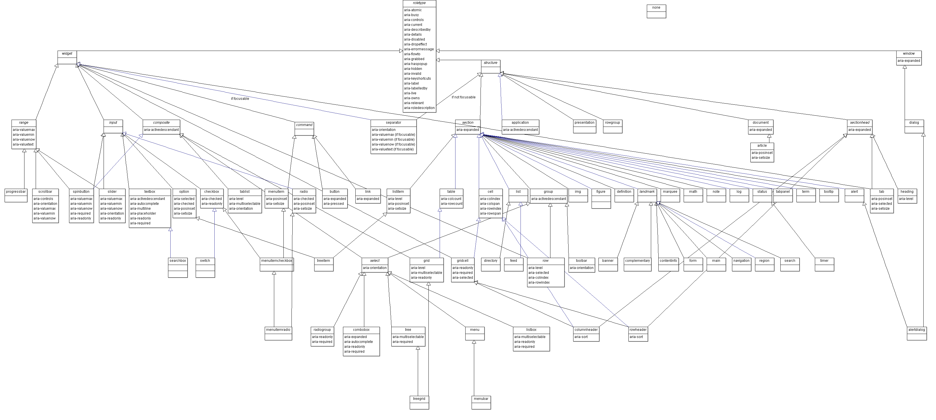
</p> <div class="wp-caption alignnone" id="attachment_161" aria-describedby="caption-attachment-161" style="width: 625px"><a href="https://www.w3.org/TR/2017/PR-wai-aria-1.1-20171102/img/rdf_model.png"><img src="http://pressbooks.library.ryerson.ca/wafd/wp-content/uploads/sites/57/2018/12/taxonomy.png" alt="WAI-ARIA Taxonomy Thumbnail, click to open full sized image." width="625" height="276" class="wp-image-161 size-full" srcset="https://pressbooks.library.ryerson.ca/wafd/wp-content/uploads/sites/57/2018/12/taxonomy.png 625w, https://pressbooks.library.ryerson.ca/wafd/wp-content/uploads/sites/57/2018/12/taxonomy-300x132.png 300w, https://pressbooks.library.ryerson.ca/wafd/wp-content/uploads/sites/57/2018/12/taxonomy-65x29.png 65w, https://pressbooks.library.ryerson.ca/wafd/wp-content/uploads/sites/57/2018/12/taxonomy-225x99.png 225w, https://pressbooks.library.ryerson.ca/wafd/wp-content/uploads/sites/57/2018/12/taxonomy-350x155.png 350w" /></a><div class="wp-caption-text" id="caption-attachment-161"><strong>Figure: </strong>WAI-ARIA taxonomy thumbnail. Click to open full-sized image.</div></div> <p>Also, see the <a href="https://www.w3.org/TR/2017/PR-wai-aria-1.1-20171102/img/rdf_model.svg">SVG version of the WAI-ARIA taxonomy</a></p> <p>A <a href="https://www.w3.org/WAI/ARIA/schemata/aria-1.uml">UML-XMLversion</a> and an <a href="https://www.w3.org/WAI/ARIA/schemata/aria-1.rdf">RDF version</a> are also available to import into systems that support those formats.</p> <div style="margin: 1em 0;padding: 1em;border: 1px solid #ddd;border-left: 10px solid #0000ff"><strong>Suggested Reading:</strong> <a href="https://www.cheatography.com/jreiche/cheat-sheets/wai-aria-1-1/">A representation or the WAI-ARIA taxonomy as a cheat sheet</a>.</div> </div></div>
<div class="chapter standard" id="chapter-activity-3-wai-aria-scavenger-hunt" title="Activity 3: WAI-ARIA Scavenger Hunt"><div class="chapter-title-wrap"><h3 class="chapter-number">22</h3><h2 class="chapter-title">Activity 3: WAI-ARIA Scavenger Hunt</h2></div><div class="ugc chapter-ugc"><h2><img src="http://pressbooks.library.ryerson.ca/wafd/wp-content/uploads/sites/57/2018/12/activity_sm.png" alt="" width="150" height="158" class="size-full wp-image-152 alignright" srcset="https://pressbooks.library.ryerson.ca/wafd/wp-content/uploads/sites/57/2018/12/activity_sm.png 150w, https://pressbooks.library.ryerson.ca/wafd/wp-content/uploads/sites/57/2018/12/activity_sm-65x68.png 65w" />WAI-ARIA Scavenger Hunt</h2> <p>The overall goal of this book is to provide the tools and knowledge needed to make web interactivity accessible to screen reader users. In this activity, you will use ChromeVox and code review to identify WAI-ARIA used throughout the Web Accessibility Auditing Showcase home page.</p> <h2>Requirements</h2> <p>Although we have only touched on the details of WAI-ARIA, in this activity, you will be spending some time examining the homepage of the Web Accessibility Auditing Showcase website. Use a combination of the following to determine how the WAI-ARIA elements are being used:</p> <ul><li>Test with ChromeVox to hear what WAI-ARIA sounds like with a screen reader.</li> <li>Review the source code.</li> </ul> <p>For full marks on this activity, list at least <strong>five</strong> static and five dynamic WAI-ARIA enabled elements in your answer. Include a brief description for each. Here’s a few made-up examples of what you might report in your findings:</p> <ul><li><code>aria-describedby</code>: used in the outer div of the side menu, to announce instructions on how the side menu works with a keyboard</li> <li><code>tabindex="0"</code>: used to give keyboard access to the custom buttons in the User Survey</li> <li><code>role="menu"</code>: used to make the main navigation list appear as a menu to screen readers</li> </ul> <p>Finally, here is the <a href="https://de.ryerson.ca/wa/showcase/">Web Accessibility Auditing Showcase website</a>. Review only the home page.</p> <div style="margin: 1em 0;padding: 1em;border: 1px solid #ddd;border-left: 10px solid #f66"><strong>Key Point: </strong>There is static and dynamic WAI-ARIA used in this page. You may View Source to find any static WAI-ARIA being used. Use your browser’s Inspect tool to find dynamic WAI-ARIA. Interact with the site to produce changes to the dynamic WAI-ARIA, and note those changes.</div> <p><strong>Note:</strong> Not all ARIA-related markup starts with the “aria-” prefix. Scan through the WAI-ARIA documentation introduced in this unit for a listing of all potential WAI-ARIA markup you might come across. Also, not all accessibility enhancements are WAI-ARIA. For example, <code>alt</code> is an accessibility feature of the HTML <code>img</code> element. You can mention these other accessibility features; however, they will not count toward your mark on this activity.</p> <h2>Grading Rubric</h2> <div><table title="" cellpadding="0" class="addborder" style="border-spacing: 0px;"><thead><tr><th>Criteria</th> <th>Points</th> </tr> </thead> <tbody><tr><td>At least five instances of static WAI-ARIA being used in the page are listed.</td> <td>5.0 pts</td> </tr> <tr><td>At least five instances of dynamic WAI-ARIA being used in the page are listed.</td> <td>5.0 pts</td> </tr> <tr><td>Total Points:</td> <td>10.0</td> </tr> </tbody> </table> </div> </div></div>
<div class="chapter standard" id="chapter-self-test-2" title="Self-Test 2"><div class="chapter-title-wrap"><h3 class="chapter-number">23</h3><h2 class="chapter-title">Self-Test 2</h2></div><div class="ugc chapter-ugc"><p><img src="http://pressbooks.library.ryerson.ca/wafd/wp-content/uploads/sites/57/2018/12/quiz.png" alt="" width="150" height="111" class="size-full wp-image-159 alignright" srcset="https://pressbooks.library.ryerson.ca/wafd/wp-content/uploads/sites/57/2018/12/quiz.png 150w, https://pressbooks.library.ryerson.ca/wafd/wp-content/uploads/sites/57/2018/12/quiz-65x48.png 65w" /><br /> Answer the following questions to test your understanding of key lessons in this unit.</p> <div class="textbox interactive-content"><span class="interactive-content__icon"></span> <p>An interactive or media element has been excluded from this version of the text. You can view it online here:<br /> <a href="https://pressbooks.library.ryerson.ca/wafd/?p=289#pb-interactive-content" title="Unit 2 Quiz">https://pressbooks.library.ryerson.ca/wafd/?p=289</a> </p> </div> </div></div>
<div class="part " id="part-slug-3-basic-wai-aria"><div class="part-title-wrap"><h3 class="part-number">IV</h3><h1 class="part-title">3. Basic WAI-ARIA</h1></div></div>
<div class="chapter standard" id="chapter-objectives-and-activities-3" title="Objectives and Activities"><div class="chapter-title-wrap"><h3 class="chapter-number">24</h3><h2 class="chapter-title">Objectives and Activities</h2></div><div class="ugc chapter-ugc"> <div class="colorBox objectives"><h2>Objectives</h2> <p><img src="http://pressbooks.library.ryerson.ca/wafd/wp-content/uploads/sites/57/2018/12/checklist.png" alt="" width="150" height="152" class="alignright size-full wp-image-157" srcset="https://pressbooks.library.ryerson.ca/wafd/wp-content/uploads/sites/57/2018/12/checklist.png 150w, https://pressbooks.library.ryerson.ca/wafd/wp-content/uploads/sites/57/2018/12/checklist-65x66.png 65w" /></p> <p>By the end of this unit, you will be able to:</p> <ul><li>Identify WAI-ARIA landmarks</li> <li>Describe common static roles</li> <li>Create accessible alerts and feedback</li> <li>Use WAI-ARIA to add keyboard access</li> <li>Identify when and where to use WAI-ARIA application and presentation roles</li> <li>Use live regions for live updating information</li> </ul> <h2>Activities</h2> <ul><li>Update the landmarks book file with appropriate landmarks</li> <li>Provide live alerts for screen readers when feedback or error messages are presented</li> </ul> </div> </div></div>
<div class="chapter standard" id="chapter-wai-aria-landmarks" title="WAI-ARIA Landmarks"><div class="chapter-title-wrap"><h3 class="chapter-number">25</h3><h2 class="chapter-title">WAI-ARIA Landmarks</h2></div><div class="ugc chapter-ugc"><p>WAI-ARIA landmarks are used to define regions on a web page. They provide a means for assistive technology users to effectively navigate the various areas of a page. WAI-ARIA landmarks should be used with other means of within-page navigation, such as bypass links and page headings. These two latter means of navigating have been around for much longer, and many will continue to use these elements as their primary method of moving around within a web page.</p> <p><strong>There are eight landmark roles. </strong></p> <p>Follow the links below to read about each type of landmark:</p> <ul><li><a href="https://www.w3.org/TR/wai-aria-1.1/#banner">banner</a></li> <li><a href="https://www.w3.org/TR/wai-aria-1.1/#complementary">complementary</a></li> <li><a href="https://www.w3.org/TR/wai-aria-1.1/#contentinfo">contentinfo</a></li> <li><a href="https://www.w3.org/TR/wai-aria-1.1/#form">form</a></li> <li><a href="https://www.w3.org/TR/wai-aria-1.1/#main">main</a></li> <li><a href="https://www.w3.org/TR/wai-aria-1.1/#navigation">navigation</a></li> <li><a href="https://www.w3.org/TR/wai-aria-1.1/#region">region</a></li> <li><a href="https://www.w3.org/TR/wai-aria-1.1/#search">search</a></li> </ul> <p>In the following short video, you will see how ChromeVox interacts with landmarked regions for the next activity coming up in this unit. Use it as a model for implementing your own landmarks. Aim to have your activity submission operate the same as it does in the video.</p> <p><strong>Video: <a href="https://www.youtube.com/embed/T3KfkwgZImc target=_blank" rel="noopener noreferrer">WAI-ARIA Landmarks Demo</a> </strong>(1:07)</p> <div class="textbox interactive-content interactive-content--oembed"><img src="https://i.ytimg.com/vi/T3KfkwgZImc/hqdefault.jpg" alt="Thumbnail for the embedded element &quot;WAI-ARIA Landmarks Demo&quot;" title="WAI-ARIA Landmarks Demo" /> <p>A YouTube element has been excluded from this version of the text. You can view it online here: <a href="https://pressbooks.library.ryerson.ca/wafd/?p=303#pb-interactive-content" title="WAI-ARIA Landmarks Demo">https://pressbooks.library.ryerson.ca/wafd/?p=303</a> </p> </div> <p>
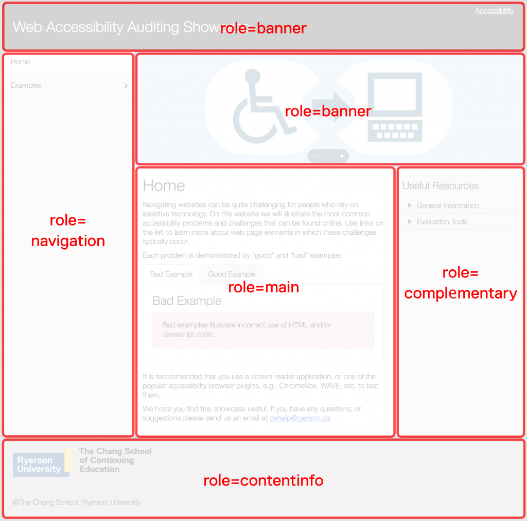
To help visualize landmarked regions, the figure below presents well-defined areas on the page, each of which serves a different purpose. Banner areas, the element that contains the content of each banner region, would be assigned <code>role="banner"</code>. The menu on the left would have its container assigned <code>role="navigation"</code>, as would other navigation bars or menus if they were present. The main content area, assigned <code>role="main"</code>, is where the primary content of the page appears. There should only be <em>one</em> main region. The region on the right containing secondary information, assigned <code>role="complementary"</code>, is where you might find advertising or related resources. And, finally, the container around the footer area would be assigned <code>role="contentinfo"</code>. This is where details such as copyright, a privacy statement, contact information, etc., would be located.</p> <p>Websites may be laid out in a multitude of ways; this particular layout is just an example. The landmarks assigned to any given region should reflect the function of that particular region, regardless of where it might appear on the page. If advertising were spread across a region at the bottom of the page, for example, then that region would be assigned <code>role="complementary"</code>.</p> <p><strong>Example of landmarked regions of a web page:</strong></p> <p><img src="http://pressbooks.library.ryerson.ca/wafd/wp-content/uploads/sites/57/2018/12/aria-landmarks-1024x1014.png" alt="The visual layout of WAI-ARIA landmarks, described above." class="wp-image-155 alignnone" width="832" height="824" srcset="https://pressbooks.library.ryerson.ca/wafd/wp-content/uploads/sites/57/2018/12/aria-landmarks-1024x1014.png 1024w, https://pressbooks.library.ryerson.ca/wafd/wp-content/uploads/sites/57/2018/12/aria-landmarks-150x150.png 150w, https://pressbooks.library.ryerson.ca/wafd/wp-content/uploads/sites/57/2018/12/aria-landmarks-300x297.png 300w, https://pressbooks.library.ryerson.ca/wafd/wp-content/uploads/sites/57/2018/12/aria-landmarks-768x761.png 768w, https://pressbooks.library.ryerson.ca/wafd/wp-content/uploads/sites/57/2018/12/aria-landmarks-65x64.png 65w, https://pressbooks.library.ryerson.ca/wafd/wp-content/uploads/sites/57/2018/12/aria-landmarks-225x223.png 225w, https://pressbooks.library.ryerson.ca/wafd/wp-content/uploads/sites/57/2018/12/aria-landmarks-350x347.png 350w" /></p> <h2>Custom Regions</h2> <p>While most of the landmarks are relatively self-explanatory in terms of what they should contain, <code>role="region"</code> needs some explanation. This landmark role can be used to contain specific information that is not effectively described by one of the other landmark roles and is important enough that a user might want to navigate directly to that area of the page. When it is used, it must be accompanied by <code>aria-label</code> or <code>aria-labelledby</code> if there is an existing element on the page that describes the region (such as a heading).</p> <p>For example, you may want to define a specific area on each page where contact information or a contact form is located. The following markup might be used to define a “contact region.”</p> <div style="height: 160px; width: 100%; overflow: hidden;"><div class="textbox interactive-content"><span class="interactive-content__icon"></span> <p>An interactive or media element has been excluded from this version of the text. You can view it online here:<br /> <a href="https://pressbooks.library.ryerson.ca/wafd/?p=303#pb-interactive-content" title="3.2">https://pressbooks.library.ryerson.ca/wafd/?p=303</a> </p> </div> </div> <h2>Other Considerations When Using Landmarks</h2> <ul><li><strong>The whole page defined in regions</strong>: When landmarks are used, it is considered best practice to contain all information presented on a page within a region, so no information is orphaned outside the defined regions.</li> <li><strong>Duplicate roles</strong>: For landmarks that may be used for multiple regions, such as <code>role="navigation"</code>, these regions should be distinguished from one another. For instance, use <code>aria-label</code> or <code>aria-labelledby </code>to describe a “main navigation” bar and a “content menu.” Both are considered navigation features, even though they serve different purposes.</li> </ul> <div style="margin: 1em 0; padding: 1em; border: 1px solid #ddd; border-left: 10px solid #0000ff;"><p><strong>Suggested Reading:</strong></p> <ul><li><a href="https://www.w3.org/WAI/GL/wiki/Using_ARIA_landmarks_to_identify_regions_of_a_page">Using ARIA landmarks to identify regions of a page</a></li> <li><a href="https://www.w3.org/WAI/tutorials/page-structure/regions/">Page Regions (WAI Web Accessibility Tutorials)</a></li> <li><a href="https://www.w3.org/TR/wai-aria-practices/examples/landmarks/index.html">ARIA Landmarks Example</a></li> </ul> </div> </div></div>
<div class="chapter standard" id="chapter-common-static-wai-aria" title="Common Static WAI-ARIA"><div class="chapter-title-wrap"><h3 class="chapter-number">26</h3><h2 class="chapter-title">Common Static WAI-ARIA</h2></div><div class="ugc chapter-ugc"><p>Much of the WAI-ARIA introduced so far is static. That is, it can be written directly into HTML elements as attributes, their values typically do not change, and they do not require scripting to control their behaviour. Landmarks and roles, for example, are all static. Anyone who knows how to read and write HTML can make use of these attributes by simply adding them to HTML elements. WAI-ARIA properties are also typically static, though not always.</p> <p>As discussed earlier, static WAI-ARIA often consists of properties given to define specific characteristics of an HTML element that has a particular functional role. For example, a nested list may be defined as a menu using <code>role="menubar"</code> to define the top-level list and  <code>role="menu"</code> to define sublists.</p> <p>List items in the top-level list that have a nested sublist would be given the attribute <code>aria-haspopup="true"</code> (or <code>aria-haspopup="menu"</code>). Thus, when encountered by assistive technology, a list item with this attribute will announce that a submenu is present (e.g., “menu with submenu” when using ChromeVox).</p> <div style="margin: 1em 0;padding: 1em;border: 1px solid #ddd;border-left: 10px solid #b9f"><p><strong><strong>Try This: </strong></strong>Using ChromeVox, navigate through the menu bar widget example below, created by Hans Hillen at the Paciello Group, to hear how submenus are announced. <a href="https://de.ryerson.ca/wa/aria/jquery/menubar.html" target="des" rel="noopener noreferrer">Open this demo in a new window.</a></p> </div> <h2>Frequently Used WAI-ARIA Attributes</h2> <p>You have already been introduced to a few static attributes. Those and a handful of others you are likely to use regularly are listed here. This is not a full list. Follow the links and read through their descriptions.</p> <ul><li><a href="https://www.w3.org/TR/wai-aria-1.1/#aria-describedby">aria-describedby</a></li> <li><a href="https://www.w3.org/TR/wai-aria-1.1/#aria-labelledby">aria-labelledby</a></li> <li><a href="https://www.w3.org/TR/wai-aria-1.1/#aria-label">aria-label</a></li> <li><a href="https://www.w3.org/TR/wai-aria-1.1/#aria-required">aria-required</a></li> <li><a href="https://www.w3.org/TR/wai-aria-1.1/#aria-controls">aria-controls</a></li> <li><a href="https://www.w3.org/TR/wai-aria-1.1/#aria-details">aria-details</a></li> <li><a href="https://www.w3.org/TR/wai-aria-1.1/#aria-haspopup">aria-haspopup</a></li> <li><a href="https://www.w3.org/TR/wai-aria-1.1/#aria-live">aria-live</a></li> <li><a href="https://www.w3.org/TR/wai-aria-1.1/#aria-owns">aria-owns</a></li> <li><a href="https://www.w3.org/TR/wai-aria-1.1/#aria-relevant">aria-relevant</a></li> <li><a href="https://www.w3.org/TR/wai-aria-1.1/#aria-roledescription">aria-roledescription</a></li> </ul> </div></div>
<div class="chapter standard" id="chapter-wai-aria-alert-and-message-dialogs" title="WAI-ARIA Alert and Message Dialogs"><div class="chapter-title-wrap"><h3 class="chapter-number">27</h3><h2 class="chapter-title">WAI-ARIA Alert and Message Dialogs</h2></div><div class="ugc chapter-ugc"><p>Providing feedback after a user completes an action is a critical accessibility feature. Feedback can be an error message when something has gone wrong. Additionally, it can  be a confirmation or warning, after which a user has to make a decision before proceeding. Or, it could be completion feedback that is presented after a particular action has occurred to indicate it was successful.</p> <p>The latter is often overlooked by developers. However, for people using a screen reader, notification that an action was successful can be as important as providing error messages. When completion feedback is provided, screen reader users do not need to search through the content of the screen to be sure the action they just completed was successful — the process  can be quite time-consuming.</p> <p>In each type of feedback, it is critical that messages be easy to access. The best strategy for making feedback accessible is to use the WAI-ARIA alert or alert-dialog roles. These are both types of live regions. When the content of the container element with <code>role="alert"</code> changes, the content that appears is automatically read aloud by screen readers. A WAI-ARIA alert has an implicit <code>aria-live="assertive"</code> and <code>aria-atomic="true"</code> (to be covered in more detail in the section on live regions). This means that, when the message appears, it will interrupt whatever the screen reader is in the middle of reading, and the entire content of the element will be read, as opposed to just the new content added (i.e., <code>aria-atomic="false"</code>).</p> <div style="margin: 1em 0;padding: 1em;border: 1px solid #ddd;border-left: 10px solid #b9f"><strong>Try This:</strong> In the following example of a WAI-ARIA alert, start ChromeVox, then press the “Say Something” button to hear how ChromeVox handles the message that appears. Examine the script and HTML below to see how it was done.</div> <div style="height:150px;width:100%;overflow:hidden"><div class="textbox interactive-content"><span class="interactive-content__icon"></span> <p>An interactive or media element has been excluded from this version of the text. You can view it online here:<br /> <a href="https://pressbooks.library.ryerson.ca/wafd/?p=308#pb-interactive-content" title="3.4-js">https://pressbooks.library.ryerson.ca/wafd/?p=308</a> </p> </div> </div> <div style="height:280px;width:100%;overflow:hidden"><div class="textbox interactive-content"><span class="interactive-content__icon"></span> <p>An interactive or media element has been excluded from this version of the text. You can view it online here:<br /> <a href="https://pressbooks.library.ryerson.ca/wafd/?p=308#pb-interactive-content" title="3.4">https://pressbooks.library.ryerson.ca/wafd/?p=308</a> </p> </div> </div> <h2>alert vs. alertdialog</h2> <p>Error, warning, and completion feedback will typically be created with <code>role="alert"</code>, while confirmation feedback will often use <code>role="alertdialog"</code>. Use <code>role="alert"</code>  when no user input is needed. Use <code>role="alertdialog"</code> when user input is expected, with focus sent to the dialog. At least one element in the dialog must be focusable when using <code>role="alertdialog"</code>.</p> <p>Watch and listen to the following video to understand how ChromeVox handles WAI-ARIA alerts.</p> <p><strong>Video: <a href="https://www.youtube.com/embed/JYcWYAe9dJM target=_blank" rel="noopener noreferrer">WAI-ARIA Alerts</a> </strong>(1:09)</p> <div class="textbox interactive-content interactive-content--oembed"><img src="https://i.ytimg.com/vi/JYcWYAe9dJM/hqdefault.jpg" alt="Thumbnail for the embedded element &quot;WAI-ARIA Alerts&quot;" title="WAI-ARIA Alerts" /> <p>A YouTube element has been excluded from this version of the text. You can view it online here: <a href="https://pressbooks.library.ryerson.ca/wafd/?p=308#pb-interactive-content" title="WAI-ARIA Alerts">https://pressbooks.library.ryerson.ca/wafd/?p=308</a> </p> </div> <div style="margin: 1em 0;padding: 1em;border: 1px solid #ddd;border-left: 10px solid #0000ff"><strong>Suggested Reading:</strong> <a href="https://www.w3.org/TR/WCAG20-TECHS/ARIA19.html">Using ARIA role=&#8221;alert&#8221; or Live Regions to Identify Errors</a></div> <h2>Modal Dialogs</h2> <p>Modal dialogs interrupt users and require an action. They are appropriate when users&#8217; attention needs to be directed toward important information.</p> <p>Modal dialogs are defined using <code>role="alertdialog"</code> and <code>aria-modal="true"</code>. Be aware what WAI-ARIA is used for modals, and be aware that when a modal dialog is displayed, focus must be sent to the dialog, and it must remain in the dialog until whatever interaction is complete (e.g., clicking the confirmation button) and the dialog closes. When the dialog closes, focus must be returned to the location from where the dialog was opened.</p> <h2>Dialogs</h2> <p>Dialogs are used like modal dialogs are, except it is still possible to interact with the other content of the page. These are defined using <code>role="dialog"</code>.</p> <div style="margin: 1em 0;padding: 1em;border: 1px solid #ddd;border-left: 10px solid #0000ff"><p><strong>Suggested Reading:</strong></p> <ul><li><a href="https://developer.mozilla.org/en-US/docs/Web/Accessibility/ARIA/ARIA_Techniques/Using_the_dialog_role">Using the Dialog Role (Mozilla)</a></li> <li><a href="https://www.nngroup.com/articles/modal-nonmodal-dialog/">Modal and Nonmodal Dialogs: When (and When Not) to Use Them</a></li> </ul> </div> </div></div>
<div class="chapter standard" id="chapter-using-tabindex" title="Using Tabindex"><div class="chapter-title-wrap"><h3 class="chapter-number">28</h3><h2 class="chapter-title">Using Tabindex</h2></div><div class="ugc chapter-ugc"><p>As you may know, the HTML <code>tabindex</code> attribute is a way to order the path the cursor takes as users use the Tab key to navigate through a website or web application. In general, however, you want to avoid using tabindex in this way, particularly when it disrupts the default tab order, which may end up creating confusion when the cursor does not follow an expected path (i.e., left to right, top to bottom). That’s not to say don’t ever use them, but be careful.</p> <p>With HTML5 and the introduction of WAI-ARIA, <code>tabindex="0"</code> is added to make it possible for developers to add keyboard accessibility to an element that would not normally have keyboard functionality. For example, it might be used to make a <code>&lt;div&gt;</code> focusable. Likewise, <code>tabindex="-1"</code> is added to remove keyboard accessibility from an element. The two are likely to be used with scripting to dynamically add and remove keyboard access to elements when focus needs to be strategically placed within a widget or web application. When the <code>tabindex</code> attribute is used in this way, it is referred to as a roving <code>tabindex</code>.</p> <div style="margin: 1em 0;padding: 1em;border: 1px solid #ddd;border-left: 10px solid #b9f"><p><strong>Try This:</strong> Take a look at the tab panels throughout the Showcase site to see how the tabs in the tabpanels toggle between values “-1” and “0” to control which tab has focus, using your browser&#8217;s Inspect feature. This demo works better on a wide screen, before responsiveness kicks in. Either reduce the zoom level, or drag your browser window wider until the menu appears at the side, instead of above the content.</p> <p><a href="https://de.ryerson.ca/wa/showcase/table.html" target="des" rel="noopener noreferrer">Open demo in a new window.</a></p> </div> <p>You can also use <code>tabindex="0"</code> in a static way when context is needed to describe how to use a menu, for instance. A <code>&lt;div&gt;</code> can be wrapped around the menu, given <code>tabindex="0"</code> to make it focusable, so, when a user navigates to the <code>&lt;div&gt;</code>, it announces instructions for using the keyboard to navigate within the menu. The following example demonstrates using <code>tabindex</code>, along with <code>aria-label</code>, to provide context information. If you navigate through the Showcase site above with ChromeVox, you’ll notice this strategy with the side menu, announcing how to operate the menu with a keyboard.</p> <div style="height:150px;width:100%;overflow:hidden"><div class="textbox interactive-content"><span class="interactive-content__icon"></span> <p>An interactive or media element has been excluded from this version of the text. You can view it online here:<br /> <a href="https://pressbooks.library.ryerson.ca/wafd/?p=310#pb-interactive-content" title="3.5-pb">https://pressbooks.library.ryerson.ca/wafd/?p=310</a> </p> </div> </div> </div></div>
<div class="chapter standard" id="chapter-keyboard-interaction" title="Keyboard Interaction"><div class="chapter-title-wrap"><h3 class="chapter-number">29</h3><h2 class="chapter-title">Keyboard Interaction</h2></div><div class="ugc chapter-ugc"><p>Keyboard access is perhaps the most important accessibility feature that can go into a website, widget, or web application. However, it is often overlooked by developers, who are typically mouse users and may not have keyboard usability as a part of their testing regimen. People who are blind are typically unable to use a mouse, so any feature that relies on a mouse alone to function will likely be inaccessible to them. Fortunately, it is relatively easy to include keyboard access. It’s more a matter of remembering to add it when mouse access is added.</p> <p>The following is a simple example of including both mouse and keyboard events when defining interaction for a widget or web application. Examine the JavaScript to see how mouse and keyboard events are handled, then under the <strong>Result tab</strong>, try operating the button with a keyboard and mouse while using ChromeVox. How you go about implementing both mouse and keyboard doesn’t really matter, as long as it is possible to interact with both.</p> <p>You may notice some inconsistencies in ChromeVox support for the live region used to present the messages in the example, more specifically the <code>aria-atomic</code> attribute. Live regions will be covered more thoroughly later in this unit.</p> <div style="height:350px;width:100%;overflow:hidden"><div class="textbox interactive-content"><span class="interactive-content__icon"></span> <p>An interactive or media element has been excluded from this version of the text. You can view it online here:<br /> <a href="https://pressbooks.library.ryerson.ca/wafd/?p=312#pb-interactive-content" title="3.6">https://pressbooks.library.ryerson.ca/wafd/?p=312</a> </p> </div> </div> <h2>Predictability, Consistency, and Convention</h2> <p>Here we will introduce the basics of keyboard interaction, and we’ll go into greater detail when we start looking more closely at particular widgets and design patterns as they are introduced in the chapters that follow.</p> <p>As the heading for this section suggests, keyboard interaction needs to be predictable, consistent, and should follow convention. That is, users should have a good idea of the path that the focus will follow (predictable). When navigating with the Tab key, that path should be the same throughout an application or website (consistent). Finally, it should be like it is in other applications, websites, or operating systems (convention).</p> <div style="margin: 1em 0;padding: 1em;border: 1px solid #ddd;border-left: 10px solid #0000ff"><strong>Suggested Reading:</strong> <a href="https://www.w3.org/TR/wai-aria-practices/#kbd_generalnav">Developing a Keyboard Interface</a></div> <p>Take for example a combo box (aka, a select menu). Regardless of the operating system being used, combo boxes work the same way. If you are developing a widget out of divs that function like a combo box, it should operate like a standard HTML combo box.</p> <p><strong>Conventional keyboard interaction for a combo box:</strong></p> <ul><li>Tab to navigate into the combo box</li> <li>While in focus, tab to navigate beyond the combo box</li> <li>While in focus, Shift + Tab to navigate before the combo box</li> <li>While in focus, Down Arrow to show next option</li> <li>While in focus, Up Arrow to show previous option</li> <li>While in focus, Alt + Down Arrow to display options list</li> <li>While options list is open, Alt + Up Arrow to close the options list</li> <li>While options list is open, Esc to close the options list and return to default state</li> <li>While an option is in focus, Enter to select that option</li> </ul> <p>When developing a custom combobox — typically, a text box and list of options — a grid, a tree, or a dialog are combined into a functional unit that should operate like a standard HTML select menu. Functionality in addition to that described above may be added to the custom combobox, e.g., to add <strong>autocompletion</strong>. As the user types letters into the text box, options beginning with the string type are <strong>displayed below as a list</strong> or the first option with those letters is <strong>displayed inline</strong> in the text box.</p> <div style="margin: 1em 0;padding: 1em;border: 1px solid #ddd;border-left: 10px solid #b9f"><p><strong>Try This:</strong> Using your keyboard, try the keyboard interactions described above to confirm whether or not the combobox functions in a conventional way. Try it with a few different browsers and notice any variations in how different browsers handle combobox interaction.</p> <div style="height:150px;width:100%;overflow:hidden"><div class="textbox interactive-content"><span class="interactive-content__icon"></span> <p>An interactive or media element has been excluded from this version of the text. You can view it online here:<br /> <a href="https://pressbooks.library.ryerson.ca/wafd/?p=312#pb-interactive-content" title="3.6b">https://pressbooks.library.ryerson.ca/wafd/?p=312</a> </p> </div> </div> </div> <div style="margin: 1em 0;padding: 1em;border: 1px solid #ddd;border-left: 10px solid #0000ff"><strong>Suggested Reading:</strong> For detailed discussion of combobox design patterns, see: <a href="https://www.w3.org/TR/wai-aria-practices/#combobox">WAI-ARIA Authoring Practices 1.1 (Combo Boxes)</a></div> <div style="margin: 1em 0;padding: 1em;border: 1px solid #ddd;border-left: 10px solid #3c3"><p><strong>Toolkit: </strong>For a list of design patterns, and keyboard interaction conventions, review the following widget development best practices. Scan for now. They will be covered more thoroughly in later chapters of the book.</p> <ul><li><a href="https://www.w3.org/TR/wai-aria-practices/#combobox">Combobox</a></li> <li><a href="https://www.w3.org/TR/wai-aria-practices/#grid">Grid</a></li> <li><a href="https://www.w3.org/TR/wai-aria-practices/#Listbox">Listbox</a></li> <li><a href="https://www.w3.org/TR/wai-aria-practices/#menu">Menu or menu bar</a></li> <li><a href="https://www.w3.org/TR/wai-aria-practices/#radiobutton">Radiogroup</a></li> <li><a href="https://www.w3.org/TR/wai-aria-practices/#tabpanel">Tabs</a></li> <li><a href="https://www.w3.org/TR/wai-aria-practices/#toolbar">Toolbar</a></li> <li><a href="https://www.w3.org/TR/wai-aria-practices/#TreeView">Tree View</a></li> </ul> </div> </div></div>
<div class="chapter standard" id="chapter-application-and-presentation-roles" title="Application and Presentation Roles"><div class="chapter-title-wrap"><h3 class="chapter-number">30</h3><h2 class="chapter-title">Application and Presentation Roles</h2></div><div class="ugc chapter-ugc"><p>The application and presentation roles in WAI-ARIA change the way assistive technologies interact with web content. Both have “use with caution” warnings. Their use and where and when to use them are described here.</p> <h2>Application Role</h2> <p>The application role is used when there is not a corresponding widget interaction pattern available to provide semantics for a custom widget.</p> <p>Imagine, for instance, a file manager application embedded in a web page, which does not have widget roles specifically defined. It may have many of the functions a typical file manager might have on a Windows, Mac, or Linux system. It might have the typical File, Edit, and View menus that most applications have, including browsers. Those menus in the file manager should function like these same menus in other applications. When the application role is used in a container containing the embedded file manager, keystrokes are intercepted and repurposed to operate the file manager, instead of the browser and the assistive technology.</p> <p>When in the file manager application, this behaviour may be desirable. But, defined with the application role, all of the standard screen reader shortcut keys are also disabled, so the user is no longer able to navigate the pages by headings, or landmarks, for instance, while inside the application. This may be fine in such a case because the screen reader user will likely temporarily want shortcut keys to file manager functions, and not those of the browser or screen reader.</p> <p>If, however, the application role is used to contain a carousel widget, for example, then browser and assistive technology functionality may be unnecessarily disabled, potentially creating barriers. A carousel widget typically has limited functionality. For example, carousels may contain scripted Arrow keys to move back and forth between slides, between headings within each slide for added structure, or link to another section of the site presented in a slide. In such cases, screen reader users would be unable to navigate through the slides by listing headings or links, using their screen reader’s default heading and link list functionality. By removing the application role, the scripted next/previous link, as well as the heading and the links could be used to navigate the carousel.</p> <p>The bottom line is to use the application role carefully. Be sure it is not creating more barriers than it is intended to prevent.</p> <h2>Presentation Role</h2> <p>Much like the application role disables default keyboard functionality, the presentation role (and its synonym <code>role="none"</code>), theoretically, removes the default semantics from children of the element it applies to.</p> <p>So, for instance, if you have a list with <code>role="presentation"</code>, it should not announce as a list, and its list items should not announce as list items. However, nested lists within those suppressed list items will announce as usual.</p> <p>There are a couple of intended exceptions where the presentation role will not remove default semantics:</p> <ul><li>When <code>role="presentation"</code> is not applied to elements that have tab focus, such as links, form elements, and elements that have tabindex defined, or</li> <li>Where an element has been modified with any of the <a href="https://www.w3.org/TR/wai-aria-1.1/#global_states">21 global states or properties</a></li> </ul> <p>Where <code>role="presentation"</code> is applied to a parent element, all of its child elements should inherit that role, but not all of its grandchildren. For example, if <code>&lt;ul role="presentation"&gt;</code> is used then the semantics for each of its <code>&lt;li&gt;</code> elements will be ignored. But, if an <code>&lt;li&gt;</code> contains a sublist, that list would be announced as usual.</p> <p>It should be noted that current support for the presentation role is spotty across browsers and assistive technologies, and you are likely to find it not all that useful if you’re trying to develop with cross browser compatibility. Typically, tables, images, and headings are affected by the presentation role, while other elements like lists, forms, and links are not, or only partially affected. If you are trying to hide elements completely from screen readers, you might consider using either <code>aria-hidden</code> or CSS <code>display:none</code>.</p> <p>Three common uses for <code>role="presentation"</code> include:</p> <div><ol><li>Hiding a decorative image. It is equivalent to giving the image null alt text.</li> <li>Suppressing table semantics for tables used for layout in circumstances where the table semantics do not convey meaningful relationships.</li> <li>Eliminating semantics of intervening orphan elements in the structure of a composite widget, such as a tablist, menu, or tree as demonstrated in the example above.</li> </ol> </div> <p><a href="https://www.w3.org/TR/wai-aria-practices-1.1/#presentation_role">Source: WAI-ARIA Authoring Best Practices</a></p> <p>There are also a number of WAI-ARIA <a href="https://www.w3.org/TR/wai-aria-practices-1.1/#children_presentational">roles that act like the presentation role</a>, and these suppress the default semantics for the elements to which they are applied. For instance, if a <code>tablist</code> is created from a <code>&lt;ul&gt;</code>, and <code>role="tab"</code> is applied to each of the list items within that <code>&lt;ul&gt;</code>, their default <code>listitem</code> role will be replaced with the <code>tab</code> role, without the need to set them as presentational.</p> <p>The following JSFiddle examples have been created for cross browser testing of the presentation role. Navigate through each example with ChromeVox + Chrome. If you have them available, also navigate them with JAWS + IE and NVDA + FF to understand the varied support for the presentation role. Below, the fiddle is a listing of support for current versions of these screen readers.</p> <p><a style="font-size: 0" href="#skipjsf">Skip JSFiddle</a></p> <div style="height:600px;width:100%;overflow:hidden"><div class="textbox interactive-content"><span class="interactive-content__icon"></span> <p>An interactive or media element has been excluded from this version of the text. You can view it online here:<br /> <a href="https://pressbooks.library.ryerson.ca/wafd/?p=314#pb-interactive-content" title="3.7">https://pressbooks.library.ryerson.ca/wafd/?p=314</a> </p> </div> </div> <p><a id="skipjsf"></a></p> <h3><strong>Screen Reader Output from the Above Demo</strong></h3> <h4>NVDA (2018.1.1) + Edge (41.16299.248.0)</h4> <p>By keyboard, only the link is announced. Mouseover, though, and all elements are announced.</p> <ul><li><strong>Link:</strong> not announced</li> <li><strong>List:</strong> not announced or keyboard focusable</li> <li><strong>Headings:</strong> not announced or keyboard focusable</li> <li><strong>Table:</strong> not announced or keyboard focusable</li> <li><strong>Image:</strong> not announced or keyboard focusable</li> <li><strong>Form:</strong> &#8220;Combo box opt three collapsed&#8221;</li> </ul> <h4>NVDA (2018.1.1) + FireFox (59.0.2)</h4> <ul><li><strong>Link:</strong> announces as usual</li> <li><strong>List:</strong> values announced but not bullets or the list itself</li> <li><strong>Headings:</strong> announce as usual</li> <li><strong>Table:</strong> not announced.</li> <li><strong>Image:</strong> not announced</li> <li><strong>Form:</strong> announces opts but not the combobox</li> </ul> <h4>JAWS (18) + Edge (41.16299.248.0)</h4> <ul><li><strong>Link:</strong> focusable, but not announced</li> <li><strong>List:</strong> not focusable, not announced</li> <li><strong>Headings:</strong> does not announce first heading, but does announce second heading</li> <li><strong>Table:</strong> not announced</li> <li><strong>Image:</strong> not announced</li> <li><strong>Form:</strong> not focusable, not announced</li> </ul> <h4>ChromeVox (53.0.2784.5)</h4> <ul><li><strong>Link:</strong> focusable, but not read (using Tab key) Announces as usual when using CVOX + Arrows</li> <li><strong>List:</strong> Skips over list (using Arrow key) except when link receives focus first, then Arrow key announces the numbers in the list. Announces numbers but not as a list when using CVOX + Arrows</li> <li><strong>Headings:</strong> Does not announce the first heading, but does announce the second (Arrows and CVOX+Arrows)</li> <li><strong>Table:</strong> not announced.</li> <li><strong>Image:</strong> reads alt text “Ryerson Chang School” both Arrow and CVOX + Arrow</li> <li><strong>Form:</strong> focusable, not announced (using Tab key), Arrow keys announces “Combobox. Opt 3, 3 of 3.”</li> </ul> <div style="margin: 1em 0;padding: 1em;border: 1px solid #ddd;border-left: 10px solid #0000ff"><p><strong>Suggested Reading:</strong></p> <ul><li><a href="https://www.w3.org/TR/wai-aria-1.1/#presentation%20">WAI-ARIA Presentation Role</a></li> <li><a href="https://www.powermapper.com/tests/screen-readers/aria/">PowerMapper: Screen Reader Compatibility</a> (Updated Dec 2017)</li> <li><a href="https://developer.mozilla.org/en-US/docs/Web/Accessibility/ARIA/ARIA_Test_Cases">Mozilla: ARIA Test Cases</a></li> </ul> </div> </div></div>
<div class="chapter standard" id="chapter-live-regions" title="Live Regions"><div class="chapter-title-wrap"><h3 class="chapter-number">31</h3><h2 class="chapter-title">Live Regions</h2></div><div class="ugc chapter-ugc"><p>Live regions are used to present changes in web content that occur after a web page has loaded. Typical uses include presenting news feeds, feedback and error messages, or live chat output to screen readers, which would otherwise not know about this content changing or being added to a web page already rendered. Live regions can also be used to announce feedback and error messages when a page loads, so screen reader users do not need to search through a web page to find feedback. It reads automatically when a page finishes loading.</p> <h2>Types of Live Regions</h2> <p>A typical live region can be created by adding <code>aria-live="polite"</code> to any element in which content is updated after a web page has loaded. The “polite” value indicates the priority of the content being updated. In this case, a screen reader will wait for a break in its audio output before announcing the change that occurred. You may also use <code>aria-live="assertive"</code> to interrupt whatever the screen reader is reading, and instead read the changed content before continuing. Typically, “assertive” should be avoided. Only use it in cases where critical information is being updated, such as an error message or critical feedback.</p> <p>Normally, <code>aria-live</code> would not be used to present feedback or error messages, though it is possible. Instead <code>role="alert"</code>, introduced earlier, would be used. Using <code>role="alert"</code> creates an assertive live region that interrupts a screen reader to present its content. They can be used within rendered content to present messages without reloading the page, or they can be used after a page loads, to present the message before any of the other content on the page is read.</p> <p>In addition to the commonly used <code>role="alert"</code>, there are other less commonly used roles that also act as live regions. These are:</p> <ul><li>role=&#8221;log&#8221;</li> <li>role=&#8221;marquee&#8221;</li> <li>role=&#8221;timer&#8221;</li> <li>role=&#8221;status&#8221;</li> </ul> <p>Here is the full list of live region attributes:</p> <ul><li>aria-live: polite, assertive, off</li> <li>aria-relevant: additions, removals, text, all</li> <li>aria-atomic: true, false</li> <li>aria-busy: true, false</li> <li>role=&#8221;alert&#8221;</li> <li>role=&#8221;log&#8221;</li> <li>role=&#8221;marquee&#8221;</li> <li>role=&#8221;timer&#8221;</li> <li>role=&#8221;status&#8221;</li> </ul> <div style="margin: 1em 0;padding: 1em;border: 1px solid #ddd;border-left: 10px solid #0000ff"><strong>Suggested Reading: </strong>More details on these other <a href="https://www.w3.org/TR/wai-aria-1.1/#live_region_roles">Live Region Roles</a> can be found in the WAI-ARIA 1.1 specification.</div> <h2>Care When Using Live Regions</h2> <p>There are a few cases where using a live region (<code>aria-live</code>) to read changing content can create a barrier. Take, for instance, a carousel that presents a series of panels that rotate at a particular frequency. It can be helpful to set up a carousel as a live region, so as each panel slides into view, a screen reader reads the content. However, this behaviour could present a barrier, interfering with the screen reader when it is focused elsewhere, reading other content on the page. If a live region is used with a carousel, it should only be active when the carousel has focus. While typically a live region is created as a static WAI-ARIA attribute, in this case, it should be dynamically added on focus and dynamically removed on blur.</p> <p>For carousels, it is also important to consider the rate at which panels rotate, ensuring that screen readers have enough time to read the content of the panel before rotating on to the next. This timing can be difficult to predict. It depends on the amount of content on each panel, which can vary significantly, and the rate at which users have their reading rate set on their screen reader. One solution to this issue may be to make the carousel manually rotate when it has focus so users can proceed to the next panel only when they are ready.</p> <p>Another case where live regions can be problematic is with timers. Timers counting by seconds can essentially render the rest of the content on a page unusable for a screen reader user. As the screen reader announces every second, it interrupts the reading of the other content on a page. Timers that increment each minute, for instance, would not have this problem.</p> <p>Other places where live regions may be problematic are with very active news or Twitter feeds. Though live regions can be useful for this type of updating content, if there is a constant stream of updates or updates occur frequently, screen reader users may have difficulty comprehending other page content with the frequent interruptions.</p> <div style="margin: 1em 0;padding: 1em;border: 1px solid #ddd;border-left: 10px solid #b9f"><p><strong>Try This: </strong>To experience the aggravation of a constantly updating live region, open ChromeVox and give focus to the timer below. In this case, the timer is in an iframe, so you can simply set focus outside the iframe to stop it from reading. If the timer were embedded in the content of the page itself, you would not have this option, and the rest of the page would become unusable with a screen reader. The only option would be to leave the page.</p> <div style="height:100px;width:100%;overflow:hidden"><div class="textbox interactive-content"><span class="interactive-content__icon"></span> <p>An interactive or media element has been excluded from this version of the text. You can view it online here:<br /> <a href="https://pressbooks.library.ryerson.ca/wafd/?p=317#pb-interactive-content" title="3.8">https://pressbooks.library.ryerson.ca/wafd/?p=317</a> </p> </div> </div> </div> <div style="margin: 1em 0;padding: 1em;border: 1px solid #ddd;border-left: 10px solid #f66"><strong>Key Point:</strong> Be aware of potential barriers that can be created when live regions are used with high-frequency content updates.</div> </div></div>
<div class="chapter standard" id="chapter-activity-4-wai-aria-landmarks-and-alerts" title="Activity 4: WAI-ARIA Landmarks and Alerts"><div class="chapter-title-wrap"><h3 class="chapter-number">32</h3><h2 class="chapter-title">Activity 4: WAI-ARIA Landmarks and Alerts</h2></div><div class="ugc chapter-ugc"><h2>WAI-ARIA Landmarks and Alerts</h2> <p><img src="http://pressbooks.library.ryerson.ca/wafd/wp-content/uploads/sites/57/2018/12/activity_sm.png" alt="" class="alignright size-full wp-image-152" width="150" height="158" srcset="https://pressbooks.library.ryerson.ca/wafd/wp-content/uploads/sites/57/2018/12/activity_sm.png 150w, https://pressbooks.library.ryerson.ca/wafd/wp-content/uploads/sites/57/2018/12/activity_sm-65x68.png 65w" />Landmarks were added to the WAI-ARIA specification as a way of providing easy navigation within a web page for assistive technology users. Prior to landmarks, bypass links were often used (and still are) that would allow a screen reader user to jump from the top of a page, typically, to an anchor strategically placed further down the page. In the first part of this activity you will add a set of landmark roles to a website user interface (UI).</p> <p>Live regions were introduced in WAI-ARIA as a way to present changing content to assistive technology users. Feedback messages are good candidates for a live region, so the content of a feedback message is read to the user automatically when it appears without the need to search the page to determine whether an action completed successfully or, alternately, if an action produced an error message. The WAI-ARIA “alert” role is a type of live region ideal for presenting error or success feedback messages. In Part 2 of this activity, you’ll add <code>role="alert"</code> to the error messages when the form in the landmarks.html file is submitted with missing or invalid required fields, and when it is submitted successfully.</p> <p>In your copy of the activity files, open and edit the <a href="https://github.com/learnaria/learnaria.github.io/blob/master/landmarks.html">landmarks.html</a> file. When you have completed both parts of the activity, commit the file back to your GitHub Pages repository, or upload it to the location you have chosen to post your activity files for marking or submit a <a href="https://raw.githack.com">GitHack</a> URL.</p> <h2>Requirements</h2> <h3>Part 1: Landmarks</h3> <p>Add the appropriate landmark roles to elements within the page. Be sure all content within the page is contained within a landmarked region and, depending on the type of content on the page, apply the correct landmark for that type of content.</p> <p>When you have added all the appropriate landmarks, test the file with ChromeVox (keys: Cvox + L + semicolon) to be sure they are all functioning properly.</p> <h3>Part 2: Live Error and Feedback Messages</h3> <p>The form on the page has three required fields. If you submit the form without valid input for these fields, an error message is generated below each field that has invalid input. Add <code>role="alert"</code> to the first error message, so, when it appears, it is automatically read by ChromeVox along with sending focus to the first field in error so it can be corrected. Do the same for the feedback message that appears when the form is submitted without errors.</p> <p><strong>HINT</strong>: look in <a href="https://github.com/learnaria/learnaria.github.io/blob/master/join.lib.js">join.lib.js</a> in the activity files.</p> <h2>Grading Rubric</h2> <div><table class="addborder" style="width: 100%; width: 100%;"><thead><tr><th style="width: 89.3911%;">Criteria</th> <th style="width: 10.5166%;">Points</th> </tr> </thead> <tbody><tr><td style="width: 89.3911%;">Content Contained:<br /> All content is contained within a landmarked region.</td> <td style="width: 10.5166%;">2.0 pts</td> </tr> <tr><td style="width: 89.3911%;">Correct Landmarks:<br /> Appropriate landmarks have been used for each region.</td> <td style="width: 10.5166%;">3.0 pts</td> </tr> <tr><td style="width: 89.3911%;">Messages Announced:<br /> The first Error/Feedback message is announced when the form is submitted with and without invalid input. When the first required field is corrected, the next Error/Feedback message is announced, and so on, so any field with invalid content is read aloud.</td> <td style="width: 10.5166%;">4.0 pts</td> </tr> <tr><td style="width: 89.3911%;">Landmarks Distinguishable:<br /> Landmark regions with the same role are distinguishable from each other.</td> <td style="width: 10.5166%;">1.0 pts</td> </tr> <tr><td style="width: 89.3911%;">Total Points:</td> <td style="width: 10.5166%;">10.0</td> </tr> </tbody> </table> </div> </div></div>
<div class="chapter standard" id="chapter-self-test-3" title="Self-Test 3"><div class="chapter-title-wrap"><h3 class="chapter-number">33</h3><h2 class="chapter-title">Self-Test 3</h2></div><div class="ugc chapter-ugc"><p><img src="http://pressbooks.library.ryerson.ca/wafd/wp-content/uploads/sites/57/2018/12/quiz.png" alt="" width="150" height="111" class="alignright size-full wp-image-159" srcset="https://pressbooks.library.ryerson.ca/wafd/wp-content/uploads/sites/57/2018/12/quiz.png 150w, https://pressbooks.library.ryerson.ca/wafd/wp-content/uploads/sites/57/2018/12/quiz-65x48.png 65w" /></p> <p>Answer the following questions to test your understanding of key lessons in this unit. This quiz is not being marked.</p> <div class="textbox interactive-content"><span class="interactive-content__icon"></span> <p>An interactive or media element has been excluded from this version of the text. You can view it online here:<br /> <a href="https://pressbooks.library.ryerson.ca/wafd/?p=321#pb-interactive-content" title="Unit 3 Quiz">https://pressbooks.library.ryerson.ca/wafd/?p=321</a> </p> </div> </div></div>
<div class="part " id="part-chapter-4-interactive-wai-aria-basic"><div class="part-title-wrap"><h3 class="part-number">V</h3><h1 class="part-title">4. Interactive WAI-ARIA (Basic)</h1></div></div>
<div class="chapter standard" id="chapter-objectives-and-activities-4" title="Objectives and Activities"><div class="chapter-title-wrap"><h3 class="chapter-number">34</h3><h2 class="chapter-title">Objectives and Activities</h2></div><div class="ugc chapter-ugc"> <div class="colorBox objectives"><h2>Objectives</h2> <p><img src="http://pressbooks.library.ryerson.ca/wafd/wp-content/uploads/sites/57/2018/12/checklist.png" alt="" width="150" height="152" class="alignright size-full wp-image-157" srcset="https://pressbooks.library.ryerson.ca/wafd/wp-content/uploads/sites/57/2018/12/checklist.png 150w, https://pressbooks.library.ryerson.ca/wafd/wp-content/uploads/sites/57/2018/12/checklist-65x66.png 65w" /></p> <p>By the end of this unit, you will be able to:</p> <ul><li>Identify elements of an accessible suggestion box</li> <li>Describe the function of accessible tooltips</li> <li>Identify the elements of an accessible progress bar</li> </ul> <h2>Activities</h2> <ul><li>Create the following accessible elements: <ul><li>Suggestion box</li> <li>Tooltips</li> <li>Progress bar</li> </ul> </li> </ul> </div> </div></div>
<div class="chapter standard" id="chapter-toggle-buttons-activity-example" title="Toggle Buttons (Activity Example)"><div class="chapter-title-wrap"><h3 class="chapter-number">35</h3><h2 class="chapter-title">Toggle Buttons (Activity Example)</h2></div><div class="ugc chapter-ugc"><p>The remainder of the book is hands-on. You&#8217;ll be taking inaccessible widgets, like the example of toggle buttons described here, and making them accessible by adding appropriate WAI-ARIA and keyboard operability. The toggle buttons widget demonstrated here is provided as an example for the ten widgets you will be working on over the next three chapters, describing the <strong>Activity Elements</strong> you will find in each exercise.</p> <div style="margin: 1em 0; padding: 1em; border: 1px solid #ddd; border-left: 10px solid #0be;"><strong>Activity Element:</strong> Following the short introduction to the widget above, a list of the WAI-ARIA roles, states, and properties used with the widget are listed.</div> <div class="textbox"><p><strong>Roles, states, and properties for toggle buttons</strong><code><code><code></code></code></code></p> <p><code><code><code></code></code></code></p> <ul><li>role=&#8221;button&#8221;</li> <li>tabindex=&#8221;0&#8243;</li> <li>aria-label=&#8221;[button name]&#8221;</li> <li>aria-pressed=&#8221;[true|false]&#8221;</li> </ul> <p><code><code></code></code></p> </div> <div style="margin: 1em 0; padding: 1em; border: 1px solid #ddd; border-left: 10px solid #0be;"><strong>Activity Element:</strong> Where available, a Suggested Reading is included that provides additional information about accessibility features for the widget being discussed, often linking to the W3C WAI-ARIA 1.1 Authoring Practice documentation, or to a similar resource. These readings are optional but recommended.</div> <div style="margin: 1em 0; padding: 1em; border: 1px solid #ddd; border-left: 10px solid #0000ff;"><strong>Suggested Reading: </strong>Read more about <a href="https://www.w3.org/TR/wai-aria-practices-1.1/#button">buttons in the WAI-ARIA 1.1 Authoring Practices</a>.</div> <div style="margin: 1em 0; padding: 1em; border: 1px solid #ddd; border-left: 10px solid #0be;"><p><strong>Activity Element:</strong> Each widget will have an inaccessible JSFiddle version provided, like the one below. You can examine the JavaScript and HTML to observe how the widget was created. Under the Result tab, view and try out the widget to see how it functions. CSS is also provided, though you will not be working with CSS as part of the activities. In the JSFiddle here, the accessibility elements are included but commented out so you can see how the code snippets below have been applied. In the activities that follow, the accessibility elements will not be present. Your task will be to apply the code snippets yourself to make the inaccessible version provided in the activity file accessible.</p> <p>At the top right, you may choose to &#8220;Edit in JSFiddle&#8221; and test the code snippets that will be provided below, to understand how they add accessibility to the widget. You can start by uncommenting the accessibility elements for the toggle buttons, and testing the resulting version with ChromeVox.</p> </div> <p>The following JSFiddle presents a typical toggle button. Review the JavaScript and HTML markup. Test the buttons present under the Result tab with ChromeVox to understand how it functions without any accessibility features added (if it functions at all). You can work in JSFiddle itself by clicking &#8220;Edit in JSFiddle&#8221; and copying the accessibility/WAI-ARIA code described below to fix the accessibility of the toggle buttons, before completing the Activity on the page that follows (there is no activity that follows in this example case). <a style="font-size: 0;" href="#skipjsf">Skip JSFiddle</a></p> <div style="margin: 1em 0; padding: 1em; border: 1px solid #ddd; border-left: 10px solid #f66;"><strong>Key Point: </strong>The code that appears under the JavaScript tab is not exactly as it appears in the activity files. The $(document.ready{}) function at the top is copied from the associated HTML file for the widget, and the contents of ik_util.js have been appended, so the widget will function in JSFiddle. You will not need to include these in the JavaScript file from the activity files that you will be editing for each widget.</div> <div style="height: 600px; width: 100%; overflow: hidden;"><div class="textbox interactive-content"><span class="interactive-content__icon"></span> <p>An interactive or media element has been excluded from this version of the text. You can view it online here:<br /> <a href="https://pressbooks.library.ryerson.ca/wafd/?p=324#pb-interactive-content" title="4.2">https://pressbooks.library.ryerson.ca/wafd/?p=324</a> </p> </div> </div> <div style="margin: 1em 0; padding: 1em; border: 1px solid #ddd; border-left: 10px solid #0be;"><strong>Activity Element:</strong> Following the JSFiddle will be a collection of code snippets hosted in PasteBin. These code snippets can be applied to the code presented in the JSFiddle and applied to the code in the activity files, which you will be submitting for marking.</div> <p>Add a <code>tabindex</code> to each button to make them keyboard focusable, define the <code>role="button"</code>, and add a label with <code>aria-label="[button name]"</code> and set the default state to “not pressed” with <code>aria-pressed="false"</code>.</p> <div style="height: 180px; width: 100%; overflow: hidden;"><div class="textbox interactive-content"><span class="interactive-content__icon"></span> <p>An interactive or media element has been excluded from this version of the text. You can view it online here:<br /> <a href="https://pressbooks.library.ryerson.ca/wafd/?p=324#pb-interactive-content" title="4.2a">https://pressbooks.library.ryerson.ca/wafd/?p=324</a> </p> </div> </div> <p>Add in equivalent keyboard access where mouse access is provided, referencing the <code>onActivate()</code> function, described below, with jQuery <code>.on('keydown')</code>.</p> <div style="height: 100px; width: 100%; overflow: hidden;"><div class="textbox interactive-content"><span class="interactive-content__icon"></span> <p>An interactive or media element has been excluded from this version of the text. You can view it online here:<br /> <a href="https://pressbooks.library.ryerson.ca/wafd/?p=324#pb-interactive-content" title="4.2b">https://pressbooks.library.ryerson.ca/wafd/?p=324</a> </p> </div> </div> <p>Set <code>aria-pressed="[true|false]"</code> for buttons when activated or deactivated to announce the button’s state to screen readers.</p> <div style="height: 390px; width: 100%; overflow: hidden;"><div class="textbox interactive-content"><span class="interactive-content__icon"></span> <p>An interactive or media element has been excluded from this version of the text. You can view it online here:<br /> <a href="https://pressbooks.library.ryerson.ca/wafd/?p=324#pb-interactive-content" title="4.2c">https://pressbooks.library.ryerson.ca/wafd/?p=324</a> </p> </div> </div> <h3>Adding Keyboard Operability</h3> <p>Keyboard access for the buttons is fairly simple, with no special key press events needing to be defined.</p> <div style="margin: 1em 0; padding: 1em; border: 1px solid #ddd; border-left: 10px solid #0be;"><strong>Activity Element: </strong>When the WAI-ARIA 1.1 Authoring Practices has a set of recommended keyboard interactions, they will be reproduced here. Widgets will typically follow the recommended practice, though in some cases keyboard interaction may vary.</div> <div><div class="textbox"><div><h4>Keyboard Interaction for Toggle Buttons</h4> <p>When the button has focus:</p> <ul><li>Space: Activates the button.</li> <li>Enter: Activates the button.</li> <li>Following button activation, focus is set depending on the type of action the button performs. For example: <ul><li>If activating the button opens a dialog, the focus moves inside the dialog (see <a href="https://www.w3.org/TR/wai-aria-practices-1.1/#dialog_modal">dialog pattern</a>).</li> <li>If activating the button closes a dialog, focus typically returns to the button that opened the dialog unless the function performed in the dialog context logically leads to a different element. For example, activating a cancel button in a dialog returns focus to the button that opened the dialog. However, if the dialog were confirming the action of deleting the page from which it was opened, the focus would logically move to a new context.</li> <li>If activating the button does not dismiss the current context, then focus typically remains on the button after activation, e.g., an Apply or Recalculate button.</li> <li>If the button action indicates a context change, such as move to next step in a wizard or add another search criteria, then it is often appropriate to move focus to the starting point for that action.</li> <li>If the button is activated with a shortcut key, the focus usually remains in the context from which the shortcut key was activated. For example, if Alt + U were assigned to an &#8220;Up&#8221; button that moves the currently focused item in a list one position higher in the list, pressing Alt + U when the focus is in the list would not move the focus from the list.</li> </ul> </li> </ul> </div> <p>Source: <a href="https://www.w3.org/TR/wai-aria-practices-1.1/#button">W3C WAI-ARIA 1.1 Authoring Practices</a></p> </div> </div> <div style="margin: 1em 0; padding: 1em; border: 1px solid #ddd; border-left: 10px solid #0be;"><strong>Activity Element:</strong> Though this widget requires no keyboard interaction beyond that provided in ik_utils.js to handle space bar and Enter keys, other widgets will have a custom function provided here that defines possible keyboard interactions for those widgets. In most cases, that code can be copied as is into the widget’s JavaScript file.</div> <p>No added keyboard interaction is required for the toggle buttons beyond the standard Space bar and Enter key defined in the ik_utils.js file. Reference to these key events is added to the <code>onActivate()</code> function.</p> <div style="height: 720px; width: 100%; overflow: hidden;"><div class="textbox interactive-content"><span class="interactive-content__icon"></span> <p>An interactive or media element has been excluded from this version of the text. You can view it online here:<br /> <a href="https://pressbooks.library.ryerson.ca/wafd/?p=324#pb-interactive-content" title="4.2d">https://pressbooks.library.ryerson.ca/wafd/?p=324</a> </p> </div> </div> <h3>Accessible Toggle Buttons in Action</h3> <div style="margin: 1em 0; padding: 1em; border: 1px solid #ddd; border-left: 10px solid #0be;"><strong>Activity Element:</strong> Each widget will have a short video of it interacting with ChromeVox. When completing the activities, aim to have your activity submission function as presented in the video.</div> <p>The buttons are accessed initially with the Tab key, and the Tab key is used to move between buttons. The Space bar or Enter keys are used to activate and deactivate buttons. Aim to have the widget you edit in the associated activity function like that presented in the video (there is no associated activity for this example).</p> <p><strong>Video: <a href="https://www.youtube.com/watch?v=C0d5IdPcQVU" rel="noopener">Accessible Toggle Buttons</a></strong></p> <div class="textbox interactive-content interactive-content--oembed"><img src="https://i.ytimg.com/vi/C0d5IdPcQVU/hqdefault.jpg" alt="Thumbnail for the embedded element &quot;Accessible Toggle Buttons&quot;" title="Accessible Toggle Buttons" /> <p>A YouTube element has been excluded from this version of the text. You can view it online here: <a href="https://pressbooks.library.ryerson.ca/wafd/?p=324#pb-interactive-content" title="Accessible Toggle Buttons">https://pressbooks.library.ryerson.ca/wafd/?p=324</a> </p> </div> </div></div>
<div class="chapter standard" id="chapter-suggestion-boxes" title="Suggestion Boxes"><div class="chapter-title-wrap"><h3 class="chapter-number">36</h3><h2 class="chapter-title">Suggestion Boxes</h2></div><div class="ugc chapter-ugc"> <p>A suggestion box (aka, combo box or autocomplete box) is a type of selection menu that helps users enter a correct choice. They are typically made up of a text entry field and a list of choices based on a number of characters entered into the text field. In the example provided here, entering a few characters brings up a list of countries that contain those characters.</p> <p>Because the text entry field is a standard form text input field, it will be accessible by default. No additional coding is required to make it accessible. What needs the most attention is the list of choices, which needs to announce itself when it appears and needs to be keyboard navigable.</p> <div class="textbox"><p><strong>WAI-ARIA roles, states, and properties used in a suggestion box</strong></p> <ul><li>role=’region’</li> <li>aria-live=’polite’</li> <li>aria-describedby='[id of instructions div]’</li> </ul> </div> <div style="margin: 1em 0;padding: 1em;border: 1px solid #ddd;border-left: 10px solid #0000ff"><strong>Suggested Reading:</strong> For details on constructing accessible suggestion boxes, refer to: <a class="external" href="https://www.w3.org/TR/wai-aria-practices-1.1/#combobox" target="_blank" rel="noopener noreferrer">WAI-ARIA Best Practices: Combo Box</a>.</div> <p>The following JSFiddle presents a typical suggestion box. Review the JavaScript and HTML markup, and test the suggestion box presented under the Result tab with ChromeVox to understand how it functions without any accessibility features added. You can work in JSFiddle itself by clicking “Edit in JSFiddle”, copying the accessibility/WAI-ARIA code described below to fix the accessibility of the suggestion box, before completing&nbsp;<a href="#chapter-4-4-activity-5-accessible-suggestion-box">Activity 5</a>, on the page that follows.</p> <div style="height:600px;overflow:hidden"><div class="textbox interactive-content"><span class="interactive-content__icon"></span> <p>An interactive or media element has been excluded from this version of the text. You can view it online here:<br /> <a href="https://pressbooks.library.ryerson.ca/wafd/?p=330#pb-interactive-content" title="4.3">https://pressbooks.library.ryerson.ca/wafd/?p=330</a> </p> </div> </div> <p>Define some instructions to make it clear there will be suggestions appearing when text is entered into the text input field.</p> <div style="height: 215px;overflow:hidden"><div class="textbox interactive-content"><span class="interactive-content__icon"></span> <p>An interactive or media element has been excluded from this version of the text. You can view it online here:<br /> <a href="https://pressbooks.library.ryerson.ca/wafd/?p=330#pb-interactive-content" title="4.3a">https://pressbooks.library.ryerson.ca/wafd/?p=330</a> </p> </div> </div> <p>When the suggestion box receives focus, generate the instructions for it by adding the <code>notify()</code> function to the <code>onFocus()</code> function to produce a live region with the instruction text.&nbsp; This instruction text is then read automatically when a screen reader encounters the suggestion box text field.</p> <div style="height: 140px"><div class="textbox interactive-content"><span class="interactive-content__icon"></span> <p>An interactive or media element has been excluded from this version of the text. You can view it online here:<br /> <a href="https://pressbooks.library.ryerson.ca/wafd/?p=330#pb-interactive-content" title="4.3b">https://pressbooks.library.ryerson.ca/wafd/?p=330</a> </p> </div> </div> <p>Within the <code>init()</code> function, create a <code>&lt;div&gt;</code> to use as a live region, adding <code>aria-live="polite"</code> to announce the list usage instructions defined above when the text field receives focus. Also, give it a <code>role="region"</code> so it can be found in the landmarks list.</p> <div style="height: 140px"><div class="textbox interactive-content"><span class="interactive-content__icon"></span> <p>An interactive or media element has been excluded from this version of the text. You can view it online here:<br /> <a href="https://pressbooks.library.ryerson.ca/wafd/?p=330#pb-interactive-content" title="4.3c">https://pressbooks.library.ryerson.ca/wafd/?p=330</a> </p> </div> </div> <p>Provide additional instructions when the suggestion box is populated, adding to the <code>getSuggestions()</code> function.</p> <div style="height: 110px"><div class="textbox interactive-content"><span class="interactive-content__icon"></span> <p>An interactive or media element has been excluded from this version of the text. You can view it online here:<br /> <a href="https://pressbooks.library.ryerson.ca/wafd/?p=330#pb-interactive-content" title="4.3c">https://pressbooks.library.ryerson.ca/wafd/?p=330</a> </p> </div> </div> <h2>Adding Keyboard Operability</h2> <p>WAI-ARIA best practices defines all recommended suggestion box keyboard functionality, listed below. In our example, only the required keyboard events are included.</p> <div class="textbox"><h3>Suggestion Box Keyboard Interaction</h3> <p>When focus is in the textbox:</p> <ul><li>Down Arrow: If the popup is available, moves focus into the popup: <ul><li>If the autocomplete behaviour automatically selected a suggestion before Down Arrow was pressed, focus is placed on the suggestion following the automatically selected suggestion.</li> <li>Otherwise, places focus on the first focusable element in the popup.</li> </ul> </li> <li>Up Arrow (Optional): If the popup is available, places focus on the last focusable element in the popup.</li> <li>Esc: Dismisses the popup if it is visible. Optionally, clears the textbox.</li> <li>Enter: If an autocomplete suggestion is automatically selected, accepts the suggestion either by placing the input cursor at the end of the accepted value in the textbox or by performing a default action on the value. For example, in a messaging application, the default action may be to add the accepted value to a list of message recipients and then clear the textbox so the user can add another recipient.</li> <li>Printable Characters: Type characters in the textbox. Note that some implementations may regard certain characters as invalid and prevent their input.</li> <li>Standard single line text editing keys appropriate for the device platform (see note below).</li> <li>Alt+Down Arrow (Optional): If the popup is available but not displayed, displays the popup without moving focus.</li> <li>Alt+Up Arrow (Optional): If the popup is displayed: <ul><li>If the popup contains focus, returns focus to the textbox.</li> <li>Closes the popup.</li> </ul> </li> </ul> <div style="margin: 1em 0;padding: 1em;border: 1px solid #ddd;border-left: 10px solid #3c3"><p><strong>Note:</strong>&nbsp;Standard single line text editing keys appropriate for the device platform:</p> <ol><li>include keys for input, cursor movement, selection, and text manipulation.</li> <li>Standard key assignments for editing functions depend on the device operating system.</li> <li>The most robust approach for providing text editing functions is to rely on browsers, which supply them for HTML inputs with type text and for elements with the <code>contenteditable</code> HTML attribute.</li> <li><strong>IMPORTANT:</strong> Be sure that JavaScript does not interfere with browser-provided text editing functions by capturing key events for the keys used to perform them.</li> </ol> </div> <p style="text-align: left"><a href="https://www.w3.org/TR/wai-aria-practices-1.1/#combobox">Source: W3C WAI-ARIA 1.1 Best Practices</a></p> </div> <p>The most significant effort in making the suggestion box accessible is adding keyboard operability. In our case, we’ll add Up and Down Arrow operability to the list box. Create a switch that captures the keypress event. If it’s a Down Arrow, select the next item down in the list. If it’s an Up Arrow, select the previous item. If it’s any character key, enter the value in the text field. Add this to the <code>onKeyUp()</code> function, while integrating the existing functionality in the function into the default for the switch statement.</p> <div style="height: 820px;overflow:hidden"><div class="textbox interactive-content"><span class="interactive-content__icon"></span> <p>An interactive or media element has been excluded from this version of the text. You can view it online here:<br /> <a href="https://pressbooks.library.ryerson.ca/wafd/?p=330#pb-interactive-content" title="4.3e">https://pressbooks.library.ryerson.ca/wafd/?p=330</a> </p> </div> </div> <h2>Accessible Suggestion Box in Action</h2> <p>Watch the following video to see how ChromeVox interacts with a suggestion box. When the suggestion box receives focus, instructions are read. When the second letter is typed into the text field a list of suggestions appears below. Additional instructions are provided on how to make a selection from the list. Arrow keys are used to navigate through the suggestions, and the Enter key is used to select one of them. Aim to have the suggestion box you update in <a href="#chapter-4-4-activity-5-accessible-suggestion-box">Activity 5</a> on the following page operate and announce like the one in the video.</p> <p><strong>Video: <a href="https://www.youtube.com/watch?v=IGqaH8HrIu0" rel="noopener">Accessible Suggest Box</a></strong></p> <div class="textbox interactive-content interactive-content--oembed"><img src="https://i.ytimg.com/vi/IGqaH8HrIu0/hqdefault.jpg" alt="Thumbnail for the embedded element &quot;Accessible Suggest Box&quot;" title="Accessible Suggest Box" /> <p>A YouTube element has been excluded from this version of the text. You can view it online here: <a href="https://pressbooks.library.ryerson.ca/wafd/?p=330#pb-interactive-content" title="Accessible Suggest Box">https://pressbooks.library.ryerson.ca/wafd/?p=330</a> </p> </div> </div></div>
<div class="chapter standard" id="chapter-activity-5-accessible-suggestion-box" title="Activity 5: Accessible Suggestion Box"><div class="chapter-title-wrap"><h3 class="chapter-number">37</h3><h2 class="chapter-title">Activity 5: Accessible Suggestion Box</h2></div><div class="ugc chapter-ugc"> <h2>Accessible Suggestion Box</h2> <p><img src="http://pressbooks.library.ryerson.ca/wafd/wp-content/uploads/sites/57/2018/12/activity_sm.png" alt="" class="alignright size-full wp-image-152" width="150" height="158" srcset="https://pressbooks.library.ryerson.ca/wafd/wp-content/uploads/sites/57/2018/12/activity_sm.png 150w, https://pressbooks.library.ryerson.ca/wafd/wp-content/uploads/sites/57/2018/12/activity_sm-65x68.png 65w" />Based on the <a href="#chapter-4-3-suggestion-boxes">Suggestion Box details</a> on the previous page, apply what you have learned to the associated activity files to make the suggestion box provided accessible.</p> <p>Files for this activity include:</p> <ul><li>/<a href="https://github.com/learnaria/learnaria.github.io/blob/master/suggest.html">suggest.html</a></li> <li>/<a href="https://github.com/learnaria/learnaria.github.io/blob/master/assets/ik_suggest.js">assets/ik_suggest.js</a></li> </ul> <p>Use the surroundings of the highlighted code on the previous page as a guide to find where the fixes should be applied. Repair the accessibility of the suggestion box by applying the highlighted code to the /<a href="https://github.com/learnaria/learnaria.github.io/blob/master/assets/ik_suggest.js">assets/ik_suggest.js</a> file.</p> <p><strong>Note:</strong> While we suggest using the highlighted code we’ve provided, you are free to come up with your own solutions provided they produce the expected results listed in the marking rubric below.</p> <p>Test your updated suggestion box with ChromeVox to ensure each element described in the marking rubric below is functioning as suggested.</p> <h2>Requirements</h2> <p>Apply your changes and test to be sure your suggestion box functions as described. Then, submit the URL of&nbsp; your suggest.html file located on your GitHub site, on the web server you are using to host your copy of the activity files, or a <a href="https://raw.githack.com">GitHack</a> URL.</p> <h2>Grading Rubric</h2> <div><table class="addborder" title="" cellpadding="0" style="border-spacing: 0px;"><thead><tr><th>Criteria</th> <th>Points</th> </tr> </thead> <tbody><tr><td>Initial Instructions:<br /> Instructions are provided when the country field receives focus.</td> <td>2.0 pts</td> </tr> <tr><td>Announce Suggestions Present:<br /> The suggestion list is announced when suggestions are available.</td> <td>2.0 pts</td> </tr> <tr><td>Suggestion Instructions<br /> Instructions are provided when suggestions are available.</td> <td>1.0 pts</td> </tr> <tr><td>Keyboard Access:<br /> A country selection can be made using only the keyboard</td> <td>5.0 pts</td> </tr> <tr><td>Total Points:</td> <td>10.0</td> </tr> </tbody> </table> </div> </div></div>
<div class="chapter standard" id="chapter-tooltips" title="Tooltips"><div class="chapter-title-wrap"><h3 class="chapter-number">38</h3><h2 class="chapter-title">Tooltips</h2></div><div class="ugc chapter-ugc"> <p>A tooltip is typically used to display some information about its owning element when a user hovers a mouse pointer over or gives keyboard focus to an element. Tooltips might include a definition for a word, perhaps full wording for an acronym or abbreviation, or maybe instructions on how to operate a tool or widget. There are many possibilities.</p> <p>Tooltips are an enhancement for the default “title text” standard with HTML. They provide much more flexibility in the presentation and types of information that can be presented than a standard title text tooltip.</p> <div class="textbox"><p><strong>WAI-ARIA roles, states, and properties used in a tooltip</strong></p> <ul><li>role="tooltip"</li> <li>aria-hidden:[true|false]</li> <li>aria-live="polite"</li> <li>tabindex = [0|-1]</li> </ul> </div> <div style="margin: 1em 0;padding: 1em;border: 1px solid #ddd;border-left: 10px solid #0000ff"><strong>Suggested Reading: </strong>For details on constructing accessible tooltips, refer to: <a class="external" href="https://www.w3.org/TR/wai-aria-practices-1.1/#tooltip" target="_blank" rel="noopener noreferrer">WAI-ARIA Best Practices: Tooltips</a>.</div> <p>The following JSFiddle presents a typical tooltip. Review the JavaScript and HTML markup. Test the tooltip presented under the Result tab with ChromeVox to understand how it functions without any accessibility features added. You can work in JSFiddle by clicking “Edit in JSFiddle”, copying the accessibility/WAI-ARIA code described below to fix the accessibility of the tooltip before completing <a href="#chapter-4-6-activity-6-accessible-tooltips">Activity 6</a>&nbsp;on the page that follows.</p> <div style="height: 600px;overflow: hidden"><div class="textbox interactive-content"><span class="interactive-content__icon"></span> <p>An interactive or media element has been excluded from this version of the text. You can view it online here:<br /> <a href="https://pressbooks.library.ryerson.ca/wafd/?p=336#pb-interactive-content" title="4.5">https://pressbooks.library.ryerson.ca/wafd/?p=336</a> </p> </div> </div> <p>The first thing to add to the <code>init()</code> function, where the tooltip <code>&lt;span&gt; </code>element is defined, are the WAI-ARIA attributes. First, define the tooltip with <code>role="tooltip"</code>. Hide the tooltip by default with <code>aria-hidden="true"</code>. Also, add a live region with <code>aria-live="polite"</code>, so screen readers automatically read the tooltip when it appears. Note, the WAI-ARIA 1.1 best practices recommend using <code>aria-describedby</code> within the owning element to reference the content of a tooltip, which does not announce as expected with current versions of Chrome. Instead, we use <code>aria-live</code>, which announces correctly across all current browsers.</p> <div style="height: 230px;overflow: hidden"><div class="textbox interactive-content"><span class="interactive-content__icon"></span> <p>An interactive or media element has been excluded from this version of the text. You can view it online here:<br /> <a href="https://pressbooks.library.ryerson.ca/wafd/?p=336#pb-interactive-content" title="4.5a">https://pressbooks.library.ryerson.ca/wafd/?p=336</a> </p> </div> </div> <p>Next, add keyboard focus to the element the tooltip belongs to with <code>tabindex="0"</code>, and add <code>focus</code> to <code>.on('mouseover')</code>, so both a mouse hover and keyboard focus open the tooltip.</p> <div style="height: 220px;"><div class="textbox interactive-content"><span class="interactive-content__icon"></span> <p>An interactive or media element has been excluded from this version of the text. You can view it online here:<br /> <a href="https://pressbooks.library.ryerson.ca/wafd/?p=336#pb-interactive-content" title="4.5b">https://pressbooks.library.ryerson.ca/wafd/?p=336</a> </p> </div> </div> <p>Also, further down in the owning element’s definition, add <code>aria-hidden="false"</code> so the hidden-by-default tooltip becomes visible when the mouse hover or keyboard focus occurs.</p> <div><div><span class="interactive-content__icon"></span> <p>An interactive or media element has been excluded from this version of the text. You can view it online here:<br /> <a href="https://pressbooks.library.ryerson.ca/wafd/?p=336#pb-interactive-content" title="4.5c">https://pressbooks.library.ryerson.ca/wafd/?p=336</a> </p> </div> </div> <p>Also, added here is <code>aria-hidden="true"</code> to be sure the tooltip is hidden from screen readers, should a mouseout event close the tooltip, adding it to <code>.on(mouseout)</code> chained to the element (<code>$elem</code>) definition.</p> <div><div><span class="interactive-content__icon"></span> <p>An interactive or media element has been excluded from this version of the text. You can view it online here:<br /> <a href="https://pressbooks.library.ryerson.ca/wafd/?p=336#pb-interactive-content" title="4.3e">https://pressbooks.library.ryerson.ca/wafd/?p=336</a> </p> </div> <h2>Adding Keyboard Operability</h2> <p>WAI-ARIA best practices defines keyboard interaction for a tooltip as follows:</p> <div><div class="textbox"><h3>Recommended Keyboard Interaction for a Tooltip</h3> <p>Tooltip widgets do not receive focus. A hover that contains focusable elements can be made using a non-modal dialog.</p> <ul><li>Esc: Dismisses the Tooltip.</li> </ul> <div><div style="margin: 1em 0;padding: 1em;border: 1px solid #ddd;border-left: 10px solid #3c3"><p><strong>Note:</strong></p> <ol><li>Focus stays on the triggering element while the tooltip is displayed.</li> <li>If the tooltip is invoked when the trigger element receives focus, then it is dismissed when it no longer has focus (onBlur). If the tooltip is invoked with mouseIn, then it is dismissed with mouseOut.</li> </ol> <p style="text-align: left">Source: <a href="https://www.w3.org/TR/wai-aria-practices-1.1/#tooltip">W3C WAI-ARIA Best Practices 1.1</a></p> </div> </div> </div> <div><span style="text-align: initial;font-size: 1em">Keyboard operability for a tooltip or, rather, the owning element is relatively simple. As a keyboard equivalent for the </span><code style="text-align: initial">.on(mouseout)</code> <span style="text-align: initial;font-size: 1em">described above, </span><code style="text-align: initial">.on(blur)</code> <span style="text-align: initial;font-size: 1em">is chained to the </span><code style="text-align: initial">$elem</code> <span style="text-align: initial;font-size: 1em">element and within it </span><code style="text-align: initial">aria-hidden="true"</code> <span style="text-align: initial;font-size: 1em">hides the tooltip again, if the mouse pointer is not over the element.</span></div> </div> <div><div><span class="interactive-content__icon"></span> <p>An interactive or media element has been excluded from this version of the text. You can view it online here:<br /> <a href="https://pressbooks.library.ryerson.ca/wafd/?p=336#pb-interactive-content" title="4.5c">https://pressbooks.library.ryerson.ca/wafd/?p=336</a> </p> </div> <p>Also, if the Esc key is used, add <code>aria-hidden="true"</code> to hide the tooltip, even if the mouse is hovering, or the owning element has focus.</p> <div><div><span class="interactive-content__icon"></span> <p>An interactive or media element has been excluded from this version of the text. You can view it online here:<br /> <a href="https://pressbooks.library.ryerson.ca/wafd/?p=336#pb-interactive-content" title="4.3f 33">https://pressbooks.library.ryerson.ca/wafd/?p=336</a> </p> </div> <p><!--https://pastebin.com/embed_iframe/jUJNMdvs/noheader --></p> <h2>Accessible Tooltip in Action</h2> <p>Watch the following video to see how ChromeVox interacts with a tooltip. The Tab key is used to navigate to the first tooltip, which opens a live region when its content is read aloud. Pressing the Tab key once again, move focus to the text input field, and a second tooltip opens and its content is read aloud. Aim to have the tooltips you update in <a href="#chapter-4-6-activity-6-accessible-tooltips">Activity 6</a> on the following page operate and announce like the one in the video.</p> <p><strong>Video: <a href="https://www.youtube.com/watch?v=aUYNdp20TEE" rel="noopener">Accessible Tooltips</a></strong></p> <div class="textbox interactive-content interactive-content--oembed"><img src="https://i.ytimg.com/vi/aUYNdp20TEE/hqdefault.jpg" alt="Thumbnail for the embedded element &quot;Accessible Tooltips&quot;" title="Accessible Tooltips" /> <p>A YouTube element has been excluded from this version of the text. You can view it online here: <a href="https://pressbooks.library.ryerson.ca/wafd/?p=336#pb-interactive-content" title="Accessible Tooltips">https://pressbooks.library.ryerson.ca/wafd/?p=336</a> </p> </div> <!-- pb_fixme --> </div></div></div></div></div>
<div class="chapter standard" id="chapter-activity-6-accessible-tooltips" title="Activity 6: Accessible Tooltips"><div class="chapter-title-wrap"><h3 class="chapter-number">39</h3><h2 class="chapter-title">Activity 6: Accessible Tooltips</h2></div><div class="ugc chapter-ugc"> <h2>Accessible Tooltips</h2> <p><img src="http://pressbooks.library.ryerson.ca/wafd/wp-content/uploads/sites/57/2018/12/activity_sm.png" alt="" class="alignright size-full wp-image-152" width="150" height="158" srcset="https://pressbooks.library.ryerson.ca/wafd/wp-content/uploads/sites/57/2018/12/activity_sm.png 150w, https://pressbooks.library.ryerson.ca/wafd/wp-content/uploads/sites/57/2018/12/activity_sm-65x68.png 65w" />Based on the&nbsp;<a href="#chapter-4-5-tooltips">Tooltip details</a> on the previous page, apply what you have learned to the associated activity files to make the tooltips there accessible.</p> <p>Files for this activity include:</p> <ul><li>/<a href="https://github.com/learnaria/learnaria.github.io/blob/master/tooltip.html">tooltip.html</a></li> <li>/<a href="https://github.com/learnaria/learnaria.github.io/blob/master/assets/ik_tooltip.js">assets/ik_tooltip.js</a></li> </ul> <p>Use the surroundings of the highlighted code on the previous page as a guide to find where the fixes should be applied. Repair the accessibility of the tooltips by applying the highlighted code to the /assets/ik_tooltip.js file.</p> <p><strong>Note:</strong> While we suggest using the highlighted code we’ve provided, you are free to come up with your own solutions provided they produce the expected results listed in the marking rubric below.</p> <p>Test your updated tooltips with ChromeVox to ensure each element described in the marking rubric below is functioning as suggested.</p> <h2>Requirements</h2> <p>When you have applied your changes and tested to be sure your tooltips function as described, submit the URL to your tooltip.html file on your GitHub Pages site, to the file on the web server you are using to host your copy of the activity files, or to a <a href="https://raw.githack.com">Githack</a> URL.</p> <h2>Grading Rubric</h2> <div><table class="addborder" title="" cellpadding="0" style="border-spacing: 0px;"><thead><tr><th>Criteria</th> <th>Points</th> </tr> </thead> <tbody><tr><td>Tooltips Open:<br /> Tooltips open when their owning element receives keyboard focus or mouseover.</td> <td>3.0&nbsp;pts</td> </tr> <tr><td>Tooltips Read:<br /> Tooltips read aloud when their owning element receives keyboard focus or mouseover.</td> <td>3.0&nbsp;pts</td> </tr> <tr><td>Tooltips Hides:<br /> Tooltips hide when focus is removed or on mouseout.</td> <td>2.0&nbsp;pts</td> </tr> <tr><td>Tooltips Escape:<br /> Tooltips hide when the Esc key is pressed.</td> <td>2.0&nbsp;pts</td> </tr> <tr><td>Total Points:</td> <td>10.0</td> </tr> </tbody> </table> </div> </div></div>
<div class="chapter standard" id="chapter-progress-bars" title="Progress Bars"><div class="chapter-title-wrap"><h3 class="chapter-number">40</h3><h2 class="chapter-title">Progress Bars</h2></div><div class="ugc chapter-ugc"> <p>Progress bars are typically implemented when a user has to wait for a process to complete, whether that may be waiting for an upload to finish, data to be compiled, a report to be generated, or any other process that takes more than a few seconds to complete.</p> <p>For most users, there is generally a visual representation of progress, such as a status bar or a circular progress indicator. As a process progresses, a viewer can estimate when it will be complete. For blind users, however, the visual presentation provides no useful information, so they will need to be able to retrieve the current value some other way.</p> <div class="textbox"><p><strong>Roles, states, and properties in a progress bar</strong></p> <ul><li>role="progressbar"</li> <li>tabindex = [0|-1]</li> <li>aria-valuenow = "0"</li> <li>aria-valuemin = "0"</li> <li>aria-valuemax = "[max value define in default options]"</li> <li>aria-describedby = "[instruction ID]"</li> <li>role = "region"</li> <li>aria-live = "assertive"</li> <li>aria-atomic = "additions"</li> <li>aria-hidden = "[true|false]"</li> </ul> </div> <div style="margin: 1em 0;padding: 1em;border: 1px solid #ddd;border-left: 10px solid #0000ff"><strong>Suggested Reading:</strong> For more about accessible progress bars, see&nbsp;<a class="external" style="text-decoration: underline" href="https://www.w3.org/TR/wai-aria-1.1/#progressbar" target="_blank" rel="noopener noreferrer">WAI-ARIA 1.1: Progressbar</a></div> <p>The following JSFiddle presents a typical progress bar widget. Review the JavaScript and HTML markup and test the progress bar presented under the result tab with ChromeVox to understand how it functions without any accessibility features added. You can work in JSFiddle itself by clicking the Edit in “JSFiddle” at the top, right-hand side. Copy the accessibility/WAI-ARIA code described below to fix the accessibility of the progress bar before completing&nbsp;<a href="#chapter-4-8-activity-7-accessible-progress-bar">Activity 7</a> on the page that follows.</p> <div><div><span class="interactive-content__icon"></span> <p>An interactive or media element has been excluded from this version of the text. You can view it online here:<br /> <a href="https://pressbooks.library.ryerson.ca/wafd/?p=341#pb-interactive-content" title="4.7.1">https://pressbooks.library.ryerson.ca/wafd/?p=341</a> </p> </div> </div> <h2>WAI-ARIA to Make the Progress Bar Accessible</h2> <div style="margin: 1em 0;padding: 1em;border: 1px solid #ddd;border-left: 10px solid #f66"><strong>Key Point: </strong>For the exercise in <a href="#chapter-4-8-activity-7-accessible-progress-bar">Activity 7: Accessible Progress Bar</a>, aim to have the progress bar function in ChromeVox, but, be aware that solutions described here will not work in other screen readers.</div> <p>In this example, we have added WAI-ARIA to a progress bar, but due to limited support for the WAI-ARIA <code>progressbar</code> attributes by screen readers other than ChromeVox, there is also a workaround using the jQuery <code>.data()</code> function to output the current value for users of JAWS or NVDA screen readers. You can refer to the <a href="https://github.com/learnaria/learnaria.github.io/blob/master/assets/ik_progressbar_data.js">ik_progressbar_data.js</a> file for the workaround. However, for&nbsp;<a href="#chapter-4-8-activity-7-accessible-progress-bar">Activity 7</a>, be sure to start from the <a href="https://github.com/learnaria/learnaria.github.io/blob/master/assets/ik_progressbar.js">ik_progressbar.js</a> file for the assignment submission. To experiment with the <code>.data()</code> version of the progress bar JavaScript file, you can adjust the reference to the file in the <a href="https://github.com/learnaria/learnaria.github.io/blob/master/progressbar.html">progressbar.html</a> file.</p> <p>First, as is typical, create some instructions describing how to operate the progress bar with a screen reader and keyboard and add them to the default options.</p> <div style="height: 140px;"><div class="textbox interactive-content"><span class="interactive-content__icon"></span> <p>An interactive or media element has been excluded from this version of the text. You can view it online here:<br /> <a href="https://pressbooks.library.ryerson.ca/wafd/?p=341#pb-interactive-content" title="4.7.2">https://pressbooks.library.ryerson.ca/wafd/?p=341</a> </p> </div> </div> <p>Update the <code>init()</code> function to add the required WAI-ARIA. First set <code>tabindex="-1"</code> to be sure the bar itself is not keyboard focusable by default, and associate the bar with the instructions so when the bar does receive focus the instructions are read. Set some default values for <code>aria-valuemin</code>, <code>aria-valuenow</code>, and <code>aria-valuemax</code>. Also, add keyboard access to the bar with an <code>on(keydown)</code> reference to the <code>onKeyDown()</code> function, described below.</p> <p>Add to the notifications <code>&lt;div&gt;</code> live region attributes so when Space/Enter are pressed and the progress percent is added, or if “Loading Complete!” is added, they are read aloud by the screen reader.</p> <p>Finally, create the <code>&lt;div&gt;</code> with instructions referenced by its ID with <code>aria-describedby</code> added to the bar <code>&lt;div&gt;</code>&nbsp;and hide it by default.</p> <div style="height: 1000px;overflow:hidden"><div class="textbox interactive-content"><span class="interactive-content__icon"></span> <p>An interactive or media element has been excluded from this version of the text. You can view it online here:<br /> <a href="https://pressbooks.library.ryerson.ca/wafd/?p=341#pb-interactive-content" title="4.7.3">https://pressbooks.library.ryerson.ca/wafd/?p=341</a> </p> </div> </div> <p>Replace the <code>data(value)</code> in the <code>getValue()</code> function, used to retrieve the current value of the progress bar when the Space bar or Enter keys are pressed, with an <code>aria-valuenow</code> attribute. This replaces the <code>.data(value)</code>&nbsp;needed to function with screen readers other than ChromeVox.</p> <div style="height: 250px;overflow:hidden"><div class="textbox interactive-content"><span class="interactive-content__icon"></span> <p>An interactive or media element has been excluded from this version of the text. You can view it online here:<br /> <a href="https://pressbooks.library.ryerson.ca/wafd/?p=341#pb-interactive-content" title="4.7.4">https://pressbooks.library.ryerson.ca/wafd/?p=341</a> </p> </div> </div> <p>In the <code>setValue()</code> function, add in a <code>tabindex="-1"</code> to remove keyboard focus from the bar when the max value is reached and to add the “Loading Complete” message to the notification <code>&lt;div&gt;</code>. Finally, add either the current value of the progress on keypress or the max value (if progress is complete) to an <code>aria-valuenow</code> attribute. This replaces the <code>.data()</code> work-around, which is needed to function with screen readers other than ChromeVox.</p> <div style="height: 580px;overflow: hidden"><div class="textbox interactive-content"><span class="interactive-content__icon"></span> <p>An interactive or media element has been excluded from this version of the text. You can view it online here:<br /> <a href="https://pressbooks.library.ryerson.ca/wafd/?p=341#pb-interactive-content" title="4.7.5">https://pressbooks.library.ryerson.ca/wafd/?p=341</a> </p> </div> </div> <h2>Adding Keyboard Operability</h2> <p>Keyboard access for a progress bar is relatively simple. There is typically no mouse or keyboard interaction. One generally waits and, when progress is complete, continues on with some other action. For screen reader users, however, they will need to be able to get the current progress value using a keypress.</p> <p>To allow the current value to be retrieved, set up the Enter and Space bar keyboard controls with the <code>onKeyDown()</code> function. This also triggers the <code>notify()</code> function. When one of those keys is pressed, it outputs the value to the notification <code>&lt;div&gt;</code> that we have set up as a live region.</p> <div style="height: 480px;overflow:hidden"><div class="textbox interactive-content"><span class="interactive-content__icon"></span> <p>An interactive or media element has been excluded from this version of the text. You can view it online here:<br /> <a href="https://pressbooks.library.ryerson.ca/wafd/?p=341#pb-interactive-content" title="4.7.6">https://pressbooks.library.ryerson.ca/wafd/?p=341</a> </p> </div> </div> <h2>Accessible Progress Bar in Action</h2> <p>Watch the following video to see how ChromeVox interacts with a progress bar. When the Run Demo button is pressed, instructions are provided on how to announce progress. Pressing the Space bar or Enter key announces the percentage progress at any given moment. When progress has finished, “Loading Complete” is announced. Aim to have the progress bar you update in the activity on the following page operate and announce like the one in the video.</p> <p><strong>Video: <a href="https://www.youtube.com/watch?v=rDasJ2PMPZA" rel="noopener">Accessible Progress Bar</a></strong></p> <div class="textbox interactive-content interactive-content--oembed"><img src="https://i.ytimg.com/vi/rDasJ2PMPZA/hqdefault.jpg" alt="Thumbnail for the embedded element &quot;Accessible Progress Bar&quot;" title="Accessible Progress Bar" /> <p>A YouTube element has been excluded from this version of the text. You can view it online here: <a href="https://pressbooks.library.ryerson.ca/wafd/?p=341#pb-interactive-content" title="Accessible Progress Bar">https://pressbooks.library.ryerson.ca/wafd/?p=341</a> </p> </div> <!-- pb_fixme --> </div></div>
<div class="chapter standard" id="chapter-activity-7-accessible-progress-bar" title="Activity 7: Accessible Progress Bar"><div class="chapter-title-wrap"><h3 class="chapter-number">41</h3><h2 class="chapter-title">Activity 7: Accessible Progress Bar</h2></div><div class="ugc chapter-ugc"> <p><img src="http://pressbooks.library.ryerson.ca/wafd/wp-content/uploads/sites/57/2018/12/activity_sm.png" alt="" class="alignright size-full wp-image-152" width="150" height="158" srcset="https://pressbooks.library.ryerson.ca/wafd/wp-content/uploads/sites/57/2018/12/activity_sm.png 150w, https://pressbooks.library.ryerson.ca/wafd/wp-content/uploads/sites/57/2018/12/activity_sm-65x68.png 65w" /></p> <h2>Accessible Progress Bar</h2> <p>Based on the <a href="#chapter-4-7-progress-bars">Progress Bar details</a> on the previous page, apply what you have learned to the associated activity files to make the progress bar there accessible.</p> <p>Files for this activity include:</p> <ul><li>/<a href="https://github.com/learnaria/learnaria.github.io/blob/master/progressbar.html">progressbar.html</a></li> <li>/<a href="https://github.com/learnaria/learnaria.github.io/blob/master/assets/ik_progressbar.js">assets/ik_progressbar.js</a></li> </ul> <p>Use the surroundings of the highlighted code on the previous page as a guide to find where the fixes should be applied. Repair the accessibility of the progress bar by applying the highlighted code to the /assets/ik_progressbar.js file.</p> <p><strong>Note:</strong> While we suggest using the highlighted code we’ve provided, you are free to come up with your own solutions provided they produce the expected results listed in the marking rubric below.</p> <p>Test your updated progress bar with ChromeVox to ensure each element described in the marking rubric below is functioning as suggested.</p> <h2>Requirements</h2> <p>When you have applied your changes and tested to be sure your progress bar functions as described, submit the URL to your progressbar.html file on your GitHub Pages site, to the file on the web server you are using to host your copy of the activity files, or to a <a href="https://raw.githack.com" class="external" target="_blank" rel="noreferrer noopener">GitHack</a> URL.</p> <h2>Grading Rubric</h2> <div><table class="addborder" style="width: 814px; border-spacing: 0px;" title="" cellpadding="0"><thead><tr><th style="width: 708.062px;">Criteria</th> <th style="width: 77.0625px;">Points</th> </tr> </thead> <tbody><tr><td style="width: 708.062px;">Instructions Provided:<br /> When the progress bar begins running, instructions are provided on how to announce progress percentage.</td> <td style="width: 77.0625px;">2.0 pts</td> </tr> <tr><td style="width: 708.062px;">Keyboard Announce Progress:<br /> The keyboard can be used to announce progress percentage.</td> <td style="width: 77.0625px;">5.0 pts</td> </tr> <tr><td style="width: 708.062px;">Announce Complete:<br /> When progress finishes, Loading Complete is announced.</td> <td style="width: 77.0625px;">3.0 pts</td> </tr> <tr><td style="width: 708.062px;">Total Points:</td> <td style="width: 77.0625px;">10.0</td> </tr> </tbody> </table> </div> </div></div>
<div class="part " id="part-chapter-5-interactive-wai-aria-intermediate"><div class="part-title-wrap"><h3 class="part-number">VI</h3><h1 class="part-title">5. Interactive WAI-ARIA (Intermediate)</h1></div></div>
<div class="chapter standard" id="chapter-objectives-and-activities-5" title="Objectives and Activities"><div class="chapter-title-wrap"><h3 class="chapter-number">42</h3><h2 class="chapter-title">Objectives and Activities</h2></div><div class="ugc chapter-ugc"> <div class="colorBox objectives"><h2>Objectives</h2> <p><img src="http://pressbooks.library.ryerson.ca/dabp/wp-content/uploads/sites/35/2018/04/checklist.png" alt="" class="alignright size-full wp-image-201" width="76" height="77" /></p> <p>By the end of this unit, you will be able to:</p> <ul><li>Recognize the elements of an accessible slider</li> <li>Identify what makes an accordion accessible</li> <li>Identify the elements of an accessible tab panel</li> <li>Explain the challenges of making a carousel accessible</li> </ul> <h2>Activities</h2> <ul><li>Create the following accessible elements: <ul><li>Slider</li> <li>Accordion</li> <li>Tab panel</li> <li>Carousel</li> </ul> </li> </ul> </div> </div></div>
<div class="chapter standard" id="chapter-sliders" title="Sliders"><div class="chapter-title-wrap"><h3 class="chapter-number">43</h3><h2 class="chapter-title">Sliders</h2></div><div class="ugc chapter-ugc"> <p>Sliders typically allow users to select a value between minimum and maximum values by dragging a slider thumb along a slider bar or track.</p> <div class="textbox"><p><strong>WAI-ARIA roles, states, and properties used in a slider</strong></p> <ul><li>tabindex="[0 | -1]"</li> <li>role="slider"</li> <li>aria-valuemin="[number]"</li> <li>aria-valuemax="[number]"</li> <li>aria-valuenow="[number]"</li> </ul> </div> <div style="margin: 1em 0;padding: 1em;border: 1px solid #ddd;border-left: 10px solid #0000ff"><strong>Suggested Reading: </strong>Additional information about <a href="https://www.w3.org/TR/wai-aria-practices-1.1/#slider">creating accessible sliders</a> can be found in the WAI-ARIA Best Practices.</div> <p>The following JSFiddle presents a typical slider widget. Review the JavaScript and HTML markup. Test the slider presented under the Result tab with ChromeVox to understand how it functions without any accessibility features added. You can work in JSFiddle itself by clicking the “Edit in JSFiddle” at the top, right-hand side, copying the accessibility/WAI-ARIA code described below to fix the accessibility of the slider before completing <a href="#chapter-5-3-activity-8-accessible-slider">Activity 8&nbsp;</a>on the page that follows.</p> <div style="height:600px;overflow:hidden;"><div class="textbox interactive-content"><span class="interactive-content__icon"></span> <p>An interactive or media element has been excluded from this version of the text. You can view it online here:<br /> <a href="https://pressbooks.library.ryerson.ca/wafd/?p=349#pb-interactive-content" title="5.2.1">https://pressbooks.library.ryerson.ca/wafd/?p=349</a> </p> </div> </div> <p>Define some instructions that describe how to use the slider for screen reader users.</p> <div style="height:200px;overflow:hidden;"><div class="textbox interactive-content"><span class="interactive-content__icon"></span> <p>An interactive or media element has been excluded from this version of the text. You can view it online here:<br /> <a href="https://pressbooks.library.ryerson.ca/wafd/?p=349#pb-interactive-content" title="5.2.2">https://pressbooks.library.ryerson.ca/wafd/?p=349</a> </p> </div> </div> <p>Add a <code>tabindex="0"</code> to make the slider thumb keyboard focusable. Assign a <code>role="slider"</code> to the text box so it announces as a slider instead of a text entry field. Set <code>aria-valuemin</code>, <code>aria-valuemax</code>, and <code>aria-valuenow</code> values, and reference the instructions with <code>aria-describedby</code>. Using <code>.on('keydown')</code> reference the <code>onKeyDown</code> function to add keyboard operability to the slider.</p> <div style="height:380px;overflow:hidden;"><div class="textbox interactive-content"><span class="interactive-content__icon"></span> <p>An interactive or media element has been excluded from this version of the text. You can view it online here:<br /> <a href="https://pressbooks.library.ryerson.ca/wafd/?p=349#pb-interactive-content" title="5.2.3">https://pressbooks.library.ryerson.ca/wafd/?p=349</a> </p> </div> </div> <p>Create a <code>&lt;div&gt;</code> for the screen reader instructions.</p> <div style="height:180px;overflow:hidden;"><div class="textbox interactive-content"><span class="interactive-content__icon"></span> <p>An interactive or media element has been excluded from this version of the text. You can view it online here:<br /> <a href="https://pressbooks.library.ryerson.ca/wafd/?p=349#pb-interactive-content" title="5.2.4">https://pressbooks.library.ryerson.ca/wafd/?p=349</a> </p> </div> </div> <p>Dynamically set the value of <code>aria-valuenow</code> based on the value at which the slider thumb is located.</p> <div style="height:240px;overflow:hidden;"><div class="textbox interactive-content"><span class="interactive-content__icon"></span> <p>An interactive or media element has been excluded from this version of the text. You can view it online here:<br /> <a href="https://pressbooks.library.ryerson.ca/wafd/?p=349#pb-interactive-content" title="5.2.5">https://pressbooks.library.ryerson.ca/wafd/?p=349</a> </p> </div> </div> <p>Remove keyboard access from the original text field.</p> <div style="height:180px;overflow:hidden;"><div class="textbox interactive-content"><span class="interactive-content__icon"></span> <p>An interactive or media element has been excluded from this version of the text. You can view it online here:<br /> <a href="https://pressbooks.library.ryerson.ca/wafd/?p=349#pb-interactive-content" title="5.2.6">https://pressbooks.library.ryerson.ca/wafd/?p=349</a> </p> </div> </div> <h2>Adding Keyboard Operability</h2> <p>WAI-ARIA authoring practices defines recommended keyboard functionality for a slider, listed below.</p> <div><div class="textbox"><h3>Keyboard Interaction for a Slider</h3> <ul><li>Right Arrow: Increase the value of the slider by one step.</li> <li>Up Arrow: Increase the value of the slider by one step.</li> <li>Left Arrow: Decrease the value of the slider by one step.</li> <li>Down Arrow: Decrease the value of the slider by one step.</li> <li>Home: Set the slider to the first allowed value in its range.</li> <li>End: Set the slider to the last allowed value in its range.</li> <li>Page Up (Optional): Increment the slider by an amount larger than the step change made by Up Arrow.</li> <li>Page Down (Optional): Decrement the slider by an amount larger than the step change made by Down Arrow.</li> </ul> <div style="margin: 1em 0;padding: 1em;border: 1px solid #ddd;border-left: 10px solid #3c3"><div id="h-note-20" class="note-title marker" role="heading"><strong>Note:</strong></div> <ol class=""><li>Focus is placed on the slider (the visual object that the mouse user would move, also known as the thumb).</li> <li>In some circumstances, reversing the direction of the value change for the keys specified above (e.g., having Up Arrow decrease the value) could create a more intuitive experience.</li> </ol> </div> <p style="text-align: left">Source: <a href="https://www.w3.org/TR/wai-aria-practices-1.1/#slider">W3C WAI-ARIA 1.1 Best Practices</a></p> </div> <p>Add keyboard event handling to our slider widget. In our case, we will add Left and Right Arrow controls for moving the slider thumb along the slider bar, and End and Home controls for moving the slider thumb between the start and end of the slider bar.</p> <div style="height:920px;overflow:hidden;"><div class="textbox interactive-content"><span class="interactive-content__icon"></span> <p>An interactive or media element has been excluded from this version of the text. You can view it online here:<br /> <a href="https://pressbooks.library.ryerson.ca/wafd/?p=349#pb-interactive-content" title="5.2.7">https://pressbooks.library.ryerson.ca/wafd/?p=349</a> </p> </div> </div> <h2>Accessible Slider in Action</h2> <p>Watch the following video of ChromeVox interacting with a slider.&nbsp;The Arrow keys are used to move the slider thumb along the slider bar, and the Home and End keys are used to move the slider thumb between the start and the end of the slider bar. You may notice that ChromeVox interprets “min” as “minute” rather than min and max that define the range along the slider bar. Aim to have the slider you update in the activity that follows on the next page operate and announce like the one in the video.</p> <p><strong>Video: <a href="https://www.youtube.com/watch?v=RvIOphVpdoA" rel="noopener">Accessible Slider</a></strong></p> <div class="textbox interactive-content interactive-content--oembed"><img src="https://i.ytimg.com/vi/RvIOphVpdoA/hqdefault.jpg" alt="Thumbnail for the embedded element &quot;Accessible Slider&quot;" title="Accessible Slider" /> <p>A YouTube element has been excluded from this version of the text. You can view it online here: <a href="https://pressbooks.library.ryerson.ca/wafd/?p=349#pb-interactive-content" title="Accessible Slider">https://pressbooks.library.ryerson.ca/wafd/?p=349</a> </p> </div> </div> </div></div>
<div class="chapter standard" id="chapter-activity-8-accessible-slider" title="Activity 8: Accessible Slider"><div class="chapter-title-wrap"><h3 class="chapter-number">44</h3><h2 class="chapter-title">Activity 8: Accessible Slider</h2></div><div class="ugc chapter-ugc"> <p><img src="http://pressbooks.library.ryerson.ca/wafd/wp-content/uploads/sites/57/2018/12/activity_sm.png" alt="" class="alignright size-full wp-image-152" width="150" height="158" srcset="https://pressbooks.library.ryerson.ca/wafd/wp-content/uploads/sites/57/2018/12/activity_sm.png 150w, https://pressbooks.library.ryerson.ca/wafd/wp-content/uploads/sites/57/2018/12/activity_sm-65x68.png 65w" /></p> <h2>Accessible Slider</h2> <p>Based on the <a href="#chapter-5-2-sliders">Slider details</a> on the previous page, apply what you have learned to the associated activity files to make the slider there accessible.</p> <p>Files for this activity include:</p> <ul><li>/<a href="https://github.com/learnaria/learnaria.github.io/blob/master/slider.html">slider.html</a></li> <li>/<a href="https://github.com/learnaria/learnaria.github.io/blob/master/assets/ik_slider.js">assets/ik_slider.js</a></li> </ul> <p>Use the code surrounding the highlighted solutions on the previous page as a guide to find where the fixes should be applied. Repair the accessibility of the slider by applying the highlighted code to the /assets/ik_slider.js file.</p> <p><strong>Note:</strong> While we suggest using the highlighted solutions we’ve provided, you are free to come up with your own solutions as long as they produce the expected results listed in the marking rubric below.</p> <p>Test your updated slider with ChromeVox to ensure each element described in the marking rubric below is functioning as suggested.</p> <h2>Requirements</h2> <p>When you have applied your changes and tested to be sure your slider functions as described, submit the URL to your slider.html file on your GitHub Pages site, to the file on the web server you are using to host your copy of the activity files, or to a <a href="https://raw.githack.com" class="external" target="_blank" rel="noreferrer noopener">GitHack</a>&nbsp;URL.</p> <h2>Grading Rubric</h2> <div><table class="addborder" style="width: 640px; border-spacing: 0px;" title="" cellpadding="0"><thead><tr><th style="width: 535.062px;">Criteria</th> <th style="width: 76.0625px;">Points</th> </tr> </thead> <tbody><tr><td style="width: 535.062px;">Slider Focusable:<br /> Slider thumb is keyboard focusable.</td> <td style="width: 76.0625px;">2.0 pts</td> </tr> <tr><td style="width: 535.062px;">Keyboard Operable:<br /> Slider thumb moves using Left and Right Arrow keys, and the Home and End keys.</td> <td style="width: 76.0625px;">5.0 pts</td> </tr> <tr><td style="width: 535.062px;">Min/Max Values Announced:<br /> Minimum and maximum values are announced.</td> <td style="width: 76.0625px;">1.0 pts</td> </tr> <tr><td style="width: 535.062px;">Value Announced:<br /> When the slider moves, its new value is announced.</td> <td style="width: 76.0625px;">2.0 pts</td> </tr> <tr><td style="width: 535.062px;">Total Points:</td> <td style="width: 76.0625px;">10.0</td> </tr> </tbody> </table> </div> </div></div>
<div class="chapter standard" id="chapter-accordions" title="Accordions"><div class="chapter-title-wrap"><h3 class="chapter-number">45</h3><h2 class="chapter-title">Accordions</h2></div><div class="ugc chapter-ugc"> <p>Accordion widgets can come in single or multi-select formats, in which one or multiple panels can be opened at once, respectively. They are typically used to reduce the space that content occupies and to reduce scrolling. Accordions are made up of <strong>Accordion Headers</strong> and <strong>Accordion</strong> <strong>Panels. </strong>The accordion headers control the display of their associated accordion panel.</p> <div class="textbox"><p><strong>The WAI-ARIA roles, states, and properties used in an accordion</strong></p> <p><code><code><code></code></code></code></p> <ul><li>aria-multiselectable ="(true | false)"</li> <li>role="heading"</li> <li>role="button"</li> <li>aria-controls="[panel id]"</li> <li>tabindex="0"</li> <li>role="region"</li> <li>aria-hidden= "(true | false)"</li> <li>aria-expanded= "(true | false)"</li> </ul> </div> <div style="margin: 1em 0;padding: 1em;border: 1px solid #ddd;border-left: 10px solid #0000ff"><strong>Suggested Reading:</strong> For details on constructing accessible accordions, refer to: <a href="https://www.w3.org/TR/wai-aria-practices-1.1/#accordion">WAI-ARIA Authoring Practices: Accordion</a></div> <p>The following JSFiddle presents a typical accordion widget. Review the JavaScript and HTML markup. Test the accordion presented under the Result tab with ChromeVox to understand how it functions without any accessibility features added. You can work in JSFiddle itself by clicking&nbsp; “Edit in JSFiddle”, copying the accessibility/WAI-ARIA code described below to fix the accessibility of the accordion before completing <a href="#chapter-5-5-activity-9-accessible-accordion">Activity 9</a> on the page that follows.</p> <div style="height: 600px;overflow: hidden"><div class="textbox interactive-content"><span class="interactive-content__icon"></span> <p>An interactive or media element has been excluded from this version of the text. You can view it online here:<br /> <a href="https://pressbooks.library.ryerson.ca/wafd/?p=353#pb-interactive-content" title="5.4.1">https://pressbooks.library.ryerson.ca/wafd/?p=353</a> </p> </div> </div> <p>First, add the accordion to the landmarked regions by assigning <code>role="region"</code> to the opening <code>&lt;DL&gt;</code> element when the accordion is initialized, adding the region role to the <code>init()</code> function.</p> <div style="height: 90px; overflow: hidden"><div class="textbox interactive-content"><span class="interactive-content__icon"></span> <p>An interactive or media element has been excluded from this version of the text. You can view it online here:<br /> <a href="https://pressbooks.library.ryerson.ca/wafd/?p=353#pb-interactive-content" title="5.4.2">https://pressbooks.library.ryerson.ca/wafd/?p=353</a> </p> </div> </div> <p>Next, add the <code>aria-multiselectable</code> attribute to the <code>&lt;DL&gt;</code>, which will&nbsp; be dynamically set to true or false based on plugin configuration settings. This lets a user know that more than one accordion panel can be opened when set to TRUE or only a single panel when set to FALSE. Refer to the <code>$(document).ready</code> block in the HTML, where the assignment takes place.</p> <div style="height: 45px;overflow: hidden"><div class="textbox interactive-content"><span class="interactive-content__icon"></span> <p>An interactive or media element has been excluded from this version of the text. You can view it online here:<br /> <a href="https://pressbooks.library.ryerson.ca/wafd/?p=353#pb-interactive-content" title="5.4.3">https://pressbooks.library.ryerson.ca/wafd/?p=353</a> </p> </div> </div> <p>The semantics of the children of the <code>&lt;DL&gt;</code> element, which was assigned <code>role="presentation"</code>, will also have their definition list semantics removed. Add the accordion semantics <code>role="heading"</code> to assign a heading role to the <code>&lt;DT&gt;</code> elements. The <code>aria-level</code> attribute might be used to implement nested accordion panels, but for the purpose of this book a simplified version is sufficient.</p> <div style="height: 75px;overflow: hidden"><div class="textbox interactive-content"><span class="interactive-content__icon"></span> <p>An interactive or media element has been excluded from this version of the text. You can view it online here:<br /> <a href="https://pressbooks.library.ryerson.ca/wafd/?p=353#pb-interactive-content" title="5.4.4">https://pressbooks.library.ryerson.ca/wafd/?p=353</a> </p> </div> </div> <p>Add a <code>&lt;div&gt;</code> inside the header (i.e., <code>DT</code>) and define its <code>role</code> as a button. The button is given an <code>aria-controls</code> attribute to define which of the accordion panels it controls. By default the toggle state is set to false with <code>aria-expanded="false"</code> to be updated dynamically when the button is clicked or key pressed. Finally add <code>tabindex="0"</code> to the button (<code>&lt;div&gt;</code>) to make it keyboard focusable.</p> <div style="height: 180px;overflow: hidden"><div class="textbox interactive-content"><span class="interactive-content__icon"></span> <p>An interactive or media element has been excluded from this version of the text. You can view it online here:<br /> <a href="https://pressbooks.library.ryerson.ca/wafd/?p=353#pb-interactive-content" title="5.4 51">https://pressbooks.library.ryerson.ca/wafd/?p=353</a> </p> </div> </div> <p>The tabindex will make the button focusable, but it will not make it clickable. The <code>.on()</code> jQuery function adds a click event to the button, but a keypress event must also be added. Adding <code>.on('keydown')</code> activates the <code>onKeyDown</code> function, defined below, so the accordion headers operate with both a mouse click and a keypress.</p> <div style="height: 145px;overflow: hidden"><div class="textbox interactive-content"><span class="interactive-content__icon"></span> <p>An interactive or media element has been excluded from this version of the text. You can view it online here:<br /> <a href="https://pressbooks.library.ryerson.ca/wafd/?p=353#pb-interactive-content" title="5.4 52">https://pressbooks.library.ryerson.ca/wafd/?p=353</a> </p> </div> </div> <p>In the <code>togglePanel()</code> function, before <code>autoCollapse()</code>, add in the toggle to add and update the <code>aria-expanded</code> attribute for the panel headers, based on whether the associated panel is visible or not.</p> <div style="height: 250px;overflow: hidden"><div class="textbox interactive-content"><span class="interactive-content__icon"></span> <p>An interactive or media element has been excluded from this version of the text. You can view it online here:<br /> <a href="https://pressbooks.library.ryerson.ca/wafd/?p=353#pb-interactive-content" title="5.4 53">https://pressbooks.library.ryerson.ca/wafd/?p=353</a> </p> </div> </div> <p>Within the <code>autoCollapse()</code> function, toggle <code>aria-expanded="false"</code>&nbsp;and <code>aria-hidden="true"</code>&nbsp;for all accordion tabs that are not the current one. This ensures only one panel is open at a time.</p> <div style="height: 110px;overflow: hidden"><div class="textbox interactive-content"><span class="interactive-content__icon"></span> <p>An interactive or media element has been excluded from this version of the text. You can view it online here:<br /> <a href="https://pressbooks.library.ryerson.ca/wafd/?p=353#pb-interactive-content" title="5.4 54">https://pressbooks.library.ryerson.ca/wafd/?p=353</a> </p> </div> </div> <p>Finally, the accordion panel semantics are added, defining the <code>&lt;DD&gt;</code> elements that had its semantics removed when <code>role="presentation"</code> was added to the parent <code>&lt;DL&gt;</code>. Panels are given a generic <code>role="region"</code>&nbsp; to make the panel browsable in the landmarks list, set to be hidden by default with <code>aria-hidden="true"</code> so all panels are closed when the page loads. Further,&nbsp;<code>tabindex="0"</code> is also added to make the panels keyboard focusable so the content of the panel is read as the user navigates to them.</p> <div style="height: 210px;overflow: hidden"><div class="textbox interactive-content"><span class="interactive-content__icon"></span> <p>An interactive or media element has been excluded from this version of the text. You can view it online here:<br /> <a href="https://pressbooks.library.ryerson.ca/wafd/?p=353#pb-interactive-content" title="5.4 55">https://pressbooks.library.ryerson.ca/wafd/?p=353</a> </p> </div> </div> <h2>Adding Keyboard Operability</h2> <p>WAI-ARIA best practices defines all recommended accordion keyboard functionality, listed below. In our example, only the required keyboard events are included.</p> <div class="textbox"><h3>Keyboard Interaction for Accordions</h3> <ul><li>Enter or Space: <ul><li>When focus is on the accordion header for a collapsed panel, expands the associated panel. If the implementation allows only one panel to be expanded, and if another panel is expanded, collapses that panel.</li> <li>When focus is on the accordion header for an expanded panel, collapses the panel if the implementation supports collapsing. Some implementations require one panel to be expanded at all times and allow only one panel to be expanded; so they do not support a collapse function.</li> </ul> </li> <li>Down Arrow (Optional): If focus is on an accordion header, moves focus to the next accordion header. If focus is on the last accordion header, either does nothing or moves focus to the first accordion header.</li> <li>Up Arrow (Optional): If focus is on an accordion header, moves focus to the previous accordion header. If focus is on the first accordion header, either does nothing or moves focus to the last accordion header.</li> <li>Home (Optional): When focus is on an accordion header, moves focus to the first accordion header.</li> <li>End (Optional): When focus is on an accordion header, moves focus to the last accordion header.</li> <li>Ctrl+Page Down (Optional): If focus is inside an accordion panel or on an accordion header, moves focus to the next accordion header. If focus is in the last accordion header or panel, either does nothing or moves focus to the first accordion header.</li> <li>Ctrl+Page Up (Optional): If focus is inside an accordion panel, moves focus to the header for that panel. If focus is on an accordion header, moves focus to the previous accordion header. If focus is on the first accordion header, either does nothing or moves focus to the last accordion header.</li> </ul> <p><a>Source: </a><a href="https://www.w3.org/TR/wai-aria-practices-1.1/#accordion">WAI-ARIA Accordion Design Patterns</a></p> </div> <p>The following <code>onKeyDown</code> function has been created to add keyboard operability to the header elements of the accordion, allowing both Space bar and Enter keys to operate the toggles (i.e., headers) that open and close panels, and the Arrow keys to move between the accordion headers. By default, users can navigate between headers, and between headers and panels using the Tab key.</p> <div style="height: 1000px;overflow: hidden"><div class="textbox interactive-content"><span class="interactive-content__icon"></span> <p>An interactive or media element has been excluded from this version of the text. You can view it online here:<br /> <a href="https://pressbooks.library.ryerson.ca/wafd/?p=353#pb-interactive-content" title="5.4 56">https://pressbooks.library.ryerson.ca/wafd/?p=353</a> </p> </div> </div> <h3>Accessible Accordion in Action</h3> <p>Watch the following video to see how ChromeVox interacts with an accordion. The Tab key is used to navigate into the accordions, move between accordion headers, and move between accordion headers and panels. Arrow keys can also be used to move between accordion headers, but not from headers to an associated panel. Aim to have the accordion you update in the activity on the following page operate and announce like the one in the video.</p> <p><strong>Video: <a href="https://www.youtube.com/watch?v=LPLx15F9Pqk" rel="noopener">Accessible Accordions</a></strong></p> <div class="textbox interactive-content interactive-content--oembed"><img src="https://i.ytimg.com/vi/LPLx15F9Pqk/hqdefault.jpg" alt="Thumbnail for the embedded element &quot;Accessible Accordions&quot;" title="Accessible Accordions" /> <p>A YouTube element has been excluded from this version of the text. You can view it online here: <a href="https://pressbooks.library.ryerson.ca/wafd/?p=353#pb-interactive-content" title="Accessible Accordions">https://pressbooks.library.ryerson.ca/wafd/?p=353</a> </p> </div> </div></div>
<div class="chapter standard" id="chapter-activity-9-accessible-accordion" title="Activity 9: Accessible Accordion"><div class="chapter-title-wrap"><h3 class="chapter-number">46</h3><h2 class="chapter-title">Activity 9: Accessible Accordion</h2></div><div class="ugc chapter-ugc"> <p><img src="http://pressbooks.library.ryerson.ca/wafd/wp-content/uploads/sites/57/2018/12/activity_sm.png" alt="" class="alignright size-full wp-image-152" width="150" height="158" srcset="https://pressbooks.library.ryerson.ca/wafd/wp-content/uploads/sites/57/2018/12/activity_sm.png 150w, https://pressbooks.library.ryerson.ca/wafd/wp-content/uploads/sites/57/2018/12/activity_sm-65x68.png 65w" /></p> <h2>Accessible Accordion</h2> <p>Based on the <a href="#chapter-5-4-accordions">Accordion details</a> on the previous page, apply what you have learned to the associated activity files to make the accordion there accessible.</p> <p>Files for this activity include:</p> <ul><li>/<a href="https://github.com/learnaria/learnaria.github.io/blob/master/accordion.html">accordion.html</a></li> <li>/<a href="https://github.com/learnaria/learnaria.github.io/blob/master/assets/ik_accordion.js">assets/ik_accordion.js </a></li> </ul> <p>Use the surroundings of the highlighted code on the previous page as a guide to find where the fixes should be applied. Repair the accessibility of the accordion by applying the highlighted code to the /assets/ik_accordion.js file.</p> <p><strong>Note:</strong> While we suggest using the highlighted code we’ve provided, you are free to come up with your own solutions provided they produce the expected results listed in the marking rubric below.</p> <p>Test your updated accordion with ChromeVox to ensure each element described in the marking rubric below is functioning as suggested.</p> <h2>Requirements</h2> <p>When you have applied your changes and tested to be sure your accordion functions as described, submit the URL to your accordion.html file on your GitHub Pages site, to the file on the web server you are using to host your copy of the activity files, or a <a href="https://raw.githack.com">GitHack</a> URL.</p> <h2>Grading Rubric</h2> <div><table class="addborder" style="width: 669px; border-spacing: 0px;" title="" cellpadding="0"><thead><tr><th style="width: 571.062px;">Criteria</th> <th style="width: 69.0625px;">Points</th> </tr> </thead> <tbody><tr><td style="width: 571.062px;">Header Focus:<br /> Accordion headers are keyboard focusable.</td> <td style="width: 69.0625px;">1.0 pts</td> </tr> <tr><td style="width: 571.062px;">Headers as Buttons:<br /> Accordion headers are announced as buttons instead of list items.</td> <td style="width: 69.0625px;">2.0 pts</td> </tr> <tr><td style="width: 571.062px;">Open Panels:<br /> Accordion headers open panels with a click or key press.</td> <td style="width: 69.0625px;">2.0 pts</td> </tr> <tr><td style="width: 571.062px;">Expand/Collapse:<br /> Accordions announce expanded when a panel is opened and collapsed when closed.</td> <td style="width: 69.0625px;">2.0 pts</td> </tr> <tr><td style="width: 571.062px;">Panels Focusable:<br /> Accordion panels are focusable with a Tab key press when opened.</td> <td style="width: 69.0625px;">2.0 pts</td> </tr> <tr><td style="width: 571.062px;">Header Navigation:<br /> Navigation between accordion headers with Up and Down Arrow keys, and the Tab key.</td> <td style="width: 69.0625px;">1.0 pts</td> </tr> <tr><td style="width: 571.062px;">Total Points:</td> <td style="width: 69.0625px;">10.0</td> </tr> </tbody> </table> </div> </div></div>
<div class="chapter standard" id="chapter-tab-panels" title="Tab Panels"><div class="chapter-title-wrap"><h3 class="chapter-number">47</h3><h2 class="chapter-title">Tab Panels</h2></div><div class="ugc chapter-ugc"> <p>Tab panels, much like accordions, are often used to conserve space and reduce scrolling. They are typically made up of a tablist that contains a series of tabs, each tab controlling the display of a panel. As each tab is activated, its associated panel is displayed and other panels are hidden. When a tab is selected, it is highlighted to indicate which tab and panel are active.</p> <div class="textbox"><p><strong>WAI-ARIA roles, states, and properties used in a tab panel</strong></p> <ul><li>role="tablist"</li> <li>role="tabpanel"</li> <li>role="tab"</li> <li>aria-hidden="[true|false]"</li> <li>tabindex = [0 | -1]</li> <li>aria-controls="[panel id]"</li> <li>aria-selected="[true|false]"</li> </ul> </div> <div style="margin: 1em 0;padding: 1em;border: 1px solid #ddd;border-left: 10px solid #0000ff"><strong>Suggested Reading: </strong>Additional information about <a href="https://www.w3.org/TR/wai-aria-practices-1.1/#tabpanel">creating accessible tab panels</a> can be found in the WAI-ARIA Authoring Practices.</div> <p>The following JSFiddle presents a typical tab panel widget. Review the JavaScript and HTML markup. Test the tab panel presented under the Result tab with ChromeVox to understand how it functions without any accessibility features added. You can work in JSFiddle itself by clicking&nbsp; “Edit in JSFiddle”, copying the accessibility/WAI-ARIA code described below to fix the accessibility of the tab panel before completing <a href="#chapter-5-7-activity-10-accessible-tab-panel">Activity 10</a>&nbsp;on the page that follows.</p> <div style="height: 600px;overflow:hidden"><div class="textbox interactive-content"><span class="interactive-content__icon"></span> <p>An interactive or media element has been excluded from this version of the text. You can view it online here:<br /> <a href="https://pressbooks.library.ryerson.ca/wafd/?p=357#pb-interactive-content" title="5.6 57">https://pressbooks.library.ryerson.ca/wafd/?p=357</a> </p> </div> </div> <p>In our case, we are generating the tabs for each child <code>&lt;div&gt;</code> defined in the HTML, though tabs and tab panels could be static HTML. The tablist is made up of a <code>&lt;ul&gt;</code> and child <code>&lt;li&gt;</code> elements. We assign <code>role="tablist"</code> to the <code>&lt;ul&gt;</code> to remove its list semantics and replace it with tab panel semantics.</p> <div style="height: 145px;overflow: hidden"><div class="textbox interactive-content"><span class="interactive-content__icon"></span> <p>An interactive or media element has been excluded from this version of the text. You can view it online here:<br /> <a href="https://pressbooks.library.ryerson.ca/wafd/?p=357#pb-interactive-content" title="5.6 58">https://pressbooks.library.ryerson.ca/wafd/?p=357</a> </p> </div> </div> <p><!--https://pastebin.com/embed_iframe/tyH0BGDb/noheader --></p> <p>Next, we add WAI-ARIA to the panels, assigning <code>role="tabpanel"</code> to each of the original <code>&lt;div&gt;</code> elements, hide them by default with <code>aria-hidden="true"</code>, and finally adding <code>tabindex="0"</code> to make the panels keyboard focusable.</p> <div style="height: 185px;overflow: hidden"><div class="textbox interactive-content"><span class="interactive-content__icon"></span> <p>An interactive or media element has been excluded from this version of the text. You can view it online here:<br /> <a href="https://pressbooks.library.ryerson.ca/wafd/?p=357#pb-interactive-content" title="5.6 59">https://pressbooks.library.ryerson.ca/wafd/?p=357</a> </p> </div> </div> <p><!--https://pastebin.com/embed_iframe/5JZfN7us/noheader --></p> <p>The tabs themselves are now defined, replacing the list item semantics with tab semantics adding <code>role="tab"</code> to each of the <code>&lt;li&gt;</code> elements generated. We also need to define which tab controls which tabpanel, dynamically generating <code>aria-controls="[panel_id]"</code> for each of the tabs.</p> <div style="height: 200px;overflow: hidden"><div class="textbox interactive-content"><span class="interactive-content__icon"></span> <p>An interactive or media element has been excluded from this version of the text. You can view it online here:<br /> <a href="https://pressbooks.library.ryerson.ca/wafd/?p=357#pb-interactive-content" title="5.6 60">https://pressbooks.library.ryerson.ca/wafd/?p=357</a> </p> </div> </div> <p><!--https://pastebin.com/embed_iframe/pQUkwesA/noheader --></p> <p>When a tab is selected, we want to remove selection from other tabs with <code>aria-selected="false"</code>, and remove keyboard access temporarily by assigning <code>tabindex="-1"</code> to the unselected tabs, so that that tabpanel becomes next in the tab order, and users can navigate directly from the tab to the panel without having to pass through the other tabs in the tablist.</p> <div style="height: 190px;overflow: hidden"><div class="textbox interactive-content"><span class="interactive-content__icon"></span> <p>An interactive or media element has been excluded from this version of the text. You can view it online here:<br /> <a href="https://pressbooks.library.ryerson.ca/wafd/?p=357#pb-interactive-content" title="5.6 61">https://pressbooks.library.ryerson.ca/wafd/?p=357</a> </p> </div> </div> <p><!--https://pastebin.com/embed_iframe/GXMgqh6s/noheader --></p> <p>Likewise, when a tab is selected we assign <code>aria-selected="true"</code> so screen readers announce the selected tab, we add <code>tabindex="0"</code> as the roving tabindex to make that tab focusable.</p> <div style="height: 155px; overflow: hidden"><div class="textbox interactive-content"><span class="interactive-content__icon"></span> <p>An interactive or media element has been excluded from this version of the text. You can view it online here:<br /> <a href="https://pressbooks.library.ryerson.ca/wafd/?p=357#pb-interactive-content" title="5.6 62">https://pressbooks.library.ryerson.ca/wafd/?p=357</a> </p> </div> </div> <p><!--https://pastebin.com/embed_iframe/2YmDaiNf/noheader --></p> <p>As the tabs change, hide all the panels with <code>aria-hidden="true"</code> so screen readers do not see them, then open the panel the current tab controls with <code>aria-hidden="false"</code> so screen readers can see the active panel. These are added to the end of the <code>selectTab()</code> function.</p> <div style="height: 270px;overflow: hidden"><div class="textbox interactive-content"><span class="interactive-content__icon"></span> <p>An interactive or media element has been excluded from this version of the text. You can view it online here:<br /> <a href="https://pressbooks.library.ryerson.ca/wafd/?p=357#pb-interactive-content" title="5.6 63">https://pressbooks.library.ryerson.ca/wafd/?p=357</a> </p> </div> </div> <p><!--https://pastebin.com/embed_iframe/itQTZn3J/noheader --></p> <h2>Adding Keyboard Operability</h2> <p>W3C describes authoring practices for tab panel keyboard interactions as follows.</p> <div class="textbox"><h3>Keyboard Interaction for Tab Panels</h3> <p>For the tab list:</p> <ul><li>Tab: When focus moves into the tab list, places focus on the active <code>tab</code> element. When the tab list contains the focus, moves focus to the next element in the page tab sequence outside the tablist, which is typically either the first focusable element inside the tab panel or the tab panel itself.</li> <li>When focus is on a tab element in a horizontal tab list: <ul><li>Left Arrow: moves focus to the previous tab. If focus is on the first tab, moves focus to the last tab. Optionally, activates the newly focused tab (See note below).</li> <li>Right Arrow: Moves focus to the next tab. If focus is on the last tab element, moves focus to the first tab. Optionally, activates the newly focused tab (See note below).</li> </ul> </li> <li>When focus is on a tab in a tablist with either horizontal or vertical orientation: <ul><li>Space or Enter: Activates the tab if it was not activated automatically on focus.</li> <li>Home (Optional): Moves focus to the first tab</li> <li>End (Optional): Moves focus to the last tab.</li> <li>Shift + F10: If the tab has an associated pop-up menu, opens the menu.</li> <li>Delete (Optional): If deletion is allowed, deletes (closes) the current tab element and its associated tab panel. If any tabs remain, sets focus to the tab following the tab that was closed and activates the newly focused tab. Alternatively, or in addition, the delete function is available in a context menu.</li> </ul> </li> </ul> <div style="margin: 1em 0;padding: 1em;border: 1px solid #ddd;border-left: 10px solid #3c3"><p><strong>Note:</strong></p> <ol class=""><li>It is recommended that tabs activate automatically when they receive focus as long as their associated tab panels are displayed without noticeable latency. This typically requires tab panel content to be preloaded. Otherwise, automatic activation slows focus movement, which significantly hampers users’ ability to navigate efficiently across the tab list. For additional guidance, see <a class="sec-ref" href="https://www.w3.org/TR/wai-aria-practices-1.1/#kbd_selection_follows_focus">5.4 Deciding When to Make Selection Automatically Follow Focus</a>.</li> <li>If the tabs in a tab list are arranged vertically: <ol><li>Down Arrow performs as Right Arrow is described above.</li> <li>Up Arrow performs as Left Arrow is described above.</li> </ol> </li> <li>If the tab list is horizontal, it does not listen for Down Arrow or Up Arrow so those keys can provide their normal browser scrolling functions even when focus is inside the tab list.</li> </ol> </div> </div> <p>As usual, the tab panel needs to be keyboard operable to be accessible to screen readers. The <code>onKeyDown()</code> function is added to the functions, to add arrow key navigation between tabs, and between tabs and panels. Tab navigation and Enter keys are enabled by default and do not need to be defined here.</p> <div style="height: 780px;overflow: hidden"><div class="textbox interactive-content"><span class="interactive-content__icon"></span> <p>An interactive or media element has been excluded from this version of the text. You can view it online here:<br /> <a href="https://pressbooks.library.ryerson.ca/wafd/?p=357#pb-interactive-content" title="5.6 64">https://pressbooks.library.ryerson.ca/wafd/?p=357</a> </p> </div> </div> <p><!--https://pastebin.com/embed_iframe/00zDBF4G/noheader --></p> <p>The <code>onKeyDown</code> function is then added to each tab, referenced with jQuery’s <code>.on('keydown')</code> function, added to the <code>init()</code> function’s <code>$tab</code> definition.</p> <p>Now, with keyboard access and WAI-ARIA added to define the semantics of the tab panel, it should be fully functional for screen readers.</p> <div style="height: 220px;overflow: hidden"><div class="textbox interactive-content"><span class="interactive-content__icon"></span> <p>An interactive or media element has been excluded from this version of the text. You can view it online here:<br /> <a href="https://pressbooks.library.ryerson.ca/wafd/?p=357#pb-interactive-content" title="5.6 65">https://pressbooks.library.ryerson.ca/wafd/?p=357</a> </p> </div> </div> <p><!--https://pastebin.com/embed_iframe/JayQe591/noheader --></p> <h3>Accessible Tab Panel in Action</h3> <p>Watch the following video showing ChromeVox interacting with a tab panel. The Tab key is used to navigate into the tab panel and to the first tab. The arrow keys are used to move between tabs and, when on a tab, the Tab key is used to navigate to the associated panel. While on a panel, Shift + Tab is used to return to the tablist. There might also be Up and Down arrows enabled to move between tabs and panels, though we have not enabled them here. Aim to have the tab panel you update in the activity coming up on the next page operate and announce itself like the one in the video.</p> <p><strong>Video: <a href="https://www.youtube.com/watch?v=xnJNbANCnPc" rel="noopener">Accessible Tab Panel</a></strong></p> <div class="textbox interactive-content interactive-content--oembed"><img src="https://i.ytimg.com/vi/xnJNbANCnPc/hqdefault.jpg" alt="Thumbnail for the embedded element &quot;Accessible Tab Panel&quot;" title="Accessible Tab Panel" /> <p>A YouTube element has been excluded from this version of the text. You can view it online here: <a href="https://pressbooks.library.ryerson.ca/wafd/?p=357#pb-interactive-content" title="Accessible Tab Panel">https://pressbooks.library.ryerson.ca/wafd/?p=357</a> </p> </div> </div></div>
<div class="chapter standard" id="chapter-activity-10-accessible-tab-panel" title="Activity 10: Accessible Tab Panel"><div class="chapter-title-wrap"><h3 class="chapter-number">48</h3><h2 class="chapter-title">Activity 10: Accessible Tab Panel</h2></div><div class="ugc chapter-ugc"> <p><img src="http://pressbooks.library.ryerson.ca/wafd/wp-content/uploads/sites/57/2018/12/activity_sm.png" alt="" class="alignright size-full wp-image-152" width="150" height="158" srcset="https://pressbooks.library.ryerson.ca/wafd/wp-content/uploads/sites/57/2018/12/activity_sm.png 150w, https://pressbooks.library.ryerson.ca/wafd/wp-content/uploads/sites/57/2018/12/activity_sm-65x68.png 65w" /></p> <h2>Accessible Tab Panel</h2> <p>Based on the <a href="#chapter-5-6-tab-panels">Tab Panel details</a> on the previous page, apply what you have learned to the associated activity files to make the tab panel there accessible.</p> <p>Files for this activity include:</p> <ul><li>/<a href="https://github.com/learnaria/learnaria.github.io/blob/master/tabs.html">tabs.html</a></li> <li>/<a href="https://github.com/learnaria/learnaria.github.io/blob/master/assets/ik_tabs.js">assets/ik_tabs.js</a></li> </ul> <p>Use the surroundings of the highlighted code on the previous page as a guide to find where the fixes should be applied. Repair the accessibility of the tab panel by applying the highlighted code to the /assets/ik_tabs.js file.</p> <p><strong>Note:</strong> While we suggest using the highlighted code we’ve provided, you are free to come up with your own solutions provided they produce the expected results listed in the marking rubric below.</p> <p>Test your updated tab panel with ChromeVox to be sure each element described in the marking rubric below is functioning as suggested.</p> <h2>Requirements</h2> <p>When you have applied your changes and tested to ensure your tab panel functions as described, submit the URL to your tabs.html file on your GitHub Pages site, to the file on the web server you are using to host your copy of the activity files, or a <a href="https://raw.githack.com">GitHack&nbsp;</a>URL.</p> <h2>Grading Rubric</h2> <div><table class="addborder" title="" cellpadding="0" style="border-spacing: 0px;"><thead><tr><th style="width: 749.062px;">Criteria</th> <th style="width: 73.0625px;">Points</th> </tr> </thead> <tbody><tr><td style="width: 749.062px;">List to Tab Semantics:<br /> List semantics are replaced with tab panel semantics.</td> <td style="width: 73.0625px;">2.0 pts</td> </tr> <tr><td style="width: 749.062px;">Tab Position:<br /> Focus position in the tablist is announced.</td> <td style="width: 73.0625px;">1.0 pts</td> </tr> <tr><td style="width: 749.062px;">Tab Focus opens Panel:<br /> When a tab is in focus, its associated panel displays.</td> <td style="width: 73.0625px;">1.0 pts</td> </tr> <tr><td style="width: 749.062px;">Arrow Key Between Tabs:<br /> Arrow keys can be used to navigate between tabs.</td> <td style="width: 73.0625px;">2.0 pts</td> </tr> <tr><td style="width: 749.062px;">Tab Key from Tab to Panel:<br /> Tab key can be used to move from a selected tab directly to its associated panel, Shift+Tab to move back to tabs.</td> <td style="width: 73.0625px;">2.0 pts</td> </tr> <tr><td style="width: 749.062px;">Panels Focusable:<br /> Panels are keyboard focusable.</td> <td style="width: 73.0625px;">2.0 pts</td> </tr> <tr><td style="width: 749.062px;">Total Points:</td> <td style="width: 73.0625px;">10.0</td> </tr> </tbody> </table> </div> </div></div>
<div class="chapter standard" id="chapter-carousels" title="Carousels"><div class="chapter-title-wrap"><h3 class="chapter-number">49</h3><h2 class="chapter-title">Carousels</h2></div><div class="ugc chapter-ugc"> <p>Carousels are typically used to present a series of panels or images that rotate at a particular frequency.</p> <div class="textbox"><p><strong>WAI-ARIA roles, states, and properties used in carousels</strong></p> <ul><li>role="region"</li> <li>aria-live="polite"</li> <li>tabindex="0"</li> <li>aria-describedby="[id of div with instructions]"</li> <li>aria-hidden="(true|false)"</li> </ul> </div> <div style="margin: 1em 0;padding: 1em;border: 1px solid #ddd;border-left: 10px solid #0000ff"><strong>Suggested Reading: </strong>The <a href="https://www.w3.org/WAI/tutorials/carousels/">Carousel Tutorial</a> from the W3C provides additional details on constructing accessible carousels.</div> <p>The following JSFiddle presents a typical carousel widget. Review the JavaScript and HTML markup. Test the carousel presented under the Result tab with ChromeVox to understand how it functions without any accessibility features added. You can work in JSFiddle itself by clicking “Edit in JSFiddle.” Copy the accessibility/WAI-ARIA code described below to fix the accessibility of the accordion before completing <a href="#chapter-5-9-activity-11-accessible-carousel">Activity 11</a> on the page that follows.</p> <div style="height: 600px;overflow: hidden"><div class="textbox interactive-content"><span class="interactive-content__icon"></span> <p>An interactive or media element has been excluded from this version of the text. You can view it online here:<br /> <a href="https://pressbooks.library.ryerson.ca/wafd/?p=362#pb-interactive-content" title="5.8 66">https://pressbooks.library.ryerson.ca/wafd/?p=362</a> </p> </div> </div> <p><!--https://jsfiddle.net/greggy/qahsutc7/embedded/ --></p> <p>Though instructions are not always required, they can be helpful for screen reader users when there is non-standard keyboard navigation. In our case, we’ll add a few words and assign them to the “instructions” variable in the default settings of the <code>init()</code> function for the carousel. The instructions will be rendered in its own <code>&lt;div&gt;</code> and referenced with <code>aria-describedby</code> a little later in the code.</p> <div style="height: 110px;overflow: hidden"><div class="textbox interactive-content"><span class="interactive-content__icon"></span> <p>An interactive or media element has been excluded from this version of the text. You can view it online here:<br /> <a href="https://pressbooks.library.ryerson.ca/wafd/?p=362#pb-interactive-content" title="5.8 67">https://pressbooks.library.ryerson.ca/wafd/?p=362</a> </p> </div> </div> <p><!--https://pastebin.com/embed_iframe/sYAeXwkH/noheader --></p> <p>We’ll define a few attributes when the carousel is initialized: give it a <code>role="region"</code> to add it to the landmarks, add a <code>tabindex</code> to make it keyboard focusable, and reference the ID of the instructions <code>&lt;div&gt;</code> with <code>aria-describedby</code>. Add keyboard operability with <code>.on('keydown')</code> and a reference to the <code>onKeyDown</code> function, described below.</p> <div style="height: 215px;overflow: hidden"><div class="textbox interactive-content"><span class="interactive-content__icon"></span> <p>An interactive or media element has been excluded from this version of the text. You can view it online here:<br /> <a href="https://pressbooks.library.ryerson.ca/wafd/?p=362#pb-interactive-content" title="5.8 68">https://pressbooks.library.ryerson.ca/wafd/?p=362</a> </p> </div> </div> <p><!--https://pastebin.com/embed_iframe/RVMinTBK/noheader --></p> <p>Screen reader users will not need the Next/Previous controls, so hide them. They will be using the Arrow keys instead, defined in the <code>onKeyDown</code> function further below.</p> <div style="height: 135px;overflow: hidden"><div class="textbox interactive-content"><span class="interactive-content__icon"></span> <p>An interactive or media element has been excluded from this version of the text. You can view it online here:<br /> <a href="https://pressbooks.library.ryerson.ca/wafd/?p=362#pb-interactive-content" title="5.8 69">https://pressbooks.library.ryerson.ca/wafd/?p=362</a> </p> </div> </div> <p><!--https://pastebin.com/embed_iframe/Mving7Rv/noheader --></p> <p>Hide images from screen readers. Notice that the <code>alt</code> text for the images are defined in the HTML but left empty so it is not read in this case. Screen readers will read the <code>figcaptions</code>.</p> <div style="height: 135px;overflow: hidden"><div class="textbox interactive-content"><span class="interactive-content__icon"></span> <p>An interactive or media element has been excluded from this version of the text. You can view it online here:<br /> <a href="https://pressbooks.library.ryerson.ca/wafd/?p=362#pb-interactive-content" title="5.8 70">https://pressbooks.library.ryerson.ca/wafd/?p=362</a> </p> </div> </div> <p><!--https://pastebin.com/embed_iframe/YW9xbKbN/noheader --></p> <p>Add screen reader instructions by generating a <code>&lt;div&gt;</code> that contains the instruction text defined earlier and hide the <code>&lt;div&gt;</code> by default. The instructions are read when the carousel receives focus, and the <code>aria-describedby</code> attribute is dynamically added to reference the instructions.</p> <div style="height: 195px;overflow: hidden"><div class="textbox interactive-content"><span class="interactive-content__icon"></span> <p>An interactive or media element has been excluded from this version of the text. You can view it online here:<br /> <a href="https://pressbooks.library.ryerson.ca/wafd/?p=362#pb-interactive-content" title="5.8 71">https://pressbooks.library.ryerson.ca/wafd/?p=362</a> </p> </div> </div> <p><!--https://pastebin.com/embed_iframe/hCSDX1EB/noheader --></p> <p>Add an <code>aria-live</code> attribute to the <code>stopTimer</code> function. Set its value to <code>polite</code> so content updating in the live region announces when a screen reader is not reading elsewhere on the page. The content of the visible carousel panel is read automatically when it is in focus, manually navigating between panels with the Arrow keys.</p> <div style="height: 65px;overflow: hidden"><div class="textbox interactive-content"><span class="interactive-content__icon"></span> <p>An interactive or media element has been excluded from this version of the text. You can view it online here:<br /> <a href="https://pressbooks.library.ryerson.ca/wafd/?p=362#pb-interactive-content" title="5.8 72">https://pressbooks.library.ryerson.ca/wafd/?p=362</a> </p> </div> </div> <p><!--https://pastebin.com/embed_iframe/P9hKLdFU/noheader --></p> <p>Remove the live region when focus on the carousel is removed in the <code>startTimer</code> function. By doing so, the live region stops reading when the timer is reactivated <code>onblur</code>, and it does not interfere with the screen reader reading elsewhere on the page.</p> <div style="height: 65px;overflow: hidden"><div class="textbox interactive-content"><span class="interactive-content__icon"></span> <p>An interactive or media element has been excluded from this version of the text. You can view it online here:<br /> <a href="https://pressbooks.library.ryerson.ca/wafd/?p=362#pb-interactive-content" title="5.8 73">https://pressbooks.library.ryerson.ca/wafd/?p=362</a> </p> </div> </div> <p><!--https://pastebin.com/embed_iframe/u0KCjM0p/noheader --></p> <p>Hide the active slide from screen readers with <code>aria-hidden="true"</code>. Then, make the next slide visible to screen readers with <code>aria-hidden="false"</code>&nbsp;in the <code>gotoSlide</code> function.</p> <div style="height: 285px;overflow: hidden"><div class="textbox interactive-content"><span class="interactive-content__icon"></span> <p>An interactive or media element has been excluded from this version of the text. You can view it online here:<br /> <a href="https://pressbooks.library.ryerson.ca/wafd/?p=362#pb-interactive-content" title="5.8 74">https://pressbooks.library.ryerson.ca/wafd/?p=362</a> </p> </div> </div> <p><!--https://pastebin.com/embed_iframe/CTN3WWq7/noheader --></p> <h2>Adding Keyboard Operability</h2> <p>Add keyboard operations for the carousel, pulling keyboard events from ik_utils.js to use Left and Right arrows for moving between panels in the carousel, and the Esc key to exit the carousel and resume automatic rotation.</p> <div style="height: 570px;overflow: hidden"><div class="textbox interactive-content"><span class="interactive-content__icon"></span> <p>An interactive or media element has been excluded from this version of the text. You can view it online here:<br /> <a href="https://pressbooks.library.ryerson.ca/wafd/?p=362#pb-interactive-content" title="5.8 75">https://pressbooks.library.ryerson.ca/wafd/?p=362</a> </p> </div> </div> <p><!--https://pastebin.com/embed_iframe/S1FxX48y/noheader --></p> <h2>Accessible Carousel in Action</h2> <p>Watch the following video to see how ChromeVox interacts with a carousel. The carousel rotates automatically when focus is elsewhere on the page. When it receives focus, rotation stops, and navigation instructions are read. The Left and Right arrow keys are used to move manually between panels in the carousel while it has focus. The contents of each panel are read through a live region, dynamically added to the main container <code>&lt;div&gt;</code> when the carousel has focus. Using the Tab key while the carousel has focus sends focus to any focusable element within the panel that is in view, a link to the person who shared the photo in this case. Aim to have the carousel you update in the activity on the following page operate and announce like the one in the video.</p> <p><strong>Video: <a href="https://www.youtube.com/watch?v=oqY-iMIW2sQ" rel="noopener">Accessible Carousel</a></strong></p> <div class="textbox interactive-content interactive-content--oembed"><img src="https://i.ytimg.com/vi/oqY-iMIW2sQ/hqdefault.jpg" alt="Thumbnail for the embedded element &quot;Accessible Carousel&quot;" title="Accessible Carousel" /> <p>A YouTube element has been excluded from this version of the text. You can view it online here: <a href="https://pressbooks.library.ryerson.ca/wafd/?p=362#pb-interactive-content" title="Accessible Carousel">https://pressbooks.library.ryerson.ca/wafd/?p=362</a> </p> </div> </div></div>
<div class="chapter standard" id="chapter-activity-11-accessible-carousel" title="Activity 11: Accessible Carousel"><div class="chapter-title-wrap"><h3 class="chapter-number">50</h3><h2 class="chapter-title">Activity 11: Accessible Carousel</h2></div><div class="ugc chapter-ugc"> <h2>Accessible Carousel</h2> <p><img src="http://pressbooks.library.ryerson.ca/wafd/wp-content/uploads/sites/57/2018/12/activity_sm.png" alt="" class="alignright size-full wp-image-152" width="150" height="158" srcset="https://pressbooks.library.ryerson.ca/wafd/wp-content/uploads/sites/57/2018/12/activity_sm.png 150w, https://pressbooks.library.ryerson.ca/wafd/wp-content/uploads/sites/57/2018/12/activity_sm-65x68.png 65w" />Based on the <a href="#chapter-5-8-carousels">Carousel details</a> on the previous page, apply what you have learned to the associated activity files to make the carousel there accessible.</p> <p>Files for this activity include:</p> <ul><li>/<a href="https://github.com/learnaria/learnaria.github.io/blob/master/carousel.html">carousel.html</a></li> <li>/<a href="https://github.com/learnaria/learnaria.github.io/blob/master/assets/ik_carousel.js">assets/ik_carousel.js</a></li> </ul> <p>Use the surroundings of the highlighted code on the previous page as a guide to find where the fixes should be applied. Repair the accessibility of the carousel by applying the highlighted code to the /assets/ik_carousel.js file.</p> <p><strong>Note:</strong> While we suggest using the highlighted code we’ve provided, you are free to come up with your own solutions provided they produce the expected results listed in the marking rubric below.</p> <p>Test your updated carousel with ChromeVox to ensure each element described in the marking rubric below is functioning as suggested.</p> <h2>Requirements</h2> <p>When you have applied your changes and tested to ensure your carousel functions as described, submit the URL to your carousel.html file on your GitHub Pages site, to the file on the web server you are using to host your copy of the activity files, or a <a href="https://raw.githack.com">GitHack&nbsp;</a>URL.</p> <h2>Grading Rubric</h2> <div><table class="addborder" style="width: 751px; border-spacing: 0px;" title="" cellpadding="0"><thead><tr><th style="width: 643.062px;">Criteria</th> <th style="width: 79.0625px;">Points</th> </tr> </thead> <tbody><tr><td style="width: 643.062px;">Instructions Provided<br /> Screen reader instructions are provided when carousel receives focus.</td> <td style="width: 79.0625px;">1.0 pts</td> </tr> <tr><td style="width: 643.062px;">Carousel Focusable<br /> Carousel panels are keyboard focusable.</td> <td style="width: 79.0625px;">1.0 pts</td> </tr> <tr><td style="width: 643.062px;">Carousel Navigation<br /> Navigate between panels with the Left and Right Arrow keys.</td> <td style="width: 79.0625px;">3.0 pts</td> </tr> <tr><td style="width: 643.062px;">Panels Read Aloud<br /> While the carousel has focus, each panel reads aloud when it comes into view.</td> <td style="width: 79.0625px;">2.0 pts</td> </tr> <tr><td style="width: 643.062px;">Manual while in Focus<br /> When in focus, or while a mouse pointer is hovering over the carousel, panels rotate manually only.</td> <td style="width: 79.0625px;">2.0 pts</td> </tr> <tr><td style="width: 643.062px;">Rotate when No Focus<br /> When the carousel is not in focus, panels rotate automatically.</td> <td style="width: 79.0625px;">1.0 pts</td> </tr> <tr><td style="width: 643.062px;">Total Points:</td> <td style="width: 79.0625px;">10.0</td> </tr> </tbody> </table> </div> </div></div>
<div class="part " id="part-chapter-6-interactive-wai-aria-advanced"><div class="part-title-wrap"><h3 class="part-number">VII</h3><h1 class="part-title">6. Interactive WAI-ARIA (Advanced)</h1></div></div>
<div class="chapter standard" id="chapter-objectives-and-activities-6" title="Objectives and Activities"><div class="chapter-title-wrap"><h3 class="chapter-number">51</h3><h2 class="chapter-title">Objectives and Activities</h2></div><div class="ugc chapter-ugc"> <div class="colorBox objectives"><h2>Objectives</h2> <p><img src="http://pressbooks.library.ryerson.ca/wafd/wp-content/uploads/sites/57/2018/12/checklist.png" alt="" width="150" height="152" class="alignright size-full wp-image-157" srcset="https://pressbooks.library.ryerson.ca/wafd/wp-content/uploads/sites/57/2018/12/checklist.png 150w, https://pressbooks.library.ryerson.ca/wafd/wp-content/uploads/sites/57/2018/12/checklist-65x66.png 65w" /></p> <p>By the end of this unit, you will be able to:</p> <ul><li>Describe the elements of an accessible menu bar</li> <li>Identify tree menu accessibility features</li> <li>Explain how an accessible sortable list functions</li> </ul> <h2>Activities</h2> <ul><li>Create the following accessible elements: <ul><li>Menu bar</li> <li>Tree menu</li> <li>Sortable list</li> </ul> </li> </ul> </div> </div></div>
<div class="chapter standard" id="chapter-menu-bars" title="Menu Bars"><div class="chapter-title-wrap"><h3 class="chapter-number">52</h3><h2 class="chapter-title">Menu Bars</h2></div><div class="ugc chapter-ugc"> <p>Menu bars are typically presented horizontally across the top of a website or web application. They contain links to key areas of the website or application. They function as toggles that open submenus or function as both links and toggles.&nbsp;Menu bars remain in view across the entire website or application.</p> <div class="textbox"><p><strong>Roles, states, and properties used in a menu bar</strong></p> <ul><li>aria-hidden = [true|false]</li> <li>role = "menubar"</li> <li>role = "menu"</li> <li>role = "menuitem"</li> <li>aria-labelledby = "[instruction div id]"</li> <li>aria-label = [link text]</li> <li>tabindex = [0 | -1]</li> <li>aria-haspopup = "true"</li> <li>aria-expanded = "[true|false]"</li> <li>aria-selected = "[true|false]"</li> </ul> </div> <div style="margin: 1em 0;padding: 1em;border: 1px solid #ddd;border-left: 10px solid #0000ff"><strong>Suggested Reading:</strong> For more about accessible menus, see <a href="https://www.w3.org/TR/wai-aria-practices-1.1/#menu">WAI-ARIA Best Practice 1.1: Menus or Menu Bar</a>.</div> <p>The following JSFiddle presents a typical menu bar widget with a variety of sub menus. Review the JavaScript and HTML markup. Test the menu bar presented under the Result tab with ChromeVox to understand how it functions without any accessibility features added. You can work in JSFiddle itself by clicking the “Edit in JSFiddle” link at the top, right-hand side, copying the accessibility/WAI-ARIA code described below to fix the accessibility of the menu bar before completing <a href="#chapter-6-3-activity-12-accessible-menu-bar">Activity 12</a> on the page that follows.</p> <div style="height:600px, overflow:hidden"><div class="textbox interactive-content"><span class="interactive-content__icon"></span> <p>An interactive or media element has been excluded from this version of the text. You can view it online here:<br /> <a href="https://pressbooks.library.ryerson.ca/wafd/?p=368#pb-interactive-content" title="6.2 76">https://pressbooks.library.ryerson.ca/wafd/?p=368</a> </p> </div> </div> <p><!--https://jsfiddle.net/greggy/xs5b6zf3/embedded/ --></p> <p>First, provide some instructions on how to use the menu with a keyboard and add them to the default options.</p> <div style="height:55px, overflow:hidden"><div class="textbox interactive-content"><span class="interactive-content__icon"></span> <p>An interactive or media element has been excluded from this version of the text. You can view it online here:<br /> <a href="https://pressbooks.library.ryerson.ca/wafd/?p=368#pb-interactive-content" title="6.2 77">https://pressbooks.library.ryerson.ca/wafd/?p=368</a> </p> </div> </div> <p><!--https://pastebin.com/embed_iframe/LD0s1Tm2/noheader --></p> <p>Hide the instructions from screen readers until needed, adding <code>aria-hidden="true"</code> to the instructions <code>&lt;div&gt;</code> defined when the menu is initialized.</p> <div style="height:65px, overflow:hidden"><div class="textbox interactive-content"><span class="interactive-content__icon"></span> <p>An interactive or media element has been excluded from this version of the text. You can view it online here:<br /> <a href="https://pressbooks.library.ryerson.ca/wafd/?p=368#pb-interactive-content" title="6.2 78">https://pressbooks.library.ryerson.ca/wafd/?p=368</a> </p> </div> </div> <p><!--https://pastebin.com/embed_iframe/EuH3K7Hx/noheader --></p> <p>Add&nbsp;<code>role="menubar"</code> to the top level <code>&lt;ul&gt;</code> in the menu. Make that <code>&lt;ul&gt;</code> keyboard focusable with <code>tabindex="0"</code>, so it reads the instructions while in focus and referenced with <code>aria-labelledby</code>.</p> <div style="height:175px, overflow:hidden"><div class="textbox interactive-content"><span class="interactive-content__icon"></span> <p>An interactive or media element has been excluded from this version of the text. You can view it online here:<br /> <a href="https://pressbooks.library.ryerson.ca/wafd/?p=368#pb-interactive-content" title="6.2 79">https://pressbooks.library.ryerson.ca/wafd/?p=368</a> </p> </div> </div> <p><!--https://pastebin.com/embed_iframe/LZxn3yiH/noheader --></p> <p>For all the menu items in the menu bar that have submenus, add <code>role="menu"</code> to their <code>&lt;ul&gt;</code> and hide them by default using <code>aria-hidden="true"</code>. This can be located after the <code>$elem.find('ul:eq(0)')</code> block presented immediately above.</p> <div style="height:65px, overflow:hidden"><div class="textbox interactive-content"><span class="interactive-content__icon"></span> <p>An interactive or media element has been excluded from this version of the text. You can view it online here:<br /> <a href="https://pressbooks.library.ryerson.ca/wafd/?p=368#pb-interactive-content" title="6.2 80">https://pressbooks.library.ryerson.ca/wafd/?p=368</a> </p> </div> </div> <p><!--https://pastebin.com/embed_iframe/w5rnaP2d/noheader --></p> <p>Hide the links in the menu items from screen readers by default using <code>tabindex="-1"</code> and setting <code>aria-hidden="true"</code>.</p> <div style="height:80px, overflow:hidden"><div class="textbox interactive-content"><span class="interactive-content__icon"></span> <p>An interactive or media element has been excluded from this version of the text. You can view it online here:<br /> <a href="https://pressbooks.library.ryerson.ca/wafd/?p=368#pb-interactive-content" title="6.2 81">https://pressbooks.library.ryerson.ca/wafd/?p=368</a> </p> </div> </div> <p><!--https://pastebin.com/embed_iframe/rzgPaQzU/noheader --></p> <p>Set up the menu items throughout the menu using <code>role="menuitem".</code>&nbsp;Also, remove keyboard access by default with <code>tabindex="-1"</code>. Next, label each menu item with the text of the associated link using <code>aria-label="[$link.text]"</code>.</p> <div style="height:80px, overflow:hidden"><div class="textbox interactive-content"><span class="interactive-content__icon"></span> <p>An interactive or media element has been excluded from this version of the text. You can view it online here:<br /> <a href="https://pressbooks.library.ryerson.ca/wafd/?p=368#pb-interactive-content" title="6.2 82">https://pressbooks.library.ryerson.ca/wafd/?p=368</a> </p> </div> </div> <p><!--https://pastebin.com/embed_iframe/UwVJEDGY/noheader --></p> <p>For each of the menu items that has a submenu, add <code>aria-haspopup="true"</code> to announce the presence of the submenu, and set its default state to “collapsed” by adding <code>aria-expanded="false"</code>.</p> <div style="height:80px, overflow:hidden"><div class="textbox interactive-content"><span class="interactive-content__icon"></span> <p>An interactive or media element has been excluded from this version of the text. You can view it online here:<br /> <a href="https://pressbooks.library.ryerson.ca/wafd/?p=368#pb-interactive-content" title="6.2 83">https://pressbooks.library.ryerson.ca/wafd/?p=368</a> </p> </div> </div> <p><!--https://pastebin.com/embed_iframe/430bXCFB/noheader --></p> <p>When a menu item is marked selected, also add <code>aria-selected="true"</code> and add keyboard access back to the menu item with <code>tabindex="0"</code>.</p> <div style="height:120px, overflow:hidden"><div class="textbox interactive-content"><span class="interactive-content__icon"></span> <p>An interactive or media element has been excluded from this version of the text. You can view it online here:<br /> <a href="https://pressbooks.library.ryerson.ca/wafd/?p=368#pb-interactive-content" title="6.2 84">https://pressbooks.library.ryerson.ca/wafd/?p=368</a> </p> </div> </div> <p><!--https://pastebin.com/embed_iframe/FD0Lf4Rz/noheader --></p> <p>Add keyboard access back to menu items using <code>tabindex="0"</code>.</p> <div style="height:300px, overflow:hidden"><div class="textbox interactive-content"><span class="interactive-content__icon"></span> <p>An interactive or media element has been excluded from this version of the text. You can view it online here:<br /> <a href="https://pressbooks.library.ryerson.ca/wafd/?p=368#pb-interactive-content" title="6.2 85">https://pressbooks.library.ryerson.ca/wafd/?p=368</a> </p> </div> </div> <p><!--https://pastebin.com/embed_iframe/u0GTXBvh/noheader --></p> <p>Reference the keyboard access class, where mouse events are defined in the <code>onKeyDown</code> function, described below.</p> <div style="height:100px, overflow:hidden"><div class="textbox interactive-content"><span class="interactive-content__icon"></span> <p>An interactive or media element has been excluded from this version of the text. You can view it online here:<br /> <a href="https://pressbooks.library.ryerson.ca/wafd/?p=368#pb-interactive-content" title="6.2 86">https://pressbooks.library.ryerson.ca/wafd/?p=368</a> </p> </div> </div> <p><!--https://pastebin.com/embed_iframe/uDYkxaDH/noheader --></p> <p>In the <code>showSubMenu</code> function, add <code>aria-expanded="true"</code> submenus when they are expanded, remove keyboard access from the submenu container with <code>tabindex="-1"</code>. Then, make the submenu visible with <code>aria-hidden="false"</code>.</p> <div style="height:220px, overflow:hidden"><div class="textbox interactive-content"><span class="interactive-content__icon"></span> <p>An interactive or media element has been excluded from this version of the text. You can view it online here:<br /> <a href="https://pressbooks.library.ryerson.ca/wafd/?p=368#pb-interactive-content" title="6.2 87">https://pressbooks.library.ryerson.ca/wafd/?p=368</a> </p> </div> </div> <p><!--https://pastebin.com/embed_iframe/nazFerkV/noheader --></p> <p>In the <code>hideSubMenu</code> function, set <code>aria-expanded="false"</code>, hide submenus with <code>aria-hidden="true"</code>, and remove keyboard access with <code>tabindex="-1"</code> when a submenu is closed.</p> <div style="height:120px, overflow:hidden"><div class="textbox interactive-content"><span class="interactive-content__icon"></span> <p>An interactive or media element has been excluded from this version of the text. You can view it online here:<br /> <a href="https://pressbooks.library.ryerson.ca/wafd/?p=368#pb-interactive-content" title="6.2 88">https://pressbooks.library.ryerson.ca/wafd/?p=368</a> </p> </div> </div> <p><!--https://pastebin.com/embed_iframe/bEK9H1aj/noheader --></p> <p>When the <code>collapseAll</code> function is called, to collapse any open menus, reverse all attributes defining the element as open, reverting to <code>aria-hidden="true"</code>, <code>aria-expanded="false"</code> and re-adding keyboard access with <code>tabindex="0"</code> so it can be opened again.</p> <div style="height:130px, overflow:hidden"><div class="textbox interactive-content"><span class="interactive-content__icon"></span> <p>An interactive or media element has been excluded from this version of the text. You can view it online here:<br /> <a href="https://pressbooks.library.ryerson.ca/wafd/?p=368#pb-interactive-content" title="6.2 89">https://pressbooks.library.ryerson.ca/wafd/?p=368</a> </p> </div> </div> <p><!--https://pastebin.com/embed_iframe/H4yGZEa0/noheader --></p> <h2>Adding Keyboard Operability</h2> <p>Menu bar keyboard functionality can be complex, particularly with large menus with multiple levels of submenus, and they can include redundant keys that perform the same function. The W3C defines suggested keyboard interaction for a menu bar as follows:</p> <div class="textbox"><h3>Menu Bar Keyboard Interaction</h3> <p>This description of keyboard behaviours assumes the following:</p> <ol><li>A horizontal <code>menubar</code> containing several <code>menuitem</code> elements.</li> <li>All items in the <code>menubar</code> have child submenus that contain multiple vertically arranged items.</li> <li>Some of the <code>menuitem</code> elements in the submenus have child submenus with items that are also vertically arranged.</li> </ol> <p>When reading the following descriptions, also keep in mind these items:</p> <ol><li>Focusable elements, which may have role <code>menuitem</code>, <code>menuitemradio</code>, or <code>menuitemcheckbox</code>, are referred to as items.</li> <li>If a behaviour applies to only certain types of items, e.g., <code>menuitem</code> elements, the specific role name is used.</li> <li>Submenus, also known as pop-up menus, are elements with role <code>menu</code>.</li> <li>Except where noted, menus opened from a menu button behave the same as menus opened from a menu bar.</li> </ol> <ul><li>When a <code>menu</code> opens, or when a <code>menubar</code> receives focus, keyboard focus is placed on the first item. All items are focusable as described in <a class="sec-ref" href="https://www.w3.org/TR/wai-aria-practices-1.1/#kbd_general_within">5.6 Keyboard Navigation Inside Components</a>.</li> <li>Enter: <ul><li>When focus is on a <code>menuitem</code> that has a submenu, opens the submenu and places focus on its first item.</li> <li>Otherwise, activates the item and closes the menu.</li> </ul> </li> <li>Space: <ul><li>(Optional): When focus is on a <code>menuitemcheckbox</code>, changes the state without closing the menu.</li> <li>(Optional): When focus is on a <code>menuitemradio</code> that is not checked, without closing the menu, checks the focused <code>menuitemradio</code> and unchecks any other checked <code>menuitemradio</code> element in the same group.</li> <li>(Optional): When focus is on a <code>menuitem</code> that has a submenu, opens the submenu and places focus on its first item.</li> <li>(Optional): When focus is on a <code>menuitem</code> that does not have a submenu, activates the <code>menuitem</code> and closes the menu.</li> </ul> </li> <li>Down Arrow: <ul><li>When focus is on a <code>menuitem</code> in a <code>menubar</code>, opens its submenu and places focus on the first item in the submenu.</li> <li>When focus is in a <code>menu</code>, moves focus to the next item, optionally wrapping from the last to the first.</li> </ul> </li> <li>Up Arrow: <ul><li>When focus is in a <code>menu</code>, moves focus to the previous item, optionally wrapping from the first to the last.</li> <li>(Optional): When focus is on a <code>menuitem</code> in a <code>menubar</code>, opens its submenu and places focus on the last item in the submenu.</li> </ul> </li> <li>Right Arrow: <ul><li>When focus is in a <code>menubar</code>, moves focus to the next item, optionally wrapping from the last to the first.</li> <li>When focus is in a <code>menu</code> and on a <code>menuitem</code> that has a submenu, opens the submenu and places focus on its first item.</li> <li>When focus is in a <code>menu</code> and on an item that does not have a submenu, performs the following 3 actions: <ol><li>Closes the submenu and any parent menus.</li> <li>Moves focus to the next <code>menuitem</code> in the <code>menubar</code>.</li> <li>Either: (Recommended) opens the submenu of that <code>menuitem</code> without moving focus into the submenu, or opens the submenu of that <code>menuitem</code> and places focus on the first item in the submenu.</li> </ol> <p>Note that if the <code>menubar</code> were not present, e.g., the menus were opened from a menubutton, Right Arrow would not do anything when focus is on an item that does not have a submenu.</p></li> </ul> </li> <li>Left Arrow: <ul><li>When focus is in a <code>menubar</code>, moves focus to the previous item, optionally wrapping from the last to the first.</li> <li>When focus is in a submenu of an item in a <code>menu</code>, closes the submenu and returns focus to the parent <code>menuitem</code>.</li> <li>When focus is in a submenu of an item in a <code>menubar</code>, performs the following 3 actions: <ol><li>Closes the submenu.</li> <li>Moves focus to the previous <code>menuitem</code> in the <code>menubar</code>.</li> <li>Either: (Recommended) opens the submenu of that <code>menuitem</code> without moving focus into the submenu, or opens the submenu of that <code>menuitem</code> and places focus on the first item in the submenu.</li> </ol> </li> </ul> </li> <li>Home: If arrow key wrapping is not supported, moves focus to the first item in the current <code>menu</code> or <code>menubar</code>.</li> <li>End: If arrow key wrapping is not supported, moves focus to the last item in the current <code>menu</code> or <code>menubar</code>.</li> <li>Any key that corresponds to a printable character (Optional): Move focus to the next menu item in the current menu whose label begins with that printable character.</li> <li>Escape: Close the menu that contains focus and return focus to the element or context, e.g., menu button or parent <code>menuitem</code>, from which the menu was opened.</li> <li>Tab: Moves focus to the next element in the tab sequence, and if the item that had focus is not in a <code>menubar</code>, closes its <code>menu</code> and all open parent <code>menu</code> containers.</li> <li>Shift + Tab: Moves focus to the previous element in the tab sequence, and if the item that had focus is not in a <code>menubar</code>, closes its <code>menu</code> and all open parent <code>menu</code> containers.</li> </ul> <div style="margin: 1em 0;padding: 1em;border: 1px solid #ddd;border-left: 10px solid #3c3"><div id="h-note-17" class="note-title marker" role="heading"><strong>Note:</strong></div> <ol><li>Disabled menu items are focusable but cannot be activated.</li> <li>A <a class="role-reference" href="https://www.w3.org/TR/wai-aria-1.1/#separator">separator</a> in a menu is not focusable or interactive.</li> <li>If a menu is opened or a menu bar receives focus as a result of a context action, Esc or Enter may return focus to the invoking context. For example, a rich text editor may have a menu bar that receives focus when a shortcut key, e.g., Alt+F10, is pressed while editing. In this case, pressing Esc or activating a command from the menu may return focus to the editor.</li> <li>Although it is recommended that authors avoid doing so, some implementations of navigation menu bars may have <code>menuitem</code> elements that both perform a function and open a submenu. In such implementations, Enter and Space bar perform a navigation function, e.g., load new content, while Down Arrow, in a horizontal menu bar, opens the submenu associated with that same <code>menuitem</code>.</li> <li>When items in a <code>menubar</code> are arranged vertically and items in <code>menu</code> containers are arranged horizontally: <ol><li>Down Arrow performs as Right Arrow is described above, and vice versa.</li> <li>Up Arrow performs as Left Arrow is described above, and vice versa.</li> </ol> </li> </ol> </div> <p>Source: <a href="https://www.w3.org/TR/wai-aria-practices-1.1/#menu">W3C WAI-ARIA 1.1 Authoring Practices</a></p> </div> <p>Here we have implemented a subset of the keyboard interaction W3C recommends in an <code>onKeyDown()</code> function that is called when event handlers are set up for menu items. These keys include <strong>Left </strong>and <strong>Right arrows</strong>, <strong>Up </strong>and <strong>Down arrows</strong>, the <strong>Space bar</strong> and <strong>Enter </strong>keys, and <strong>Tab </strong>and <strong>Esc</strong> keys. Copy the following function into the ik_menu.js file, near the end, to add keyboard operability to the menu.</p> <div style="height:1000px, overflow:hidden"><div class="textbox interactive-content"><span class="interactive-content__icon"></span> <p>An interactive or media element has been excluded from this version of the text. You can view it online here:<br /> <a href="https://pressbooks.library.ryerson.ca/wafd/?p=368#pb-interactive-content" title="6.2 90">https://pressbooks.library.ryerson.ca/wafd/?p=368</a> </p> </div> </div> <p><!--https://pastebin.com/embed_iframe/ukDSJ9Bp/noheader --></p> <h2>Accessible Menu Bar in Action</h2> <p>Watch the following video showing ChromeVox interacting with a menu bar. The Tab key is used to navigate into the menu bar, to the first menu item, and to exit the menu bar. Left and Right arrow keys are used to move across the top level menu items. Up and Down arrows are used to move into and out of a submenu and to move between menu items in a submenu. The Space bar or Enter key are used to activate a menu item. The Esc key closes the current submenu. Aim to have the menu bar you update in the activity on the next page operate and announce itself like the one in the video.</p> <p><strong>Video: <a href="https://www.youtube.com/watch?v=_8XtLXak4XQ" rel="noopener">Accessible Menu Bar</a></strong></p> <div class="textbox interactive-content interactive-content--oembed"><img src="https://i.ytimg.com/vi/_8XtLXak4XQ/hqdefault.jpg" alt="Thumbnail for the embedded element &quot;Accessible Menu Bar&quot;" title="Accessible Menu Bar" /> <p>A YouTube element has been excluded from this version of the text. You can view it online here: <a href="https://pressbooks.library.ryerson.ca/wafd/?p=368#pb-interactive-content" title="Accessible Menu Bar">https://pressbooks.library.ryerson.ca/wafd/?p=368</a> </p> </div> </div></div>
<div class="chapter standard" id="chapter-activity-12-accessible-menu-bar" title="Activity 12: Accessible Menu Bar"><div class="chapter-title-wrap"><h3 class="chapter-number">53</h3><h2 class="chapter-title">Activity 12: Accessible Menu Bar</h2></div><div class="ugc chapter-ugc"> <h2>Accessible Menu Bar</h2> <p><img src="http://pressbooks.library.ryerson.ca/wafd/wp-content/uploads/sites/57/2018/12/activity_sm.png" alt="" class="alignright size-full wp-image-152" width="150" height="158" srcset="https://pressbooks.library.ryerson.ca/wafd/wp-content/uploads/sites/57/2018/12/activity_sm.png 150w, https://pressbooks.library.ryerson.ca/wafd/wp-content/uploads/sites/57/2018/12/activity_sm-65x68.png 65w" />Based on the <a href="#chapter-6-2-menu-bars">Menu bar details</a> on the previous page, apply what you have learned to the associated activity files to make the menu there accessible.</p> <p>Files for this activity include:</p> <ul><li>/<a href="https://github.com/learnaria/learnaria.github.io/blob/master/menu.html">menu.html</a></li> <li>/<a href="https://github.com/learnaria/learnaria.github.io/blob/master/assets/ik_menu.js">assets/ik_menu.js</a></li> </ul> <p>Use the surroundings of the highlighted code on the previous page as a guide to find where the fixes should be applied. Repair the accessibility of the menu bar by applying the highlighted code to the /<a href="https://github.com/learnaria/learnaria.github.io/blob/master/assets/ik_menu.js">assets/ik_menu.js</a> file.</p> <p><strong>Note:</strong> While we suggest using the highlighted code we’ve provided, you are free to come up with your own solutions provided they produce the expected results listed in the marking rubric below.</p> <p>Test your updated menu bar with ChromeVox to ensure each element described in the marking rubric below is functioning as suggested.</p> <h2>Requirements</h2> <p>When you have applied your changes and tested to be sure your menu bar functions as described, submit the URL to your menu.html file on your GitHub Pages site, to the file on the web server you are using to host your copy of the activity files, or a <a href="https://raw.githack.com">GitHack</a> URL.</p> <h2>Grading Rubric</h2> <div><table class="addborder" style="height: 203px; border-spacing: 0px;" title="" cellpadding="0"><thead><tr style="height: 14px;"><th style="width: 694.062px; height: 14px;">Criteria</th> <th style="width: 79.0625px; height: 14px;">Points</th> </tr> </thead> <tbody><tr style="height: 44px;"><td style="width: 694.062px; height: 44px;">Instructions Provided:<br /> Instructions are announced on how to use the menu bar with a keyboard, when the menu bar first receives focus.</td> <td style="width: 79.0625px; height: 44px;">1.0 pts</td> </tr> <tr style="height: 29px;"><td style="width: 694.062px; height: 29px;">Menu Bar Semantics:<br /> List item semantics are replaced with menu semantics.</td> <td style="width: 79.0625px; height: 29px;">2.0 pts</td> </tr> <tr style="height: 29px;"><td style="width: 694.062px; height: 29px;">Submenus Announced:<br /> When a menu item with a submenu receives focus, the presence of a submenu is announced.</td> <td style="width: 79.0625px; height: 29px;">2.0 pts</td> </tr> <tr style="height: 29px;"><td style="width: 694.062px; height: 29px;">Focus Control:<br /> Only elements of the menu bar that are in view are able to receive focus.</td> <td style="width: 79.0625px; height: 29px;">2.0 pts</td> </tr> <tr style="height: 44px;"><td style="width: 694.062px; height: 44px;">Keyboard Operable:<br /> As described in Adding Keyboard Operability for a menu bar, the menu bar functions using a keyboard (and mouse).</td> <td style="width: 79.0625px; height: 44px;">3.0 pts</td> </tr> <tr style="height: 14px;"><td style="width: 694.062px; height: 14px;">Total Points:</td> <td style="width: 79.0625px; height: 14px;">10.0</td> </tr> </tbody> </table> </div> </div></div>
<div class="chapter standard" id="chapter-tree-menus" title="Tree Menus"><div class="chapter-title-wrap"><h3 class="chapter-number">54</h3><h2 class="chapter-title">Tree Menus</h2></div><div class="ugc chapter-ugc"> <p>Tree menus often have the same underlying HTML structure as a menu bar, but rather than being arranged in a horizontal layout, they tend to be arranged vertically.</p> <div class="textbox"><p><strong>WAI-ARIA roles, states, and properties used in a tree menu</strong></p> <ul><li>tabindex = [0 | -1]</li> <li>aria-labelledby = [instruction div id | title div id]</li> <li>aria-hidden = [true | false]</li> <li>role = "tree"</li> <li>role = "treeitem"</li> <li>role = "presentation"</li> <li>aria-level = [number of parent ULs]</li> <li>aria-setsize = [number of LIs in a level]</li> <li>aria-posinset = [position of each LI in a set]</li> <li>aria-expanded = [true | false]</li> <li>aria-selected = [true | false]</li> </ul> </div> <div style="margin: 1em 0;padding: 1em;border: 1px solid #ddd;border-left: 10px solid #0000ff"><strong>Suggested Reading:</strong> For more about accessible tree menus, see <a href="https://www.w3.org/TR/wai-aria-practices-1.1/#TreeView">WAI-ARIA 1.1 Authoring Practices 1.1: Tree View</a></div> <p>The following JSFiddle presents a typical tree menu widget with a few submenus. Review the JavaScript and HTML markup. Test the tree menu presented under the Result tab with ChromeVox to understand how it functions without any accessibility features added. You can work in JSFiddle itself by clicking “Edit in JSFiddle”&nbsp;at the top, right-hand side, copying the accessibility/WAI-ARIA code described below to fix the accessibility of the tree menu before completing <a href="#chapter-6-5-activity-13-accessible-tree-navigation">Activity 13</a> on the page that follows.</p> <div style="height: 600px; overflow: hidden"><div class="textbox interactive-content"><span class="interactive-content__icon"></span> <p>An interactive or media element has been excluded from this version of the text. You can view it online here:<br /> <a href="https://pressbooks.library.ryerson.ca/wafd/?p=374#pb-interactive-content" title="6.4 91">https://pressbooks.library.ryerson.ca/wafd/?p=374</a> </p> </div> </div> <p><!--https://jsfiddle.net/greggy/z5d3pt8m/embedded/ --></p> <p>First, define instructions on using the tree menu with a keyboard.</p> <div style="height: 165px; overflow: hidden"><div class="textbox interactive-content"><span class="interactive-content__icon"></span> <p>An interactive or media element has been excluded from this version of the text. You can view it online here:<br /> <a href="https://pressbooks.library.ryerson.ca/wafd/?p=374#pb-interactive-content" title="6.4 92">https://pressbooks.library.ryerson.ca/wafd/?p=374</a> </p> </div> </div> <p><!--https://pastebin.com/embed_iframe/MpTQfKSH/noheader --></p> <p>Within the <code>init()</code> function add keyboard focus to the tree container by applying <code>tabindex="0"</code> to it, and label the container with the instructions created above, which gets read by screen readers when the menu initially receives focus.</p> <div style="height: 160px; overflow: hidden"><div class="textbox interactive-content"><span class="interactive-content__icon"></span> <p>An interactive or media element has been excluded from this version of the text. You can view it online here:<br /> <a href="https://pressbooks.library.ryerson.ca/wafd/?p=374#pb-interactive-content" title="6.4 93">https://pressbooks.library.ryerson.ca/wafd/?p=374</a> </p> </div> </div> <p><!--https://pastebin.com/embed_iframe/dJSCJdHT/noheader --></p> <p>Within the <code>init()</code> function, hide the instructions <code>&lt;div&gt;</code> from screen readers by default by setting <code>aria-hidden="true"</code> when the tree menu is initialized.</p> <div style="height: 220px; overflow: hidden"><div class="textbox interactive-content"><span class="interactive-content__icon"></span> <p>An interactive or media element has been excluded from this version of the text. You can view it online here:<br /> <a href="https://pressbooks.library.ryerson.ca/wafd/?p=374#pb-interactive-content" title="6.4 94">https://pressbooks.library.ryerson.ca/wafd/?p=374</a> </p> </div> </div> <p><!--https://pastebin.com/embed_iframe/u2K6J4Yc/noheader --></p> <p>Within the <code>init()</code> function replace the unordered list semantics with tree menu semantics using <code>role="tree"</code>, and give it a title using <code>aria-labelledby</code> to reference the title defined in the default options.</p> <div style="height: 175px; overflow: hidden"><div class="textbox interactive-content"><span class="interactive-content__icon"></span> <p>An interactive or media element has been excluded from this version of the text. You can view it online here:<br /> <a href="https://pressbooks.library.ryerson.ca/wafd/?p=374#pb-interactive-content" title="6.4 95">https://pressbooks.library.ryerson.ca/wafd/?p=374</a> </p> </div> </div> <p><!--https://pastebin.com/embed_iframe/PLUjFAj8/noheader --></p> <p>Within the <code>init()</code> function, define menu items with <code>role="treeitem"</code>, remove all keyboard access by default with <code>tabindex="-1"</code>, set the number of levels in the tree based on the number of parent ULs with <code>aria-level=[number of ULs]</code>, set the number of tree items on a given level with <code>aria-setsize="[number of LIs in a UL]"</code>, and finally define the position of each tree item within a level using <code>aria-posinset="[child LI index]"</code>.</p> <div style="height: 225px;overflow: hidden"><div class="textbox interactive-content"><span class="interactive-content__icon"></span> <p>An interactive or media element has been excluded from this version of the text. You can view it online here:<br /> <a href="https://pressbooks.library.ryerson.ca/wafd/?p=374#pb-interactive-content" title="6.4 96">https://pressbooks.library.ryerson.ca/wafd/?p=374</a> </p> </div> </div> <p><!--https://pastebin.com/embed_iframe/bFp57Zz4/noheader --></p> <p>Within the <code>init()</code> function, if a tree item has a submenu UL that has been opened, set <code>aria-expanded="true"</code>, otherwise set <code>aria-expanded="false"</code>.</p> <div style="height: 315px; overflow: hidden"><div class="textbox interactive-content"><span class="interactive-content__icon"></span> <p>An interactive or media element has been excluded from this version of the text. You can view it online here:<br /> <a href="https://pressbooks.library.ryerson.ca/wafd/?p=374#pb-interactive-content" title="6.4 97">https://pressbooks.library.ryerson.ca/wafd/?p=374</a> </p> </div> </div> <p><!--https://pastebin.com/embed_iframe/S9ATtr2j/noheader --></p> <p>Within the <code>init()</code> function, for each tree item use the text of the associated <code>span</code> element as its label. To ensure both the label and the contents of the <code>span</code> element are not both read, assign <code>role="presentation"</code> to the <code>span</code>.</p> <div style="height: 290px; overflow: hidden"><div class="textbox interactive-content"><span class="interactive-content__icon"></span> <p>An interactive or media element has been excluded from this version of the text. You can view it online here:<br /> <a href="https://pressbooks.library.ryerson.ca/wafd/?p=374#pb-interactive-content" title="6.4 98">https://pressbooks.library.ryerson.ca/wafd/?p=374</a> </p> </div> </div> <p><!--https://pastebin.com/embed_iframe/Ek1gXu1u/noheader --></p> <p>Within the <code>init()</code> function, where mouse <code>onclick</code> functionality is used, provide equivalent <code>keydown</code> functionality, here referencing the <code>onKeyDown</code> function, shown below, that defines the keys to operate the menu.</p> <div style="height: 70px; overflow: hidden"><div class="textbox interactive-content"><span class="interactive-content__icon"></span> <p>An interactive or media element has been excluded from this version of the text. You can view it online here:<br /> <a href="https://pressbooks.library.ryerson.ca/wafd/?p=374#pb-interactive-content" title="6.4 99">https://pressbooks.library.ryerson.ca/wafd/?p=374</a> </p> </div> </div> <p><!--https://pastebin.com/embed_iframe/iFrns2Um/noheader --></p> <p>Within the <code>init()</code> function, right after adding <code>keydown</code> operability, make the first item in the tree menu focusable by adding <code>tabindex="0"</code> to the first <code>li</code>.</p> <div style="height: 115px; overflow: hidden"><div class="textbox interactive-content"><span class="interactive-content__icon"></span> <p>An interactive or media element has been excluded from this version of the text. You can view it online here:<br /> <a href="https://pressbooks.library.ryerson.ca/wafd/?p=374#pb-interactive-content" title="6.4 100">https://pressbooks.library.ryerson.ca/wafd/?p=374</a> </p> </div> </div> <p><!--https://pastebin.com/embed_iframe/JAi5989n/noheader --></p> <p>Within the <code>selectItem()</code> function, set up a roving tabindex, while at the same time applying <code>aria-selected=[true | false]</code> when tree items receive or lose focus.</p> <div style="height: 640px; overflow: hidden"><div class="textbox interactive-content"><span class="interactive-content__icon"></span> <p>An interactive or media element has been excluded from this version of the text. You can view it online here:<br /> <a href="https://pressbooks.library.ryerson.ca/wafd/?p=374#pb-interactive-content" title="6.4 101">https://pressbooks.library.ryerson.ca/wafd/?p=374</a> </p> </div> </div> <p><!--https://pastebin.com/embed_iframe/W9R8UbKq/noheader --></p> <p>In the <code>toggleSubmenu()</code> function, announce the state of submenus to the screen reader by toggling the <code>aria-expanded=[true | false]</code> attribute when a menu is opened or closed.</p> <div style="height: 425px; overflow: hidden"><div class="textbox interactive-content"><span class="interactive-content__icon"></span> <p>An interactive or media element has been excluded from this version of the text. You can view it online here:<br /> <a href="https://pressbooks.library.ryerson.ca/wafd/?p=374#pb-interactive-content" title="6.4 102">https://pressbooks.library.ryerson.ca/wafd/?p=374</a> </p> </div> </div> <p><!--https://pastebin.com/embed_iframe/9HdKXj82/noheader --></p> <h2>Adding Keyboard Operability</h2> <p>Much like the menu bar described in the previous activity, keyboard operability for a tree menu can be complex, with various operations using multiple key strokes to perform the same function. W3C describes potential keyboard operation in the <a href="https://www.w3.org/TR/wai-aria-practices-1.1/#TreeView">WAI-ARIA Authoring Practices 1.1</a>, reproduced below.</p> <div class="textbox"><h3>Tree Menu Keyboard Interaction</h3> <p>For a vertically oriented tree:</p> <ul><li>When a single-select tree receives focus: <ul><li>If none of the nodes are selected before the tree receives focus, focus is set on the first node.</li> <li>If a node is selected before the tree receives focus, focus is set on the selected node.</li> </ul> </li> <li>When a multi-select tree receives focus: <ul><li>If none of the nodes are selected before the tree receives focus, focus is set on the first node.</li> <li>If one or more nodes are selected before the tree receives focus, focus is set on the first selected node.</li> </ul> </li> <li>Right Arrow: <ul><li>When focus is on a closed node, opens the node; focus does not move.</li> <li>When focus is on a open node, moves focus to the first child node.</li> <li>When focus is on an end node, does nothing.</li> </ul> </li> <li>Left Arrow: <ul><li>When focus is on an open node, closes the node.</li> <li>When focus is on a child node that is also either an end node or a closed node, moves focus to its parent node.</li> <li>When focus is on a root node that is also either an end node or a closed node, does nothing.</li> </ul> </li> <li>Down Arrow: Moves focus to the next node that is focusable without opening or closing a node.</li> <li>Up Arrow: Moves focus to the previous node that is focusable without opening or closing a node.</li> <li>Home: Moves focus to the first node in the tree without opening or closing a node.</li> <li>End: Moves focus to the last node in the tree that is focusable without opening a node.</li> <li>Enter: Activates a node, i.e., performs its default action. For parent nodes, one possible default action is to open or close the node. In single-select trees where selection does not follow focus (see note below), the default action is typically to select the focused node.</li> <li>Type-ahead is recommended for all trees, especially for trees with more than 7 root nodes: <ul><li>Type a character: focus moves to the next node with a name that starts with the typed character.</li> <li>Type multiple characters in rapid succession: focus moves to the next node with a name that starts with the string of characters typed.</li> </ul> </li> <li>* (Optional): Expands all siblings that are at the same level as the current node.</li> <li><strong>Selection in multi-select trees:</strong> Authors may implement either of two interaction models to support multiple selection: a recommended model that does not require the user to hold a modifier key, such as Shift or Ctrl, while navigating the list or an alternative model that does require modifier keys to be held while navigating in order to avoid losing selection states. <ul><li>Recommended selection model – holding a modifier key while moving focus is not necessary: <ul><li>Space: Toggles the selection state of the focused node.</li> <li>Shift + Down Arrow (Optional): Moves focus to and toggles the selection state of the next node.</li> <li>Shift + Up Arrow (Optional): Moves focus to and toggles the selection state of the previous node.</li> <li>Shift + Space (Optional): Selects contiguous nodes from the last selected node to the current node.</li> <li>Ctrl + Shift + Home (Optional): Selects the node with focus and all nodes up to the first node.</li> <li>Ctrl + Shift + End (Optional): Selects the node with focus and all nodes down to the last node.</li> <li>Ctrl + A (Optional): Selects all nodes in the tree. Optionally, if all nodes are selected, it can also unselect all nodes.</li> </ul> </li> <li>Alternative selection model – moving focus without holding the Shift or Ctrl modifier unselects all selected nodes except for the focused node: <ul><li>Shift + Down Arrow: Moves focus to and toggles the selection state of the next node.</li> <li>Shift + Up Arrow: Moves focus to and toggles the selection state of the previous node.</li> <li>Ctrl + Down Arrow: Without changing the selection state, moves focus to the next node.</li> <li>Ctrl + Up Arrow: Without changing the selection state, moves focus to the previous node.</li> <li>Ctrl + Space: Toggles the selection state of the focused node.</li> <li>Shift + Space (Optional): Selects contiguous nodes from the most recently selected node to the current node.</li> <li>Ctrl + Shift + Home (Optional): Selects the node with focus and all nodes up to the first node.</li> <li>Ctrl + Shift + End (Optional): Selects the node with focus and all nodes down to the last node.</li> <li>Ctrl + A (Optional): Selects all nodes in the tree. Optionally, if all nodes are selected, it can also unselect all nodes.</li> </ul> </li> </ul> </li> </ul> <div><div style="margin: 1em 0;padding: 1em;border: 1px solid #ddd;border-left: 10px solid #3c3"><div id="h-note-27" class="note-title marker" role="heading"><strong>Note:</strong></div> <ol class=""><li>DOM focus (the active element) is functionally distinct from the selected state. For more details, see <a href="https://www.w3.org/TR/wai-aria-practices-1.1/#kbd_focus_vs_selection">this description of differences between focus and selection.</a></li> <li>The <code>tree</code> role supports the <a class="property-reference" href="https://www.w3.org/TR/wai-aria-1.1/#aria-activedescendant">aria-activedescendant</a> property, which provides an alternative to moving DOM focus among <code>treeitem</code> elements when implementing keyboard navigation. For details, see <a href="https://www.w3.org/TR/wai-aria-practices-1.1/#kbd_focus_activedescendant">Managing Focus in Composites Using aria-activedescendant</a>.</li> <li>In a single-select tree, moving focus may optionally unselect the previously selected node and select the newly focused node. This model of selection is known as “selection follows focus”. Having selection follow focus can be very helpful in some circumstances and can severely degrade accessibility in others. For additional guidance, see <a href="https://www.w3.org/TR/wai-aria-practices-1.1/#kbd_selection_follows_focus">Deciding When to Make Selection Automatically Follow Focus</a>.</li> <li>If selecting or unselecting all nodes is an important function, implementing separate controls for these actions, such as buttons for “Select All” and “Unselect All”, significantly improves accessibility.</li> <li>If the nodes in a tree are arranged horizontally: <ol><li>Down Arrow performs as Right Arrow is described above and vice versa.</li> <li>Up Arrow performs as Left Arrow is described above and vice versa.</li> </ol> </li> </ol> </div> <p><a href="https://www.w3.org/TR/wai-aria-practices-1.1/#TreeView">Source: WAI-ARIA Authoring Practices 1.1</a></p> </div> </div> <p>For the tree menu created here, we’ve added in basic keyboard operability. Keyboard operation includes: Up and Down, and Left and Right Arrows for navigating within the tree, and the Enter or Space bar keys to toggle submenus open or closed. The Tab key by default enters and exits the tree menu and does not need to be defined as part of the keyboard operability of the tree menu.</p> <div style="height: 1500px; overflow: hidden"><div class="textbox interactive-content"><span class="interactive-content__icon"></span> <p>An interactive or media element has been excluded from this version of the text. You can view it online here:<br /> <a href="https://pressbooks.library.ryerson.ca/wafd/?p=374#pb-interactive-content" title="6.4 103">https://pressbooks.library.ryerson.ca/wafd/?p=374</a> </p> </div> </div> <p><!--https://pastebin.com/embed_iframe/fhdx9mtc/noheader --></p> <h2>Accessible Tree Menu in Action</h2> <p>Watch the following video showing ChromeVox interacting with a tree menu. The Tab key is used to navigate into the tree menu, to the first tree item, and to exit the tree menu. The Up and Down arrows are used to move between tree items. The Space bar or Enter key are used to expand and collapse a tree item with a submenu. When a submenu is opened, focus moves to the first tree item in the menu. Aim to have the tree menu you update in&nbsp;&nbsp;<a href="#chapter-6-5-activity-13-accessible-tree-navigation">Activity 13 </a> operate and announce itself like the one in the video.</p> <p><strong>Video: <a href="https://www.youtube.com/watch?v=YT6a_vp2Es0" rel="noopener">Accessible Tree Menu</a></strong></p> <div class="textbox interactive-content interactive-content--oembed"><img src="https://i.ytimg.com/vi/YT6a_vp2Es0/hqdefault.jpg" alt="Thumbnail for the embedded element &quot;Accessible Tree Menu&quot;" title="Accessible Tree Menu" /> <p>A YouTube element has been excluded from this version of the text. You can view it online here: <a href="https://pressbooks.library.ryerson.ca/wafd/?p=374#pb-interactive-content" title="Accessible Tree Menu">https://pressbooks.library.ryerson.ca/wafd/?p=374</a> </p> </div> </div></div>
<div class="chapter standard" id="chapter-activity-13-accessible-tree-navigation" title="Activity 13: Accessible Tree Navigation"><div class="chapter-title-wrap"><h3 class="chapter-number">55</h3><h2 class="chapter-title">Activity 13: Accessible Tree Navigation</h2></div><div class="ugc chapter-ugc"> <p><img src="http://pressbooks.library.ryerson.ca/wafd/wp-content/uploads/sites/57/2018/12/activity_sm.png" alt="" class="alignright size-full wp-image-152" style="float: right;" width="150" height="158" srcset="https://pressbooks.library.ryerson.ca/wafd/wp-content/uploads/sites/57/2018/12/activity_sm.png 150w, https://pressbooks.library.ryerson.ca/wafd/wp-content/uploads/sites/57/2018/12/activity_sm-65x68.png 65w" /><br /> Based on the <a href="#chapter-6-4-tree-menus">Tree Menu details</a> on the previous page, apply what you have learned to the associated activity files to make the tree menu there accessible.</p> <p>Files for this activity include:</p> <ul><li>/<a href="https://github.com/learnaria/learnaria.github.io/blob/master/tree.html">tree.html</a></li> <li>/<a href="https://github.com/learnaria/learnaria.github.io/blob/master/assets/ik_treemenu.js">assets/ik_treemenu.js</a></li> </ul> <p>Use the surroundings of the highlighted code on the previous page as a guide to find where the fixes should be applied. Repair the accessibility of the tree menu by applying the highlighted code to the /<a href="https://github.com/learnaria/learnaria.github.io/blob/master/assets/ik_treemenu.js">assets/ik_treemenu.js</a> file.</p> <p><strong>Note:</strong> While we suggest using the highlighted code we’ve provided, you are free to come up with your own solutions provided they produce the expected results listed in the marking rubric below.</p> <p>Test your updated tree menu with ChromeVox to ensure each element described in the marking rubric below is functioning as suggested.</p> <h2>Requirements</h2> <p>When you have applied your changes and tested to be sure your tree menu functions as described, submit the URL to your tree.html file on your GitHub Pages site, to the file on the web server you are using to host your copy of the activity files, or a <a href="https://raw.githack.com">GitHack&nbsp;</a>URL.</p> <h2>Grading Rubric</h2> <div><table class="addborder" style="height: 218px; border-spacing: 0px;" title="" cellpadding="0"><thead><tr style="height: 14px;"><th style="width: 671.062px; height: 14px;">Criteria</th> <th style="width: 102.062px; height: 14px;">Points</th> </tr> </thead> <tbody><tr style="height: 44px;"><td style="width: 671.062px; height: 44px;">Instructions Provided:<br /> When the tree menu receives focus, instructions are announced on how to use the menu with a keyboard.</td> <td style="width: 102.062px; height: 44px;">1.0 pts</td> </tr> <tr style="height: 44px;"><td style="width: 671.062px; height: 44px;">Tree Menu Semantics:<br /> When navigating through the tree menu with a keyboard, elements are announced with tree menu semantics.</td> <td style="width: 102.062px; height: 44px;">2.0 pts</td> </tr> <tr style="height: 44px;"><td style="width: 671.062px; height: 44px;">Tree Submenus:<br /> When a tree menu item with a submenu receive focus, the submenu state is announced as expanded when open or collapsed when closed.</td> <td style="width: 102.062px; height: 44px;">2.0 pts</td> </tr> <tr style="height: 29px;"><td style="width: 671.062px; height: 29px;">Focus Control:<br /> Only elements of the tree menu that are in view are able to receive focus.</td> <td style="width: 102.062px; height: 29px;">2.0 pts</td> </tr> <tr style="height: 29px;"><td style="width: 671.062px; height: 29px;">Keyboard Operable:<br /> Tree menu functions with a keyboard as described in Adding Keyboard Operability for tree menus.</td> <td style="width: 102.062px; height: 29px;">3.0 pts</td> </tr> <tr style="height: 14px;"><td style="width: 671.062px; height: 14px;">Total Points:</td> <td style="width: 102.062px; height: 14px;">10.0</td> </tr> </tbody> </table> </div> </div></div>
<div class="chapter standard" id="chapter-sortable-lists" title="Sortable Lists"><div class="chapter-title-wrap"><h3 class="chapter-number">56</h3><h2 class="chapter-title">Sortable Lists</h2></div><div class="ugc chapter-ugc"> <p>One of the more common types of widgets that present barriers for screen reader users are drag and drop features. These can be set up in a grid, where draggable items can be rearranged horizontally or vertically by clicking on an item and moving it to a new position in the grid. A drag and drop may also be a sortable list, where items in a list can be dragged vertically to perhaps position the more important list items near the top of the list. For drag and drop elements you may come across on the Web today, the vast majority only function with a mouse, making them inaccessible to many people who rely on a keyboard to navigate. Here, we will look at a sortable list, and the WAI-ARIA and associated keyboard operability required to make that list sortable while using only a screen reader and a keyboard.</p> <div class="textbox"><p><strong>Role, states, and properties used in a sortable list</strong></p> <ul><li>role = “list”</li> <li>role = “listitem”</li> <li>tabindex = “[0 | -1]”</li> <li>aria-labelledby = “[instruction div id]”</li> <li>aria-hidden = “[true | false]”</li> </ul> </div> <div style="margin: 1em 0;padding: 1em;border: 1px solid #ddd;border-left: 10px solid #0000ff"><strong>Suggested Reading:</strong> <a href="https://medium.com/salesforce-ux/4-major-patterns-for-accessible-drag-and-drop-1d43f64ebf09">4 Major Patterns for Accessible Drag and Drop</a></div> <p>The following JSFiddle presents a typical sortable list widget. Review the JavaScript and HTML markup, and test the list presented under the Result tab with ChromeVox to understand how it functions without any accessibility features added. You can work in JSFiddle itself by clicking&nbsp;&nbsp;“Edit in JSFiddle” at the top, right-hand side, copying the accessibility/WAI-ARIA code described below to fix the accessibility of the menu bar before completing <a href="#chapter-6-7-activity-14-accessible-sortable-list">Activity 14</a> on the page that follows.</p> <div style="height: 600px;overflow: hidden"><div class="textbox interactive-content"><span class="interactive-content__icon"></span> <p>An interactive or media element has been excluded from this version of the text. You can view it online here:<br /> <a href="https://pressbooks.library.ryerson.ca/wafd/?p=379#pb-interactive-content" title="6.6">https://pressbooks.library.ryerson.ca/wafd/?p=379</a> </p> </div> </div> <p><!--https://jsfiddle.net/greggy/v5zLsxp1/embedded/ --></p> <p>As usual, create instructions on using the sortable list with a keyboard. In this case, we also want to determine which modifier key to include in the instructions. For Mac, it will be the Command key, otherwise it will be the Control key. Here, the standard accesskey key commands will also work as the modifier and can potentially be described as well (e.g., Ctrl + Alt on Mac, or Ctrl on Windows).</p> <div style="height: 150px;overflow: hidden"><div class="textbox interactive-content"><span class="interactive-content__icon"></span> <p>An interactive or media element has been excluded from this version of the text. You can view it online here:<br /> <a href="https://pressbooks.library.ryerson.ca/wafd/?p=379#pb-interactive-content" title="6.6">https://pressbooks.library.ryerson.ca/wafd/?p=379</a> </p> </div> </div> <p><!--https://pastebin.com/embed_iframe/U3eLxJyG/noheader --></p> <p>Assign a redundant <code>role="list"</code> to the opening <code>ul</code>, make the <code>ul</code> keyboard focusable, and attach the instruction with <code>aria-labelledby="[instruction div id]"</code> so keyboard navigation details are announced when the list initially receives focus while using a screen reader.</p> <div style="height: 165px;overflow: hidden"><div class="textbox interactive-content"><span class="interactive-content__icon"></span> <p>An interactive or media element has been excluded from this version of the text. You can view it online here:<br /> <a href="https://pressbooks.library.ryerson.ca/wafd/?p=379#pb-interactive-content" title="6.6">https://pressbooks.library.ryerson.ca/wafd/?p=379</a> </p> </div> </div> <p><!--https://pastebin.com/embed_iframe/scxb6heV/noheader --></p> <p>Within the <code>init()</code> function, generate the <code>&lt;div&gt;</code> that will contain the instructions, and add <code>aria-hidden="true"</code> to hide it from screen readers by default.</p> <div style="height: 200px;overflow: hidden"><div class="textbox interactive-content"><span class="interactive-content__icon"></span> <p>An interactive or media element has been excluded from this version of the text. You can view it online here:<br /> <a href="https://pressbooks.library.ryerson.ca/wafd/?p=379#pb-interactive-content" title="6.6">https://pressbooks.library.ryerson.ca/wafd/?p=379</a> </p> </div> </div> <p><!--https://pastebin.com/embed_iframe/aLmtLnT1/noheader --></p> <p>In the items section of the <code>init()</code> function, where draggable is defined for each item in the list, add a redundant <code>role="listitem"</code>, and generate a label for each item that describes the list item’s current position and that that list item is “movable.” Finally, set <code>tabindex="0"</code> on the first list item, and <code>tabindex="-1"</code> on the other list items in order to ensure a list item is focusable by default.</p> <div style="height: 175px;overflow: hidden"><div class="textbox interactive-content"><span class="interactive-content__icon"></span> <p>An interactive or media element has been excluded from this version of the text. You can view it online here:<br /> <a href="https://pressbooks.library.ryerson.ca/wafd/?p=379#pb-interactive-content" title="6.6">https://pressbooks.library.ryerson.ca/wafd/?p=379</a> </p> </div> </div> <p><!--https://pastebin.com/embed_iframe/VSJd5yDb/noheader --></p> <p>Where the draggable attributes are defined near the end of the <code>init()</code> function, attach a keydown reference to the <code>onKeyDown()</code> function to make the list draggable with a keyboard.</p> <div style="height: 180px;overflow: hidden"><div class="textbox interactive-content"><span class="interactive-content__icon"></span> <p>An interactive or media element has been excluded from this version of the text. You can view it online here:<br /> <a href="https://pressbooks.library.ryerson.ca/wafd/?p=379#pb-interactive-content" title="6.6">https://pressbooks.library.ryerson.ca/wafd/?p=379</a> </p> </div> </div> <p><!--https://pastebin.com/embed_iframe/DM5NK1eZ/noheader --></p> <p>In the <code>resetNumbering()</code> function, update the label for moved items to reflect their new position in the list using <code>aria-label = "[new position]"</code>.</p> <div style="height: 140px;overflow: hidden"><div class="textbox interactive-content"><span class="interactive-content__icon"></span> <p>An interactive or media element has been excluded from this version of the text. You can view it online here:<br /> <a href="https://pressbooks.library.ryerson.ca/wafd/?p=379#pb-interactive-content" title="6.6">https://pressbooks.library.ryerson.ca/wafd/?p=379</a> </p> </div> </div> <p><!--https://pastebin.com/embed_iframe/prv8VTQc/noheader --></p> <h2>Adding Keyboard Operability</h2> <p>Keyboard operation for a drag and drop sortable list is relatively simple, compared to the menu bar and tree menu. Essentially, only the Up and Down arrow keys are needed. The standard operating system modifier keys, typically used with tabindex (e.g., Crtl + Alt, Alt, or Ctrl), function as the modifier keys when using them in addition to the Up and Down arrows to grab, drag, and drop a list item.</p> <p>The <code>onKeyDown()</code> function for the sortable list presented below, defines just up and down arrow key operability, along with a roving tabindex. W3C has not yet created a best practice for authoring keyboard interaction for drag and drop elements.</p> <div style="height: 1000px;overflow: hidden"><div class="textbox interactive-content"><span class="interactive-content__icon"></span> <p>An interactive or media element has been excluded from this version of the text. You can view it online here:<br /> <a href="https://pressbooks.library.ryerson.ca/wafd/?p=379#pb-interactive-content" title="6.6">https://pressbooks.library.ryerson.ca/wafd/?p=379</a> </p> </div> </div> <p><!--https://pastebin.com/embed_iframe/wpDjHRpK/noheader --></p> <h2>Sortable List in Action</h2> <p>Watch the following video showing ChromeVox interacting with a sortable list. The Tab key is used to navigate into the list and to exit the list. The Up and Down arrows are used to move between list items. On a Mac, the Command key plus Up or Down arrow, selects a list item and moves it to a new location. On windows the Ctrl key is used instead of Command, along with the Up or Down arrow keys to move list items. Aim to have the sortable list you update in the activity on the next page operate and announce itself like the one in the video.</p> <p><strong>Video: <a href="https://www.youtube.com/watch?v=5wKXDbuAas8" rel="noopener">Accessible Sortable List</a></strong></p> <div class="textbox interactive-content interactive-content--oembed"><img src="https://i.ytimg.com/vi/5wKXDbuAas8/hqdefault.jpg" alt="Thumbnail for the embedded element &quot;Accessible Sortable List&quot;" title="Accessible Sortable List" /> <p>A YouTube element has been excluded from this version of the text. You can view it online here: <a href="https://pressbooks.library.ryerson.ca/wafd/?p=379#pb-interactive-content" title="Accessible Sortable List">https://pressbooks.library.ryerson.ca/wafd/?p=379</a> </p> </div> </div></div>
<div class="chapter standard" id="chapter-activity-14-accessible-sortable-list" title="Activity 14: Accessible Sortable List"><div class="chapter-title-wrap"><h3 class="chapter-number">57</h3><h2 class="chapter-title">Activity 14: Accessible Sortable List</h2></div><div class="ugc chapter-ugc"> <p><img src="http://pressbooks.library.ryerson.ca/wafd/wp-content/uploads/sites/57/2018/12/activity_sm.png" alt="" class="alignright size-full wp-image-152" width="150" height="158" srcset="https://pressbooks.library.ryerson.ca/wafd/wp-content/uploads/sites/57/2018/12/activity_sm.png 150w, https://pressbooks.library.ryerson.ca/wafd/wp-content/uploads/sites/57/2018/12/activity_sm-65x68.png 65w" />Based on the&nbsp;<a href="#chapter-6-6-sortable-lists">Sortable List details</a> on the previous page, apply what you have learned to the associated activity files to make the sortable list there accessible.</p> <p>Files for this activity include:</p> <ul><li>/<a href="https://github.com/learnaria/learnaria.github.io/blob/master/sortable.html">sortable.html</a></li> <li>/<a href="https://github.com/learnaria/learnaria.github.io/blob/master/assets/ik_sortable.js">assets/ik_sortable.js</a></li> </ul> <p>Use the surroundings of the highlighted code on the previous page as a guide to find where the fixes should be applied, Repair the accessibility of the sortable list by applying the highlighted code to the /<a href="https://github.com/learnaria/learnaria.github.io/blob/master/assets/ik_sortable.js">assets/ik_sortable.js</a> file.</p> <p><strong>Note:</strong> While we suggest using the highlighted code we’ve provided, you are free to come up with your own solutions provided they produce the expected results listed in the marking rubric below.</p> <p>Test your updated sortable list with ChromeVox to ensure each element described in the marking rubric below is functioning as suggested.</p> <h2>Requirements</h2> <p>When you have applied your changes and tested to be sure your sortable list functions as described, submit the URL to your sortable.html file on your GitHub Pages site, to the file on the web server you are using to host your copy of the activity files, or a <a href="https://raw.githack.com">GitHack</a> URL.</p> <h2>Grading Rubric</h2> <div><table class="addborder" title="" cellpadding="0" style="border-spacing: 0px;"><thead><tr><th style="width: 705.062px;">Criteria</th> <th style="width: 68.0625px;">Points</th> </tr> </thead> <tbody><tr><td style="width: 705.062px;">Instructions Provided:<br /> Instructions are announced on using the sortable list with a keyboard when it first receives focus.</td> <td style="width: 68.0625px;">1.0 pts</td> </tr> <tr><td style="width: 705.062px;">Movable List Items:<br /> When navigating through list items, their position is announced along with an indication they can be moved.</td> <td style="width: 68.0625px;">2.0 pts</td> </tr> <tr><td style="width: 705.062px;">List Items are Sortable:<br /> Using the keyboard operation described in Adding Keyboard Operability for sortable lists, list items can be moved without using a mouse.</td> <td style="width: 68.0625px;">3.0 pts</td> </tr> <tr><td style="width: 705.062px;">Moved position:<br /> When a list items is moved, its new position is announced.</td> <td style="width: 68.0625px;">4.0 pts</td> </tr> <tr><td style="width: 705.062px;">Total Points:</td> <td style="width: 68.0625px;">10.0</td> </tr> </tbody> </table> </div> </div></div>
<div class="back-matter appendix" id="back-matter-book-recap" title="Book Recap"><div class="back-matter-title-wrap"><h3 class="back-matter-number">1</h3><h1 class="back-matter-title">Book Recap</h1></div><div class="ugc back-matter-ugc"><h2>Chapter 1 Summary</h2> <p>Chapter 1 focused on getting started and providing the background information on the WAI-ARIA specification. The jQuery plugin being developed throughout the book was also introduced, and access to the inaccessible versions of the widgets that make up the plugin, also known as the activity files, was provided on GitHub. You were also introduced to a MooTools WAI-ARIA library, and another jQuery library that can also be used to quickly add WAI-ARIA to interactive web elements.</p> <p>Though the book is focused on jQuery, the application of WAI-ARIA with other JavaScript frameworks will be quite similar. Developers are encouraged to apply what they learn via jQuery to other libraries they may be working with.</p> <p>In Chapter 1, you were also introduced to the ChromeVox screen reader. Though not a screen reader people who are blind would often use, ChromeVox is an ideal tool for developers to test accessibility in their day to day development work.</p> <h2>Chapter 2 Summary</h2> <p>In Chapter 2, a more detailed description of WAI-ARIA was provided, with a discussion of when and when not to use it, understanding WAI-ARIA roles, states, and properties, as well as differences between static and dynamic application of WAI-ARIA. Though some WAI-ARIA can be added directly to HTML as static attributes, in many cases WAI-ARIA is added dynamically as needed using JavaScript. We also looked at support across assistive technologies (AT) and web browsers. Currently (as of February 2019), support is varied across these technologies but improving constantly.</p> <p>We also introduced graceful degradation and progressive enhancement as development methods that can be employed to ensure that elements that may not yet be supported across all technologies have alternatives available as fallbacks, ensuring features are functional regardless of the technology being used. Despite the variation in support for WAI-ARIA, developers are encouraged to use it now, with the assumption that support for it will continue to improve over the coming years.</p> <p>We also introduced LightHouse and aXe, two tools that can be used to validate WAI-ARIA to ensure it is being used correctly. These tools can be added to Chrome, along with ChromeVox introduced in Chapter 1, to have a collection of accessibility testing tools at your fingertips when developing for the Web. Finally the WAI-ARIA Taxonomy was introduced to help participants visualize the structure and relationships between WAI-ARIA roles, states, and properties.</p> <h2>Chapter 3 Summary</h2> <p>In Chapter 3, you built upon your understanding of WAI-ARIA with some practical implementations by looking at landmarks for implementing within page navigation for screen reader users, alerts and messages for providing easy access feedback, the new tabindex values 0 and -1 used to add keyboard access to elements that do not typically have keyboard access, and development of roving tabindexes that add and remove keyboard access as needed as users interact with a widget or application.</p> <p>We also looked briefly at the WAI-ARIA application and presentation roles. The application role is typically used with embedded web applications where keyboard interaction needs to be intercepted so the application itself is being operated on rather than interacting with the assistive technology (AT) or the web browser. When using the application role, care must be taken to not disable other critical interactions with the web browser or AT and create unintended barriers when standard functionality becomes disabled.</p> <p>The presentation role is used to hide elements from screen readers. They are typically used to hide table semantics when they are used for layout and to hide away images that are decorative. In the latter case, the presentation role works much like a null alt attribute would. Like the application role, care must be taken when using the presentation role to ensure meaningful information about the content is not being removed inadvertently.</p> <p>Finally, we introduced live regions as a way to present updating information in web content. Typically, a screen reader processes the HTML of a page when it loads, and when content in the page changes, such as a newsfeed adding a new headline, they may not notice that change. Live regions are a way to make that updated information available to a screen reader, but care must be taken to ensure that information that updates frequently does not interfere with a screen reader’s ability to read content elsewhere on the page.</p> <h2>Chapter 4 Summary</h2> <p>In Chapter 4 and the two chapters that follow, the focus moved to practical implementation of WAI-ARIA, looking at specific interactions and the types of information that need to be available to assistive technologies to ensure these interactions are accessible to users of these AT.</p> <p>In this unit, we looked specifically at:</p> <ul><li><strong>Suggestion Boxes</strong>: Instructions were provided on how to use the suggestion box, which provides suggested terms as letters are typed in, based on those letters. A live region was added to announce suggestions, and keyboard access was provided through the arrow keys scripted to navigate the suggestion list.</li> <li><strong>Tooltips</strong>: When a parent element with a tooltip receives focus, the tooltip appears in a live region and reads out loud. When focus moves away, the tooltip disappears.</li> <li><strong>Progress Bars</strong>: Instructions were provided on how to operate the progress bar with a keyboard to announce the status of the progress and indicate how far along progress is.</li> </ul> <h2>Chapter 5 Summary</h2> <p>In Chapter 5, the widgets got a little more complex. These included:</p> <ul><li><strong>Sliders</strong>: A slider bar and a slider thumb were created, minimum and maximum values were set for the slider bar, and an increment was set for the slider thumb, with each movement of the thumb moving a specific distance along the slider bar. Instructions were provided on how to operate the slider, with arrow keys used to move left and right across the slider bar, and Home and End keys used to move the slider thumb between the start and end of the slider bar.</li> <li><strong>Accordions</strong>: Two types of accordion interactions were introduced: single or multiple accordion panels. They were each opened one at a time and opened or closed by toggling accordion headers with the Enter key or space bar. The Tab key was used to navigate into an accordion, to navigate from one header to another, or to navigate from a header to its associated panel. Arrow keys were also used to navigate between accordion headers but not to their associated panels.</li> <li><strong>Tab Panels</strong>: Much like accordions are used to conserve space, tab panels provide similar functionality, though typically content is arranged horizontally whereas accordions typically arrange content vertically. The Tab key is used to navigate into the tabpanel’s tabs to navigate from tabs to their associated panels and to exit the tabpanel. The Left and Right Arrow keys are used to move between tabs, and when a panel has focus, Shift + Tab is used to return focus to the tablist. The semantics of the list used to create the tabpanel are replaced with tab panel semantics.</li> <li><strong>Carousels</strong>: Again, carousels are used to conserve space, presenting a series of slides or panels that contain images and text. A carousel typically rotates between panels automatically. When the Tab key is used to enter the carousel, automatic rotation stops, allowing users to spend as much time as they need to consume the information on each panel. The Left and Right Arrow keys are used to move between panels in the carousel. When the carousel has focus, a live region is created using the containing &lt;div&gt;, so as each slide comes into view its content is automatically read. When the Tab key is used to exit the carousel, the live region is removed and auto-rotation is restored. Removing the live region ensures the content of the slides does not continue to read out loud while the user is navigating other areas of the page.</li> </ul> <h2>Chapter 6 Summary</h2> <p>In this final unit, the widgets got more complex yet.</p> <ul><li><strong>Menu Bars</strong>: Menu bars typically appear as a set of nested lists, with the top level list arranged horizontally across the top of a page and sublists acting as submenus. Specific menu bar and menu WAI-ARIA attributes were used to replace the list semantics with menu semantics, making them easier to understand when operating them with a screen reader. The Tab key is used to enter and exit the menu bar. Arrow keys are used to move between menu items, the space bar is used to open a submenu, and Esc is used to close an active submenu.</li> <li><strong>Tree Menu</strong>: Tree menus often appear down the side of a page and include top-level topics and related subtopics that expand or contract with a toggle. Subtopics may open several levels deep. The Tab key is used to enter and exit the tree menu, and Up and Down Arrows are used to move between the menu items that are displayed. A roving tabindex is used to prevent focus on menu items that are not being displayed. When a menu item is accessed that has subtopics, the space bar or the Enter key can be used to toggle submenus open or closed. When a menuitem with a submenu receives focus, its state — expanded or collapsed — is announced by the screen reader. At any time while in the tree menu, pressing the Tab key exits the menu.</li> <li><strong>Sortable List</strong>: The sortable list is a type of drag and drop widget. Many of these currently found on the Web are difficult or impossible to use with a keyboard alone, making them inaccessible to many users. The Tab key is used to enter and exit the list. Instructions are provided on how to operate the list using a keyboard. Up and Down Arrows are used to move up and down through the list. As list items receive focus, they announce as movable to indicate that they can be rearranged. Pressing Command, Alt + Ctrl, or just Alt — depending on the browser and operating system — along with the Up or Down Arrows, moves an item to an adjacent location in the list, announcing the new location for that item.</li> </ul> </div></div>
<div class="back-matter miscellaneous" id="back-matter-web-accessibility-for-developers-toolkit" title="Web Accessibility for Developers Toolkit"><div class="back-matter-title-wrap"><h3 class="back-matter-number">2</h3><h1 class="back-matter-title">Web Accessibility for Developers Toolkit</h1></div><div class="ugc back-matter-ugc"><h2>Toolkit Items Collected</h2> <div style="margin: 1em 0; padding: 1em; border: 1px solid #ddd; border-left: 10px solid #3c3;"><p><strong>Toolkit:</strong> Provides useful tools and resources for your future reference.</p> <ul><li><a href="https://github.com/join">Join GitHub</a></li> <li><a href="https://www.sourcetreeapp.com/">SourceTree</a></li> <li><a href="https://desktop.github.com/">GitHub Desktop</a></li> <li><a href="https://hanshillen.github.io/jqtest/">jQuery UI Accessibility Enhancements</a></li> <li><a href="https://de.ryerson.ca/wa/aria/mootools/Accessible_MooTools_Widgets.html">Accessible MooTools Widgets</a></li> <li><a class="external" href="https://www.w3.org/TR/wai-aria-practices" target="_blank" rel="noopener noreferrer">WAI-ARIA Authoring Practices 1.1</a></li> <li><a class="external" href="https://www.w3.org/TR/WCAG20-TECHS/aria" target="_blank" rel="noopener noreferrer">ARIA Techniques for WCAG 2.0</a></li> <li><a class="external" href="https://www.w3.org/TR/aria-in-html/" target="_blank" rel="noopener noreferrer">Using WAI-ARIA</a></li> <li><a href="https://chrome.google.com/webstore/detail/chromevox/kgejglhpjiefppelpmljglcjbhoiplfn">ChromeVox Screen Reader</a></li> <li><a href="http://pressbooks.library.ryerson.ca/wafd/wp-content/uploads/sites/57/2018/12/ChromeVox_Key_Commands.docx">ChromeVox_Key_Commands</a> (Word)</li> <li><a class="external" href="http://whatsock.com/training/matrices/" target="_blank" rel="noopener noreferrer">The ARIA Role Matrices</a></li> <li><a class="external" href="https://www.powermapper.com/tests/screen-readers/aria/" target="_blank" rel="noopener noreferrer">WAI-ARIA Screen Reader Compatibility</a></li> <li><a class="external" href="https://caniuse.com/#feat=wai-aria" target="_blank" rel="noopener noreferrer">WAI-ARIA Browser Compatibility</a></li> <li><a class="external" href="https://developer.paciellogroup.com/blog/2017/04/aria-alert-support/" target="_blank" rel="noopener noreferrer">ARIA Alert Support</a></li> <li><a class="external" href="https://www.w3.org/WAI/WCAG20/Techniques/ua-notes/aria#ARIA11" target="_blank" rel="noopener noreferrer">User Agent Support Notes for ARIA Techniques</a></li> <li><a class="external" href="https://validator.w3.org" target="_blank" rel="noopener noreferrer">W3C HTML Validator</a></li> <li><a class="external" href="https://developers.google.com/web/tools/chrome-devtools/" target="_blank" rel="noopener noreferrer">Chrome Developer Tools</a></li> <li><a class="external" href="https://developers.google.com/web/tools/lighthouse/" target="_blank" rel="noopener noreferrer">Lighthouse</a></li> <li><a class="external" href="https://chrome.google.com/webstore/detail/aria-validator/oigghlanfjgnkcndchmnlnmaojahnjoc" target="_blank" rel="noopener noreferrer">ARIA Validator</a></li> <li><a class="external" href="https://chrome.google.com/webstore/detail/axe/lhdoppojpmngadmnindnejefpokejbdd" target="_blank" rel="noopener noreferrer">aXe (for Chrome)</a></li> <li><a class="external" href="https://addons.mozilla.org/en-US/firefox/addon/axe-devtools/" target="_blank" rel="noopener noreferrer">aXe (for Firefox)</a></li> <li><a class="external" href="https://www.w3.org/TR/wai-aria-practices/#combobox" target="_blank" rel="noopener noreferrer">Combobox</a></li> <li><a class="external" href="https://www.w3.org/TR/wai-aria-practices/#grid" target="_blank" rel="noopener noreferrer">Grid</a></li> <li><a class="external" href="https://www.w3.org/TR/wai-aria-practices/#Listbox" target="_blank" rel="noopener noreferrer">Listbox</a></li> <li><a class="external" href="https://www.w3.org/TR/wai-aria-practices/#menu" target="_blank" rel="noopener noreferrer">Menu or menu bar</a></li> <li><a class="external" href="https://www.w3.org/TR/wai-aria-practices/#radiobutton" target="_blank" rel="noopener noreferrer">Radiogroup</a></li> <li><a class="external" href="https://www.w3.org/TR/wai-aria-practices/#tabpanel" target="_blank" rel="noopener noreferrer">Tabs</a></li> <li><a class="external" href="https://www.w3.org/TR/wai-aria-practices/#toolbar" target="_blank" rel="noopener noreferrer">Toolbar</a></li> <li><a class="external" href="https://www.w3.org/TR/wai-aria-practices/#TreeView" target="_blank" rel="noopener noreferrer">Tree View</a></li> </ul> </div> </div></div>
<div class="back-matter miscellaneous" id="back-matter-answer-key-self-tests" title="Answer Key: Self-Tests"><div class="back-matter-title-wrap"><h3 class="back-matter-number">3</h3><h1 class="back-matter-title">Answer Key: Self-Tests</h1></div><div class="ugc back-matter-ugc"> <h2><a id="test1"></a>Self-Test 1</h2> <p><strong>1.</strong> What options are there for submitting book assignments? Choose all that apply.</p> <p style="padding-left: 30px;">[Incorrect] a. Upload files to the assignment dropbox in Pressbooks.<br /> <span style="background-color: #ccffcc;">[Correct] b. Submit a URL to your files on GitHub.</span><br /> [Incorrect] c. Email your assignment to the instructor.<br /> <span style="background-color: #ccffcc;">[Correct] d. Submit a URL to your files on a server you have FTP access to.</span><br /> [Incorrect] e. Upload files to the assignment DropBox folder.</p> <p style="padding-left: 30px;"><strong>Feedback:</strong> You may submit a URL to your activity files either on GitHub (i.e., GitHub Pages), or on a web server you have FTP access to.</p> <p><strong>2.</strong> Where can you get a copy of the activity files? Choose all that apply.</p> <p style="padding-left: 30px;">[Incorrect] a. Downloading from the activity file manager<br /> <span style="background-color: #ccffcc;">[Correct] b. Forking and cloning from GitHub</span><br /> <span style="background-color: #ccffcc;">[Correct] c. Downloading from GitHub</span><br /> [Incorrect] d. Ask the instructor to email them to you<br /> [Incorrect] e. Download them from the assignment DropBox folder</p> <p style="padding-left: 30px;"><strong>Feedback:</strong> You may download the learnaria.github.io repository files from github.com, or you may fork the repository to your own GitHub account and clone them from there into your own development environment.</p> <p><strong>3.</strong> What prerequisite knowledge is needed to be effective with the activities in this book? Select all that apply.</p> <p style="padding-left: 30px;">[Incorrect] a. No prerequisite knowledge is required.<br /> [Incorrect] b. The ability to write JavaScript<br /> <span style="background-color: #ccffcc;">[Correct] c. The ability to read and understand JavaScript</span><br /> <span style="background-color: #ccffcc;">[Correct] d. The ability to read and understand HTML</span><br /> [Incorrect] e. A strong understanding of WCAG 2</p> <p style="padding-left: 30px;"><strong>Feedback:</strong> Coding experience is strongly recommended, but not absolutely necessary to follow the book. Your ability to read and understand JavaScript and HTML code will determine your success with the activities in tis book.</p> <p><strong>4.</strong> When working with ChromeVox, what key or key combination can be used to stop it from speaking?</p> <p style="padding-left: 30px;">[Incorrect] a. Alt<br /> [Incorrect] b. Cvox + Q<br /> [Incorrect] c. Cvox + D<br /> <span style="background-color: #ccffcc;">[Correct] d. Ctrl</span><br /> [Incorrect] e. Cvox + S</p> <p style="padding-left: 30px;"><strong>Feedback:</strong> The most asked question when using ChromeVox is how to stop it from speaking. Simply press the Ctrl (control) key to stop it from talking.</p> <p><strong>5.</strong> When working with ChromeVox, what key or key combination can be used to turn it off, or on.</p> <p style="padding-left: 30px;">[Incorrect] a. Esc<br /> <span style="background-color: #ccffcc;">[Correct] b. Cvox + A + A</span><br /> [Incorrect] c. Cvox + Q<br /> [Incorrect] d. Cvox + D<br /> [Incorrect] e. Ctrl + F5</p> <p style="padding-left: 30px;"><strong>Feedback:</strong> The second most asked question is how to turn ChromeVox on or off without having to find your way through Manage Extensions. Press Cvox+A+A to turn the screen reader on or off while using the Chrome web browser.</p> <p><strong>6.</strong> WAI-ARIA is part of HTML5 and will not work when older versions of HTML are being used.</p> <p style="padding-left: 30px;">[Incorrect] a. True<br /> <span style="background-color: #ccffcc;">[Correct] b. False</span></p> <p style="padding-left: 30px;"><strong>Feedback:</strong> WAI-ARIA works fine with older versions of HTML, though when validating older HTML, it will produce errors or warnings. These errors or warnings can be safely ignored.</p> <p><a href="#chapter-1-9-self-test-1">Back to Self-Test 1</a></p> <hr /> <h2><a href="#chapter-2-10-self-test-2"></a><a id="test2"></a>Self-Test 2</h2> <p><strong>1.</strong> When creating a registration form for a website, it is important to use role=”form” with the element to ensure screen reader users understand they are entering a form.</p> <p style="padding-left: 30px;">[Incorrect] a. True<br /> <span style="background-color: #ccffcc;">[Correct] b. False</span></p> <p style="padding-left: 30px;"><strong>Feedback:</strong> A form element has its semantics defined by default, thus does not need a WAI-ARIA role defined. When using HTML in a standard way, WAI-ARIA should not be used, with a few exceptions.</p> <p><strong>2.</strong> When talking about WAI-ARIA, we are referring to:</p> <p style="padding-left: 30px;">[Incorrect] a. roles, settings, and properties<br /> [Incorrect] b. roles, options, and preferences<br /> <span style="background-color: #ccffcc;">[Correct] c. roles, states, and properties</span><br /> [Incorrect] d. elements, attributes, and functions<br /> [Incorrect] e. elements, options, and preferences</p> <p style="padding-left: 30px;"><strong>Feedback:</strong> WAI-ARIA is made up of HTML attributes that define roles, states, and properties.</p> <p><strong>3.</strong> Which of the following are not WAI-ARIA roles? Choose all that apply.</p> <p style="padding-left: 30px;">[Incorrect] a. menu<br /> [Incorrect] b. navigation<br /> <span style="background-color: #ccffcc;">[Correct] c. aria-label</span><br /> <span style="background-color: #ccffcc;">[Correct] d. tabindex</span><br /> <span style="background-color: #ccffcc;">[Correct] e. aria-describedby</span><br /> <span style="background-color: #ccffcc;">[Correct] f. aria-checked</span><br /> [Incorrect] g. complementary<br /> <span style="background-color: #ccffcc;">[Correct] h. footer</span><br /> [Incorrect] i. banner</p> <p style="padding-left: 30px;"><strong>Feedback:</strong> Any WAI-ARIA attribute that is prefixed with “aria-” will be a state or property, not a role. The tabindex attribute is special case, extending tabindex in previous versions of HTML, but it is not a role. Footer is not defined in WAI-ARIA.</p> <p><strong>4.</strong> WAI-ARIA Properties tend not to change.</p> <p style="padding-left: 30px;"><span style="background-color: #ccffcc;">[Correct] a. TRUE</span><br /> [Incorrect] b. FALSE</p> <p style="padding-left: 30px;"><strong>Feedback:</strong> True. States tend to change. Properties do not.</p> <p><strong>5.</strong> WAI-ARIA States tend not to change.</p> <p style="padding-left: 30px;">[Incorrect] a. TRUE<br /> <span style="background-color: #ccffcc;">[Correct] b. FALSE</span></p> <p style="padding-left: 30px;"><strong>Feedback:</strong> False. States do tend to change.</p> <p><strong>6.</strong> Which of the following tend to be used dynamically, with values updated using scripting? Choose all that apply.</p> <p style="padding-left: 30px;">[Incorrect] a. role=”menu”<br /> <span style="background-color: #ccffcc;">[Correct] b. aria-disabled=”true”</span><br /> [Incorrect] c. aria-haspopup=”true”<br /> [Incorrect] d. aria-modal=”true”<br /> <span style="background-color: #ccffcc;">[Correct] e. aria-checked=”true”</span><br /> <span style="background-color: #ccffcc;">[Correct] f. aria-expanded=”false”</span><br /> <span style="background-color: #ccffcc;">[Correct] g. aria-hidden=”true”</span></p> <p style="padding-left: 30px;"><strong>Feedback:</strong> Typically states will be dynamically updated with scripting (aria-disabled, aria-checked, aria-expanded, aria-hidden) while properties tend to be static, and do not usually change (aria-haspopup, aria-modal). Roles also tend to be static, and do not require updating values with scripting.</p> <p><strong>7.</strong> ______________ starts with a version that works for everyone, then adds features when they are supported.</p> <p style="padding-left: 30px;">[Incorrect] a. Graceful degradation<br /> <span style="background-color: #ccffcc;">[Correct] b. Progressive enhancement</span></p> <p style="padding-left: 30px;"><strong>Feedback:</strong> Progressive enhancements starts with a base version that works for everyone, and are “enhanced” with additional features where they are supported.</p> <p><strong>8.</strong> Generally, which method is preferred?</p> <p style="padding-left: 30px;">[Incorrect] a. Graceful degradation<br /> <span style="background-color: #ccffcc;">[Correct] b. Progressive enhancement</span></p> <p style="padding-left: 30px;"><strong>Feedback:</strong> For broadest support, progressive enhancement is generally preferred, to ensure that regardless of the technology a person may be using, there will always be a functional version available.</p> <p><a href="#chapter-2-10-self-test-2">Back to Self-Test 2</a></p> <hr /> <h2><a id="test3"></a>Self-Test 3</h2> <p><strong>1.</strong> Which of the following are landmark roles? Choose all that apply.</p> <p style="padding-left: 30px;">[Incorrect] a. menu<br /> <span style="background-color: #ccffcc;">[Correct] b. navigation</span><br /> [Incorrect] c. aria-label<br /> [Incorrect] d. tabindex<br /> [Incorrect] e. aria-describedby<br /> [Incorrect] f. aria-checked<br /> <span style="background-color: #ccffcc;">[Correct] g. complementary</span><br /> [Incorrect] h. footer<br /> <span style="background-color: #ccffcc;">[Correct] i. banner</span></p> <p style="padding-left: 30px;"><strong>Feedback:</strong> Navigation, complementary, and banner are landmark roles.</p> <p style="padding-left: 30px;"><strong>2.</strong> Which would usually be the best approach to provide feedback to a screen reader user with a message that an operation just completed was successful or has failed presenting an error message?</p> <p style="padding-left: 30px;">[Incorrect] a. aria-live=”polite”<br /> <span style="background-color: #ccffcc;">[Correct] b. role=”alert”</span><br /> [Incorrect] c. role=”alertdialog”<br /> [Incorrect] d. role=”dialog”<br /> [Incorrect] e. aria-modal=”true”</p> <p style="padding-left: 30px;"><strong>Feedback:</strong> Though you could use aria-live=”polite” to present feedback, the best approach is usually to use role=”alert”.</p> <p><strong>3.</strong> Keyboard interaction in web widgets and applications should be (choose all that apply):<br /> <span style="background-color: #ccffcc;"></span></p> <p style="padding-left: 30px;"><span style="background-color: #ccffcc;">[Correct] a. Predictable</span><br /> [Incorrect] b. Redundant<br /> [Incorrect] c. Easy<br /> <span style="background-color: #ccffcc;">[Correct] d. Consistent</span><br /> <span style="background-color: #ccffcc;">[Correct] e. Conventional</span></p> <p style="padding-left: 30px;"><strong>Feedback:</strong> Keyboard interaction should be predictable, consistent, and conventional.</p> <p><strong>4.</strong> Which of the following WAI-ARIA roles, when active, would disable keyboard access to the file menu in a web browser?<br /> <span style="background-color: #ccffcc;"></span></p> <p style="padding-left: 30px;"><span style="background-color: #ccffcc;">[Correct] a. Application</span><br /> [Incorrect] b. Menu<br /> [Incorrect] c. Menubar<br /> [Incorrect] d. Navigation<br /> [Incorrect] e. Presentation</p> <p style="padding-left: 30px;"><strong>Feedback:</strong> The Application role would disable the browser’s file menu.</p> <p><strong>5.</strong> When role=”presentation” is used on an unordered list element, semantics for which of the following elements would be fully suppressed? Choose all that apply.<br /> &lt;ul role=”presentation”&gt;…&lt;/ul&gt;<br /> <span style="background-color: #ccffcc;"></span></p> <p style="padding-left: 30px;"><span style="background-color: #ccffcc;">[Correct] a. UL</span><br /> <span style="background-color: #ccffcc;">[Correct] b. UL&gt;LI</span><br /> [Incorrect] c. UL&gt;LI&gt;UL<br /> [Incorrect] d. UL&gt;LI&gt;OL<br /> [Incorrect] e. UL&gt;LI&gt;UL&gt;LI</p> <p style="padding-left: 30px;"><strong>Feedback:</strong> Only the semantics of the top level UL and it’s immediate children will be suppressed. That is, the first level UL and its first level child LIs.</p> <p><strong>6.</strong> Which of the following create live regions that announce changes in the content to screen readers? Choose all that apply.<br /> <span style="background-color: #ccffcc;"></span></p> <p style="padding-left: 30px;"><span style="background-color: #ccffcc;">[Correct] a. role=”alert”</span><br /> <span style="background-color: #ccffcc;">[Correct] b. aria-live=”polite”</span><br /> <span style="background-color: #ccffcc;">[Correct] c. role=”timer”</span><br /> <span style="background-color: #ccffcc;">[Correct] d. role=”log”</span><br /> [Incorrect] e. role=”live-region”</p> <p style="padding-left: 30px;"><strong>Feedback:</strong> All except the last choice will create live regions. role=”live-region” is not a WAI-ARIA role or live region.</p> <p><strong>7.</strong> Which of the following would be good candidates for a live region? Choose all that apply.</p> <p style="padding-left: 30px;">[Incorrect] a. A timer counting down by seconds<br /> <span style="background-color: #ccffcc;">[Correct] b. A dynamically injected feedback message</span><br /> <span style="background-color: #ccffcc;">[Correct] c. A news feed from a local news provider</span><br /> <span style="background-color: #ccffcc;">[Correct] d. A twitter feed that receives occasional updates</span><br /> <span style="background-color: #ccffcc;">[Correct] e. A chat application, for communicating in real time</span></p> <p style="padding-left: 30px;"><strong>Feedback:</strong> A timer may also be a live region, but counting down by seconds may make the content on the page it is embedded in unusable. A timer counting down by minutes (e.g., minutes until the end of a quiz) would be a better candidate.</p> <p><a href="#chapter-3-10-self-test-3">Back to Self-Test 3</a></p> </div></div>
<div class="back-matter miscellaneous" id="back-matter-acknowledgements" title="Acknowledgements"><div class="back-matter-title-wrap"><h3 class="back-matter-number">4</h3><h1 class="back-matter-title">Acknowledgements</h1></div><div class="ugc back-matter-ugc"><p>This book was made possible with a grant from <a href="http://www.grants.gov.on.ca/GrantsPortal/en/OntarioGrants/GrantOpportunities/PRDR006997">The Government of Ontario&#8217;s Enabling Change Program</a>. Content was written by Greg Gay, with help from the team at Digital Education Strategies at The Chang School, Ryerson University, and the original code and the jQuery library used to create the activities for the course were written by Igor Karasyov.</p> <p>&nbsp;</p> </div></div>

</body>
</html>