
Main Body
Tutorial 6 • Tricked Out Type: Creating Cool Type Effects
Overview
This lab will explore some of the ways we can use Photoshop to turn ordinary type into extraordinary art.
Objectives
- To demonstrate how to effectively use Photoshop to manipulate type for cool effects
- To learn how create custom effects that can be used on type to enhance visual appeal
Procedure
Turning Type into a Neon Sign
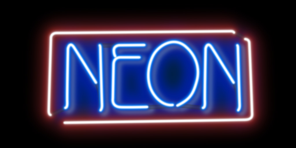
Neon signs are visually attractive and can really garner attention. It is rare that we will actually have a neon sign that says exactly what we want. In this part of the tutorial we will fabricate our own neon sign from ordinary text.
Let’s create the neon tubes:
- Open the file named GCM738_Tutorial_05_Neon_Text.psd.
- Save the Image to the Working Photoshop Files folder with the name GCM738_Tutorial_05_Neon_Text_Initials_v1.psd, where “initials” are your initials (e.g. GCM738_Tutorial_05_Neon_Text_JL_v1.psd).
- Go to the Paths Panel, then click Text Path to activate it.
- Create a new foreground colour that is R 0, G 127, and B 254. Save this colour to the Swatches Panel with the name Top Blue.
- Select a brush that is 28 pixels in size and hardness of 0%.
- Create a new layer above the Background layer and name it Text Blue 28 px.
- In the Paths Panel menu, choose to stroke the path. In the dialogue box, change the tool to brush.
- Create a new layer above the Text Blue 28 px layer and name it Border.
- Go to the Paths Panel, then click Border Path to activate it.
- In the Paths Panel, stroke the path (Tip: you can do this the same way as before, or by clicking the Stroke path with brush button
 at the bottom of the Paths Panel).
 - Create a new Hue/Saturation Adjustment Layer and call it Colourize Border. Check the box “Use Previous Layer to Create Clipping Mask”. In the Properties Panel, check the Colorize box, then set the Hue to 0, Saturation to 25, and lightness to 0.
- Create a new layer above the Colourize Border layer and name it White Glow.
- Choose the Brush Tool and reduce the size to 14 pixels. Change the foreground colour to white. In the Paths Panel, use the Stroke path with brush button to add a stroke to both the Text Path and Border Path.
- Create a new Layer Group called Neon Tubes and put all the existing layers except the Background layer in it.
Let’s create a drop shadow for the neon tubes:
- Create a new foreground colour that is R 129 G 156 B 182 and save this colour to the Swatches Panel as Drop Shadow Blue.
- Increase the brush size to 50 px.
- Hide the Neon Tubes Group, and create a new layer above the Background layer. Call this layer Drop Shadow Text.
- Go to the Paths Panel and click on the Text Path to make it active. Use the Stroke path with brush button to add a stroke.
- Make the Neon Tubes group visible again.
- With the Drop Shadow layer selected, choose Filter Other Offset. Change the horizontal amount to 13 and the vertical amount to 8. Change the opacity of the layer to 50%.
- Create a new layer above the Background layer. Call this layer Drop Shadow Border.
- Change the brush size to 64 px, and change the foreground colour to R 178 G 39 B 27. Save this colour to the Swatches Panel with the name Drop Shadow Red.
- Again, add a stroke to the path and change the layer opacity to 50%.
Let’s create some reflections in the background:
- Create a new layer above the Background layer. Call this layer Blue Reflection 01.
- Change the foreground colour to Top Blue.
- Go to the Paths Panel and activate the Refection Path. From the Paths Panel Menu, choose fill Path, and in the dialogue box, change the Feather Radius to 35 pixels. Deactivate the path.
- Change the opacity of the Blue Reflection 01 Layer to 25%.
- Create a new Layer above the Blue Reflection 01 layer and call it Red Reflection.
- Change the brush size to 150 px and change the foreground colour to Drop Shadow Red.
- Go to the Paths Panel and select the Border Path. Stroke the path then change the opacity of the Red Reflection layer to 30%.
- Create a new Layer above the Blue Reflection 01 layer and call it Blue Reflection 02.
- Change the foreground colour to Top Blue, and the go to the Paths Panel and stroke the Text Path.
- Change the layer opacity to 50% and the Blend mode to Hard Light.
- Select the Text Blue 28 px layer and choose Select Load Selection. Channel should be set to Text Blue 28 px Transparency. Click OK.
- Choose Select Modify Expand, and expand the selection by 2 pixels. Choose Select Modify Feather, and feather the selection by 5 pixels.
- Select the Drop Shadow Text layer and go to Layer Layer Mask Hide Selection.
Let’s finish the sign with some tube connectors:
- Create a new layer above the Neon Tubes group. Call this layer Connectors.
- Change the size of the brush to 18 px, and make the hardness 80%. Make the foreground colour 94% black.
- Go to the Paths Panel and make the Tube Connector Path active. Stroke the path.
- Change the brush size to 10 px with a hardness of zero. Change the foreground colour to 85% black. Stroke the path again.
- Move the Connectors layer under the Neon Tubes group and change the layer’s opacity to 40%.
- Save the file.
Metal Type Effect

Do you want to create cool metallic-looking type? This tutorial goes through a simple process of how we can do this. I like to use a serif font as opposed a sans-serif font because the serifs give really cool angles and offer a lot of interest areas to the final product.
Let’s start by creating the basic shape:
- Open the file named GCM738_Tutorial_05_Metal_Type.psd.
- Save the Image to the Working Photoshop Files folder with the name GCM738_Tutorial_05_Metal_Type _Initials_v1.psd, where “initials” are your initials (e.g. GCM738_Tutorial_05_Metal_Type_JL_v1.psd).
- Lock the transparency on the Text layer, and then fill the layer with R 128, G 128, B 128. Tip: the reason we are filling the text with a 50% gray is because it gives us the full upper half of the grayscale to create the highlights, and the full lower half of the grayscale to create the shadows.
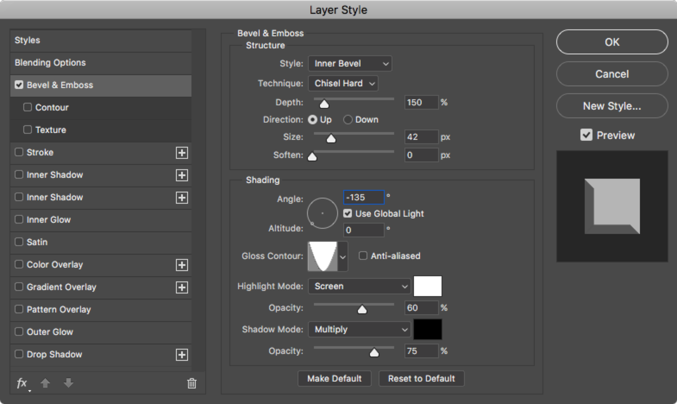
- With the Text layer still selected, choose Layer Layer Style Bevel and Emboss. Set up the style as per the image below:
- We are going to make this metallic text look like a coppery bronze. To do this, let’s make a new fill layer. Choose Layer New Fill Layer Solid Color. Name the layer Orange, and click on Use Previous Layer to Create Clipping Mask. Click OK.
- For the colour, choose R 205, G 111, B 0 and click OK. Note that even though the layer Blend Mode is set to normal, the colour appears transparent. This is because we used the layer below it to create a clipping mask. If we had not done this, the colour would have appeared opaque and solid.
- Now we will create a new “Stamp Layer” by pressing Shift, Option Command E. Name this layer Stamp Visible.
- Select the Magic Wand Tool. Set the tolerance to 4, and make sure Anti-Alias and Contiguous are both checked. Select the horizontal tops and bottoms of the type so you have a selection that looks similar to this:

- Choose Select Modify Expand. Expand the selection by 1 pixel. Save this selection as Tops/Bottoms.
- We no longer need the Stamp Visible layer, so let’s delete it.
- Go back to the Text layer, and double click on the Layer Style to modify it. Change the gloss contour to Half Round. This will make the highlights lighter, which is what we want for the next step.
- Go to the Channels Panel and duplicate the Blue Channel. Name this new Channel Left Side. Now choose Image Adjustments Levels. Move the white triangle for the input levels left until the third box has a value of 180. Click OK.
- With the Left Side Channel still selected, Command-click on the Tops/Bottoms Channel to create a selection. Fill this selection with Black. This removes these areas from the mask. Tip: You may need to use a hard brush with black to touch up any stray areas.
- Choose Image Adjustments Levels. Move the white triangle for the Input levels left until the right box has a value of 50. Click OK.
- Duplicate the Left Side Channel and call it Right Side. Press Command I to invert the channel.
- With the Right Side Channel still selected, Command-click on the Tops/Bottoms Channel to create a selection. Fill this selection with Black. This removes these areas from the mask. Tip: You may need to use a hard brush with black to touch up any stray areas.
- Click on the RGB channel and return to the Layers Panel. Double-click on the emboss effect and change the gloss contour back to Cone Inverted.
Now let’s create the texture for our type:
- Choose Image Duplicate
- Flatten the new duplicated image, and fill the canvas with R 128, G 128, B 128.
- Save the Image to the Working Photoshop Files folder with the name GCM738_Tutorial_05_Metal_Texture_intitials_v1.psd, where “initials” are your initials (e.g. GCM738_Tutorial_05_Metal_Texture_JL_v1.psd).
- Choose Filter Noise Add Noise. Make the Amount 125, and make sure Uniform and Monochromatic are selected. Click OK.
- Duplicate the Background layer and name the new layer Left Angle.
- With the Left Angle layer selected, choose Filter Blur Motion Blur. Set the Angle to 45, and the distance to 30.
- Duplicate the Background layer and name the new layer Top Angle. Move the layer to the top of the layer order.
- With the Top Angle layer selected, choose Filter Blur Motion Blur. Set the Angle to 90, and the distance to 30.
- Save the file.
- Hide the Top Angle layer and select the Left Angle layer. Select all and copy.
- Return to the other file, make sure the Orange layer is selected, and load the Left Side Channel as a selection. Choose Edit Paste Special Paste Into. Name this layer Left Texture, set the Blend Mode to Multiply, and change the opacity to 40%.
- Now load the Right Side Channel as a selection.
- Choose Edit Paste Special Paste Into. Name this layer Right Texture. Choose Edit Transform Flip Horizontal so that the pattern is going in the opposite direction of the left side. Set the Blend Mode to Overlay.
- Go back to the texture file, make the Top Angle layer visible and select it. Select all and copy.
- Go back to the main file, and load the Tops/Bottoms Channel. Choose Edit Paste Special Paste Into. Name this layer Top/Bottom Texture. Set the Blend Mode to Overlay.
Now let’s Finish by adding some depth to our type by playing around with blend modes:
- Duplicate the Left Texture layer. Change the Blend Mode to Overlay and the Opacity to 100%. Call this layer Left Depth. This layer gives more detail to the texture without affecting the highlights.
- Duplicate the Right Texture layer and name it Right Depth. This has the same effect.
- Select the Top/Bottom Texture layer and change the Blend Mode to Multiply. This darkens these areas and gives a nice effect.
- Save the file.
Plastic Type Effect
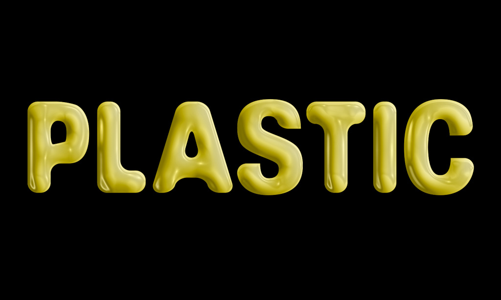
Photoshop can be used to make plain type appear to be created from extruded plastic. This is a cool effect that can be applied to a variety of scenarios. Let’s look at how this is done.
Let’s begin by making the right shape for the plastic text:
- Open the file named GCM738_Tutorial_05_Plastic_Text.ai.
- Save the Image to the Working Photoshop Files folder with the name GCM738_Tutorial_05_Plastic_Text_Initials_v1.ai, where “initials” are your initials (e.g. GCM738_Tutorial_05_Plastic_Text_JL_v1.ai).
- Select all, then choose Effect Stylize Round Corners. Make the radius 0.1, and click OK.
- Select all and copy.
- Save the file and close it.
- Open the file named GCM738_Tutorial_05_Plastic_Type.psd.
- Save the Image to the Working Photoshop Files folder with the name GCM738_Tutorial_05_Plastic_Type_Initials_v1.psd, where “initials” are your initials (e.g. GCM738_Tutorial_05_Plastic_Type_JL_v1.psd).
- Make sure the foreground colour is set to neutral gray (R 128, G 128, B 128). Choose Edit Paste to paste the copied artwork from the Illustrator file. In the Paste Dialogue Box, choose Shape Layer. Tip: The reason we are pasting this as a shape layer is that the original artwork was vector. By creating a shape layer, the artwork is pasted on its own layer as a vector graphic and uses the foreground colour as the fill. Since the path that defines the shape is vector, it can be scaled and otherwise transformed without loss of quality.
- Name the new layer Text Outline.
- Go to the Paths Panel. Notice that a temporary path was imported with the Shape Layer. Name this Path Text Path. This adds the shape as an editable path to the Paths Panel.
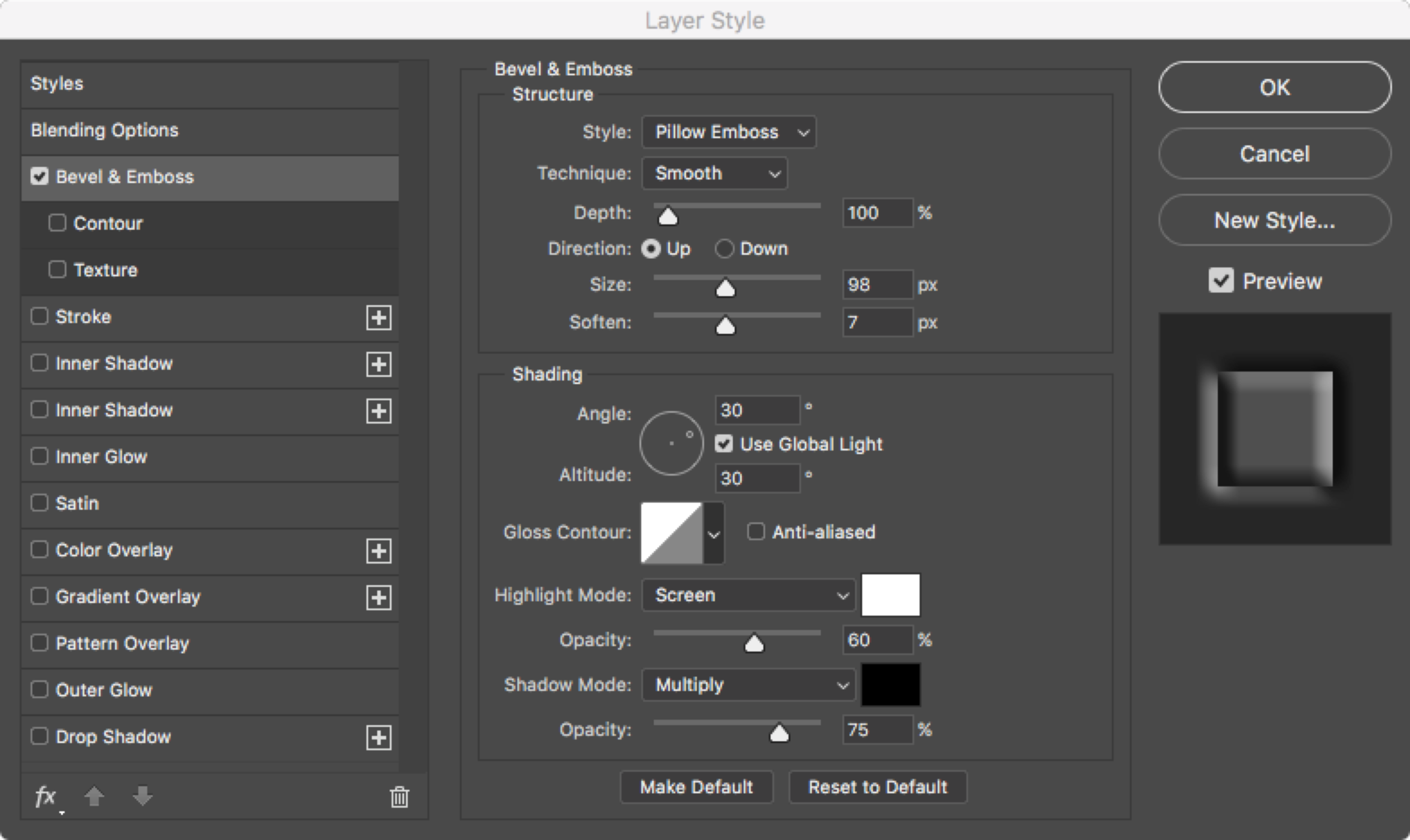
- Choose Layer Layer Style Bevel & Emboss. Make sure your settings look like the image below:
- Hold down the Command key and click on the icon on the Text Outline layer to load the shape as a selection. Choose Edit Copy Merged. Name the new layer created Plastic Text Tip: Copy Merged copies the selected artwork as though all the layers were merged and the image was flattened – or in other words, it copies the artwork as it appears, regardless of how many different layers are used to create the appearance.
- Hide the Text Outline layer.
- Now let’s add some colour:
- With the Plastic Text layer selected, choose Layer New Fill Layer, and choose solid colour. Name the layer Gold, and check Use Previous Layer to Create Clipping Mask. Click OK. Make the colour R 255, G 234, and B 94.
- Set the Blending Mode of the Gold layer to Soft Light.
- Choose Layer New Adjustment Layer Hue/Saturation. Name the layer Saturation Bump, and check Use Previous Layer to Create Clipping Mask. Click OK
- Adjust the saturation to +50.
- Now let’s add detail:
- With the Saturation Bump layer selected, choose Edit Copy Merged. Name the new layer Plastic Wrap.
- Using the Rectangular Marquee, select the left half of the canvas up to the split between the S and T.
- Choose Filter Filter Gallery. Choose the Artistic folder, and choose the Plastic Wrap effect. Set the Highlight Strength to 15, The Detail to 8, and the Smoothness to 9.
- Inverse the selection. Reapply the filter we just used by selecting Filter Gallery from the very top of the filter menu. Deselect the selection (Command D)
- With the Plastic Wrap layer selected, Command-click on the Text Outline layer to create a selection.
- Create a layer mask on the Plastic Wrap layer by clicking on the Add Layer Mask button at the bottom of the Layers Panel.
- Using Blend Modes to change the look:
- Select the Plastic Wrap layer. Change its Blend Mode to Hard Light. Tip: The Hard Light Blend Mode saturates the yellow overall by removing the midrange effects of the filter while maintaining the highlights. This makes our text look like extremely bright, shiny plastic.
- Now change the Blend Mode to Lighten. Tip: With the Blend Mode set to lighten, only the areas of the Plastic Wrap layer that are lighter than those of the layers below will be visible. The result is less shine, and more detail in the midtone.
- Now change the Blend Mode to Luminosity. Tip: With the Blend Mode set to Luminosity, the brightness information of the Plastic Wrap layer is applied to the layers below. This maintains the highlights, but still allows the midtones to show through.
- Save the file
Rusty Type
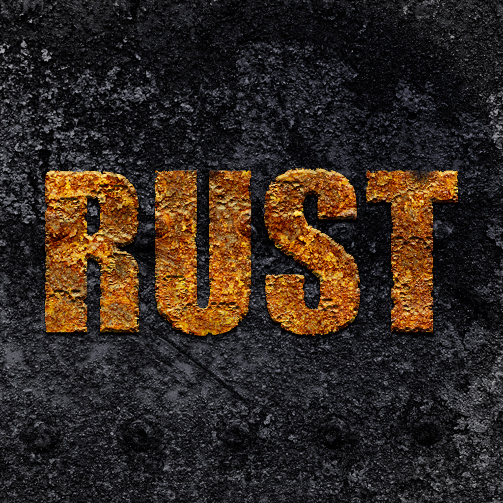
Cool, sharp new metal type can serve a purpose, but what if we want our metal type to look like it has seen better days? With the right tools and techniques, we can create realistic looking rusted type that create a cool effect for art.
Let’s begin:
- Open the file named GCM738_Tutorial_05_Rusty_Type.psd.
- Save the Image to the Working Photoshop Files folder with the name GCM738_Tutorial_05_Rusty_Type_Initials_v1.psd, where “initials” are your initials (e.g. GCM738_Tutorial_05_Rusty_Type_JL_v1.ai).
- Hide the visibility of the Original Text shape layer. Duplicate the Rust layer and call it Rusty Text. Make this layer visible.
- Go to the Paths Panel and select the path called Text Path.
- Choose Layer Vector Mask Current Path.
- Hide the Black Iron layer so we can see the changes we are about to make.
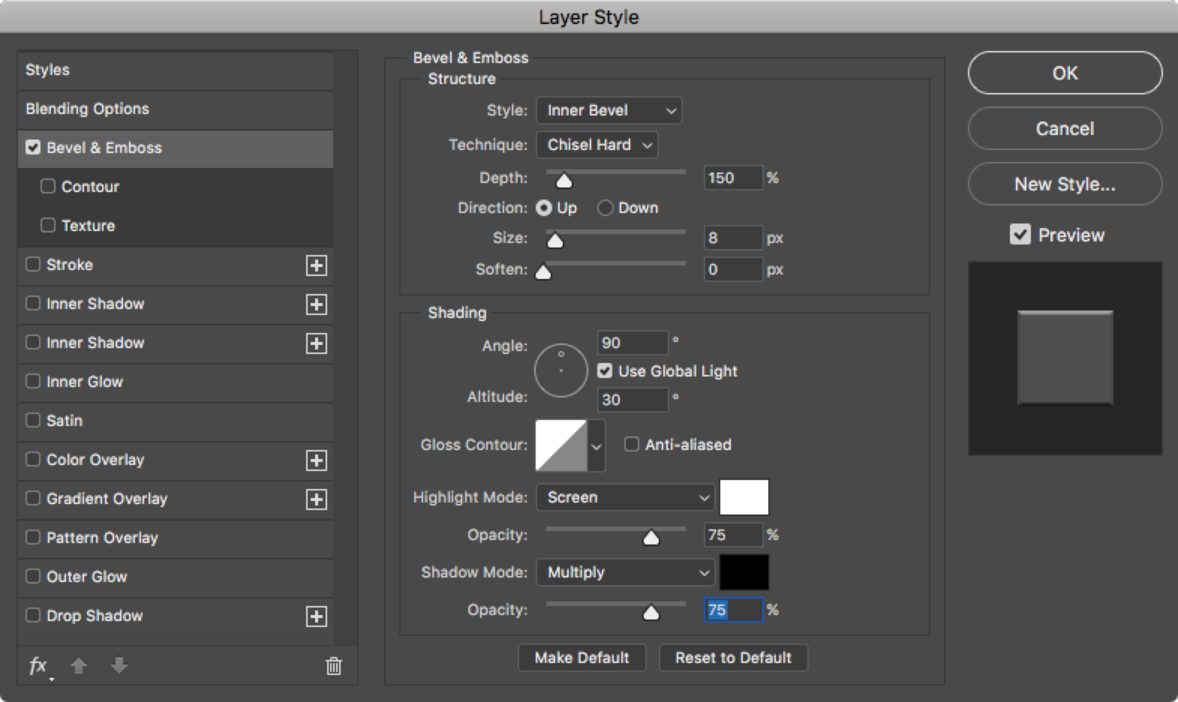
- With the Rusty Text layer selected, choose Layer Layer Style Bevel & Emboss. Make sure your settings look like the image below, and do not close this dialogue box yet:
- Change the colour of the highlight to R 250, G 250, B 150. Click OK, but still do not close the main dialogue box.
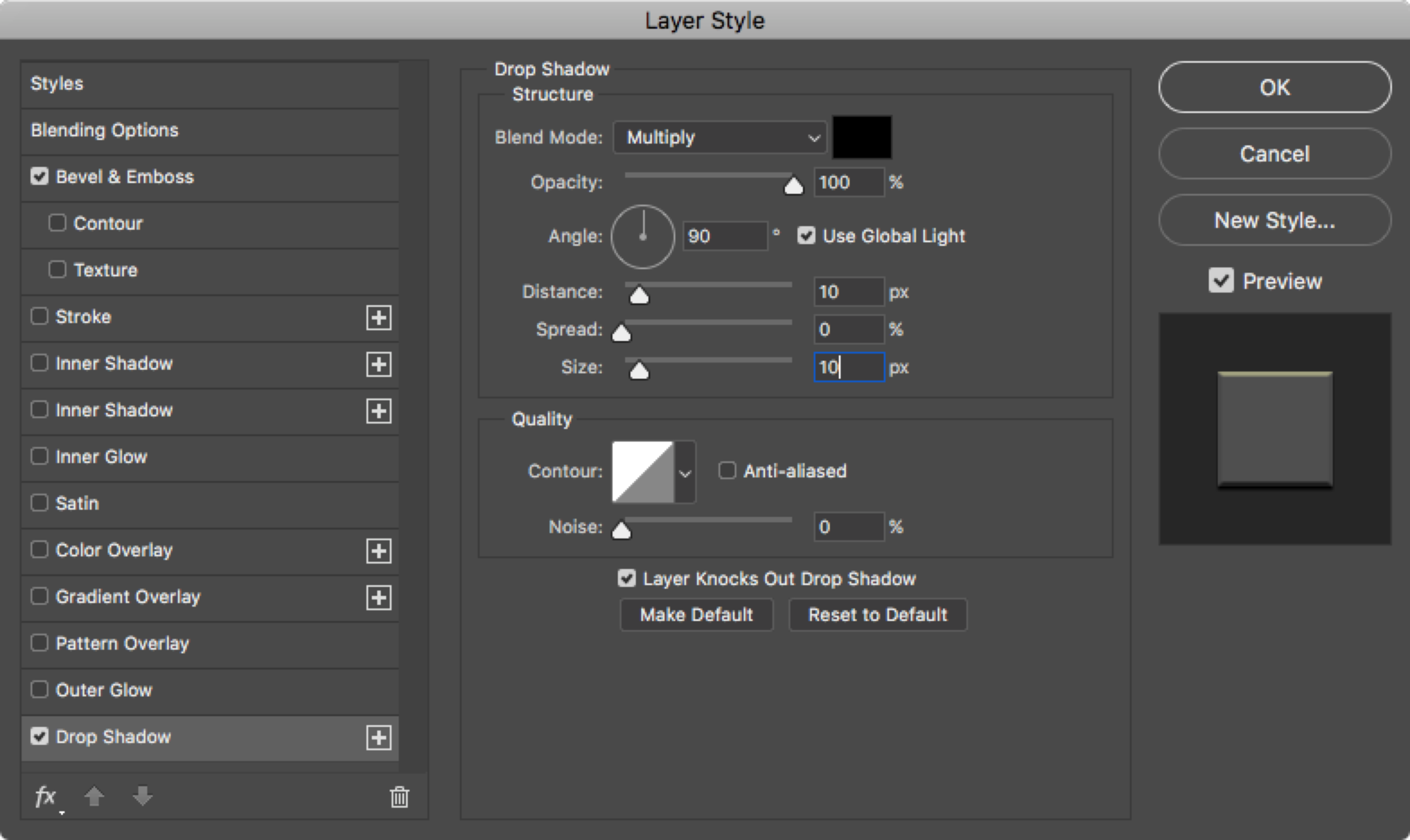
- Click on Drop Shadow in the list on the left side of the dialogue box, and set up the drop shadow to match the settings below:
- Click OK to close the dialogue box.
- Select the Rusty Text layer, and Command click on the Vector Mask to make a selection. Create a Layer Mask with the button at the bottom of the Layer Panel. Option-click on the Layer Mask to show the contents of the Layer Mask instead of the Layer.
- Make sure the Layer Mask is selected. Choose Filter Filter Gallery, go to the Brush Strokes folder, and choose Spatter. Make the Spray Radius 25 and Smoothness 15. Click OK.
- Click on the layer icon to show the layer contents, and mask the Black Iron layer visible.
- Select the layer mask on the Rusty Type layer once again. Make sure the foreground colour is set to black.
- Select the Brush Tool. Choose a Spatter Brush with a radius of 59 pixels. Change the Opacity of the Brush to 30%. Now you can add some erosion to the inside of the text as well. Try to be random as you click.
- Save the file.
Conclusion
This lab tutorial demonstrated several different ways we can turn ordinary type into attractive headlines. These are just a small sample of the many different ways Photoshop can be used to enhance type for visual appeal.