Main Body
Tutorial 2 • Planning Your Site
This tutorial is about designing your web site, including planning for the user experience, laying out the pages, designing for different devices with responsive design, doing a design critique, and implementing analytics.
The 4 “Ws” of Web Design
A work-in-progress, someone with a sense of humor determined that there are four “Ws” of web design, a reference to “www” or “W3”:
- Width—Design for width, let scrolling handle the height.
- Who—We do not know who will visit our site, but we want everyone to feel welcome and be able to use it, even with any sensory challenges they may face.
- What—We don’t know what equipment and software our users have, such as the computer platform or device, monitor or screen, operating system, browser, browser window size, color settings, and installed fonts. However we try to design for the common scenarios, such as large-screen monitors and cell phones, and give the fonts to users whenever possible.
- Where—We don’t know where our audience comes from, but we would like to keep them on our site as much as possible.
| Four “Ws” of Web Design | ||
|---|---|---|
| “W” | Description | Example(s) |
| Width | Design for width, let scrolling handle the height |
|
| Who | We do not know who will visit our site, but we want everyone to feel welcome and be able to use it, even with any sensory challenges they may face. |
|
| What | We don’t know what equipment and software our users have, such as the computer platform or device, monitor or screen, operating system, browser, or browser window size. However we try to design for the common scenarios, such as large-screen monitors and cell phones. |
|
| Where | We don’t know where our audience comes from, but we would like to keep them on our site as much as possible. |
|
User Experience Design (UXD) and “DesignAgility”
Steve Jobs of Apple Computer once said something like, “We must always think about the customers first and develop technology to meet their needs; we cannot start by inventing cool tech and then look for a way to sell it.”
Likewise, when designing web pages, designers have to think about the purpose of the site, the audience, and the readers’ experience as they use it — a process commonly called “user experience design” (UXD). “DesignAgility,” a systematic approach to UXD for media, was created by Okke Schlüter from HdM-Stuttgart and Stefanie Quade (reference: Quade, Stefanie, and Okke Schlüter, DesignAgility—Toolbox Media Prototyping. Amazon Kindle Direct Publishing, 2019). DesignAgility combines “design thinking” with “agile manufacturing.”
The first step in DesignAgility, “Discovery,” is to think of a challenge or problem that people want to solve. For a web site, this could include questions like: What is the site’s purpose—to inform, persuade, entertain, or receive a product or service? What is the dominant media—text, photos, videos, animation? Who will the audience be, and what are their interests and possible sensory challenges they may face in reading and/or listening to the site?
The second step, “Interpretation,” means to develop an understanding of how people will meet their challenge by using your site. A valuable step in understanding users is to define several “personas,” who form a representative sampling of presumed users of the site, and their characteristics.
The third step, “Ideation,” means thinking of solutions to the design challenge. The personas’ perception and use of a site can be expressed in “user stories.”
Some additional DesignAgility steps are described in the table below.
| DesignAgility Step | What to Do |
|---|---|
| Discovery | Define the purpose of your web site: • inform, persuade, entertain, receive product or service? • dominant media—text, photos, videos, animations? |
| Interpretation | Define several “personas,” or presumed users, their ages, occupations, interests, any sensory challenges they face. |
| Ideation | Write “user stories” about why each persona will be interested in the site and how they will interact with it. |
| Specification | Sketch out a sample page layout for your site: • fixed-width page for text-heavy documents • variable-width page where photos are the most important elements |
| Implementation | Design the site in HTML & CSS. |
| Evaluation | Design Critique • show your design to another class member and ask for their feedback. |
| Deployment | Make the site public and assess impact • Google Analytics—Enables tracking of users to your site |
DesignAgility Example
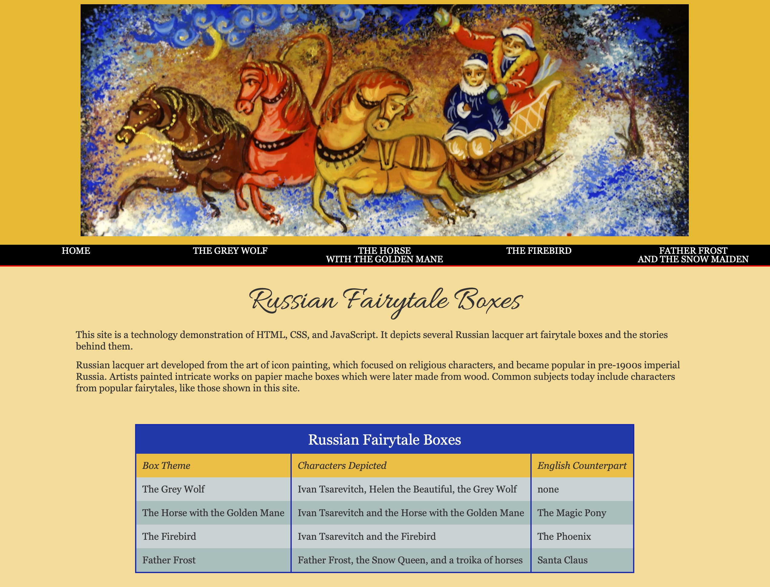
Discovery and Challenge Identification. Define a challenge or problem that people want to solve. For this example I plan to make a site about Russian fairytale boxes. These are small, hand-painted boxes with illustrations of little-known fairytale characters like “The Grey Wolf” and “The Firebird” that date back to the time of the Russian Czars. On a trip to Ukraine I bought several of the boxes and plan to photograph them so I will own the rights to the photos. The photos and text are equally important. The site should to appeal to readers “from 6 to 106.”
Interpretation and Personas. In planning the site I developed 2 “personas” of presumed users:
- Sergei Soldier is a 65-year-old grandfather who emigrated from Russia to Canada to be with his children. His interests include reading, home remodeling, and arts and crafts. Ever active, he works as a security officer at the art museum in his city. His grandchildren bought him an Android tablet so he could read eBooks and browse the web.
- Sweetie Smith is a precocious 6-year-old girl who is an avid reader and is interested in all kinds of arts and crafts. At home she has an iMac and when traveling she takes an iPad.
Ideation and User Stories. On this site the pictures and text are equally important. The photos should look good in color and when rendered in black-and-white. The text should be high-contrast and enlargeable and be readable with a screen reader or included audio. The pages should be designed responsively so they look good on both desktop computers and tablets and cell phones.
- Sergei may be interested in this eBook because of his Russian heritage and interest in arts & crafts. At his age of 65, it will be important that the site be easy to read for someone who uses reading glasses. The type should have good contrast and exhibit responsive design so it looks good and remains legible on computers and tablets. The linked quarter-page pictures that expand to full-size upon click or touch will make it easier for Sergei to examine the photos in great detail.
- Sweetie may also be interested in this site because of her interest in arts & crafts. Since she is just learning to read, it would be appealing for her if at least parts of the book included audio channels that would read portions aloud to her.
Writing Your Web Site Proposal
-
- Think about a challenge that you could address with a web site. What will be more important—text or photos? Describe how you will build the site.
- Define some personas of prospective site users and their characteristics.
- Write a user story for each persona, describing what will bring them to your site and how they will use it.
- Draw a basic layout of one of your content pages, including (if present) banner, menu, photos, text, and other information. Will the site use a fixed or variable layout?
Page Layout
A web site’s purpose and audience are important to know before designing pages. As discussed in Tutorial 1, page layout for the web is different than it is for print because the designer never knows what type of computer, device, operating system, monitor, screen, browser, or window size the readers will use. Regardless, we want everyone to feel included and be able to use the site.
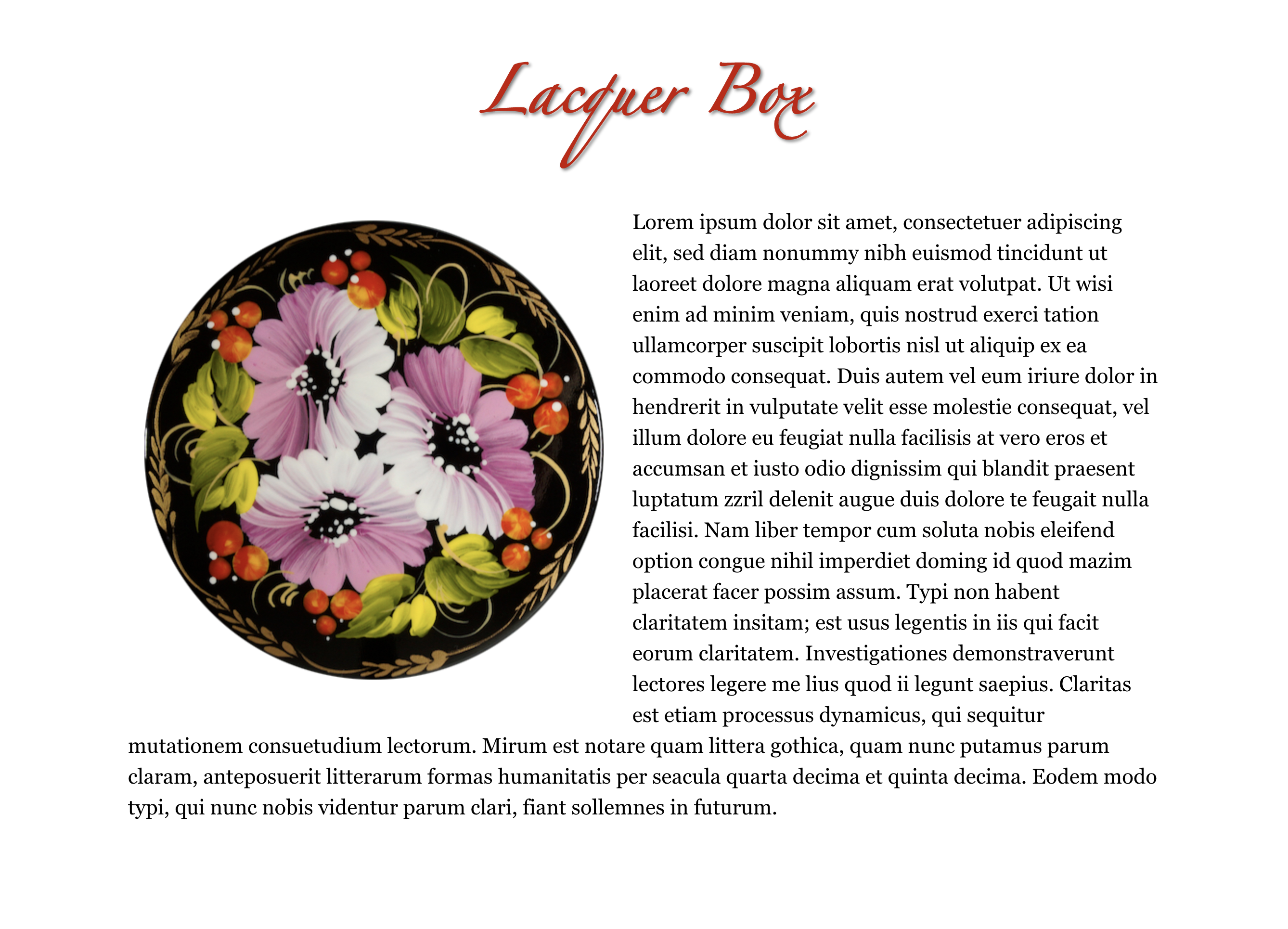
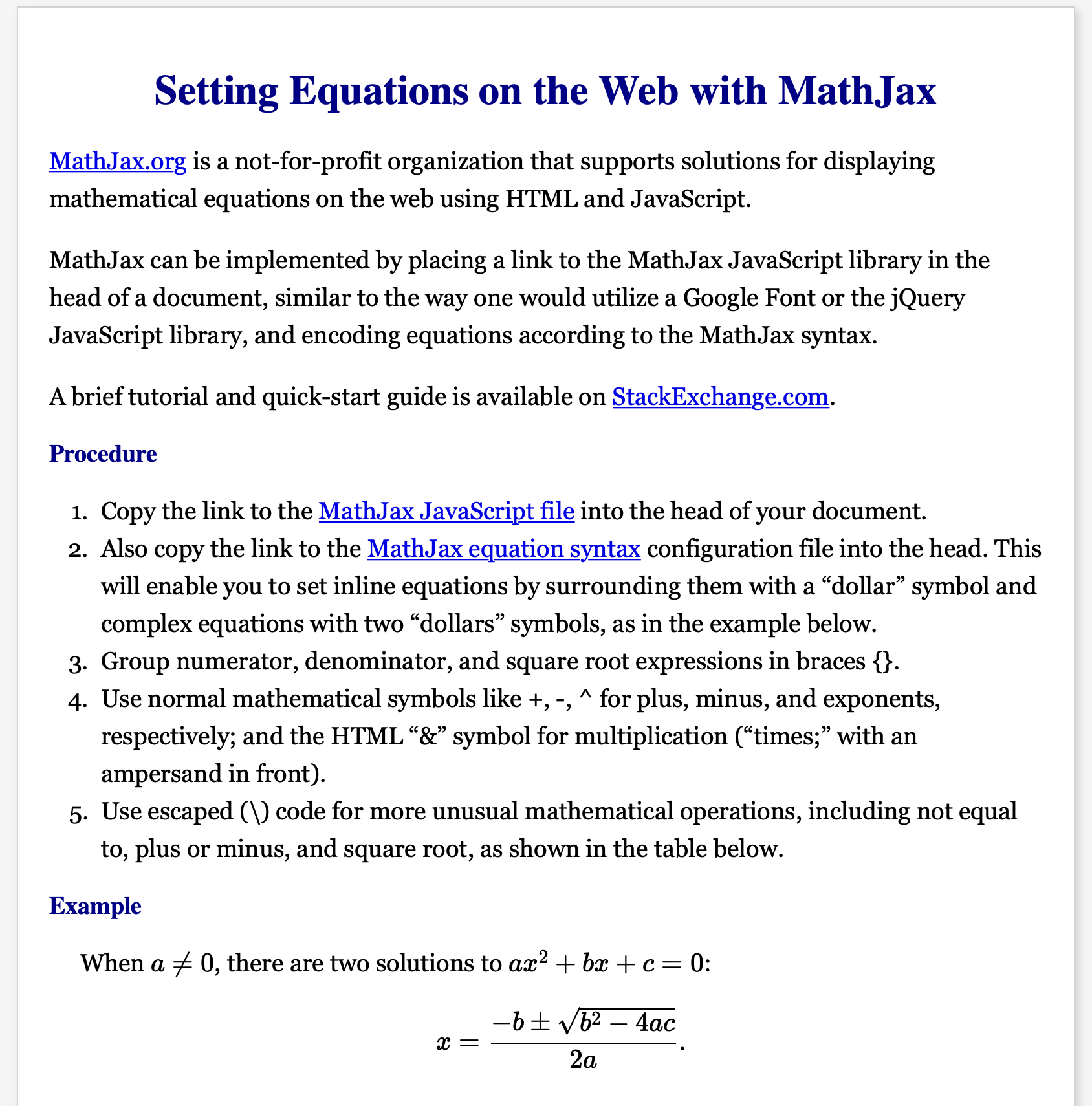
Web pages can be designed with fixed or variable sizes. Fixed size is easiest for text-heavy pages, such as news stories, while variable sizes are good when photos are the dominant media.
Below are examples of fixed-width and variable-width pages.
 |
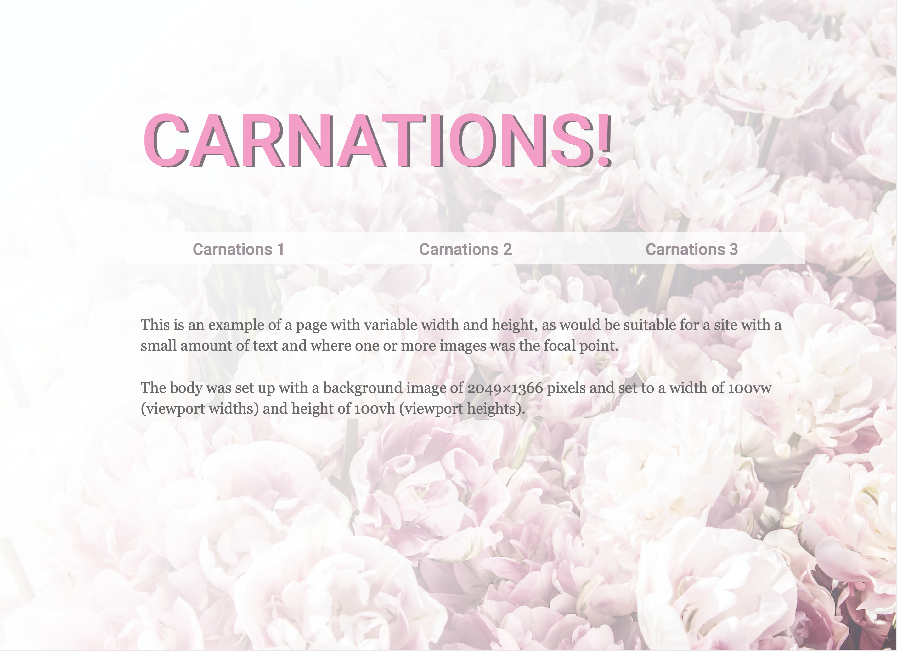 |
| Example of a fixed-width page for a text-heavy document, designed to look like a U.S. Letter or A4 page. The “page” centers itself in the browser window and remains the same size. Sizes were defined in px (pixels). | Example of a variable-width page used because the photo is the dominant medium. The photo and text expand as the browser window is enlarged. Sizes were defined in “vw” (viewport width) and “vh” (viewport height). |
Responsive Design
Does your web page need to be readable and look good on a large-screen monitor, cell phone, and iPad or tablet? If so then it should be designed to be “responsive,” or adaptable to different screen sizes.
Styles for responsive design include “width” set in percent instead of pixels, and limiting the width to that of the browser window by using the “max-width” style in percent.
In the two examples below, the widths of the page elements in the responsive page are set as 100%, 20%, and 80%, respectively; while in the fixed-width page they are set in pixels (px).

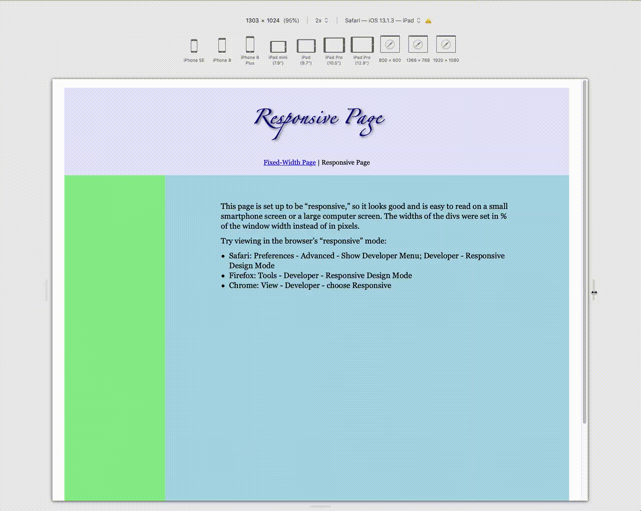
Further refinements to responsive design can be made using the media query rule (@media), in which the resolution of the applicable styles is defined. Example: @media only screen and (max-width: 750px) {}. Inside the braces would go the styles applicable to screen resolutions of 750px or less. Details in Tutorial 4.
Design Critique
This section is based on a design critique contributed to class by Prof. Bettina Tabel, HdM-Stuttgart. When designing a web page, it can be useful to get a design critique from an objective third party. Following is a list of questions to consider:
Home Page
- What is the purpose of the site? Audience? Is this clear from the title and design?
- From the title and main photo (if any), are the subject and theme of the site clear?
- Does the site’s color scheme fit the target group and the subject? Should the color scheme be neutral, pastel, bright, complementary, analogous, or other theme?
- Is the font selection appropriate to the site’s subject and audience?
- Are the fonts legible (size, contrast)? Could they benefit from a drop shadow, complimentary-colored or lighter or darker background?
- If the site has one or more photos, have the image rights been clarified?
- Are photos sized appropriately to the pages and for viewing on different devices?
Other Pages
- Do special effects (drop caps, callouts, sidebars) contribute to the theme of the site without being distracting?
- Are photos large enough for readers to see detail? If the reader clicks on or touches a photo, does it link to a larger version that can be viewed in more detail?
- Are sections (if present) separated clearly?
Sample Design Critique |
|
|
Original Site
|
Redesigned Site
|
Sample Critique • Questions
-
-
- Why are the top and bottom borders not the same height?
- Why are the links not vertically aligned in the menu bar
- Why are the links set in all caps?
- Why is a serif font used for the links?
- Why are the line lengths so long?
- Why was a script cap initial used when it’s difficult to read?
-
Common Design Flaws—Don’t Do It!
The graphic below shows several examples of common web design flaws, which are listed below and corrected in the second graphic.

- Itty-bitty images—can’t see! Make ’em bigger because people want to see!
- Excessively large image files (>1 MB) reduced in width in CSS. They take too long to download. Size appropriately in Photoshop or Preview.
- Use of bold paragraph <p> for headings. Instead use heading tags <h1>, <h2>, …, <h6>.
- Use of underline for headings, reminiscent of typewriter days. Use a heading tag and a complimentary font.
- Use of default Times Roman font (boring!).
- Itty-bitty font size (can’t read!). Make it 14pt or bigger and 1.4em line leading (line-height).
- Insufficient vertical space between elements. Use padding and/or margin to adjust vertical height, not carriage returns <br/>.
- Type lines too wide (can’t read!), set paragraph width to be 70 characters or less and center on the page.