
Main Body
Tutorial 4 • Navigation Menus and Responsive Design

In this tutorial we will turn an ordinary-looking menu into a menu bar like the one shown. The menu bar is made using the unordered list <ul> tag, where each item is a “bullet point,” or list item <li>, with the “bullet” removed. The list items are styled to “float: left,” which turns them from block to inline. (Block items act as if they had paragraph returns at the end; inline items, like spaces between.) Other settings include “color” for type, “background: color,” “border-bottom,” “line-height,” “padding,” and “width.” The width is set so that all the list items fit across the page (i.e., 2 items occupy 50%, 3 would be 33%, etc.).
Making the Menu Bar
- Open the file “index_nav_START.html. Save As each file remove the “_START” from the name.
- Make the Menu into a Menu Bar:
- Remove the bullet point from between “Home” and “The Grey Wolf,” remove the paragraph tag <p>, place the items into an unordered list <ul>, and make each item into a list item <li>.
- Style the ul to be 1004px wide and also have max-width: 100%;.
- Style the li to remove the bullet points (list-style: none;), arrange horizontally (float: left;), and set width to 50%. Add padding or set height to make the menu items into rectangles.
- Add a CSS <style> selector, li:hover, that applies when the mouse is over the item. Style the list items different so users will know they put the mouse in the right place to click a link. E.g., set a different color background, (font) color, drop shadow, and/or other style.

Adding Responsive Design
Increasingly viewers are using smartphones to look at web pages. The goal of responsive design is to have a web page “respond” to different size viewing screens by changing styles to promote legibility. Responsive design can be implemented with media queries. “Responsive” could also be interpreted as improving accessibility for readers with visual challenges.
Media queries (@media) make it possible to style something, like a menu, differently on a smartphone than on a large screen.
When designing for cell phones, keep in mind that people want to see the images as large as possible (especially if they have a lot of detail) and want to read the text easily. Image the size of postage stamps and text that runs off the page and requires horizontal scrolling will frustrate readers.

If you have a menu of several items across your page, it may be easy to see and select on a 21-in. monitor but difficult on a 4-in. phone screen.
| iPhone Screen Resolutions | ||
|---|---|---|
| Model | Screen Size | Resolution (px) |
| iPhone 5, 5s, SE | 4 in. diag. | 640 |
| iPhone 6, 6s, 7, 8 | 4.7 | 750 |
| iPhone X | 5.8 | 1125 |
| iPhone 6Plus, 7Plus, 8Plus | 5.5 | 1282 |
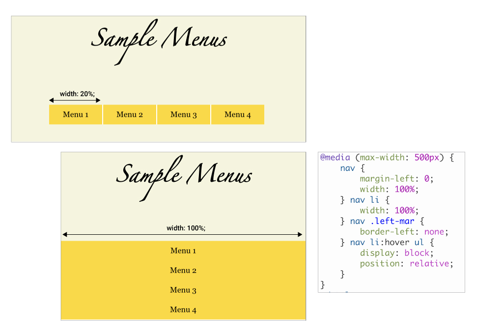
To make menus easier to see, web designers typically use a media query to structure menus vertically on the page for smartphones.
Add responsive design to your menu
-
- Add a media query to your embedded/global <style> or external .css:
@media screen and (max-width: 750px) {}
This query will apply to screens that are 750px or less in width. - Style the nav ul selector:
- max-width: 100%;
- Style the nav li selector:
- width: 100%;
- float: none;
- Add a media query to your embedded/global <style> or external .css:
Checklist for Responsive Design
❏ menu and buttons
❏ menu position, e.g., horizontal on large screen, vertical on small screen
❏ :hover — change style when mouse is over tag
❏ :active — change style when tag is clicked
❏ page layout
❏ make images occupy the full screen width by changing the image display from text wrap (float) to block
❏ make the text occupy 95% of the screen width
❏ change color (color, background)
❏ change contrast
❏ change font
❏ size (font-size)
❏ leading (line-height)
❏ bold
❏ contrast
❏ black/white vs. white/black
❏ alt tag — use to describe images
Viewing Your Responsive Design
Most popular browsers have a “responsive design mode” for viewing your page as it would appear on various smartphones and tablets.
Safari
- Preferences > Advanced > check Show Developer Menu
- Developer > Enter Responsive Design Mode > select device
Chrome
- View > Developer > Developer Tools > click on Responsive Design button


Page viewed in Safari (left) and Chrome (right) in responsive design mode with iPhone 8.

Accessibility
Accessibility and responsive design are interrelated because their goal is to promote universal access as much as possible to a web site. Accessibility refers to readers with visual or tactile challenges that may make it difficult to read or interact with a site. For example, visually-impaired readers may find it difficult to read small or low-contrast type, while those with tactile impairments may find it difficult to click the mouse on a small link. Accessibility and responsive design are interrelated.
In addition to the responsive design checklist on page 1, web designers can include image information in the form of “alt” tags that display when an image does not load, and in “title” tags that appear as popups.
<img src=”image.jpg” alt=”Chinese paper cut” title=”Chinese paper cut” />