
Digital Photography for Graphic Communications
Chapter 5 • Image Fidelity
Publishers who want “critical” or “match colour” want the closest possible match to the original. Think of a high-quality magazine cover with a still life with flowers, food, and household products. The same criteria could apply to an individual product in an online or print catalog, a portrait, a fine-art reproduction—anywhere accurate colour is required.
Colour accuracy has an obvious impact on consumer satisfaction. If colour the colour is not striking enough then consumers may not be attracted to the product. And if the product looks better in the photo than in real life, consumers may be dissatisfied and return it or leave poor reviews.
For achieving critical colour, the authors suggest the following steps.
Exposure
If the old axiom, “garbage in, garbage out” is true, then a good photo starts with proper camera setup.
- Set up the digital camera with the proper exposure and white balance, as described in Chapter 3.
- For copy work, place a grayscale target next to the original for later use in setting highlight, shadow, midtone, and gray balance (described in Editing below).
- Bracket exposures ±1/3 or 1/2 exposure value (EV) to provide a range from bright to dim.
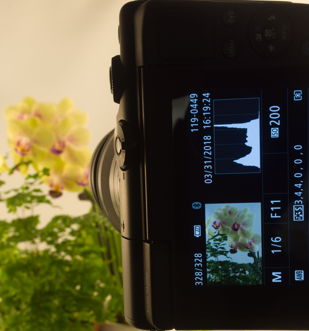
- Check the histogram on the digital camera’s screen or in the image-editing software to make sure no tones have been cut off (Figure 5-1).
- Look at the bracketed exposures on the big screen and choose the one with the best looking tone and colour.
Editing
The advent of colour scanners in the early 1980s enabled printers to make colour separations in a few minutes rather than the few hours required to make them in an enlarger. At that time system vendors and research associations developed a procedure for making the best separation on the first scan: set the contrast of the scan to the range available with the ink and paper.
Scanner operators were taught that lithographic presses could reproduce a “smallest printable dot” of 3% dot area before dots would “blow out” or fail to image, and a “largest printable dot” of 97% before shadow dots would “fill in” or blend together—in both cases losing image detail.
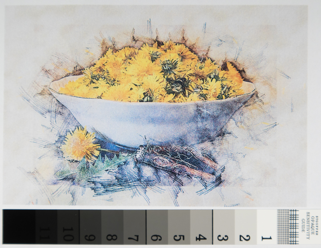
Scanner operators also attached a grayscale, a small target with a stepped or continuous series of tones, for use in setting the highlight, shadow, and midtone on originals (Figure 5-2).
You can apply the same strategy today by setting the highlight dot to 3% on the CMYK scale or 247 levels (3% of 255, where level 255 is white) and shadow to 97% (8 levels, where level 0 is black).
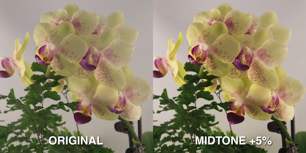
Separators also set the midtone, or midpoint, of the reproduction according to the original’s “key,” or predominant brightness level. They realized that high-key, or mostly bright, photos need more highlight contrast and adjusted the midtone to increase contrast in the highlights, at the expense of shadows (Figure 5-3). Likewise, predominantly dark, or low-key, photos needed more shadow contrast.
- Set lightest density of photo to 3% CMYK or 247 levels.
- Set darkest density of photo to 97% CMYK or 8 levels.
- Adjust midtone to give more highlight contrast for high-key images or more shadow contrast for low-key images.
Gray Balance
Gray balance (sometimes called white balance) ensures that neutral colours are neutral and free from colour casts. A colour cast is a shift toward a particular colour, as might be referred to as a reddish cast or yellowish cast.
To set gray balance, use a gray balance tool in your image-editing software. Set the tool to reproduce neutral gray, which on screens is levels 127 127 127 (half of 255). CMY printing requires slightly higher cyan, e.g., 60% 50% 50%.
Colour Correction
Early scanner operators understood that viewers could be especially critical of reds, greens, and blues in pictures—e.g., fire-engine red, grass green, sky blue—and termed these memory colours. The operator could adjust the hue of a memory colour by altering the balance of CMY colours. E.g., increase yellow for a warmer red or increase magenta for a cooler red.
Likewise the operator could make the colours more or less saturated by reducing the amount of “unwanted” or opposite colour. In this example, red is printed with magenta and yellow but also contains its opposite, cyan, to add detail and create realistic saturation.
To conclude our quality checklist:
- Set gray balance to RGB 127 127 127 levels or CMY 60 50 50% on a neutral gray object or grayscale in the photo.
- Check memory colours red, green, and blue for proper hue and saturation.
