
04
HOW THE PERCEIVED MODERNITY
OF A TYPEFACE AFFECTS
VIEWERS’ PREFERENCE FOR IT
JULIA FORRESTER
ABSTRACT
Typography as a means of visual communication has evolved significantly since it was first developed in the mid 15th century. Scholarship on the subject has established that typography can be both connotative and evocative, capable of resonating emotionally with its viewers. Given these typographic abilities, this study aimed to examine how the perceived modernity (or lack thereof) connoted by a typeface affects the viewers’ preference for it. Specifically, it looked to determine whether those born around the turn of the 21st century, between 1998 and 2002, prefer typefaces that are contemporaneous to their lifetimes or those which were popular in a time predating them. In the context of this study, typeface modernity was defined as having a current or contemporary appearance or visual aesthetic, rather than referring to the Modern type classification.
To examine the potential correlation between perceived typeface modernity and preference, an online survey based upon a review of the literature on typographic expression and emotional resonance was conducted. Participants were asked to respond to two sets of questions: background questions regarding their age, gender, place of birth, and prior typographic knowledge, and questions pertaining to their perceived modernity and preference of ten (10) typeface samples. Analysis of the responses from participants born between 1998 and 2002 indicated some correlation between the perceived modernity of a typeface and viewers’ preference for it. The results of this survey suggested that geometric sans serif typefaces are not only thought to have more modern personas than serif typefaces or sans serif typefaces from alternative classifications, but that young adults born around the turn of the 21st century tend to prefer these typefaces.
INTRODUCTION
Typography, as it is known today, developed alongside Gutenberg’s moveable type press in the 1440s. The type used by Gutenberg was a blackletter face reminiscent of the handwritten style of script that was dominant at the time. This typeface was explicitly used by Gutenberg in his 42-line Bible to “[replicate] the feel of a handwritten book as closely as possible” so that the few people who could read at the time would be able to recognize the printed text (Seddon, 2015, p. 12). While perfectly legible to Gutenberg’s 15th-century German audience, this same type would appear gothic and unfamiliar to present-day readers (see Figure 1).

Figure 1. An example of a blackletter typeface (Goudy Text MT Std), similar to the one Gutenberg would have used to print his 42-line Bible.
While the immediate decades following the publication of Gutenberg’s Bible saw a “flurry of innovation,” typographic design remained relatively unchanged until the 1900s, save for the “widespread adoption of roman letterforms” (Seddon, 2015, pp. 12-13), which were influenced by the calligraphy of Italian Humanist writers (Hyndman, 2016). Following the transition to roman letters, serif typeface classifications evolved from 15th-century Humanist type to 19th-century Slab Serifs, with several iterations in between (see Figure 2) (Hyndman, 2016).
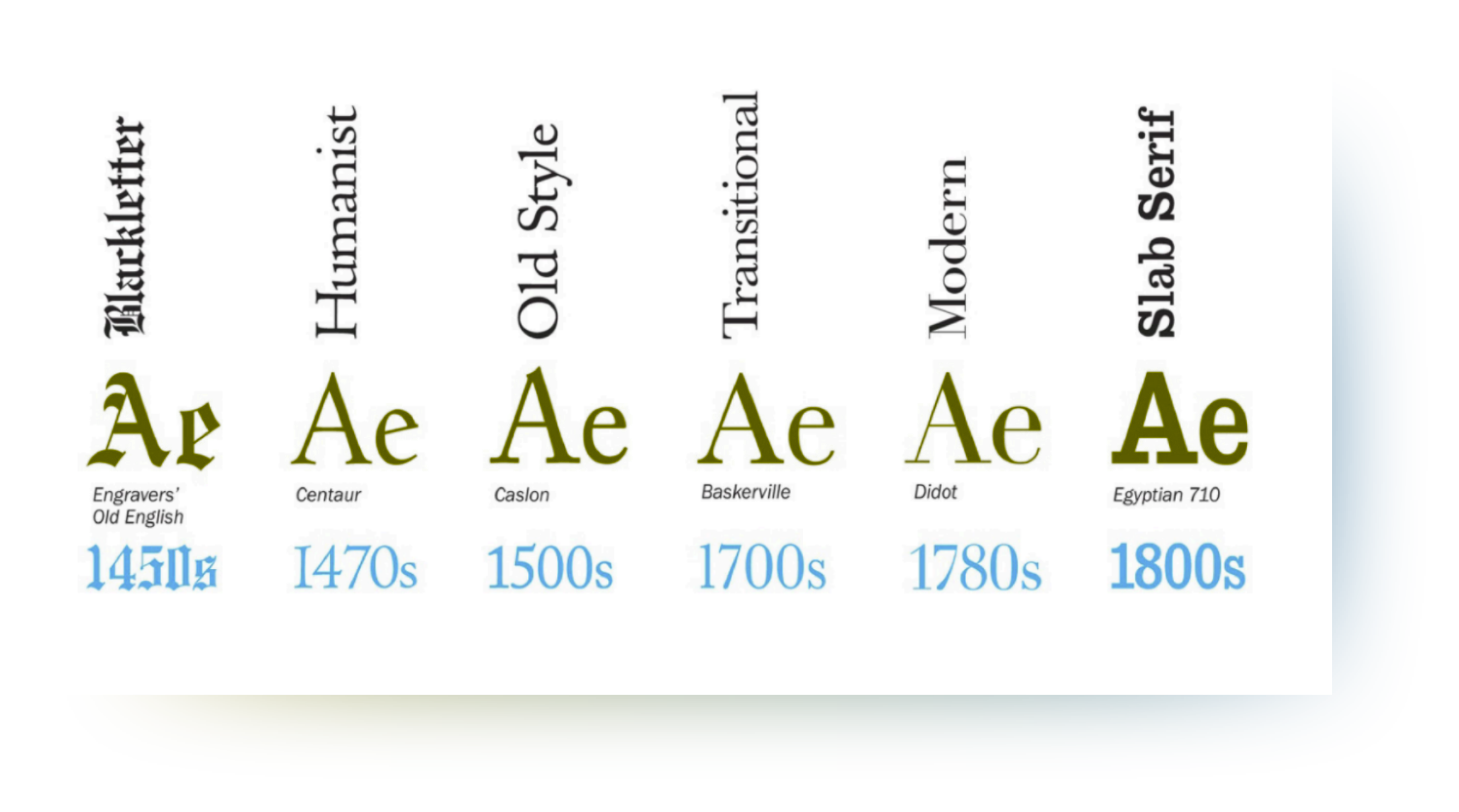
Figure 2. The development of serif typefaces, as illustrated in Why Fonts Matter (Hyndman, 2016, p. 24).
The beginning of the 20th century saw the proliferation of sans serif typefaces (Seddon, 2015), which had first appeared in an 1816 specimen book by typefounder William Caslon IV (Carter et al., 2015). Like their serif counterparts, the classification of sans serif typefaces has also evolved, from Caslon’s Grotesque faces to the Geometric style of the Bauhaus (see Figure 3) (Seddon, 2015; Hyndman, 2016).
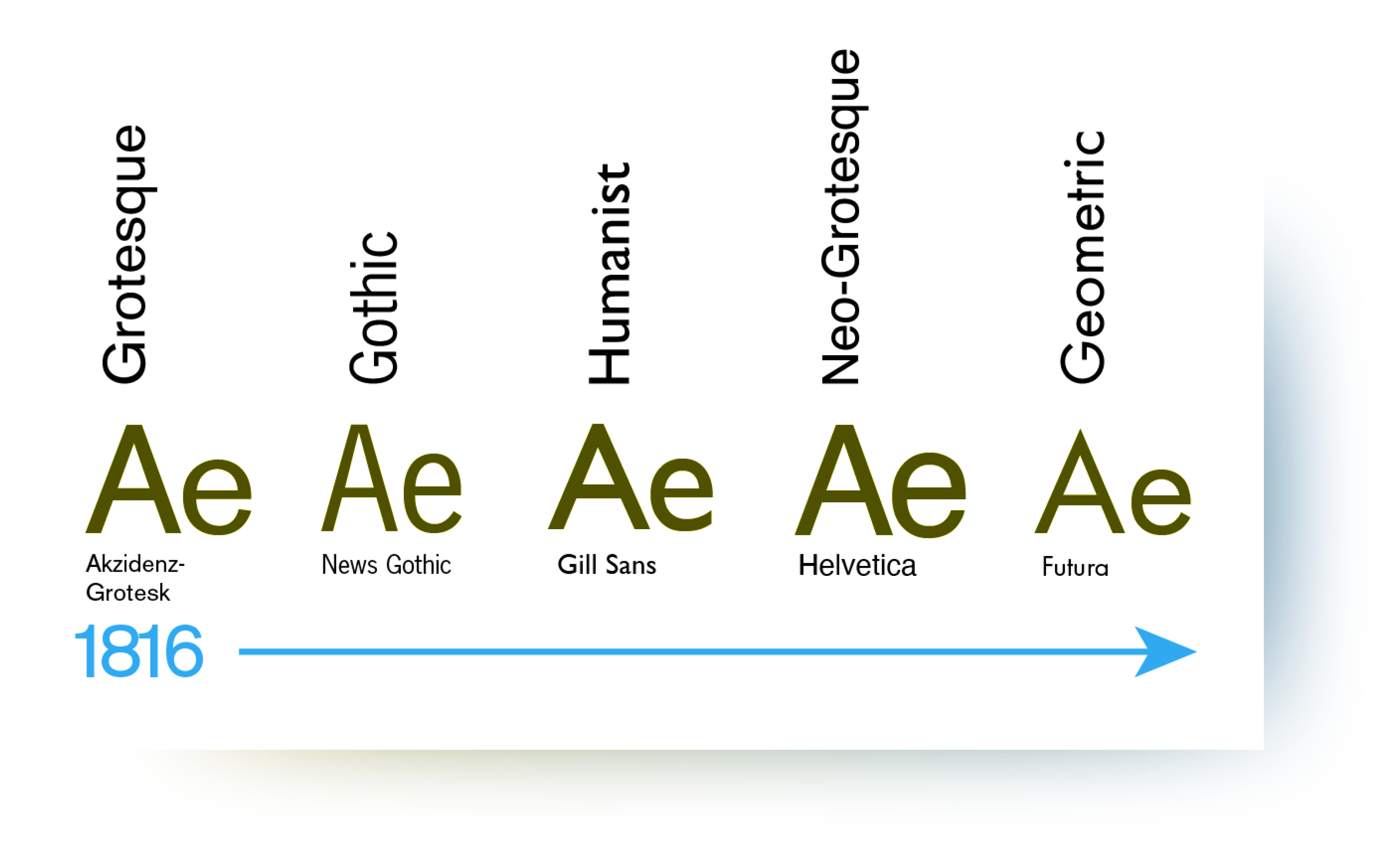
Figure 3.The development of sans serif typefaces, as classified by Tony Seddon in The Evolution of Typography and chronologically ordered by Sarah Hyndman in Why Fonts Matter.
Thought to be the logical derivations of the Modern serifs which predated them by the prominent 20th century typographer Jan Tschichold (Bedsole, 2018), these sans serif faces were seen as part of the “new typography” movement, whereby designers sought to rid printed language of clutter and decoration (i.e., serifs) (Luna, 2018), favouring utilitarian typefaces that would more clearly convey the message of the text they were meant to communicate. Tschichold (1995) stated that the goal of new typography was to “develop its visible form out of the functions of the text,” as it was “essential to give pure and direct expression to the contents of whatever is printed” (pp. 66-67). Only then, he argued, could designers “achieve a typography which expresses the spirit of modern man” (Tschichold, 1995, p. 67). Sans serif typefaces became a staple for the Modernist design of the 1950s, as they were still relatively neutral and new, “not [yet] steeped in the associations of history” (Hyndman, 2016, p. 52).
In her 1930 essay, “The Crystal Goblet: or Why Printing Should Be Invisible,” typographic scholar Beatrice Warde (2009) stated that “all good typography is modernist” and that good typography should be invisible, acting as an “unnoticed vehicle” for communicating ideas (pp. 40-41). Given that sans serif typefaces were considered both modern and relatively neutral at the time Warde’s essay was published, they perfectly exemplified the “good” typography she was describing, as they were able to transmit the text they were conveying clearly without reminding the reader of a bygone era. Warde’s essay is among the first to discuss the communicative abilities of typography and acts as a foundational piece of literature for the subsequent evolving scholarship on the rhetoric of typography. By further understanding the role of typography in the communication of written messages and its effects on human behaviour, designers can make typographic choices to better attract and influence their intended audiences.
DEFINITIONS
- Aesthetic Response – “Pleasurable feelings” prompted by arousal that are “thought to be a function of connotations” (Harrison & Morris, 1967).
- Arousal – “Becoming aware of something, someone, or some idea, such that physiological measures rise in response to its perception” (Koch, 2011). Arousal can be stimulated by certain patterns or designs (Berlyne, 1960, as cited in Harrison & Morris, 1967, pp. 120-121), can prompt an aesthetic response, and is one of the “key facets of typographic preference,” along with connotation, congruence, and legibility (Harrison & Morris, 1967, p. 121).
- Connotation – The association one makes between the content of a message and the means by which it is transmitted; “the derivation of meaning of the visual design by comparison and metaphor” (Koch, 2011, p. 114). In reference to typography, connotation is often associated with the physical characteristics of a typeface (e.g. classification, size, weight) and/or the past experiences of those interacting with the type.
- Modern – Contemporary; pertaining to current design trends.
- Perception – “Awareness, whether conscious or preconscious” (Koch, 2011, p. 11). Conscious here refers to a person being fully aware of the interaction they are experiencing, while preconscious refers to the activation of certain biophysical or neurological systems without a person’s awareness (Koch, 2011).
- Persona – “The physical and affective characteristics assigned to letterforms” (Turner, 2018, p. 92); culturally created and socially situated identities attributed to typefaces (Turner, 2018).
- Rhetoricity – The rhetorical or persuasive ability of typography; the ability of a typeface to influence the behaviour of those who view it.
- Typography – A means of visual communication that provides written language with a physical form. Typography can also be considered visual language in and of itself (Baines & Haslam, 2005).
LITERATURE REVIEW
COVERAGE OF THE LITERATURE REVIEW
This study examined the aesthetic response (i.e., preference) to typography as it relates to the “modern” persona, focusing primarily on the perspective of the layperson rather than that of designers. As such, it needed to draw on studies and practices from a wide range of disciplines, from linguistics and communications to graphic and interaction design. While there has been much research conducted into the readability and legibility of typography, there has been considerably less done on the language of typography and its meaning to those who engage with it within the field of design itself. This literature review focused on the scholarship of the latter kind and drew upon studies of typographic rhetoric produced both within and outside of the design field, as relevant to the study put forth herewith.
TYPOGRAPHY AS AN EXPRESSION OF TEXT
Jan Tschichold pioneered the new typography movement in the 1920s. In his 1928 book, Die Neue Typographie (The New Typography), Tschichold stated that “the essence of the New Typography is clarity” and its “first objective is to develop its visible form out of the functions of the text,” unlike the “old typography” which came before it (Tschichold, 1928, p. 66-67). He argued that the “decoration” of traditional, serif typefaces should be cast aside in favour of newer, sans serif typefaces which were able to more clearly express the contents of printed text (Tschichold, 1995). This idea of clarity is reinforced by Warde’s aforementioned essay, “The Crystal Goblet,” in which she described how typography should function solely as a transparent vehicle for communicating the ideas of a printed text.
TYPOGRAPHY IS CONNOTATIVE
While designers of the new typography movement sought to design typefaces that lacked the historical and cultural connotations of those which predated them, they maintained a certain consensus about the “idea that typefaces have distinct personas” and thus “can never be entirely free of rhetorical impact” (Brumberger, 2003, p. 207). Brumberger, author of the journal series “The Rhetoric of Typography,” made the case that “the new typography had a stronger rhetorical emphasis” because it was intended to be “purpose-driven” (Brumberger, 2003). The inherent rhetoricity of typography is implied by Tschichold himself, who argued that “different typefaces have different personas, and that the character of the type must match the character of the verbal text” (Brumberger, 2003, p. 207).
The idea that typefaces seemed to have inherent personas was intuitively accepted amongst designers, but it was not until the mid-20th century that quantitative research into the theory began to occur. Among the first contributions to this scholarship would be the experimental investigation of typeface connotation, conducted in 1964 by Tannenbaum et al. In this study, the researchers approached the connotative ability of typography from a semantic perspective, having three groups of people (typographic pros, semi-pros, and amateurs) rate four predetermined typefaces (two serifs and two sans serifs) using a set of semantic differential scales. Their findings suggested that there is a similarity in the judgements viewers make about typefaces and thus a degree of agreement in some of the basic elements of typographic language. They concluded that the characteristics of individual elements have inherent connotative associations, an onomatopoeia of sorts (Tannenbaum et al., 1964; Hyndman, 2016), that can be utilized as a means of communication between designers and their audiences.
Tannenbaum et al. (1964) used semantics, a linguistic study, to examine typefaces reinforced the idea that typography is intrinsically intertwined with language, not simply a conduit for written text. Baines & Haslam (2005) argued that by expressing features of oral language typically sacrificed to preserve the meaning of a text (e.g., accent, gender, age, volume, speed, rhythm, geography), typography can improve its description of language. Given the relationship between typography and language, Baines & Haslam (2005) made the case that the two be investigated alongside each other, rather than separately.
These aspects of language traditionally excluded from typographic design are also the aspects commonly used to describe the persona of a typeface, as Brumberger (2003) described in her study on the persona of typefaces and text. She hypothesized that “readers could ascribe persona to both the typeface and the text itself” based on their perception of it, informed by their prior experiences and the context of the type (Brumberger, 2003, p. 207). Her study confirmed that typefaces have distinct personas and that people consistently attribute particular personalities to text passages. Based on these findings, which confirm those of Tannenbaum et al. (1962), Brumberger (2003) concluded that “visual language is analogous to verbal language in carrying connotations” (p. 221) and that by understanding the connotations viewers ascribe to different typefaces, designers can be more mindful of the visual rhetoric of typography and make more effective decisions as they design. However, she pointed out that there is little consistency in how these personas are identified and argued that changes in typeface usage and preference over time could affect the personas readers ascribe to them (Brumberg, 2003). These limitations were not addressed in the research conducted within this paper, but should still be considered in future research.
The personas assigned to typefaces are determined by the individuals who interact with them and the cultural contexts in which they are utilized. In his defence of “bad” type, Nichols (2018) wrote that “typefaces are determined by the character of those who use and read them and the cultures in which they live” (p. 40), comparing type to a “Rorschach test for cultural beliefs” (p. 42). Like Warde (2009), Nichols (2018) discussed the idea of “good” (and “bad”) typography.
Where Warde (2009) described good typography as modern and transparent, Nichols (2018) presented the idea that type that reflects the values of society is considered “good.” Rather than a crystal goblet, Nichols (2018) proposed the idea of a mirrored one, suggesting that the “invisibility” for which researchers and designers once advocated is instead “a reflection of the cultural values of the majority [(e.g., modernity, masculinity, wealth)], while the brash insistence of a ‘bad’ type may reflect the same group’s cultural biases,” specifically against those belonging to social minorities (p. 43). If typefaces are a reflection of culture, and its characters or personas says as much about the reader as it does about the designer, Nichols (2018) argued that readers may be forced to identify with typefaces in a way that triggers a passionate or emotional response from them.
TYPOGRAPHY IS EVOCATIVE
Koch (2011) expanded upon the scholarship of typographic connotations by examining the emotional response of viewers to different typefaces. She argued that design is “visceral visual language,” driven by emotion (p. 5). According to Koch (2011), this “emotion negotiates vision,” thereby affecting viewers’ perceptions of typographic stimuli (p. 5). These perceptions are preconscious, meaning people “experience emotion about the [typographic] stimulus” they see “before they become consciously aware of the stimulus itself” (Koch, 2011, p. 5). To better understand how people react to designs, Koch studied subjects’ responses to different typographic designs and then compared their responses to pairs of typestyle designs so that she could map the connection between design and emotion. Through her study, Koch (2011) found that: (1) people responded to the typeface designs emotionally, (2) people agreed about which emotions they associated with each typeface, and (3) those emotions were associated with the formative design features of the typefaces. Koch’s results provide scientific backing for the long-held belief of designers that typography can have an emotional impact on those who view it. However, she also outlined limitations to her study that should be addressed in future scholarship, namely the inconsistency among type classification and characterization of physical attributes (e.g., size and weight) (Koch, 2011). These points highlighted by Koch remain an issue today, and as such, were also limitations of this paper’s study.
While Koch’s research investigated the emotional responses viewers can have towards typography, her writing centred primarily around the designer. Ferarri Carlevari and Hyndman, however, focused on the layperson, rather than the designer, in their respective works. Building off of Koch’s theory of evocative typographic design, Ferarri Carlevari (2015) looked to understand the impact that connotative values of typefaces may have in “creating or changing beliefs” of voters in the context of American presidential campaigns. He hypothesized that the connotative value of typefaces “may translate to a contextual emotional signification of the form of [said] typefaces” (p. 19) and found that the physical forms of letters did “shape how people connotatively perceive[d] the typefaces” (p. 37). Ferrari Carlevari (2015) noted, like Brumberger, that experience and the contexts in which people are used to seeing certain letter shapes may also affect viewers’ perceptions. Like Ferrari Carlevari, Hyndman focused on the emotional response typography can have on the average person. However, in her book, Why Fonts Matter, Hyndman (2016) went further, actively inviting the reader to “consider [their] emotional response to type” so that they can be consciously aware of the influence typography can have over them. This influence provides the basis for the rhetoricity of typography, but also poses an ethical dilemma to designers, as they have to navigate how to communicate to and motivate their audience without manipulating them (Koch, 2011).
AESTHETIC RESPONSE TO TYPOGRAPHY
Harrison & Morris (1967) argued that the connotations of typography can arouse an aesthetic response to the typographic stimulus, causing viewers to like or dislike the stimulus, and, by extension, the message it conveys. The idea of viewers experiencing an aesthetic response to a typographic stimulus reflects the perception of “good” typography put forth by Warde and Nichols and is the basis for the research question the study of this paper aimed to answer. Harrison & Morris (1967) also cautioned though, that designers be mindful of the “connotative congruence” between typefaces and the text they communicate, as they can either (a) reinforce the connotation of a text (as argued by Tschichold in 1991), (b) “provide new and independent connotations,” (c) offer little to no connotations (similar to Warde’s crystal goblet analogy), or (d) “introduce conflicting connotations” (p. 120). While the latter option may seem counterintuitive, it may be used in some instances by designers to achieve a rhetorical effect and force readers to engage with the text (Harrison & Morris, 1967; Nichols, 2018).
IMPLICATIONS OF TYPOGRAPHIC RHETORIC
Given the ethical dilemma designers face due to the rhetorical abilities of typography, research into the implications of this rhetoricity has become increasingly important. Typography underpins life in the modern Western world, with people being constantly bombarded by typographic messages (Baines & Haslam, 2005). Designers must consequently shift towards what Brumberger (2003) calls intellectual cognition so that they are able to consciously identify visual components of a design and understand their relationships not only to one another but also to the verbal rhetoric of the design. In doing so, designers will be able to create work that is more effective and memorable to their target audiences (Koch, 2011). Additionally, continuing research into the cultural connotations of typography will allow researchers to “engage with the subtle ways design contributes to issues of power and oppression through embedded and attributed meanings” (Turner, 2018, p. 96). Understanding the individual and cultural connotations of type and their impacts on readers and cultures remains an important focus for future scholarship on typographic rhetoric.
METHODOLOGY
To investigate whether the attribution of a persona to a typeface affects the aesthetic response viewers feel towards that typeface, an online survey was conducted. The survey looked specifically at the “modern” persona as it related to the typographic preference of viewers born between 1998 and 2002, and consisted of two sections (see Appendix B). The first section asked participants a series of questions to better understand their backgrounds (age, gender, nationality, prior knowledge of typography), as their perception may be influenced by their identity and past experiences. The second part of the survey asked participants to respond to ten (10) typeface samples, rating their perceived modernity of each sample as well as their preference for it. Although participants of all ages were able to complete the survey (which 93 did), only the responses of those born between 1998 and 2002 (of which there were 66) were considered, as the aim of this study was, in part, to determine whether those born around the turn of the 21st century would: (1) consider typefaces contemporaneous to their lives more modern, and (2) prefer those typefaces with which they are likely more familiar, given their popularity during their lifetimes.
The typefaces included in this study were chosen based on three criteria: (1) they are considered typographically significant (as deemed by Seddon in The Evolution of Typography), (2) they are among the most commonly featured on the website Fonts In Use (www.fontsinuse.com), a public typographic archive/database, and (3) they are considered emblematic of a decade of the past century (as determined by analyzing samples featuring typefaces included in The Evolution of Typography that have been uploaded to the Fonts In Use website and then comparing them against each other, using the four physical characteristics outlined by Koch’s study, to select a typeface representative of those popular within a given decade). Based on these criteria (see Appendix A for full selection criteria), the ten (10) typefaces chosen for inclusion in this study, along with their type classification, year of design, and the decade they represent, are shown in Table 1.
| Typeface | Classification | Year Designed | Decade Represented |
| Cheltenham | Old Style Serif | 1896 | 1920s |
| Kabel | Geometric Sans | 1927-1929 | 1930s |
| Futura | Geometric Sans | 1927-1930 | 1940s |
| Akzidenz-Grotesk | Grotesque Sans | 1898 | 1950s |
| News Gothic | Gothic Sans | 1908 | 1960s |
| ITC Avant Garde Gothic | Geometric Sans | 1970 | 1970s |
| Univers | Neo-Grotesque Sans | 1957 | 1980s |
| Gill Sans | Humanist Sans | 1928-1930 | 1990s |
| Helvetica | Neo-Grotesque Sans | 1957 | 2000s |
| Gotham | Geometric Sans | 2000 | 2010s |
Table 1.The ten (10) typefaces chosen for the inclusion in this study
For this study, the “regular” style of each typeface (e.g., Gill Sans Regular) was presented at a size of 30 points to minimize the number of physical characteristic variables that could otherwise contribute to the perception and preference of participants. However, as Koch (2011) noted in her study of emotional response to typographic design, there is not yet a standardization of typeface sizes and weights. Thus the samples shown within this study may not all appear to be a consistent size to viewers. It is consequently uncertain whether subtle differences in the physical characteristics of the typeface samples affected the responses participants had towards them.
The survey was made publicly available online for one week. As such, the participants of the survey were part of a voluntary response sample and thus were entirely representative of the 1998-2002 age demographic. This sampling method was used to select participants due to both the timeframe available within which to complete the study and physical distancing measures put into place during the course of the study.
RESULTS AND DISCUSSION
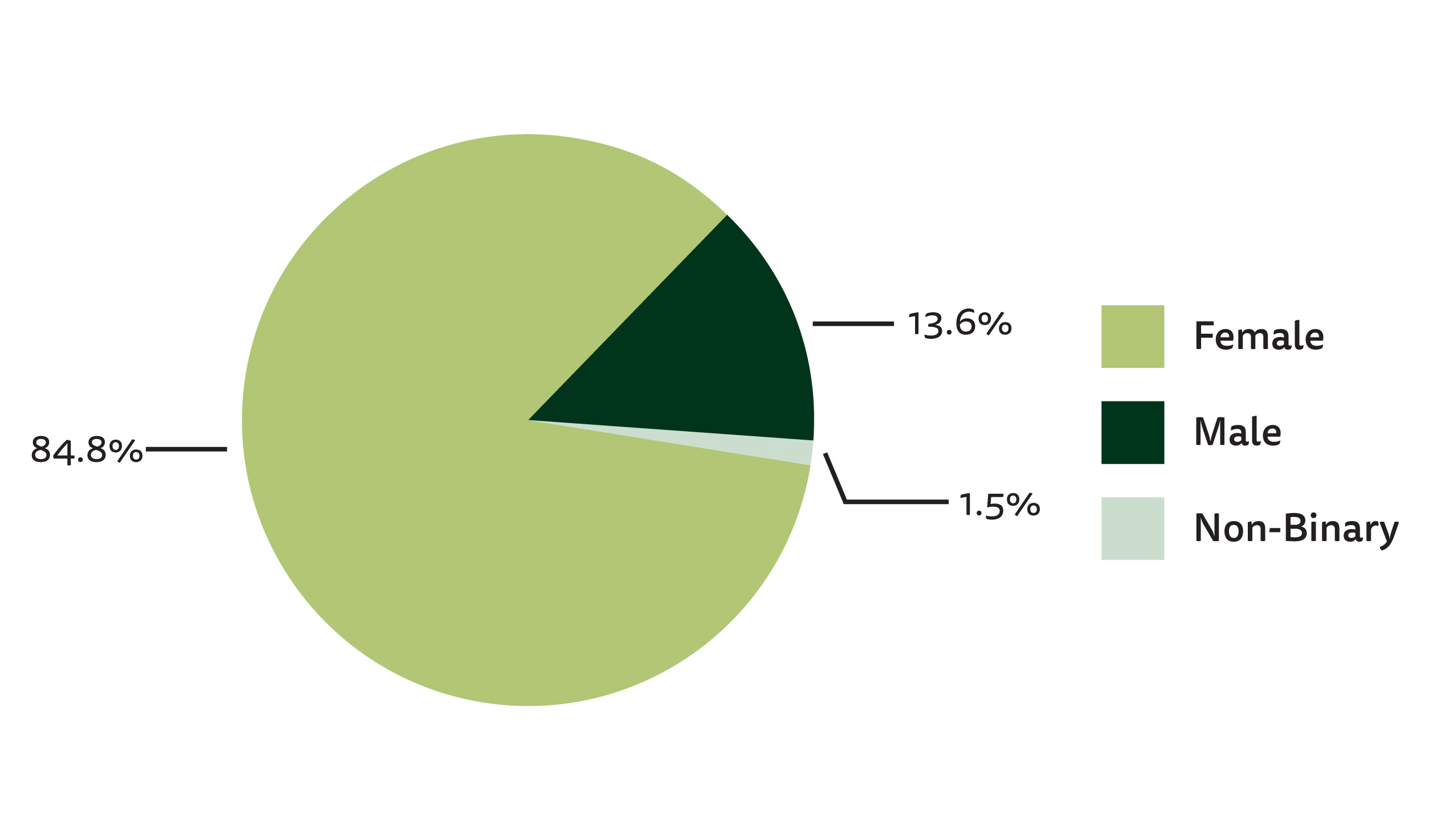
Of the 93 survey participants, 66 were born between 1998 and 2002, broken down by year as follows: 27 were born in 1998 (40.9%), 11 in 1999 (16.7%), 16 in 2000 (24.2%), 2 in 2001 (3%), and 10 in 2002 (15.2%). 56 of these 66 participants identified as female (84.8%), 9 as male (13.6%), and 1 as non-binary (1.5%). 57 of the participants (86.4%) were born and raised in North America, while 8 (12.1%) were raised but not born in North America (2 were born in Europe, 6 in Asia), and 1 (1.5%) was neither born nor raised in North America (born and raised in the Philippines). 35 participants (53%) rated themselves as having minimal prior knowledge of typography (21 rated themselves a 1 on a scale from 1-5; 14 rated themselves a 2), while 31 (47%) rated themselves as having moderate prior knowledge (22 rated themselves as a 3; 9 rated themselves as a 4). No participants in this age demographic rated themselves as having expert knowledge (a 5 on the scale used). See Appendix B for responses from all 93 survey participants.
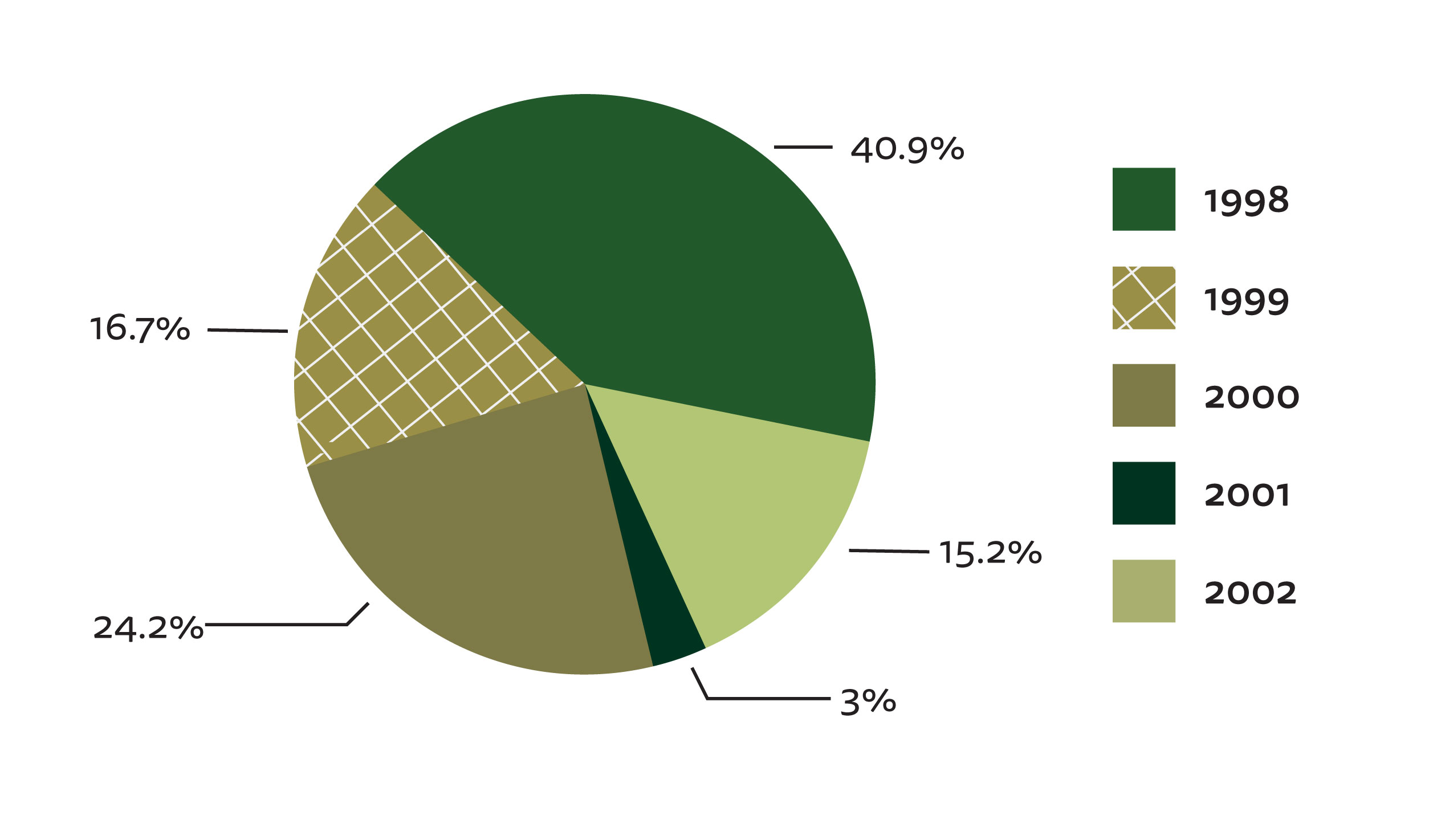
Figure 4a.The year of birth of survey participants. |
|
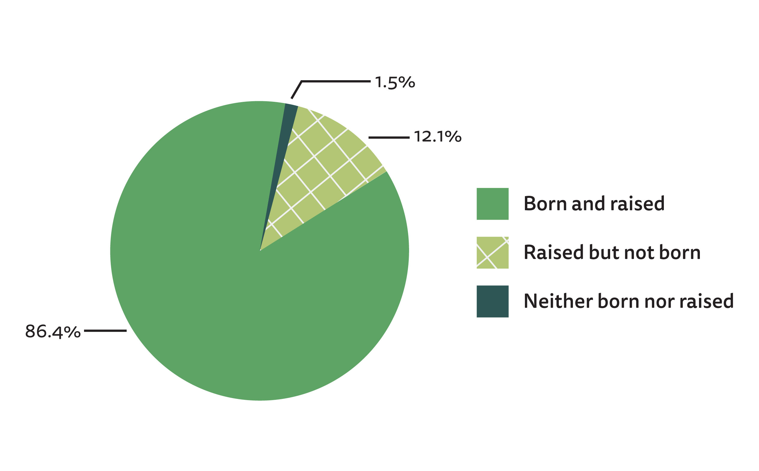
Figure 4c.The nationality of survey participants. |
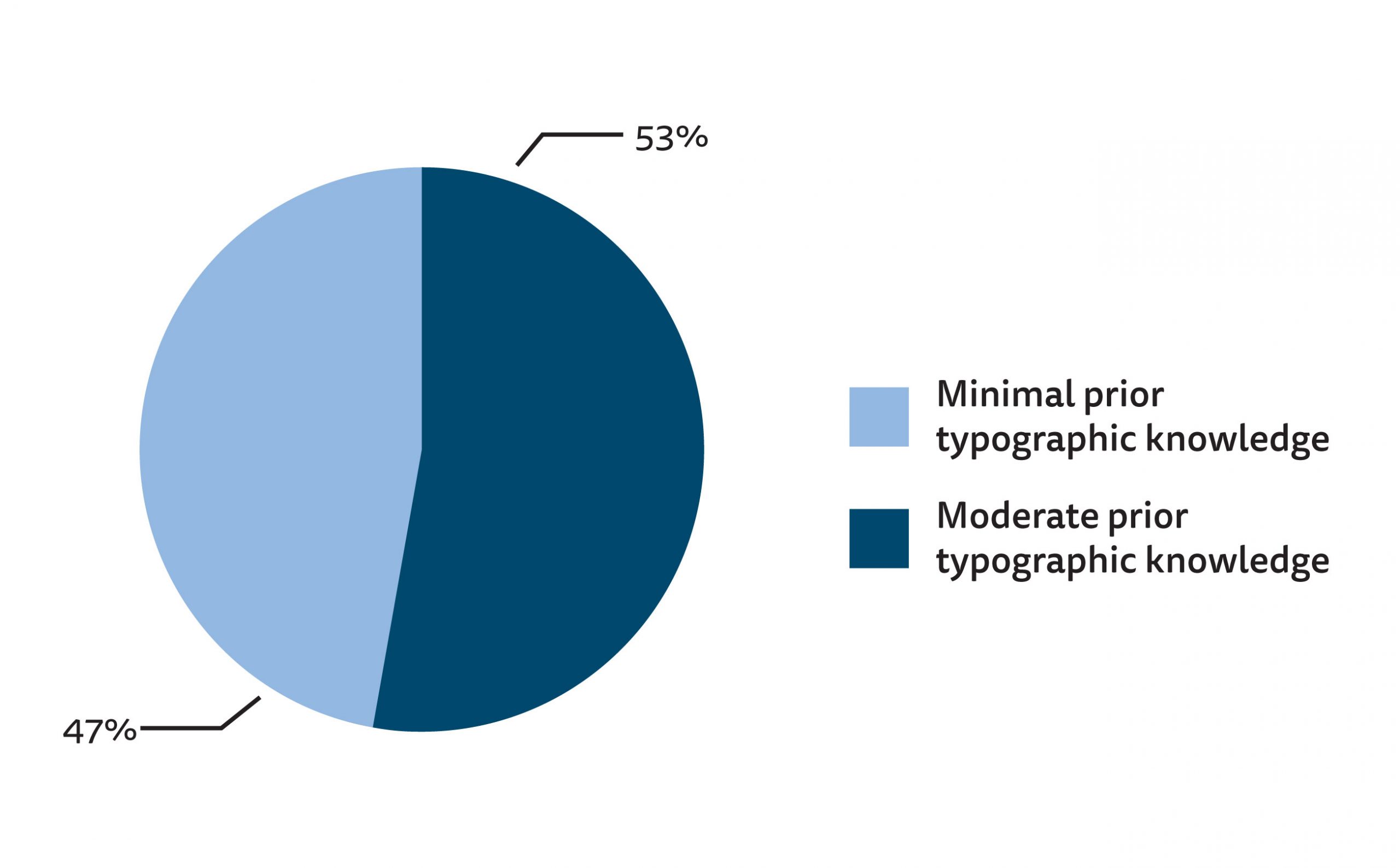
Figure 4d.The prior typographic knowledge of survey participants. |
The results of the second section of the survey, which asked participants to respond to a series of ten (10) typeface samples, are graphed in Figures 5a and 5b (see Appendix B for full results). Gotham, the typeface designed most recently and chosen to represent the 2010s, was perceived as being the most modern sample and was the most preferred typeface. Cheltenham, the oldest typeface and the only serif face included in the survey, was perhaps unsurprisingly rated the least modern of the ten samples. However, it was rated among the most preferred typeface samples, ranking fourth only behind Gotham, Futura, and ITC Avant Garde Gothic. As Cheltenham was the only serif typeface included in this survey, it can likely be considered an outlier in this dataset. Akzidenz-Grotesk, which was designed only two years after Cheltenham, is part of the Grotesque Sans classification, making it the oldest sans serif face and style included in the survey, was rated the least preferred typeface sample by participants born between 1998 and 2002.
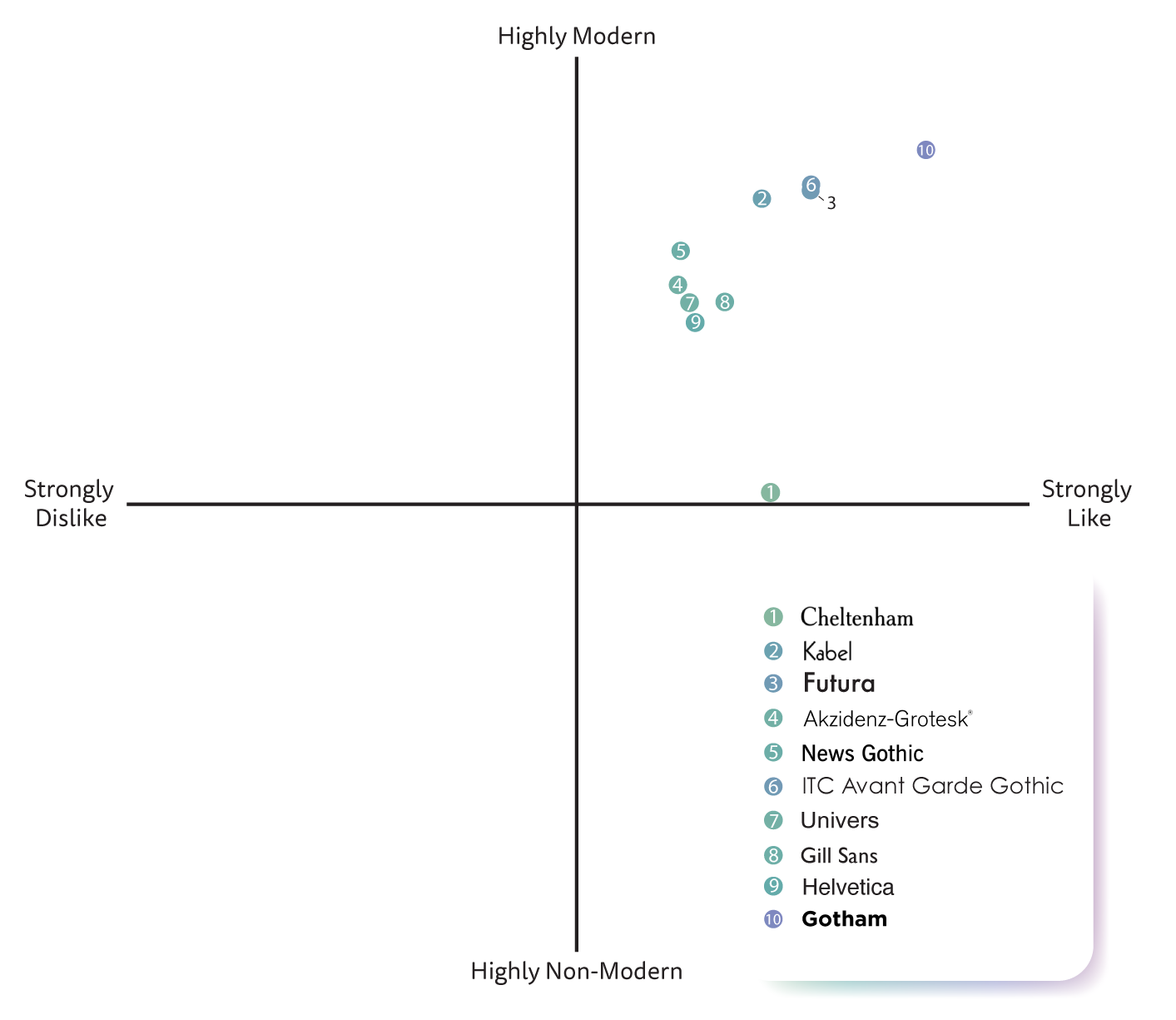
Figure 5a.The typeface preferences of those born between 1998-2002 as it relates to their perceived modernity of those typefaces.
The results of this study suggested that while there is some correlation between the perceived modernity of a typeface and viewers’ preference of it, a typeface being perceived as having a more modern persona does not necessarily mean it will be more strongly preferred than typefaces which are perceived to be less modern. Interestingly, the four typefaces perceived to be the most modern (Gotham, ITC Avant Garde Gothic, Futura, and Kabel, respectively) were all Geometric Sans faces, the newest classification of sans serif typefaces, typified by the Bauhaus style of design of which Tschichold (1995) was an advocate. Perhaps because the geometric style of typography is culturally regarded as more modern and it is therefore considered to be “good” that individuals perceived these typefaces to be more modern and more preferable. The use of sans serif faces for digital purposes, which may be inherently thought of as modern, may also have influenced participants’ perceptions. Additionally, it is possible that participants ascribed alternate personas to the typeface samples shown to them and that it was these other personas that affected their preference for each sample. Future studies into typographic preference in relation to the “modern” persona may include a larger range and number of typeface samples to see if the same results hold true in a broader context and may devise a way to better isolate the “modern” persona from others that may be ascribed to a typeface.
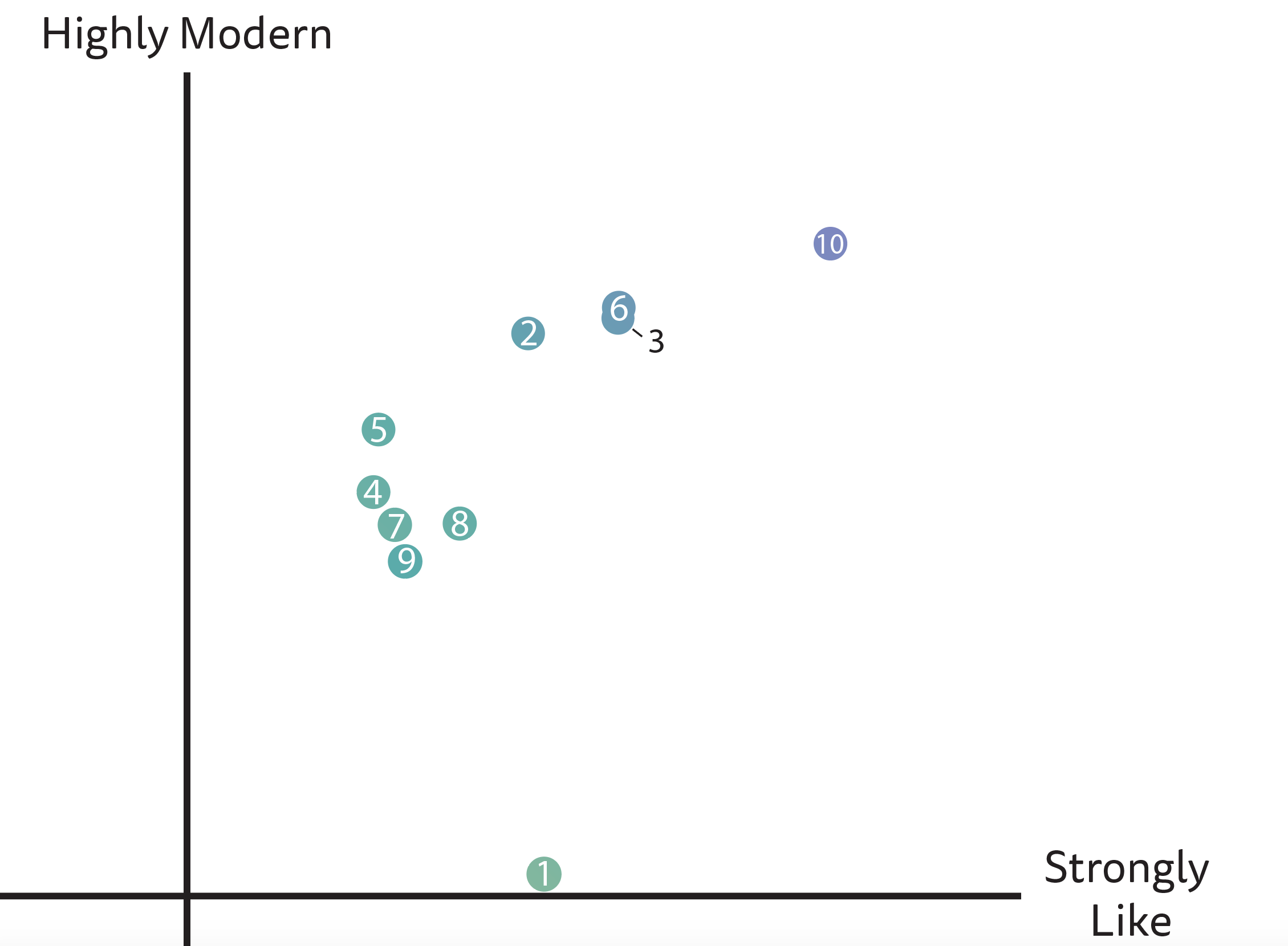
Figure 5b. A magnified view of the results shown in Figure 5a.
Further, the results of this survey showed that while the newest typeface, Gotham (designed in 2000), and the oldest typeface, Cheltenham (designed in 1896), were rated the most and least modern, respectively, there was little other correlation between the perceived modernity of a typeface and its actual age. Helvetica, the typeface chosen to represent the 2000s, was rated among the least modern and least preferred, despite its prevalence during the participants’ lifetimes. As such, while it is possible to conclude that those born between 1998 and 2002 demonstrate some preference for typefaces that appear modern, they do not necessarily prefer the typefaces that are contemporaneous to their lives.
LIMITATIONS
Given the means by which this survey was distributed (i.e., via social media), those who responded to it comprised a voluntary response sample, and thus their responses may not have been representative of the entire target demographic of young adults born between 1998 and 2002. As well, it is likely that the majority of participants who rated themselves as having a moderate amount of prior typographic knowledge (either a 3 or 4 on a scale from 1-5) were students from the Graphic Communications Management program at Ryerson University and would have taken a mandatory second-year introduction to typography course. It may be the case that the teachings of said course influenced their perspectives of what a “modern” typeface looks like. It is suggested that a more diverse range of participants from the target demographic be included in further studies of the relationship between typeface preference and persona. Additionally, it is possible that more suitable, alternative means of selecting typefaces for inclusion in future studies could merit different responses from participants. If more serif typefaces, for example, had been included, perhaps a more distinct contrast between the two type classifications would have been documented.
IMPLICATIONS
Should the results of this study hold true for future studies examining typographic preference as a function of persona, designers could utilize this knowledge to reinforce connotative meanings of text and thereby better reach and motivate young adults by incorporating geometric sans serif typefaces to either relay a message of modernity or arouse an aesthetic response in their target demographic. There is not enough data available from this survey to determine what those in the 1998-2002 cohort consider “bad” typography, but future research could be done to do so. This understanding of what “bad” typography means to those within this age demographic could allow designers to utilize this type as a rhetorical tool to force their desired audience to engage with the message they aim to communicate.
CONCLUSION
The primary aim of this research was to determine whether there is a correlation between the perceived modernity of a typeface and the viewer’s preference for it. Based on the study conducted to examine this potential relationship, it can be concluded that there is some correlation between the perceived modernity of Geometric Sans typefaces specifically and the preference of those born between 1998 and 2002, but that this correlation may not be consistent among different type classifications. If future studies into this subject include a wider array of typographic samples and have a more diverse set of participants, this question of correlation may be better answered. Should these results be reinforced by future research, designers could use these findings to inform their design work to more effectively communicate with and motivate their target audiences, whether by reinforcing the connotation of their texts through typography or by contrasting them.
While they were chosen in the 1950s for their lack of historical associations, it is perhaps because of their ties to the Modernist design movement that sans serif typefaces, specifically those of the Geometric classification, remain favoured by designers for today’s “modern” designs. When considered in connection to the present values of Western society, it is perhaps unsurprising then that participants in this study exhibited a preference for the four Geometric sans serif typefaces included in the survey and perceived these typefaces as having more modern personas. It would be interesting to determine whether these opinions will evolve as typography, technology, and cultural values do or whether future studies will find that designers and laypeople alike will continue to associate sans serif typefaces (specifically Geometric ones) with the Modernist movement and thus, they will always connote modernity to those who interact with them.
Typographic rhetoric is becoming increasingly central to typographic and design scholarship as it has evolved into a more significant aspect of the design practice. This study is but one contribution to the literature on this topic. However, it will hopefully serve to aid future research into the aesthetic response to type and typeface personas so that designers may target messages towards their intended audiences and that readers may become more visually and typographically literate.
REFERENCES
Baines, P., & Haslam, A. (2005). Type & Typography. New York: Watson-Guptill. Bedsole, D. (2018). Jan Tschichold’s Renunciation of Die Neue Typographie: The Anatomy and Ethics of a Typographical Reversal. In C. S. Wyatt, & D. N. DeVoss, Type Matters (pp. 211- 228). Anderson: Parlor Press.
Brumberger, E. (2003). The Rhetoric of Typography: The Persona of Typeface and Text. Technical Communication, 206-223.
Carter, R., Meggs, P. B., Day, B., Maxa, S., & Sanders, M. (2015). Typographic Design: Form and Communication. Hoboken: John Wiley & Sons, Incorporated.
Ferarri Carlevari, M. (2015). Typeface Connotation. Ann Arbor: ProQuest LLC. Harrison, R., & Morris, C. D. (1967). Communication Theory and Typographic Research. Journal of Typographic Research, 115-124.
Hyndman, S. (2016). Why Fonts Matter. London: Virgin Books.
Koch, B. E. (2011). Human emotion response to typographic design. Ann Arbor: ProQuest LLC. Luna, P. (2018). Typography: A Very Short Introduction. Oxford: Oxford University Press. Nichols, G. W. (2018). Type Reveals Culture: A Defense of “Bad” Type. In C. S. Wyatt, & D. N. DeVoss, Type Matters (pp. 33-62). Anderson: Parlor Press.
Schoenholz, M., & Kolko, J. (2009). Designing in the face of change: the elusive push toward emotionally resonate experiences. New Review of Hypermedia and Multimedia, 211-220. Seddon, T. (2015). The evolution of type: a graphic guide to 100 landmark typefaces. Richmond Hill: Firefly Books Ltd.
Tannenbaum, P. H., Jacobson, H. K., & Norris, E. L. (1964). An Experimental Investigation of Typeface Connotations. Journalism Quarterly, 65-73.
Tschichold, J. (1995). The New Typography: A Handbook for Modern Designers. Berkeley: University of California Press Ltd.
Turner, H. N. (2018). The Development of Typeface Personas and the Consequences of Perceived Identites. In C. S. Wyatt, & D. N. DeVoss, Type Matters (pp. 89-108). Anderson: Parlor Press.
Warde, B. (2009). The Crystal Goblet: or Why Printing Should Be Invisble. In H. Armstrong, Graphic Design Theory : Readings From the Field (pp. 39-43). New York: Princeton Architectural Press.
APPENDIX A – TYPEFACE SELECTION FOR SURVEY
APPENDIX B – SURVEY QUESTIONS AND RESPONSES
![]()