
03
THE VALUE OF DYNAMIC
BRANDING IN THE MODERN
MARKETING LANDSCAPE
LIZ THAN
ABSTRACT
Branding, broadly defined as the promotion of a company via an identifiable design, plays a vital role in marketing. The world, however, is fast-moving. Although brands must ensure consistency in the communication of brand values and priorities, they are no longer defined by a single set of typefaces and colours. In van Nes’ book Dynamic Identities: How to Create a Living Brand (2012), she explains that the Internet, social media, and technological revolutions have allowed brands to behave like “living organisms.” As a result, van Nes encourages brands to constantly adapt to their environment(s) in order to survive in the modern marketplace. In other words, consumer behaviours, preferences, and values have changed, and the ways in which brands interact with their customers has diversified. Most interactions today take place online, which gives brands the opportunity to adopt a variable brand identity and create an emotional connection with diverse populations of consumers. This form of visual identity reflects a company’s existing values, but its organic nature allows it to evolve and adapt to changing social environments. This paper explored the history of visual branding identities, defined the concept of dynamic branding in contrast to static branding, and analyzed the viability of adopting dynamism. Case studies were presented to compare dynamic brands to static brands. To limit the scope, this paper examined examples in three service-related industries: tourism (City of Toronto vs. City of Melbourne), educational services (Emily Carr University of Art and Design vs. Ontario College of Art and Design University), and web services (Yahoo vs. Google). The information provided assists readers in understanding how dynamic branding can help brands effectively engage with today’s consumers. Ultimately, as the world changes, so should design.
INTRODUCTION
For centuries, humans have needed and desired social identification as a way to communicate ownership. The branding of livestock, for example, was born out of necessity and allowed farmers to mark their property as early as 2700 BC (Khan & Mufti, 2007, p. 76). Branding, broadly defined as the promotion of a company, organization, or institution via an identifiable design, has since evolved and continues to play a vital role in recognition as well as marketing. The beginning of the digital era and the introduction of complex technologies have transformed the world, and nowadays, markets have become increasingly saturated. As a result, consumers are exposed to more information and brand choices than ever before. Whether people notice it or not, advertisements are all around us and they are fighting for our attention.
Several influential changes have occurred following the rise of modern technology—one of them being that humanity is producing vastly larger amounts of data (Airey, 2010, p. 5). According to a study conducted by an independent research organization based in Norway called SINTEF (2013), “in 2013, a full 90 percent of the data in the world had been generated during the previous two years.” In other words, as more and more information is visually branded and presented to consumers, logos become strikingly similar to one another (Airey, 2010, p. 5). Consequently, visual differentiation from competitors has become an increasingly complex challenge for designers. Moreover, Grzesiak (2015) found that younger audiences, acknowledged as representatives of Generations Y and Z, have different expectations and attitudes from their parents and grandparents: “they require a message to be as interactive as possible, as well as personalized, and they have much less trust in traditional forms of advertising” (p. 89) like television, radio, and press. Consumer behaviours, preferences, and values have changed, so brands must diversify how they interact with their customers in response. As such, there is a clear need for branding design to adapt to the modern context. Leaders in the graphic design community, such as those in the International Council of Design (Ico-D), recognized this as an issue and endorsed an important message: in the new world of technology, design must change. Brands can no longer be defined by a single set of typefaces and colours (Murdock, 2016, p. 1).
Dynamic branding, a concept characterized by flexibility and variability, is one of the ways in which brands can differentiate from competitors while achieving greater customer perception and loyalty. In van Nes’ book Dynamic Identities: How to Create a Living Brand (2012), she expanded on the methodology behind this concept:
Fifty years ago, a brand was just a single mark used for brand recognition, which set it apart from the rest. Now a brand has become a platform where like-minded people come together, and an experience that creates emotional attachment. Brands need to constantly adapt to their […] environment in order to survive. Internet, social media and technical revolutions have given brands the opportunity to behave like living organisms (p. 6).
Essentially, a brand changes with every interaction; it is a living, breathing interaction between consumers and the world (Stratten & Stratten, 2017, p. 1). The organic nature of a dynamic brand identity allows a company to interact with its consumers in new ways while ensuring consistency in the communication of its values and priorities. Companies can use the flexibility of dynamic branding to create meaningful connections to consumers. Essentially, the manipulation of variable elements (i.e., logo, colour, typography, graphic elements, imagery and language) creates opportunities for personalization and customization—a growing trend that utilizes modern society’s wealth of data to bring companies and their customers closer together (Ferrara, 2014; Grzesiak, 2015; van Nes, 2012). This form of visual identity reflects the company’s existing values, but its organic nature allows it to adapt to changing environments—the brand, therefore, becomes a living organism.
Overall, given the shifts in consumer mentalities, this study sought to explore the value of dynamic branding in the modern marketing landscape. The research revealed how changing consumer behaviour impacts the evolution of traditional branding strategies and whether dynamic branding is a viable concept to adopt in contrast to said traditional methods. Real-life examples of brands that use dynamism were evaluated and contrasted to competitor brands that opted for static brand identities. Ultimately, dynamic or flexible branding is a relatively new concept in the design world that aims to redefine brand consistency for a modern context. The rise of dynamic branding as an area of study is representative of the requirement for design to evolve to meet changing needs.
For the purpose of this paper, “branding” refers to visual identity design, or the graphic or typographic mark (i.e., logo) that is used to represent an organization, and the “modern marketing landscape” refers to the evolution of branding from the beginning of the twenty-first century onwards—that is, the start of the digital era. It is important to note that the intention of this paper was not to prove whether one form of branding is better than the other but, rather, to highlight the benefits and implications of dynamism. Ultimately, the objective was to develop a pluralistic view of visual identity design and inform readers of a broader design landscape.
LITERATURE REVIEW
A variety of literary sources were consulted to develop a greater understanding of the history, importance and components of branding, as well as the difference between static and dynamic brand identities. A review of the literature showed a lack of empirical work in the area of flexible identities, and that the concept of dynamic branding as a whole is relatively unexplored. Nonetheless, a few studies have laid the foundation for this new subject field.
VISUAL IDENTITY SYSTEMS: A FUNDAMENTAL PART OF BRANDING
The History of Branding and the Rise of TechnologyBorn out of the second wave of the industrial revolution (ca. 1870–1914), the graphic design profession undertook the challenge of helping commercial organizations find ways to visually communicate their personality and their reason for existence to consumers (Eskilson, 2012; Jury, 2012; Murdock, 2016). During the twentieth century, visual identity design, which plays a vital role in branding, followed the industrial model of production. Citing Wally Olins’ (1978) work on corporate identity, Murdock (2016) explained that visual branding overwhelmingly depended on “the creation of a set of discrete yet wholly interdependent graphic devices [and] the production of a comprehensive manual that served to educate and instruct the client organization on how to use the graphic devices to project a carefully-crafted, consistent corporate image” (p. 1). In other words, the industrial era was characterized by a finite set of static elements with predefined guidelines (Felsing, 2010). However, in the post-industrial economy of the developed world, the traditional methods of branding have since changed.
Grzesiak (2015) noted that the contemporary world is experiencing decreasing effectiveness of traditional forms of brand communication through television, press, radio, and out-of-home (OOH) advertising (p. 89). Essentially, consumers are “embracing new forms of connection, communication and commerce” (Moving Brands, 2010, p. 14) as well as demanding interactivity. Social media, for instance, now “presents an advantageous platform for engaging consumers into [brands] and for building stronger and more meaningful [connections] with them” (Tuškej & Podnar, 2018, p. 4). Overall, as Grzesiak (2015) noted, technological advancements give “much greater opportunities to establish personal relationships with customers, which will be of great importance when … Generation Z, depending on fully personalized messages, will dominate the market” (p. 98). In today’s technology-driven world, it is essential for brands to adjust their visual identities to meet modern needs and to pursue new ways to connect with their target audiences (Brasel & Hagtvedt, 2016; Cian et al., 2014; van Nes, 2012).
THE GOALS AND IMPORTANCE OF BRANDING IN THE MODERN CONTEXT
Kall (2015) summarized the goals of branding as follows: (1) to provide information about the brand’s usefulness, (2) to develop a strong brand image by building awareness and (3) to stimulate consumer involvement in a relationship with the brand. With so many brands in the marketplace, marketers strive to find different, innovative means to engage consumers with their brands (Cian et al., 2014). Airey (2010) asserted that branding is important because “people often choose products [and services] based on their perceived value rather than their actual value” (p. 6). With the right branding strategies and materials, businesses can improve the perceived value of their offerings, establish valuable relationships with consumers, and nurture said relationships into lifelong bonds. Stratten & Stratten (2017) recognized that creating loyalty “by focusing on ways to create comfort, high perceived value, convenience and congruence for … customers … is the best defense against fast-paced change in the age of disruption” (p. 283). Furthermore, consumer-brand identification, defined as “the extent to which the consumer sees his or her own self-image as overlapping with the brand’s image” (Tuškej & Podnar, 2018, p. 5), is also vital for brands to sustain long-term connections with their customers. Establishing parallels between brands and consumers develop relationships that can represent significant competitive advantages in saturated markets.
COMPONENTS OF VISUAL IDENTITY
As identified by van Nes (2012), reiterated by Jochum (2013), there are six basic components of visual identity: logo, colour, typography, graphic elements, imagery, and language – see Table 1.
Table 1.Definitions for the Six Components of a Visual Identity in a Branding Context
| Component | Definition |
| Logo | The sign, symbol or trademark that is acknowledged as the center of the visual identity |
| Colour | The palette used to strategically ensure brand recognisability (also has the power of persuasion) |
| Typography | The palette used to strategically ensure brand recognisability (also has the power of persuasion) |
| Graphic Elements | Forms, shapes, lines and/or pictographs |
| Imagery | The pictures or photographs that communicate a brand’s message, values and stories by simulating a mood or feeling |
| Language | Unique naming of services, products or product series (ex. Apple’s “i” sub-brand line) |
Note. Definitions paraphrased from Jochum (2013, 14-15).
According to van Nes (2012), each of these components work together to build and sharpen the identity of a brand and that “within these limitations, [there is] room for more freedom” (p. 7). In short, as shown in Figure 1, the six components of an identity and their connections create the visual identity system.
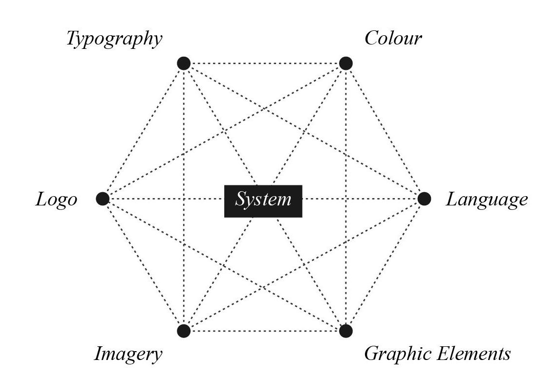
Figure 1. A recreation of van Nes’ (2012, p. 29) diagram outlining the six components of a visual design system and their connections to each other.
STATIC BRANDING IDENTITY DESIGN
Static visual identity design was “born out of and embraces the processes of the industrial revolution [and] maximizes the number of constants by fixing as many [variables] as possible” (Murdock, 2016, p. 51, 53). By eliminating variability in the visual identity system, a fixed identity is created—the supporting idea being that such a method creates a unified, strategic identity that appears consistent through a variety of format applications as well as through time. Strict brand guidelines ensure visual consistency: everything that a brand puts out looks the same and has an “unchangeable stamp” (Jochum, 2013, p. 8).

Figure 2. Examples of notable companies with static, or fixed, brand identities (Starbucks, 2011; Amazon, 2000; IBM, 1972; Microsoft, 2012; Twitter, 2012; Nintendo, 1983).
In reference to the six components of a visual identity, the principle of static branding design states that each component stays the same. Delahunty (2013) recognized that brand design, especially logos, should be timeless and “look [as] fresh today as they did twenty to thirty years ago” (p. 4). As noted by Lelis (2019), however, “recent studies show that much is happening within the rich field of brand design, hence opening opportunities for new questions and diverse research avenues” (p. 449). Market saturation, in particular, has increased the need to explore different modes of differentiation in visual identity design.
DYNAMIC BRANDING IDENTITY DESIGN
Delahunty (2013) explained that “as human beings living in today’s technological world our identity is constantly changing to adapt to our environment” (p. 1) and introduced the idea that a company, which is an organic entity, should then also adapt its identity to these elements of change. Brands must recognize that change plays a vital part in their business realities and that they have to behave as “living organisms” (van Nes, 2012, p. 6) as well as platforms for people to develop emotional attachments. Rather than approaching visual identity with an instruction manual that outlines a finite set of static elements, the dynamic approach “understands visual identity to be a flexible, living system generated by an infinitely updatable database of elements with an algorithm that establishes constants and variables” (Murdock, 2016, p. 2). Dynamic branding, therefore, allows brands to “fit within different time-bound media, and … to keep in line with market expectations” (Lelis, 2019, p. 446). Hewitt (2008) observed that “in a world where some brands are seen on screens more than in print, flexible identity is a logical development.”
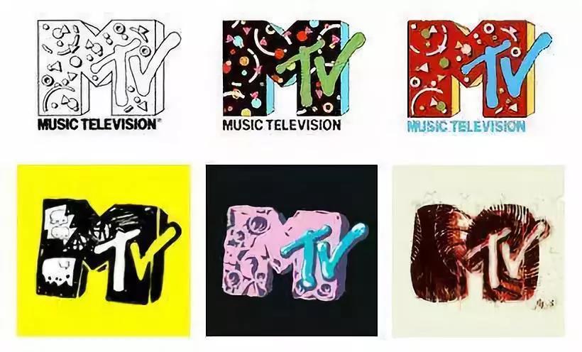
Figure 3. Example of a prominent company with a dynamic brand identity: MTV (MTV, 1980).
Although dynamic visual identities embrace variability, consistency is preserved. In fact, “the dynamic aspect of brand identity entails being flexible to contextual changes while preserving a stable sense of self” (da Silveira et al., 2013, p. 35). Therefore, consumer-brand recognition is retained. Furthermore, there are several managerial implications that can be directly implemented, as well as studies that suggest the viability of dynamic branding. Tuškej & Podnar (2018), for instance, found that “consumer’s [sic] identification with a corporate brand is stronger when the brand is perceived as more prestigious and humanlike” (p. 14) and urged brands to show their human character. In addition, Cian et al. (2014) observed that “a more dynamic logo can be more engaging and can enhance consumer attitudes” (p. 195).
Overall, “to be enduring, [a] brand identity [should] be dynamic and flexible so that [the] brand and consumers’ faces are supported within the changing environment” (da Silveira et al., 2013, p. 35). To truly stand the test of time, businesses must allow their brands to change so that they stay relevant in consumers’ minds. Based on the evidence presented in Murdock’s (2016) work, among various others, “it can be said that dynamic visual identity design is not a trend … and that it can be especially effective as part of a broader strategy” (p. 18) to help companies grow and evolve.
METHODOLOGY
For the purpose of this paper, examples in three highly-competitive, service-related industries were compared: tourism, educational services, and web services. Each case study compared a brand with a static visual identity to a competitor brand with a dynamic visual identity and noted the following: background information about the company or brand, the agency responsible for the branding or rebranding, and the strategic rationale for launching the visual identity. Ultimately, the goal of these case studies was to examine and recognize the difference between static and dynamic brands. By comparing and contrasting these two types of identities, it pinpointed the limitations experienced by static brands, as well as traditional branding practices. Subsequently, in addition to solidifying the idea of dynamic branding, the opportunities that dynamic visual identities offer could then also be addressed.
This study combined the six components of a visual identity, a concept defined by van Nes (2012), with Jochum’s (2013) “Flexibility Chart” methodology to analyze the degree of variability for each component (p. 10). In essence, the comparative analysis of the charts lead to a better understanding of the relationship between variable and static elements in different contexts, and how such relationships impact the visual identity as a whole. The radial chart, seen in Figure 4, identified components that were considered outliers in variability. The chart ranked each component on a scale of 0 to 3 – 0 being static and 3 being entirely flexible. Additionally, components recognized as static (0) were plotted with a filled bullet, while dynamic components were plotted with an outlined bullet.
Table 2. Explanation for each rank in the flexibility scale.
| Rank | Definition |
| 0 | No variability (static, unchangeable) |
| 1 | Little variability |
| 2 | Moderate amount of variability |
| 3 | Full variability (dynamic, flexible) |
While reviewing the chart, it is important to note that although variability is crucial to the degree of dynamism of a brand, “keeping a certain constant to maintain recognition” (van Nes, 2012, p. 7) is also vital. In other words, having at least one component remain static helps consumer-brand identification and ensures that the visual identity does not stray too far from the original values of the brand. Nevertheless, as previously mentioned, there is room for freedom and playfulness within these limitations as countless component variations exist.
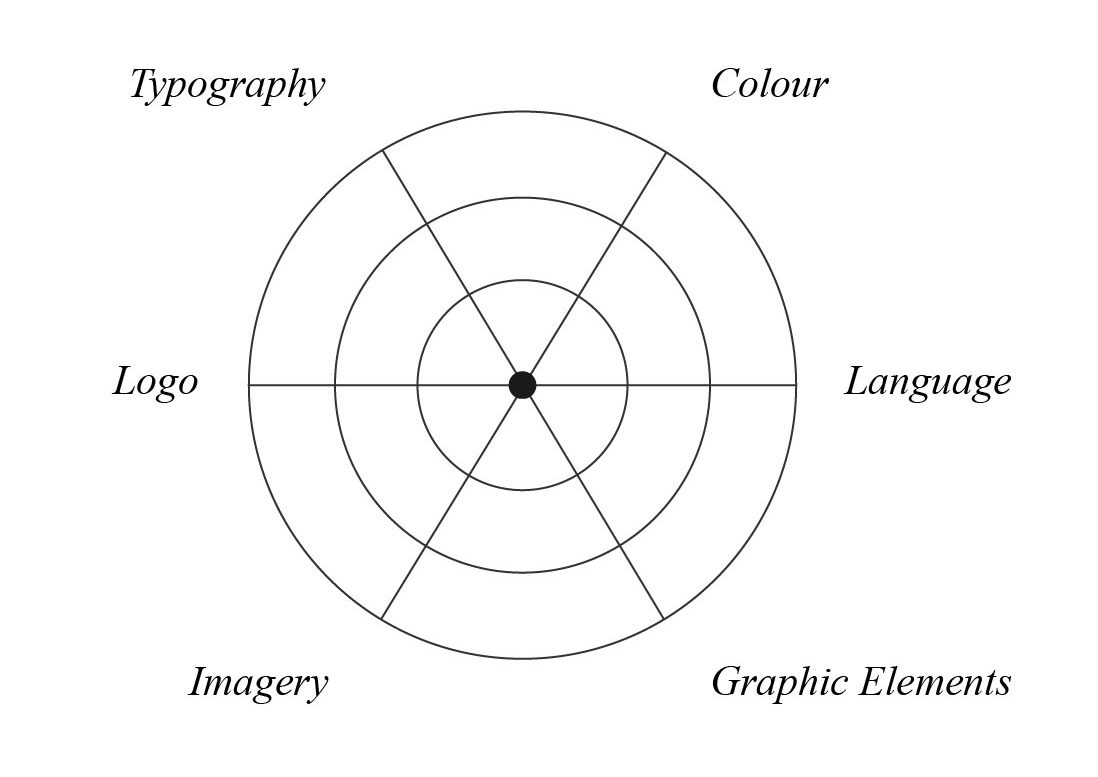
Figure 4. An example of a flexibility chart.
It was recognized that a flexibility analysis of static brands would result in the recreation of the original chart (Figure 4), where all of the components of a visual identity would be ranked with a flexibility of 0 on the scale. Therefore, the chart was only used to illustrate the variability of dynamic brands. The flexibility chart remained useful in this context because it showed how different companies use varying combinations of constant and variable elements to achieve a dynamic brand identity.
CASE STUDY RESULTS AND DISCUSSION
CASE STUDY 1: TOURISM
CITY OF TORONTO
The City of Toronto, located in Ontario, Canada, is a vibrant metropolis that boasts diversity through its multicultural population. In May 1998, to establish the newly amalgamated city, City Council introduced a corporate logo as the official mark of the city (City of Toronto, 2000). The static logo was developed as the mark for the merger between six previously separate municipalities (i.e., Etobicoke, Scarborough, York, East York, North York, and the City of Toronto) that came together to form the new, singular City of Toronto. An internal process was used to select the official logo and involved members of the Council, but the design is unattributable. According to Christopher Brands, the City’s former Project Manager of Corporate Identity & Branding, the logo is a combination of several design ideas from different designers in the Greater Toronto Area (GTA) as well as the City’s own design team (McGinn, 2014).

Figure 5. The City of Toronto logo colourized with the brand’s predominant blue (City of Toronto, 1998).
A report published by the City of Toronto (2000) acknowledged the logo as a key identifier, and stated that the goal in establishing a corporate image was to “ensure that the City’s brand appropriately represents Toronto as one of the largest and most successful cities in North America [as well as to reflect] the City’s vibrancy and diversity.” Notably, there have been critiques of this logo design—namely by Richard Sommer, Dean of the John H. Daniels Faculty of Architecture, Landscape, and Design at the University of Toronto, who stated that the logo “takes a city that is richly diverse and reduces it to the seat of its politics” (McGinn, 2014). As such, in regards to tourism, the logo does little to bring worldwide attention to Toronto.
CITY OF MELBOURNE
The City of Melbourne, the coastal capital located in the state of Victoria in Australia, is progressive and multifaceted. Due to significant changes during previous decades, the City of Melbourne Council sought to develop a brand identity that was more representative of its citizens and environment, while also having the ability to attract tourists. In 2009, working with a prominent design and branding consulting firm called Landor Associates, Melbourne aimed to “show off the [city’s] cool sophistication on the world stage, capture the passion of its people, and provide the city with a unified, and future-focused image” (Landor, 2010). The result was an impactful and adaptable visual identity system revolving around a core principle: a bold ‘M’ as the foundation of anything related to the initiatives, activities, services, and city events. The flexibility of this new design allows for endless possibilities as well as opportunities for people in the city to identify with the brand.
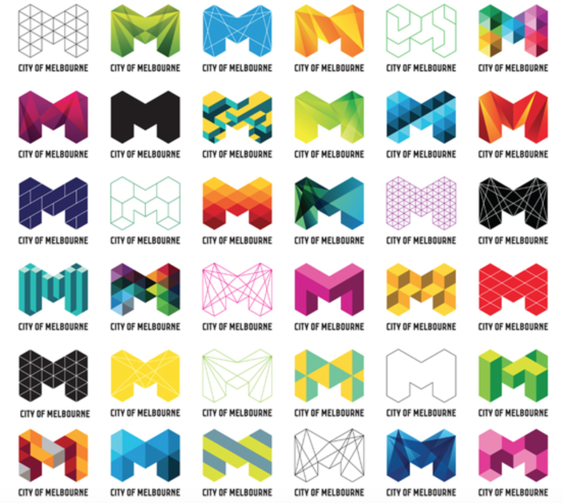
Figure 6. The City of Melbourne’s identity system and various iterations of its logo (City of Melbourne, 2009).
Landor (2010) explained that during the development of the new identity, “the diversity of Melbourne became a sacred concept” and acknowledged that it was important to allow the brand to flex, grow, and evolve along with its changing population. Essentially, building flexibility into the city’s brand identity, as illustrated in Figure 7, leaves room for creative interpretation and helps to assure the longevity of the visual brand. Recognizing Melbourne’s dynamic brand identity as successful, van Nes (2012) called it “a celebration of diversity and personal interpretation that is both future-proof and iconic” (p. 14).
Figure 7. Flexibility chart for the City of Melbourne’s visual identity.
OBSERVATIONS AND ANALYSIS
From an economic perspective, city branding affects a destination’s competitiveness and attractiveness in tourism. In fact, “the perception of the city affects its attractiveness to tourists and foreign investors, and also to potential foreign students or local residents” (Herget et al., 2015, p. 120). Additionally, city branding helps to unify a community of people and allows them to synonymously connect with a single identity. Dynamic branding, therefore, profits from a “unique and yet simple system of the visual identity, enabling different visual approaches of target groups” (Jochum, 2013, p. 33). In other words, the variability of dynamism allows for different people to connect with a singular, evolving visual identity, prompting increased engagement.
The City of Toronto’s logo, however, has not experienced such benefits of city branding. As an extension of Sommer’s critique of the logo, it can be said that the current static mark misrepresents the city’s multiculturally diverse population as well as how the city wants to promote itself to the rest of the world. The current logo, which features iconography of City Hall, says nothing about the general public and therefore eliminates the potential for a range of people to connect with the mark. In fact, Torontonians have felt so negatively about the official logo that changing it was one of the top suggestions on how to improve Toronto (McGinn, 2014). Given that there is so little freedom built into the visual identity of the original design, the logo has been unable to grow and expand in its 22-year tenure. In essence, the City of Toronto’s static logo has become outdated due to lack of flexibility, which has limited the mark’s ability to evolve with the city as populations have grown and changed. In order for the City of Toronto to develop a mark that is representative of its modern, diverse identity and to market itself as a prominent competitor in tourism, the adoption of dynamic branding concepts appear to be beneficial.
In contrast, the City of Melbourne’s dynamic logo (i.e., the ‘M’ concept) has been able to evolve and depict the changing vibrancy of its city. Melbourne’s logo is representative of its identity and core values—this logo stands for something and it is impactful. Landor (2010) recognized that “for a city, the … identity helps create positive, distinguishing associations for people” and that an effective logo “can provide an immediate visual trigger to a set of emotions or ideas that put a city in the best possible light.” The agency, therefore, designed an open system that effectively anticipates change by incorporating different colours, forms and structures (see Figure 7). As shown in the flexibility chart in Figure 7, the static ‘M’ icon remains constant and helps to retain recognizability. Ultimately, Landor and the City of Melbourne resisted the traditional way of thinking about identity design and embraced the idea of adaptation, allowing the brand to indefinitely evolve as it encounters different influences.
Overall, in contrast to the City of Melbourne’s dynamic logo, the City of Toronto’s static logo misrepresents its modern identity and core values. Lack of flexibility has limited the Toronto mark’s ability to expand and adapt to today’s environment, and therefore the ability for people to connect with the brand. The flexibility of Melbourne’s logo, in comparison, allows people to create an emotional connection to the city as the brand evolves with its changing population and adapts to different contexts. In this case study, dynamic branding increases public perception of a city’s attractiveness by offering opportunities to engage with diverse populations with effective variations constituted from a flexible visual identity.
CASE STUDY 2: EDUCATIONAL SERVICES
EMILY CARR UNIVERSITY OF ART AND DESIGN (ECUAD)
The Emily Carr University of Art and Design (ECUAD), founded in 1925 and located in Vancouver, British Columbia, is one of the only institutions in the world that is solely dedicated to the education of arts, media and design (ECUAD, n.d.). In 2017, to commemorate a new year and a new campus building, ECUAD worked with Camp Pacific, a Vancouver design agency, to launch a new visual identity.

Figure 8. ECUAD’s logo (ECUAD, 2017).
The new static logo, shown in Figure 8, features vivid colours that curve around the university’s name and subsequently serve as a motif on marketing collateral. According to a press release, the new identity was “inspired by the painting palette of the University’s namesake, the artist Emily Carr, [and] the colours layer and overlap [to reference] the transformative and accretive process of learning” (Toronto, 2017). The multi-layered surfaces of the logo are said to “depict the energy, progress and joy of expression attained through education” (Toronto, 2017) as well as the diversity of the University’s faculties.
ONTARIO COLLEGE OF ART AND DESIGN UNIVERSITY (OCAD U)
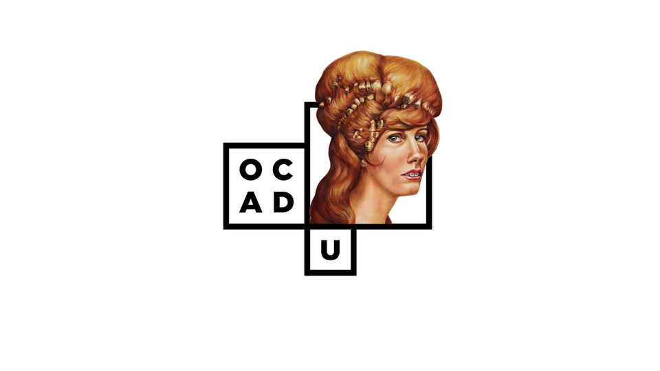
At its 96th Annual Graduate Exhibition in 2011, the Ontario College of Art and Design University (OCAD U), located in downtown Toronto, Ontario, unveiled its new visual identity. The new logo, created in collaboration with Toronto-based studio Bruce Mau Design (BMD) and various OCAD U staff, students and alumni, is dynamic and modular in design. Essentially, OCAD U “sought a new visual identity that would reflect the 135-year-old institution’s desire to move quickly into the future” (Bruce Mau Design, n.d.). As such, an interactive concept was built into the new identity system: each year, the school invites select graduating students to design a logo in the basic ‘window’ framework and uses these iterations on collateral in the following school year. Therefore, as the institution grows, “a library of identities will emerge, with records of ideas and aesthetics gathered over time” (Bruce Mau Design, n.d.).
![]() Figure 9. OCAD U’s identity system and various iterations of its logo using the basic ‘window’ framework (OCAD U, 2011).
Figure 9. OCAD U’s identity system and various iterations of its logo using the basic ‘window’ framework (OCAD U, 2011).
As noted by Bruce Mau Design (n.d.), the dynamic visual identity that OCAD U boasts is representative of the school’s mission to be an “inclusive, vibrant institution built on creativity, risk and innovation.” The ‘window’ framework, modelled after the architecture of the school’s main building, is simple but leaves an abundance of room for freedom and creativity. Although seemingly static in nature, the changing backgrounds and illustrations create the impression of dynamism in visually engaging ways. As shown in Figure 10, OCAD U maintains consistency through fixed typography while simultaneously achieving a flexible visual identity through the manipulation of elements like imagery and colour.

Figure 10. Flexibility chart for OCAD’s visual identity.
OBSERVATIONS AND ANALYSIS
In the modern marketing landscape, university branding has arisen as a key initiative as schools strive to meet and exceed their enrollment expectations. Universities and colleges have historically branded themselves to attract students, improve their rankings and name awareness, and to increase perceived academic quality (Bunzel, 2007; Joseph et al., 2012). As such, dynamic branding becomes important in a university branding context because students contribute to the evolving brand of their university. That is, if students distinguish themselves academically and make an impact in their respective fields, then the university brand is enhanced. In short, the organic nature of dynamic visual identities allows an institution’s brand to evolve and expand as it matures.
Upon reviewing ECUAD’s logo, it can be observed that the mark lacks the creativity that one would expect from a design school. The static logo, although used to emphasize the school’s mission to encourage public support of art and design, shows little relation to the arts fields without explanation. All of the meaning and methodology behind the design of the visual identity by Camp Pacific is not effectively communicated to the general viewer. Not to mention, with this particular identity, ECUAD seems to conform to the visuals that a typical academic institution would possess. As expressed by Vit (2017), the co-founder of a notable graphic design firm called UnderConstruction, ECUAD “needs to put more art and design into [their logo] than university-ness.” Additionally, the logo’s lack of flexibility limits the institution’s ability to evolve with its students and alumni. The reason for this, as expressed by Whisman (2009), is that because of their complex nature, traditional branding methods do not work for university branding purposes. As such, it is beneficial for a degree of variability to be built into the visual identity so that a sustainable, interesting brand is created.
Conversely, OCAD U uses dynamism to strategically showcase its creativity to the public and present an array of student work. In fact, dynamism makes OCAD U different and helps it to stand out regardless of any existing reputations in the educational sphere. Keeping true to professionalism associated with university-level education, OCAD U explores a structured format that incorporates creative whimsy-ness. Although there is more room for variability, as shown in the lack of flexible elements in Figure 10, recognizability is retained. In essence, there is enough variability that makes the visual identity stand out among competitors but not too much that familiarity and consistency are lost.
Overall, in contrast to OCAD U’s dynamic ‘window’ framework, which serves as a platform to showcase student work, ECUAD’s static logo is monotonous. In the context of university branding for arts-focused schools, dynamism is appropriate as it typically aligns their core values (i.e., to stand out, be imaginative and innovative, etc.). ECUAD’s visual identity relies heavily on its academic status and not enough on the diversity and creativity that it strives to communicate. In other words, ECUAD’s logo, although colourful and able to be manipulated in interesting ways in marketing collateral, does not show the same diversity and creativity that OCAD U’s logo does. In this case, dynamic branding concepts allow OCAD U to visualize their core values in an innovative manner while growing an impressive archive of logos. As well, OCAD U benefits from differentiating itself from other design schools through its flexibility and is able to garner attention from potential students, faculty, and donors. While ECUAD’s logo appears institutional, dynamic branding allows OCAD U to showcase its personality while remaining professional—creating a memorable experience for a wide range of audiences.
CASE STUDY 3: WEB SERVICES
YAHOO
Established in 1994, Yahoo was one of the Internet’s early pioneers. In 2019, in hopes of revitalizing its brand under new leadership, the web services provider collaborated with Pentagram, a New York based design studio, to design a refreshed identity. According to Pentagram (n.d.), “the identity reflects a new brand strategy for Yahoo that focuses on helping users find a more personalized, customized experience online.” This new logo, although more flexible than its predecessors, is considered a static identity at its core.

Figure 11. Yahoo’s reimagined logo uses the brand’s signature purple colour as a key identifier (Yahoo, 2019).
Internally, the rebranding of Yahoo was called “Project Purple” (Pentagram, n.d.) and was established to mark the upcoming launch of the company’s new products and enhancements. With this new identity, Yahoo presents itself with a sense of excitement to today’s consumers.
Google, one of the world’s leading technology giants, was founded in 1998. Before the company was even incorporated, however, the concept of the Doodle was born, and Google has since changed their logo many times over the years (Google, n.d.a). Google Doodles are used to celebrate events of the past, birthdays and holidays, and have acquired interactive elements in the modern digital age. The identity formula—a predefined set of colours organized in a particular sequence and a vague form of the wordmark—still stands (van Nes, 2012, p. 8). Google has used its home page to display “countless variations representing virtually every known fluid mark species” (Pearson, 2013). The demand for Doodles has risen in the U.S. and internationally, and creating Doodles is now the responsibility of a team of illustrators, called “doodlers,” and engineers (Google, n.d.a).

Figure 12. Example of Google Doodles, from left to right: International Women’s Day 2020, Canadian Elections 2019, Mother’s Day 2019 and Google’s 20th Birthday in 2018 (Google Doodles, n.d.b).
The Google Doodle presents a unique case of dynamism: its placement is temporary, but it grants the company the same benefits as any other entities that use dynamic branding as part of their visual identity strategy. That is, through dynamic branding, Google is able to create meaningful connections with its users while promoting positive brand associations. As with dynamic brands, all Google Doodles have an element that remains constant, like typography, while new aspects are added. It is important to note that, unlike most other companies that may struggle with recognizability when adopting dynamism, Google “enjoys a homepage advantage, in that visitors to [its website] readily associate the fluid variants populating the same spot on its homepage with Google as the source” (Pearson, 2013).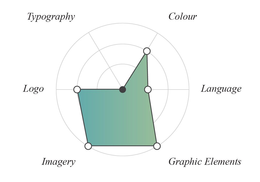
Figure 13. Flexibility chart for Google’s visual identity based on its Doodles.
OBSERVATIONS AND ANALYSIS
As with every other industry in today’s marketplace, the ability to adapt to changing environments has become increasingly important as technology advances. Additionally, the saturation of services made available online has made it essential for companies to adopt strategic branding approaches that can help them to stay relevant. For Internet-based companies in particular, interactivity has also arisen as a critical factor in engaging with consumers. Pearson (2013) noted that “as [brand owners] strive to humanise their brands and keep them relevant, [they] are challenging trademark fundamentals by rejecting static source identifiers and adopting fluid marks that change frequently—sometimes constantly.” In the digital area, branding is vital in the creation and preservation of strong and meaningful consumer-brand relationships. As such, incorporating dynamism into visual identities presents a strategic way to maintain corporate integrity while captivating diverse audiences.
In the case of Yahoo, it appears that the company has struggled with developing and sustaining a visual identity that can effectively grow and expand with its operations. Since it was founded, Yahoo has rebranded seven times—with its current identity being the most recent redesign. It is important to note, however, that there are likely other factors impacting Yahoo’s instability, and the company’s consistent rebranding efforts show that it wants to stay relevant in consumers’ minds and to keep pace with the times. With that said, although Yahoo’s new static logo has contemporary appeal, it is indistinguishable from every other logo in the modern marketing landscape. The fixed identity lacks differentiation and is unable to stand out amongst other sans serif logos. As such, engagement becomes difficult and reduces the brand’s chance at creating valuable connections and relationships with its target consumers.
Google, on the other hand, has benefits from a first-mover advantage in the web services sector. The Doodle concept has been a decisive tool in Google’s branding strategy ever since it was first introduced. Variability of various visual elements (see Figure 13), along with positive associations with celebratory events, have allowed Google to showcase its creativity as a company while also allowing users to develop an emotional connection to the brand. Dynamic branding, as represented by the countless Doodles that have been released throughout the years, has opened up the opportunity for consumers to voluntarily engage with Google and has helped create meaningful, long-term consumer-brand relationships. Essentially, Google has benefited greatly from finding a way to uniquely interact with its users—keeping its services at the top of their minds at all times.
Overall, continual lack of flexibility in visual identity design has limited the Yahoo logo’s ability to grow with the brand. With rebranding being a constant in the company’s operations, staying relevant in consumers’ minds has been a challenge. As such, Yahoo has struggled to develop and sustain meaningful relationships with today’s web services users despite its modern rebrand. In contrast, as Google Doodles promote positive brand associations amongst users, Google boasts a significant competitive advantage. The flexibility of Google’s identity has allowed it to also reach and connect with a diverse range of audiences. In a web services context, dynamic branding prompts the development of valuable consumer-brand exchanges through unique differentiation, and, subsequently, relevancy in the marketplace is sustained.
LIMITATIONS
The case studies presented were merely a small analysis of a larger collection of brands that have adopted dynamic branding. There were numerous other cases of dynamism outlined in exploratory literature, but time and paper length constraints limited the scope of this study. For instance, this study only looked at service-based companies rather than product-based ones—the reasoning behind this being that the variability of identities in service industries retain recognizability (i.e., it would be more difficult for consumers to recognize a product that is constantly changing its logo). Furthermore, there were limitations to the flexibility chart used to visualize the variability of the components of a brand’s visual identity. The ranking scale, in particular, was relatively subjective (i.e., varies from person to person). As everyone has their own personal feelings, tastes and opinions, it is logical to think that different people would produce varying results. It is expected, however, that clarification of the extents of flexibility can be better defined once a deeper understanding of dynamic branding is established within the design community.
For the reasons provided, among others, there is room for further exploration regarding dynamic branding. It is vital for further analysis to continue considering the fact that there is very little published literature-based research on dynamic branding. It is important to emphasize that with more time and research devoted to dynamism in visual branding systems, the distinction between static and dynamic identities will become clearer—making it easier for companies to identify dynamic branding as a viable option to pursue.
CONCLUSION
In the modern marketing landscape, dynamic branding is a valuable concept to consider during the development or redevelopment of a visual identity. The case studies presented in this paper showed how dynamism, through the manipulation of different visual identity components, can be applied in various service industries. As observed in the tourism-focused case study, the City of Melbourne’s dynamic brand was able to accurately represent the city’s identity and core values, while also being adaptable enough to allow a diverse range of people to engage with the brand. Similarly, the educational services study showed that OCAD U’s dynamic identity created a memorable experience for viewers. In OCAD U’s case, dynamism was also strategically used as a tool to showcase the university’s creativity, which helped to differentiate it from similar arts-focused institutions. Lastly, the web services study reiterated the importance of differentiation through flexibility, and the ability for dynamic branding to prompt the creation of meaningful consumer-brand relationships and to, ultimately, sustain relevancy in saturated markets. Overall, considering that the concept is relatively new and unique, dynamic branding is expected to continue to evolve as brands apply their own innovative ideas to the existing principles that form the foundation of a flexible visual identity. In short, the advantages, possibilities and opportunities associated with dynamic branding are endless.
As expressed by Delahunty (2013), “dynamic identities are adaptable to change while static approaches run the risk of not anticipating change quickly enough” (p. 46). In essence, change is inevitable; thus, flexibility should be built into the structure of visual identities to allow brands to adapt to new developments. When managing branding initiatives, it is important to consider that “to make big changes, to innovate, and to thrive during times of innovation, [brands] need to be willing to take risks” (Stratten & Stratten, 2017, p. 277). As the world changes, so should branding design.
KEY TAKEAWAYS
Given the information provided in this study, there are a few main takeaways. Firstly, it is important to recognize that dynamic branding is a valuable design method that allows brands to differentiate themselves from competitors while creating meaningful connections with their consumers (van Nes, 2012). Furthermore, although there are not as many dynamic brands as static at this point in time, the field of dynamic branding has a promising future and enormous potential for growth. Jochum (2013), who conducted multiple interviews with professionals in the design community, found that “the very positive feedback about the topic shows that it has a strong relevance in the business reality of design and communication agencies” (p. 90). Constant technological improvements, as well as changing markets and consumer preferences, support the notion that a brand should be a living organism that has the ability to adjust to different contexts.
Furthermore, dynamic branding creates opportunities for freedom of creative expression. By applying variability to one or more of the components of a visual identity, a brand can effectively engage with different audiences while existing in varying contexts. It is important to remember, however, that to remain recognizable and consistent is to ensure that at least one component is constant. In the cases presented in this study, the dynamic brands of the City of Melbourne, OCAD U and Google all shared a constant element that aided in maintaining recognition: typography.
Lastly, it is crucial to note that dynamic branding should not be adopted solely for the sake of differentiation—it must complement and align with the company’s values, priorities, strategy and personality. In fact, not every identity has to be dynamic. If reliability is something that consumers look for in a company (e.g., an insurance company), then dynamic branding might not be the best option to pursue. Ultimately, a well-designed brand identity should be representative of the company’s message.
FUTURE OPPORTUNITIES FOR RESEARCH AND RELATED WORK
Considering the novelty of dynamic branding as a design concept, there are countless opportunities to explore and different ways for brands to apply elements of variability to their visual identities. Acknowledging that “brands need to adapt to their fast-changing environments to survive” (van Nes, 2012, p. 9), dynamic branding arises as a formidable option to consider. In particular, there is room for industries outside of the cultural sector to adopt dynamic branding, if it fits into the messages and values that a company is trying to communicate to consumers. As this study only looked at service-based brands, more research should be conducted to analyze the value of branding dynamism in product-based companies.
In addition, it would be interesting to explore which visual identity components are typically static in visual identities. As observed in the flexibility charts for the dynamic brands introduced in this study, the typography element serves as the constant for all of the logos—but why is this? Are static typographic elements the basis for every dynamic brand? Investigating this observation would be valuable in creating a better understanding of dynamism and how designers can apply it to various branding projects.
Moreover, to further analyze the viability of dynamic brand identities in the modern context, research into consumer perceptions on brands that have adopted dynamism should be carried out. Observing logo familiarity as a limitation could also be very useful because “if a brand is familiar and well-known, [dynamism] may not have such an impact on engagement and consequent attitudes” (Cian et al., 2014, p. 195). In other words, if consumers are highly aware of a brand, its personality and its values, dynamism may not have an impact. Apple, for instance, has such a large consumer base that it has to do very little to stand out. As such, it may be appropriate to say that dynamic branding would have the greatest overall impact on unfamiliar or new brands, but more research needs to be conducted to confirm any assumptions.
Finally, it would be valuable to explore the legalities surrounding dynamic branding and the ability to protect a fluid mark. From a legal perspective, it is difficult to patent a dynamic brand (Pearson, 2013; van Nes, 2012), but it is not impossible. Pearson (2013) stated that “to minimise the legal risks of embellishing their marks in this manner, brand owners would be wise to focus on: ensuring that the template for the fluid mark—the word or design mark, or both—is a strong, distinctive mark and registered as a mark.” Both Pearson (2013) and van Nes (2012) emphasized the importance of maintaining at least one constant component that can serve as the pillar of the brand, and to register for trademark, copyright, design or patent protection for said pillar. Ultimately, “companies might be afraid to take a leap with a corporate identity they cannot protect under current intellectual property legislation” (van Nes, 2012, p. 9). However, as more research is conducted and new IP laws are established, the modern marketing landscape may witness the adoption of dynamic branding by more companies.
ACKNOWLEDGMENTS
First and foremost, I would like to acknowledge Heather Belot, my thesis advisor throughout this study. I am deeply grateful for her valuable guidance and for sharing her marketing expertise. Her ideas and suggestions helped me to solidify the focus of the research topic, and her enthusiasm was truly motivating.
I would also like to thank my writing group members, Julia Forrester and Matt Lescano, for providing me with feedback, support and words of encouragement. Our collaborative meetings played a vital role in the development, execution and completion of my thesis.
REFERENCES
Airey, D. (2010). Logo Design Love: A Guide to Creating Iconic Brand Identities (Second ed.), Berkeley: New Riders.
Amazon. (2000). [Amazon Logo]. Retrieved from https://green-strike.com/amazon-logo-transparent
Brasel, S. A. & Hagtvedt, H. (2016). Living brands: Consumer responses to animated brand logos. Journal of the Academy of Marketing Science, 44(5), 639-653. doi:10.1007/s11747-015-0449-2
Bunzel, D. L. (2007). Universities sell their brands. Journal of Product & Brand Management 16(2):152–153.
Cian, L., Krishna, A., & Elder, R. S. (2014). This logo moves me: Dynamic imagery from static images. Journal of Marketing Research, 51(2), 184-197. doi:10.1509/jmr.13.0023
City of Toronto. (1998). [City of Toronto logo]. Retrieved from https://biotalent.s3.ca-central-1.amazonaws.com/media/public/uploads/2019/03/11/TO_logo_PMS647.png
City of Toronto. (2000). Corporate Identity Program Principles for the Use of the City of Toronto Corporate Logo, Coat of Arms and Official Flag. Retrieved from the City of Toronto website: https://www.toronto.ca/legdocs/2000/agendas/council/cc/cc000704/adm14rpt/cl005.pdf
da Silveira, C., Lages, C., & Simões, C. (2013). Reconceptualizing brand identity in a dynamic environment. Journal of Business Research, 66(1), 28–36. doi:10.1016/j.jbusres.2011.07.020
Delahunty, D. (2013). The evolution of visual identities from static identities to dynamic identities (Master’s thesis, University of Dublin, Dublin, Ireland). Retrieved from https://www.scss.tcd.ie/publications/theses/diss/2013/TCD-SCSS-DISSERTATION-2013-048.pdf
ECUAD. (n.d.). History and Evolution. Retrieved from https://www.ecuad.ca/about/at-a-glance/history-and-evolution
ECUAD. (2017). [Emily Carr University of Art + Design Logo]. Retrieved from https://www.ecuad.ca/about/news-and-media/graphic-standards/logo-files
Eskilson, S. J. (2012). Graphic design: A new history (2nd ed.). New Haven, CT: Yale University Press.
Felsing, U. (2010). Dynamic identities in cultural and public contexts (Vol. 1, Design in context). Baden: Lars Müller.
Ferrara, J. (2014). The case for personalization. DM News, 36(2), 14.
Google. (n.d.a). About Doodles. Retrieved from https://www.google.com/doodles/about
Google. (n.d.b). [Examples of Doodles]. Retrieved from https://www.google.com/doodles
Grzesiak, M. (2015). E-BRANDING vs. TRADITIONAL BRANDING. Modern Management Review, doi:10.7862/rz.2015.mmr.56
Herget, J., Petrů, Z. & Abrhám, J. (2015). City branding and its economic impacts on tourism. Economics & Sociology, 8(1), 119-126. doi:10.14254/2071-789X.2015/8-1/9
Hewitt, J. (2008, February 13). “Flexible Consistency, Consistent Flexibility.” Retrieved from https://www.underconsideration.com/speakup/archives/004431.html
IBM. (1972). [IBM Logo]. Retrieved from https://upload.wikimedia.org/wikipedia/commons/thumb/5/51/IBM_logo.svg/1280px-IBM_logo.svg.png
Jochum, E. (2013, May). Dynamic Branding Thesis (Master’s thesis, Zurich University of the Arts, Zurich, Switzerland). Retrieved from https://issuu.com/emanueljochum/docs/Jochum_emanuel_thesis_final_may2013
Joseph, M., Mullen, E. W., & Spake, D. (2012). University branding: Understanding student’s choice of an educational institution. The Journal of Brand Management, 20(1), 1-12. doi:10.1057/bm.2012.13
Jury, D. (2012). Graphic design before graphic designers: The printer as designer and craftsman 1700–1914. London: Thames & Hudson.
Kall, J. (2015). Branding on smartphone. Brand mobile communication. Wolters Kluwer SA, Warsaw.
Khan, S. U. & Mufti, O. (2007). The Hot History and Cold Future of Brands. Journal of Managerial Sciences, 1(1), 75-84. Retrieved from http://www.qurtuba.edu.pk/jms/default_files/JMS/1_1/5_saif_ullah.pdf
Landor. (2010, February 26). Rebranding the city of Melbourne. Retrieved from https://landor.com/thinking/rebranding-the-city-of-melbourne
Lelis, C. (2019). Like a chameleon: The polychromatic virtue of dynamic brands. The Journal of Product & Brand Management, 28(4), 445-461. doi:10.1108/JPBM-10-2017-1621
McGinn, D. (2014, January 10). Eight designers offer up new logos for the City of Toronto. The Globe and Mail. Retrieved from https://www.theglobeandmail.com/news/toronto/reimagining-the-way-we-think-about-toronto/article16284100
Microsoft. (2012). [Microsoft Logo]. Retrieved from https://www.microsoft.com/en-us/legal/intellectualproperty/trademarks/usage/logo.aspx
Moving Brands. (2010). Living Identity. Moving Brands: London, GB.
MTV. (1941). [MTV Logo]. Retrieved from https://www.underconsideration.com/speakup/archives/004431.html
Murdock, J. E. (2016). Fluid identity: History & Practice of Dynamic Visual Identity Design (Master’s thesis, Kent State University).
Nintendo. (1983). [Nintendo Logo]. Retrieved from https://www.stickpng.com/assets/images/5a1c3678f65d84088faf1403.png
OCAD U. (2011). [Ontario College of Art and Design University Logo]. Retrieved from https://www.brucemaudesign.com/work/ocadu
Olins, W. (1978). The corporate personality: An inquiry into the nature of corporate identity. New York, NY: Mayflower Books.
Pearson, L. (2013). Fluid marks 2.0: Protecting a dynamic brand. Managing Intellectual Property, (229), 26.
SINTEF. (2013, May 22). Big Data, for better or worse: 90% of world’s data generated over last two years. ScienceDaily. Retrieved from www.sciencedaily.com/releases/2013/05/130522085217.htm
Starbucks. (2011). [Starbucks Logo]. Retrieved from https://creative.starbucks.com/logos/
Stratten, A. & Stratten, S. (2017, October 9). UnBranding: 100 Branding Lessons for the Age of Disruption. John Wiley & Sons.
Toronto, R. (2017, January 31). A New Look for Emily Carr University. Retrieved from https://www.ecuad.ca/news/2017/a-new-look-for-emily-carr-university
Tuškej, U., & Podnar, K. (2018). Consumers’ identification with corporate brands: Brand prestige, anthropomorphism and engagement in social media. Journal of Product & Brand Management, 27(1), 3-17. doi:10.1108/JPBM-05-2016-1199
Twitter. (2012). [Twitter Logo]. Retrieved from https://about.twitter.com/en_us/company/brand-resources.html
van Nes, I. (2012). Dynamic Identities: How to Create a Living Brand. BIS Publishers: Amsterdam, NL.
Vit, A. (2017, February 8). New Logo and Identity for Emily Carr University of Art + Design by Camp Pacific. Brand New. Retrieved from https://www.underconsideration.com/brandnew/archives/new_logo_and_identity_for_emily_carr_university_of_art_design_by_camp_pacific.php
Whisman, R. (2009). Internal branding: A university’s most valuable intangible asset. Journal of Product and Brand Management, 18(5): 367–370.
Yahoo. (2019). [Yahoo Logo]. Retrieved from https://www.yahoo.com/now/yes-we-unveiled-our-brand-new-logo-today-but-thats-not-all-120018895.html
![]()