
Main Body
Chapter 7 • Page Layout
Two web designs that are appropriate for different purposes are the fixed-width page and the variable-width page.
1. Fixed-Width Page
Fixed-width or “print-replica” pages are good for text-heavy documents, such as news sites, online magazine articles and eBooks, and those with descriptions, instructions, or procedures. Examples include cnn.com, foxnews.com, and numerous other news sites
Fixed-width pages attempt to duplicate the look of paper documents by providing a width that is comfortable to read by scanning left-to-right (depending upon language). Unlike paper documents, fixed-width web pages can have unlimited length. (In the Introduction, see “Five W’s of Web Design,” #4, Width.)
Fixed-width pages can be created by placing a division <div> grouping tag in the document <body> and setting its width, height, center position, and background color.
2. Variable-Width Page
Variable width pages expand and contract with the browser window. These are best suited to pages where you want to give maximum impact to images as being the most important part of the page, and there is minimal type. Example: An artist/designer wants to showcase one or more photos, drawings, paintings, sculptures, or other work. Variable-width pages can be created by setting an image as the background of the page. For the creator who wants to show multiple images, a simple JavaScript program can be added to change the background image.
Page Layout Strategies
Three ways of placing images and text on a page include:
- Order and position of tags. Setting the order of the tags, along with positioning styles like width, height, float: left or float: right, and margin and padding.
- Flexible box layout. Using the flexible box layout (display: flex;), in which tags inside a “container” <div> will arrange themselves automatically on the page. This type of layout is great for portfolios and online catalogs, in which you want to add and/or change items frequently. The layout works especially well with small thumbnail images that can be linked to larger images and descriptions. Subsidiary styles like “justify-content” and “align-items” control the positioning of objects within the page. A great way to learn the flexible box layout is to play the online game, Flexbox Froggy. This game includes 24 levels to show positioning options of “frogs” on “lily pads.”
- Grid layout. Using the grid layout (display: grid;). The grid layout enables dividing the page (or a container <div>) into a specified number of rows and columns. The grid can contain rows and columns of both fixed and flexible heights and widths. The display: grid style must also include subsidiary styles to define the row- and column layout (grid-template) and, if necessary, the grid position of items in the grid (grid-area). An excellent way to learn settings for the grid layout is to play the game, Grid Garden. The game includes 28 levels.
Responsive Design
Responsive design ensures pages are accessible and visually appealing across a variety of devices and screen sizes.
Whether viewed on a large desktop monitor, a tablet, or a small smartphone screen, the content will adjust to fit the screen size without losing functionality or readability.
This approach is important because it enhances user experience by providing consistent and optimized viewing, regardless of the device used.
Additionally, responsive design is beneficial for search engine optimization (SEO) as search engines like Google prioritize mobile-friendly websites in their rankings. By ensuring that all readers can access and interact with web content seamlessly, responsive design helps to reach a broader audience and accommodate the diverse ways people access the internet.
When planning responsive design, consider your audience’s age group. As people age, they become susceptible to various visual impairments, such as presbyopia (inability to see up close), cataracts, galucoma, and retinal degeneration. Styling type and images to be large on small cell phone screens makes a web page more legibile for older audiences.
“Responsive Design in Three Easy Steps” boils down the design process to three questions that designers can ask about their web pages, as shown in the sidebar and explained further below.
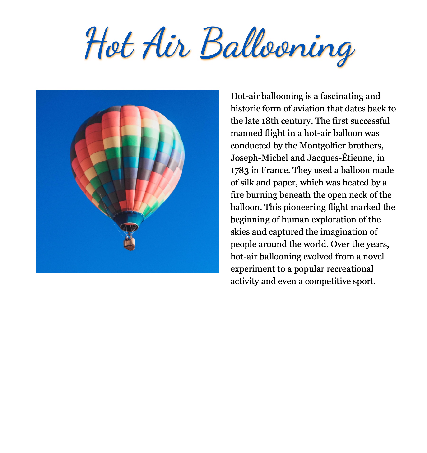
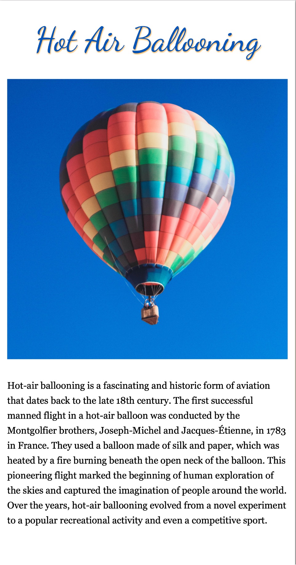
In the above example at left of a fixed-width or “print replica” page, the body width has been set to 768px so it approximates a sheet of letter-size paper on-screen. The page includes a paragraph and an image set to float-left.
In its current state, if readers narrow the browser window below 1024px wide, part of the banner image, menu, and text will be cut off, so readers will need to scroll horizontally to view the cut-off parts.
The example at right has been styled for responsive design by adding a max-width style to the body width and an @media query that unfloats the image, sets it to width 95%, enlarges the type, and increases the line leading for viewing on a 750px wide iPhone or Android.
| Units of Measure for Responsive Design | |
|---|---|
| unit | description |
| px | Pixels, a fixed measurement |
| % | Percent, a variable measurement referring to the percentage width of the enclosing tag. Note that % cannot be used for vertical measurements. |
| vw | Viewport width, a percentage of the browser window width; note that vw is not a percent of the enclosing tag but of the whole browser window width. Note that vw can also be used for height measurements. |
| vh | Viewport height, a percentage of the browser window height. Note that vh can also be used for width measurements. |
Responsive Design in Three Easy Steps
- Can I specify width in % or vw?
- If not, can I add the supplemental style, “max-width”?
- Can I add a media query to change how photos and text appear on smartphones less than a specified resolution?
Addressing these three steps for the example page above:
Can I specify width in % or vw?
In this example, no, to retain the letter-size page appearance, these tag widths cannot be specfied in percent or vw (viewport widths).
Can I add “max-width”?
In this example, yes, the supplemental style, “max-width: 100%;” can be added below the width style so that the page contracts to fit within smaller browser window sizes.
Can I add a media query?
Yes, and for smartphones it would be nice to have the floated image full-width and to enlarge the text, and to increase the line leading of the text.
For a simple media query setup, I recommend using the width resolution of an iPhone 8, 750px. The reason is, we have to assume that our readers have at least an iPhone 8 or equivalent Android phone.
The media query acts as a selector and creates a subset of selectors and styles that apply to the stated resolution. Example:
@media only screen and (max-width: 850px) {
    [styles for phone]
}
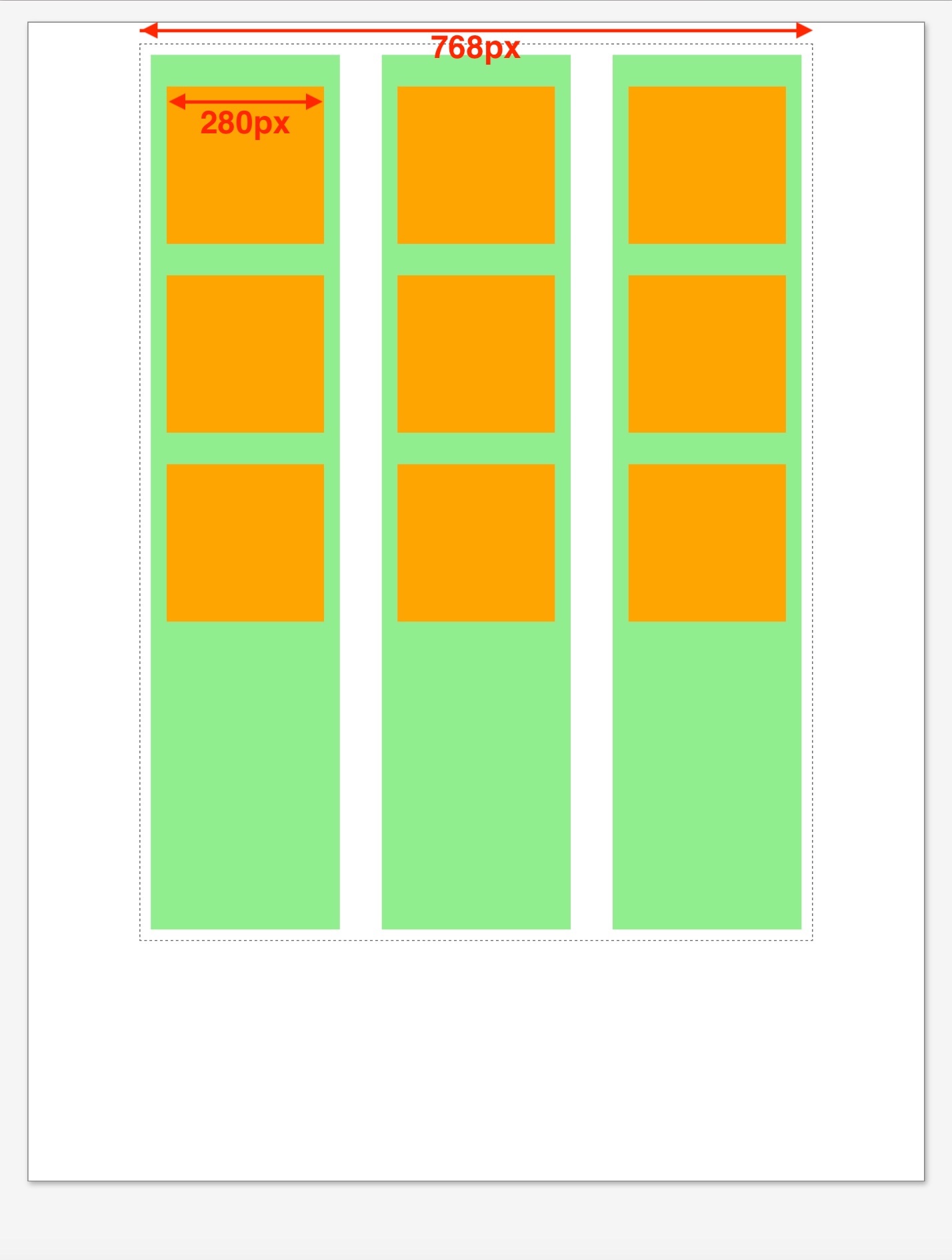
 This example shows a mockup of a catalog page that uses a 3-column grid layout (grid-template-columns: auto auto auto;), columns in green and future catalog items in orange.
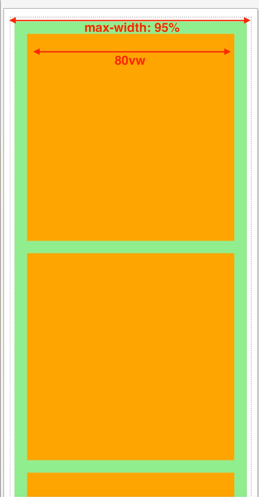
For the smartphone media query, the column number was changed to 1 (grid-template-columns: auto;) and the item width was set to 80vw (viewport widths).
Reference Documents
Fixed-width page size comparison: rich-adams.net > GRC 365 > Reference Documents > Page Sizes
Flexible Box Layout: rich-adams.net > GRC 365 > Demo Site > Trips — illustrates the flexible box layout using a container <div> with portfolio-like thumbnails
Grid Layout: rich-adams.net > GRC 365 > Demo Site > Demos > Grid — shows an example of the grid layout with 3 rows, 2 columns, and an image that spans three rows.
Responsive Design: rich-adams.net > GRC 365 > Responsive Design
Responsive Design: rich-adams.net > GRC 365 > Demo Document > Responsive
Also see additional documents available under Completed Tutorials after the demos.
