
Main Body
Chapter 8 • Portfolio
In this “editorial” chapter I describe some ideas for online portfolios, understanding that you will want to design your portfolio in keeping with your educational and career goals and the work you want to show.
Since this writeup is necessarily rather subjective, I assumed that I was a graphic design student, that I like to design for print and web, and that I also like to write, photograph, and draw. My educational goal is to graduate and apply for an advanced degree, then hopefully get a full-time, salaried position with benefits with a design or marketing firm or for a company whose products or services interest me. Eventually I may want to start my own design firm, working with like-minded colleagues.
One of my bosses had a wooden sign on his desk: “The greatest reward for a job well done is the chance to do more.” Forget about a promotion, raise, time off, or even pat on the back. The sign reminded me of what quality expert W. Edwards Deming admonished management not to do is issue “exhortations to the work force.” Then again, if you enjoy what you do, you want to make the opportunity to do more. And even, as much as possible. Enter, the portfolio!

Portfolio Considerations
Some important considerations for a portfolio include:
• What type, and how many kinds, of works do you want to show? E.g., book and magazine covers, chapters and articles, posters, brochures, business cards, packages, and other print work; and of course designs for screens, including web pages, eBooks, and maybe even apps and app icons.
• In addition to design, what skills and knowledge do you want to show? Hot topics today include accessibility, artificial intelligence (AI), video, animation, and JavaScript interactivity.
• How many pages will your portfolio require? E.g., you may want separate pages for print and screen designs.
The Thumbnail-High Res Model
Portfolios consisting of multiple small images (thumbnails) linked to larger images provide readers a glance of the scope of your work and the opportunity to examine individual works in greater detail. Using the CSS flexible box layout (display: flex;) allows additional thumbnails added to your portfolio to arrange themselves on the page.
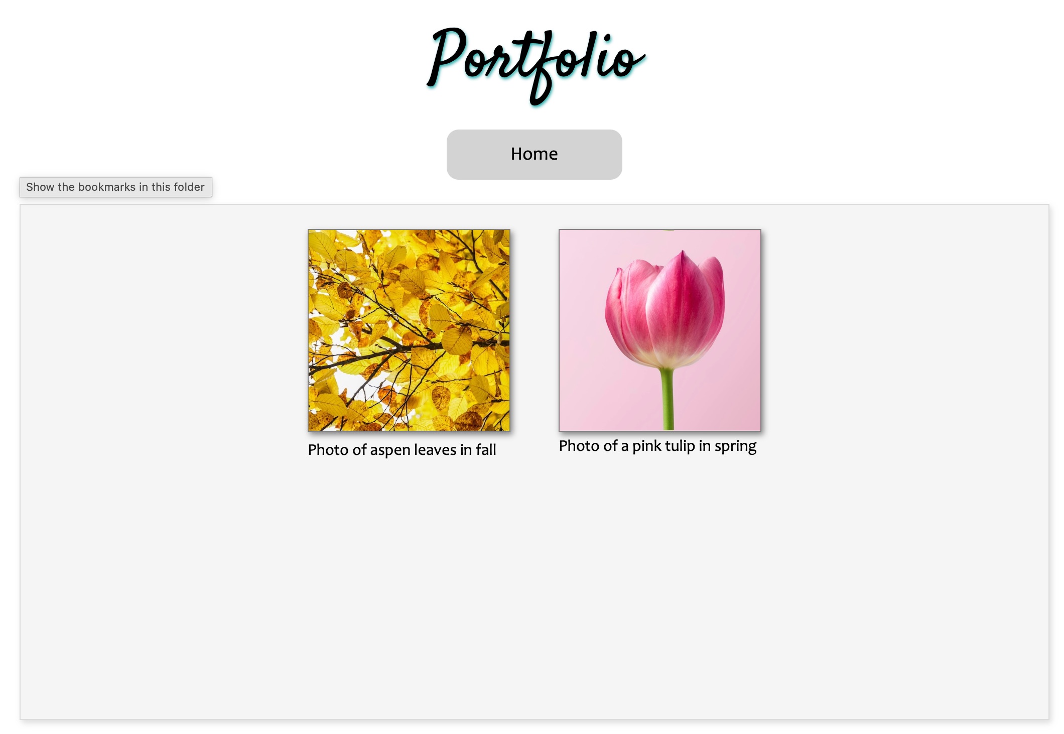 Beginnings of a sample portfolio page with low-res thumbnail images linked to high-res photos and described with brief captions. The gray box tag is set to “display: flex;” so that thumbnails added later will arrange themselves within the box. (Photos courtesy of Unsplash.com)
Procedure
Collecting Your Works
- Collect the works you want to initially show in a folder in web-displayable formats, including JPEG, PNG, GIF, PDF, EPUB, and HTML.
- Note the layout of each work, whether portrait or landscape.
- Size the works to 2000px or less in their longest dimension; file size should be no larger than 500K.
- Duplicate the files and make low-res thumbnails of each, no larger than 400px in their longest dimension. If you have mixed portrait and landscape formats, consider cropping them to a square format for uniformity. Make JPEG screen captures of document formats including PDF, EPUB, and web pages.
Making Your Portfolio Page
- Consider whether a fixed-width or variable-width page would best show off your work. E.g., fixed width is good if you want to include a lot of text describing your work. Variable-width is good if your primary works consist of photos, drawings, or paintings.
- For a fixed-width page, place a division tag, <div>, with e.g., id=”page” and style to width: 1024px and height: 1228px (or auto, which will lengthen to accommodate the content). Center the page and consider putting a border and drop-shadow around it.
- Inside the “page” div, place another <div> with id=”textbox” (or any name that you want) and size to slightly smaller than the page. Style this div to “display: flex;” to utilize the flexible box layout. Add subsidiary styles “flex-wrap: wrap;” “justify-content: center;” “align-items: flex-start;” and “align-content: flex-start;” or as you prefer.
- Place each thumbnail image with an <img> tag. Consider assigning a class to the thumbnail images if you have other images on your page, such as a banner image at the top. Style to maximum width 200px or as you prefer.
- Surround the thumbnail image with a <figure> to group it with a <figcaption> describing the work, e.g., what type of work is it, how was it created, and who is the client or audience. Style the figure tag to the same with as your img tag.
- Style the figcaption with font, size, and style that you like. I usually use minimum 12pt type and may use italics and center (if less than 3 lines) or left-justify it.
- Link each thumbnail image to its high-res counterpart using an anchor tag, e.g., <a href=”high-res-image.jpg”>. Another option is to write a JavaScript program that makes the high-res image pop up when the thumbnail is clicked.
- For your page title and caption text, consider choosing a font that compliments the theme of your work.
Managing Your Portfolio
As you add more thumbnails of your work to the flexible “textbox,” they will arrange themselves on the page according to the subsidiary styles you have set (step 3 above). If you run out of space, some options are to (1) make the thumbnails smaller, (2) reduce the size of the gap between thumbnails (margin or gap), (3) lengthen the page height, or (4) consider dividing your site into separate pages for your different types of work.
Creative Ideas
- Details tag. Consider writing your captions with a <details> tag. This tag has a default style of hidden text (except for the included <summary> tag) with an arrow at the left that readers can click on and show the contents.
- Variable-width page. If the work you mainly want to show is photos, drawings, or paintings, consider creating a variable-width page with one or more photos or drawings and paintings as a background. To do so, style the <body> tag to width: 100vw (viewport width); and height: 100vh; (viewport height), and background: url(“image-of-your-choice.jpg”); You could even write a JavaScript program to change the images every few seconds. Using a background image assumes you do not have a lot of text for your audience to read, or that you will display the text against a lightened or darkened background to increase contrast. Perhaps the variable-width page could be your Home page and the portfolio pages could have a lightened or “ghosted-back” image to increase contrast.
- Style the <figure> tag. Consider setting a uniform width and height for your <figure> tag so that the thumbnail images fill the width of the tag.
References
Animated “Flexbox Demo”
Sample portfolio page
Portfolio page with JavaScript image expander and details tags as captions
