
Module 4: Responsible Data Storytelling
Considerations
In this section, we’ll explore the various considerations for creating your own data visualization. These include:
- Cognitive load
- Accessibility
- Colour
- Fonts
- Gestalt’s principles:
- Proximity
- Similarity
- Continuity
- Closure
- Figure-ground
Cognitive Load
Cognitive scientist James Bruner suggested that we are 22 times more likely to remember information if it’s presented as a story. When drafting data visualizations, we want to manage our audience’s cognitive load. Cognitive load is the mental effort needed to take in new information. Think of it as humans’ ability to process. In designing a data visualization, we want to make the best use of human processing power and direct the audience to what they need to know.
Accessibility
To ensure your infographic is accessible, make sure that you design for accessibility. Below are some tips:
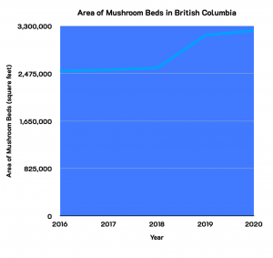
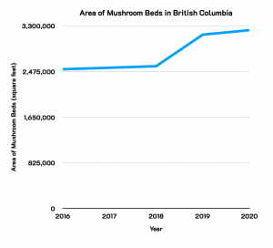
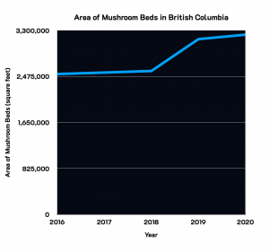
- Use contrasting colours. A bar graph with five shades of blue for example may be too difficult to read. If possible, review your data visualizations through colourblind eyes. Try the Colour Contrast Checker which is a tool for checking foreground and background colours. Figure 4.1-4.3[1] below display the same data with different background colours.
Reflection
Which graph grabs your attention from the ones above?
- Provide an alternative format or brief description for images for individuals using screen readers.
Deeper Dive
You can learn more about creating accessible infographics through this resource from the Universal Design Center.
Colour
Visual communication can overcome certain communication barriers such as language. Data visualizations have the ability to communicate more universally. However, visual communication is not universal. Our ways of looking are strongly influenced and possibly determined by the visual culture we inhabit. We learn certain ways of looking at the world, and what we see is governed by the ways of looking that we have acquired culturally. Colours may also have cultural connotations. When developing visualizations for external audiences, you may want to look at David McCandless’ work on colour meaning across cultures.
Fonts
When selecting fonts, here are a few suggestions:
- Strategically use typefaces to communicate varying feelings, moods, style, and emphasis.
- Serif fonts have a traditional feel and style and are often preferred in print.
Figure 4.4. Serif font contains a stroke at the end of a letter’s stem. - San Serif fonts have a modern feel/style and are better for headlines.

Questions to ask yourself about selecting fonts:
- Is your message evident from the visuals and text?
- Have you used creative, relevant visuals in your designs?
- Is the text appropriate and tailored to your audience?
- How do your creative pieces stand out?
- Statistics Canada. Table 32-10-0356-01 Area, production and sales of mushrooms. Data is reproduced and distributed on an "as is" basis with the permission of Statistics Canada. Retrieved January 8th, 2022. DOI: https://doi.org/10.25318/3210035601-eng. Statistics Canada Open Licence: https://www.statcan.gc.ca/en/reference/licence ↵
