
Module 2: How to Critically Analyze and Interpret Data Visualizations
Step 4: Focus on Content and Visual Encoding
The most important element of most data visualizations is their content and how that content is .
Essentially, data visualizations are always built with symbols that follow a set of rules. This might sound a bit complicated, so let’s break it down using Figure 2.7[1] below, a standard bar chart of monthly average retail prices for two food categories in Canada from January to July 2021.
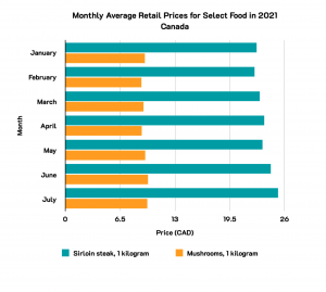
Let’s focus on the visual encoding, and the “rules” that this chart is following. Click on each method below to learn more about the “rules” that are being followed in Figure 2.7.
This may all seem obvious, but it is important to understand the “rules” of the data visualization that you are looking at to interpret it correctly. This will also help you recognize when the rules are being broken to manipulate the data or alter the way that you perceive the data.
Exercises
- Statistics Canada. Table 18-10-0002-01 Monthly average retail prices for food and other selected products. Data is reproduced and distributed on an "as is" basis with the permission of Statistics Canada. Retrieved February 2nd, 2022. DOI: https://doi.org/10.25318/1810000201-eng. Statistics Canada Open Licence: https://www.statcan.gc.ca/en/reference/licence ↵
Representing the data with a visual element or symbol.
