
Module 2: How to Critically Analyze and Interpret Data Visualizations
Misleading Data Visualizations
Now that we know how to analyze and break down a data visualization, let’s go through a few examples of design choices (and mistakes!) that can create confusion.
Using the Wrong Type of Data Visualization
As we learned in Module 1, some types of data visualizations work well for communicating specific types of information, but not others. For example, pie charts are good for making comparisons between a few different categories, but are not great for identifying patterns or showing data over time.
Data visualizations can be confusing and misleading when the designer has picked a format that isn’t well suited to the data they are analyzing.
Review Figure 2.9[1] below, a pie chart of Ontario television viewing in 2004. There are 12 categories of television and similar colours used in the graph, as well as white font over the bright colours, making this hard to read.

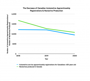
False Causation
Correlation does not imply causation.
If you’ve ever taken a statistics or data analysis course, you have almost certainly come across this common phrase. It means that, just because two trends seem to fluctuate alongside each other, it doesn’t prove that one causes the other or that they are related in a meaningful way.
Review Figure 2.10[2][3] below, which shows a line graph of the decrease of Canadian automotive apprenticeship registrations and nectarine production. What do these two things have to do with each other? They are unrelated quantities that appear to decrease at the same rate over a similar time period.
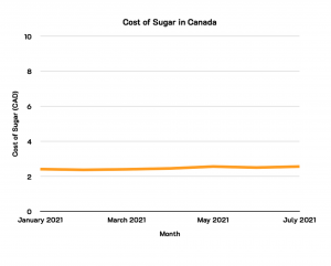
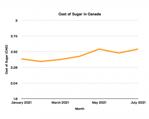
Inconsistent or Manipulated Scale
It’s important to examine the scales of a data visualization carefully. Compressing or expanding the scale of a graph can make the changes between data points seem either more or less significant than they really are.
Review Figure 2.11[4] below, which shows the cost of sugar in Canada from January to July 2021. Because of the expanded scale on the line graph, there does not appear to be much fluctuation in the cost of sugar in Canada. This makes the data appear less significant than it could really be (see Figure 2.12 below for a more compressed scale).
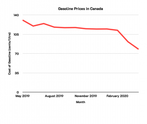
Cherry-picking or Omitting Data
The term “cherry-picking” refers to only presenting the best data, and omitting data points which are less favourable, in order to reinforce a particular narrative. This can create a false impression of the data. For example, showing an upward sales trend over the first few months of a year, while omitting the data that showed sales declined for the rest of the year.
Review Figure 2.13[5] below, which shows a downward trend on gasoline prices in Canada from May 2019 to February 2020. Because of the carefully selected timeframe (i.e., short timeframe), it appears that the gasoline prices in Canada are decreasing.
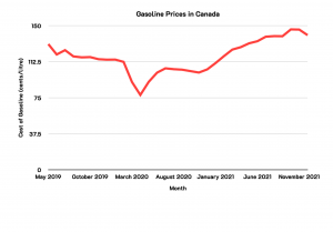
Now review Figure 2.14[6] below, which shows an overall upward trend on gasoline prices in Canada from May 2019 to November 2021. When looking at the full timeline (i.e., long timeframe), the reader can see that gasoline prices are increasing in Canada.
3D Distortion or Occlusion
Three-dimensional (3D) data visualizations may look visually appealing, but they often make it more difficult to interpret the data and spot patterns within them. Two common issues are: distortion and occlusion.
Review Figure 2.15[7] below, which is a 3D bar graph of the percentage of Canadian vs. foreign television programmes watched in Saskatchewan from 2000 to 2003. Because of the tilt of the 3D bar graph, the bars in the front hide the bars in the back, making it hard to read. The reader cannot pinpoint the exact percentage of Canadian vs. foreign programmes by the year it is presented.

The Colour Scale
When used thoughtfully, colour can make it easier to spot trends and relationships in a data visualization. However, colour can also cause confusion.
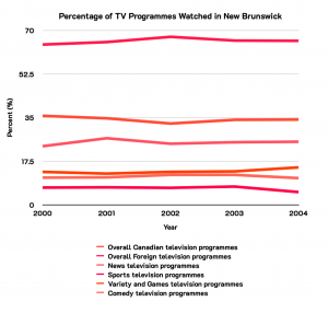
Some common issues include: using too many colours, using colours with minimal contrast, using colours that aren’t safe for colourblind viewers and using colours in unconventional ways. Review Figure 2.16[8] below, which is a line graph of the percentage of Canadian vs. foreign television programmes watched in New Brunswick from 2000 to 2004. Because of the similar colours of the lines, it is difficult for the reader to understand which line graph corresponds to which colour from the legend.
- Statistics Canada. Table 22-10-0097-01 Television viewing time of all television stations, by province, content and type of programme. Data is reproduced and distributed on an "as is" basis with the permission of Statistics Canada. Retrieved February 2nd, 2022. DOI: https://doi.org/10.25318/2210009701-eng. Statistics Canada Open Licence: https://www.statcan.gc.ca/en/reference/licence ↵
- Statistics Canada. Table 37-10-0079-01 Registered apprenticeship training, registrations by major trade groups and sex. Data is reproduced and distributed on an "as is" basis with the permission of Statistics Canada. Retrieved February 2nd, 2022. DOI: https://doi.org/10.25318/3710007901-eng. Statistics Canada Open Licence: https://www.statcan.gc.ca/en/reference/licence ↵
- Statistics Canada. Table 32-10-0364-01 Area, production and farm gate value of marketed fruits. Data is reproduced and distributed on an "as is" basis with the permission of Statistics Canada. Retrieved January 9th, 2022. DOI: https://doi.org/10.25318/3210036401-eng. Statistics Canada Open Licence: https://www.statcan.gc.ca/en/reference/licence ↵
- Statistics Canada. Table 18-10-0002-01 Monthly average retail prices for food and other selected products. Data is reproduced and distributed on an "as is" basis with the permission of Statistics Canada. Retrieved February 2nd, 2022. DOI: https://doi.org/10.25318/1810000201-eng. Statistics Canada Open Licence: https://www.statcan.gc.ca/en/reference/licence ↵
- Statistics Canada. Table 18-10-0002-01 Monthly average retail prices for food and other selected products. Data is reproduced and distributed on an "as is" basis with the permission of Statistics Canada. Retrieved February 2nd, 2022. DOI: https://doi.org/10.25318/1810000201-eng. Statistics Canada Open Licence: https://www.statcan.gc.ca/en/reference/licence ↵
- Statistics Canada. Table 18-10-0002-01 Monthly average retail prices for food and other selected products. Data is reproduced and distributed on an "as is" basis with the permission of Statistics Canada. Retrieved February 2nd, 2022. DOI: https://doi.org/10.25318/1810000201-eng. Statistics Canada Open Licence: https://www.statcan.gc.ca/en/reference/licence ↵
- Statistics Canada. Table 22-10-0097-01 Television viewing time of all television stations, by province, content and type of programme. Data is reproduced and distributed on an "as is" basis with the permission of Statistics Canada. Retrieved February 2nd, 2022. DOI: https://doi.org/10.25318/2210009701-eng. Statistics Canada Open Licence: https://www.statcan.gc.ca/en/reference/licence ↵
- Statistics Canada. Table 22-10-0097-01 Television viewing time of all television stations, by province, content and type of programme. Data is reproduced and distributed on an "as is" basis with the permission of Statistics Canada. Retrieved February 2nd, 2022. DOI: https://doi.org/10.25318/2210009701-eng. Statistics Canada Open Licence: https://www.statcan.gc.ca/en/reference/licence ↵
