
Module 1: An Introduction to Data Literacy and Data Visualization
Methods of Data Presentation
Once data has been collected and analyzed, there are many different ways you can communicate those results:
- Write a report describing your results
- Organize your results into a table
- Display your results visually in a chart or infographic
For example, if a university wanted to find out if their students preferred virtual or in-person classes, they might conduct a survey. That survey might ask students if they prefer attending their classes virtually or in-person, but would probably also include an option for students who wanted to do a mix of both and students who didn’t have a strong preference.
When the data is ready to be presented, it could be written in text, perhaps as part of a report:
“Of the 1260 students surveyed, 560 students stated a preference for attending their classes virtually, 440 preferred in-person, 1006 stated that they would prefer a mix of both virtual and in-person classes and 194 did not have a strong preference.”
This is a simple way of presenting the data, but does require reading through quite a bit of text, and doesn’t allow for easy comparison between the results.
To really focus in on the numbers, this information could also be presented in a table, as in Table 1.1 below.
| Preferences for Attending Class | Number of Students |
| Virtually | 560 |
| In-Person | 440 |
| Mix of Virtual and In-Person | 1006 |
| No Preference | 194 |
The advantage of presenting this data in a table is that it’s all about the numbers. This table makes it clear that most students prefer a mix of virtual and in-person classes. However, it still doesn’t allow for immediate comparison between all of the results. When you are looking to compare more than two numbers, it is often better to present the data in a more visual way.
To make it easier to compare the results, this information could also be presented visually in a bar graph[1] (see Figure 1.2 below).
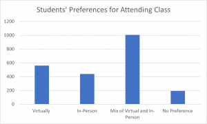
From looking at this graph, it is clear straight away that most students prefer a mix of virtual and in-person classes. This illustrates how powerful data visualizations can be; you can tell a clear story without using words or numbers.
Key Takeaways
There are three main methods of data presentation:
- Textual
- Tabular
- Visual
- Author: Nora Mulvaney, License CC0 1.0 https://creativecommons.org/publicdomain/zero/1.0/ ↵
