Module 1: An Introduction to Data Literacy and Data Visualization
Different Types of Data Visualizations
If you’ve decided that you want to represent your data visually, you’ll also need to think about which type of data visualization would best represent your data. Choosing the right kind of visualization depends on many factors:
- What kind of data do you have?
- Are there patterns in the data? Do they change over time?
- What is the purpose of your data visualization?
- Who is your intended audience?
Keep reading for an introduction to some basic types of data visualizations.
Bar Chart
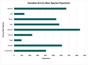
A bar chart (also known as a bar graph or a column graph) is a good option for making comparisons between different groups of things and for identifying patterns. Typically, a bar chart uses either vertical or horizontal bars to show numerical comparisons across categories. One axis of the chart shows the categories being compared and the other axis displays the value scale of the numbers that are being compared. Bar charts with a large number of bars can become difficult to read as the labels for the categories will be more difficult to display clearly. (See Figure 1.3[1] below for an example.)
Key Takeaways
A bar graph is good for making comparisons and identifying patterns.
Pie Chart
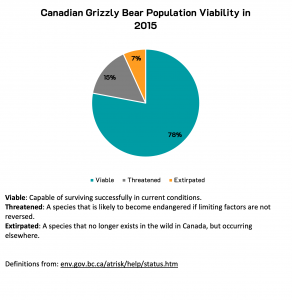
A pie chart is a good option for displaying the composition of a whole or the proportional distribution of the data. A pie chart consists of a circle that is divided into proportional segments, with the full circle representing the total sum of the data. (See Figure 1.4[2] below for an example.)
Key Takeaways
A pie chart is: good for making comparisons, indicating proportional representation and showing part-to-a-whole
Line Graph
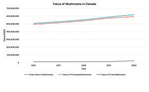
A line graph is used to display quantitative values over a time period or other continuous interval, and is usually used to display trends and portray change over time. A line graph can also be used for comparison when grouped with other lines; this can, however, become cluttered and difficult to read if you are using more than 3-4 lines per graph. (See Figure 1.5[3] below for an example.)
Key Takeaways
A line graph is good for identifying patterns, showing data over time and making comparisons (when the lines are grouped in a single graph).
Scatterplot
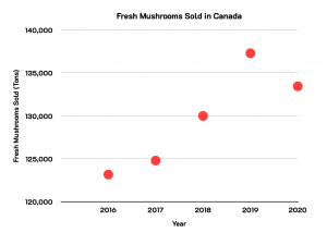
A scatter plot (also known as a scatter graph, scatter chart, point graph or X-Y plot) uses a collection of points to display values from two variables. By displaying the values in each axis, you can detect if a correlation or relationship exists between the two variables. (See Figure 1.6[4] below for an example.)
Key Takeaways
A scatterplot is good for identifying patterns and relationships.
Maps
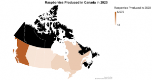
A map can display data in many different ways. Maps can display divided geographical areas that are coloured, shaded or patterned in relation to a data variable. Maps can also be used to detect spatial patterns or the distribution of data over a geographical region using a gradient colour scheme. (See Figure 1.7[5] below for an example, where each province is a different colour representing its raspberry production.)
Key Takeaways
A map is good for mapping distribution, identifying patterns, and making comparisons.
Infographic
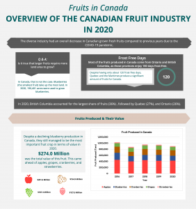
An infographic consists of several data visualizations, and combines information and graphics (as the name suggests) to tell a clear data story. (See Figure 1.8[6] below for an example.)
Key Takeaways
An infographic is good for telling a comprehensive data story.
Dashboard
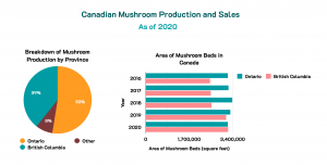
A dashboard is when several data visualizations are put together. Dashboards can use tables, charts and graphics to display information, often to inform business decisions. Dashboards are usually updated regularly and show changes over time. (See Figure 1.9[7] below for an example, which includes a pie chart and a bar chart presented under a header that describes their relation to each other.)
Key Takeaways
A dashboard is very versatile and is often used in a variety of ways to inform decision making.
Exercises
Take a moment to test your understanding of the different types of data visualization. In the activity below, you’ll find a series of scenarios. Match the type of data visualization to the most appropriate use.
Deeper Dive
Want to learn more about different types of data visualizations? Check out the Data Visualization Catalogue.
- Government of British Columbia. Grizzly Bear Population Units. Retrieved January 8th, 2022. URL: https://open.canada.ca/data/en/dataset/caa22f7a-87df-4f31-89e0-d5295ec5c725 Government of British Columbia, Contains information licensed under the Open Government Licence – British Columbia. https://www2.gov.bc.ca/gov/content/data/open-data/open-government-licence-bc ↵
- Government of British Columbia. Grizzly Bear Population Units. Retrieved January 8th, 2022. URL: https://open.canada.ca/data/en/dataset/caa22f7a-87df-4f31-89e0-d5295ec5c725 Government of British Columbia, Contains information licensed under the Open Government Licence – British Columbia. https://www2.gov.bc.ca/gov/content/data/open-data/open-government-licence-bc ↵
- Statistics Canada. Table 32-10-0356-01 Area, production and sales of mushrooms. Data is reproduced and distributed on an "as is" basis with the permission of Statistics Canada. Retrieved January 9th, 2022. DOI: https://doi.org/10.25318/3210035601-eng. Statistics Canada Open Licence: https://www.statcan.gc.ca/en/reference/licence ↵
- Statistics Canada. Table 32-10-0356-01 Area, production and sales of mushrooms. Data is reproduced and distributed on an "as is" basis with the permission of Statistics Canada. Retrieved January 9th, 2022. DOI: https://doi.org/10.25318/3210035601-eng. Statistics Canada Open Licence: https://www.statcan.gc.ca/en/reference/licence ↵
- Statistics Canada. Table 32-10-0364-01 Area, production and farm gate value of marketed fruits. Data is reproduced and distributed on an "as is" basis with the permission of Statistics Canada. Retrieved January 9th, 2022. DOI: https://doi.org/10.25318/3210036401-eng. Statistics Canada Open Licence: https://www.statcan.gc.ca/en/reference/licence ↵
- Statistics Canada. Table 32-10-0364-01 Area, production and farm gate value of marketed fruits. Data is reproduced and distributed on an "as is" basis with the permission of Statistics Canada. Retrieved January 9th, 2022. DOI: https://doi.org/10.25318/3210036401-eng. Statistics Canada Open Licence: https://www.statcan.gc.ca/en/reference/licence ↵
- Statistics Canada. Table 32-10-0356-01 Area, production and sales of mushrooms. Data is reproduced and distributed on an "as is" basis with the permission of Statistics Canada. Retrieved January 9th, 2022. DOI: https://doi.org/10.25318/3210035601-eng. Statistics Canada Open Licence: https://www.statcan.gc.ca/en/reference/licence ↵

