Module 1: An Introduction to Data Literacy and Data Visualization
The Power of Data Visualizations to Tell Impactful Stories
Data visualizations are powerful because they help us identify patterns, make sense of relationships between variables, understand trends … and because they enable us to more readily tell a story.
Florence Nightingale
One of the most famous examples of the power of data visualizations to persuade involves Florence Nightingale. She is probably best known as the founder of modern nursing, but she was also a statistician and early pioneer of data visualizations.
Nightingale tended to soldiers during the Crimean War (1853 to 1856) where she observed that more soldiers were dying from diseases caught in camp than on the actual battlefield. For two years, she meticulously gathered mortality data and arranged them in very detailed tables that contained several columns and rows upon rows of numbers.
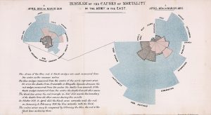
She subsequently conveyed the patterns she found in her data in what has come to be known as the Nightingale Rose Chart (see Figure 1.10[1], below), also known as a polar area diagram or a ‘coxcomb’ chart.

This visualization might look a bit like a pie chart, but it was designed to show change over time with each triangular wedge indicating the month of the year. The different colours convey the cause of death: blue represents soldier deaths from infections and preventable diseases, red were those from wounds, while black indicates deaths from accidents and other causes.
Nightingale used data visualization to convey meaningful patterns in her data and to communicate them to others in a very compelling way. Her “Diagram of the causes of mortality in the army in the East” was published in Notes on Matters Affecting the Health, Efficiency, and Hospital Administration of the British Army and sent to Queen Victoria in 1858.
Shared with leading influencers and decision makers, her work sparked a revolution in hygiene and health care that saved countless lives, both in battlefield and public hospitals around the world.
Nightingale’s story teaches us that clearly conveyed data can inform actions that have tremendous impact.
Deeper Dive
Interested in more about Florence Nightingale’s use of data visualizations?
Listen to episode of the 99% Invisible podcast: Episode 433 – Florence Nightingale: Data Viz Pioneer.
- Florence Nightingale, Public domain, circa 1858 via Wikimedia Commons https://commons.wikimedia.org/wiki/File:Nightingale-mortality.jpg ↵

