Authoring Techniques for Accessible Office Documents: Word Processing Applications

Microsoft Word 2013, 2016, and 2019

The curb cut icon is a light bulb super-imposed over a ramp This icon highlights “curb cut” opportunities in these techniques. “Curb cuts” are situations in which accommodations made for accessibility reasons will also result in significantly better and more efficient outcomes for everyone. The name comes from sidewalk “curb cuts” that were added for people in wheelchairs, but are commonly used by people with baby strollers, handcarts, wheeled luggage, and others.

At the time of testing (December 2019), Word provides a set of accessibility features that is sufficient to enable the production of accessible digital office documents. In addition, Word includes an accessibility checking feature. This guide is intended to be used for documents that are:

  • Intended to be used by people (i.e., not computer code),
  • Text-based (i.e., not simply images, although they may contain images),
  • Fully printable (i.e., where dynamic features are limited to automatic page numbering, table of contents, etc. and do not include audio, video, or embedded interactivity),
  • Self-contained (i.e., without hyperlinks to other documents, unlike web content), and
  • Typical of office-style workflows (e.g., Reports, letters, memos, budgets, presentations, etc.).

If you are creating forms, web pages, applications, or other dynamic and/or interactive content, these techniques will still be useful to you, but you should also consult the W3C-WAI Web Content Accessibility Guidelines (WCAG 2.0) because these are specifically designed to provide guidance for highly dynamic and/or interactive content.

File Formats

The default file format for Word is Office Open XML (DOCX).

In addition, Word offers many other word processor and web format saving options (e.g., PDF, HTML, OpenDocument Text, Rich Text Format, etc.). Most of these have not been checked for accessibility, but some information and/or instructions are available in Technique 11.

Document Conventions

We have tried to formulate these techniques so that they are useful to all authors, regardless of whether they use a mouse. However, for clarity there are several instances where mouse-only language is used. Below are the mouse-only terms and their keyboard alternatives:

  • *Right-click: To right-click with the keyboard, select the object using the Shift+Arrow keys and then press either (1) the “Right-Click” key (some keyboard have this to the right of the spacebar) or (2) Shift+F10.

Disclaimer and Testing Details

  • Following these techniques will increase the accessibility of your documents, but it does not guarantee accessibility to any specific disability groups. In cases where more certainty is required, it is recommended that you test the office documents with end users with disabilities, including screen reader users.
  • The application-specific steps and screenshots in this document were created using Microsoft Word 2013 and Microsoft Word included with Office 365 while creating a DOCX document.

WCAG 2.0 Applicability:

  • All success criteria

All office documents start with a template. These can be as simple as a blank standard-sized page or complex nearly complete document with text, graphics, and other content (e.g., a “meeting minutes” template). Because templates provide the starting-point for so many documents, accessibility is critical. If you are unsure whether a template is accessible, you should check a sample document produced when the template is used (see Technique 10. Check Accessibility). Word’s default template for new documents is a blank page. The basic installation also includes a variety of other blank office-related documents. These are all accessible by virtue of being blank. It is also possible to create your own accessible templates.

Curb Cuts: Updating templates is also a good opportunity to improve document consistency, copy-editing, and branding.

To create an accessible template

  1. Create a new document (from the default blank template or from one of the prepackaged templates).
  2. Ensure that you follow all of the techniques in this document.
  3. When finished, check the accessibility of the document (see Technique 10. Check Accessibility).
  4. Go to menu item: File > Save As.
  5. Select Templates.
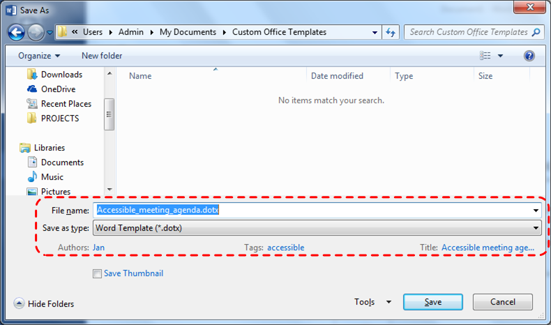
  6. In the Save as type list, select Word Template (*.dotx).
  7. In the File name box, type a name for the template. Using a descriptive File name (e.g., “Accessible Memo Template”) may increase the prominence of the accessibility status. As well, filling in the text boxes labeled Tags and Title with the terms that include “accessibility” may improve the discoverability of the template as an accessible file.
  8. Select Save.
    Image demonstrates location of the File name text box, the Save as type drop-down menu, the Tags field and the Title field in the Save As dialog.

To select an accessible template

Only use these steps if you have an accessible template available (e.g., one that you previously saved). Otherwise, simply open a new (blank) document.

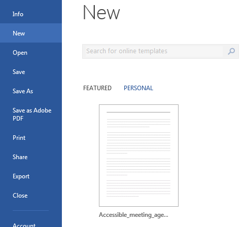
  1. Go to menu item: File > New.
  2. Select Personal.
  3. Select your accessible template from the list.
    Image demonstrates the location of the Personal templates gallery.
  4. A new document based on the template will be displayed. If you chose an accessible template, the document will be accessible at this point.
  5. As you add your content (e.g., text, images, etc.), ensure that you consult the sections that follow to preserve accessibility.

WCAG 2.0 Applicability:

  • 3.1.1 Language of Page
  • 3.1.2 Language of Parts

In order to enable for assistive technologies (e.g., screen readers) to present your document accurately, you must indicate the natural (human) language of the document. If a different natural language is used for a paragraph or selected text, this also needs to be clearly indicated.

Curb Cuts: The specified document language is also used by the spelling and grammar checker. In Canada, make sure to choose “English (Canada)” to avoid having to override American spellings of words such as “colour.”

To change the default language

  1. Go to menu item: File.
  2. Select Options from the list in the left window pane.
  3. Select Language from the list in the left of the Options dialog.
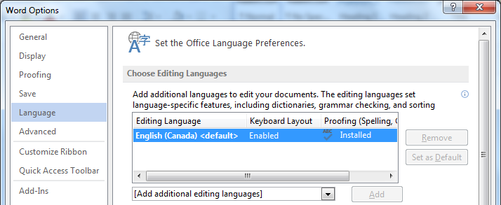
  4. Under Choose Editing Languages, select the editing language you want to use.
    Note: To add an editing language, select the language from the drop down list labeled “Add additional editing languages.”
  5. Select Set as Default.
  6. Close all Office documents and open them again for the changes to take effect.
    Image demonstrates location of Language option, Editing Language options list, Set as Default button, and Add additional editing languages drop-down menu in the Options dialog.

Word has an automatic language detection mechanism, which can automatically detect the language of your text. If you type a section of text in a different language than the rest of your document, Word should programmatically mark the language of that section of text appropriately.

To turn on automatic language detection

  1. Go to menu item: Review.
  2. In the Language section, select the Language button.
  3. Select Set Proofing Language.
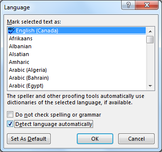
  4. In the Language dialog, select the Detect language automatically check box.
    Image demonstrates location of Detect language automatically option in the Language dialog.

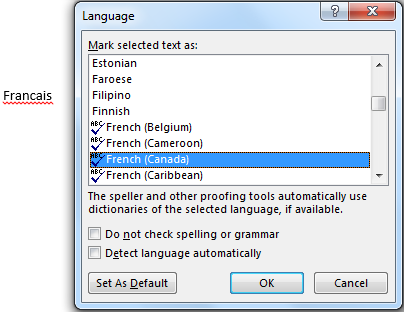
To apply a language directly to selected text

  1. Select the text.
  2. Go to menu item: Review.
  3. In the Language section, select the Language button.
  4. Select Set Proofing Language.
  5. In the Mark selected text as box, select the language from the list.
  6. Select OK.
    Image demonstrates location of language selection list in the Mark selected text as box in the Language dialog. The word 'Francais' is visible to demonstrate.

WCAG 2.0 Applicability:

  • 1.1.1 Non-text Content

When using images or other graphical objects, such as charts and graphs, it is important to ensure that the information you intend to convey by the image is also conveyed to people who cannot see the image. This is done by adding concise alternative text to of each image. If an image is too complicated to concisely describe in the alternative text alone (e.g., artwork, flowcharts, etc.), provide a short text alternative and a longer description as well.

Curb Cuts: Sometimes it may not be clear what a particular image is meant to convey and alternative text can provide that clarity. Also, alternate text has been shown to be included in search engines rankings.

Tips for writing alternative text

  • Try to answer the following question: “What information is the image conveying?”
  • If the image does not convey any useful information, leave the alternative text blank.
  • If the image contains meaningful text, include all of the text in the alternative.
  • Alternative text should be fairly short, usually a sentence or less and rarely more than two sentences.
  • If more description is required (e.g., for a chart or graph), provide a short description in the alternative text (e.g., a summary of the trend) and more detail in the long description, see below.
  • Test by having others review the document with the images replaced by the alternative text.

Tips for writing longer descriptions

  • Long descriptions should be used when text alternatives (see above) are insufficient to answer the question: “What information is the image conveying?”
  • In some situations, the information being conveyed will be how an image looks (e.g., an artwork, architectural detail, etc.). In these cases, try to describe the image without making too many of your own assumptions.
  • One approach is to imagine you are describing the image to a person over the phone.
  • Ensure that you still provide concise alternative text to help readers decide if they are interested in the longer description.

Alternatively, you can include the same information conveyed by the image within the body of the document, providing the images as an alternate to the text. In that case, you do not have to provide alternate text within the image.

To add alternative text to images and graphical objects

  1. Right-click* the object.
  2. Select Format Picture…
  3. Select the Layout & Properties tab.
  4. Select the Alt Text option from the list under that tab.
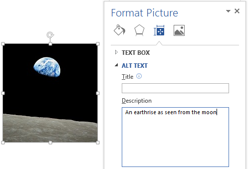
  5. Fill in the Description field (not the “Title” field).
    Image demonstrates location of Title and Description boxes in the Alt Text section of the Format Picture dialog.

When inserting a very small image (or resizing a larger image to be much smaller) and following it with text, Word sometimes assumes that the image is intended to be a bullet-point for a bulleted list. Once Word defines the image as a bullet, the option to add alternative text disappears. Select Undo, to redefine the bullet as an image.

Editor’s note: For later versions of Word, the Alt Text menu is also available in the right-click, pop-up menu that appears when you right-click on an image.

For more information, see these resources:

WCAG 2.0 Applicability:

  • 1.3.2 Meaningful Sequence

When certain elements (e.g., images, objects, text boxes) are inserted into Word documents they default to being an “inline object”. Inline objects keep their position on the page relative to a position in the text. This is beneficial for users of assistive technologies (e.g., screen readers), because the position of the object in the document order is clear, so the screen reader can read the object’s alternative content (e.g., Description field) when the user moves keyboard focus to that position. However, Word also provides the option to have these elements “float” outside of the text order, with text flowing around, under or over it. This is a problem because the position of the object in the document is no longer clear and the screen reader will often read the alternative text out of context, which can be confusing. These text flow options should be avoided. Similarly, avoid placing drawing objects such as arrows, lines and shapes directly into the document (e.g., as borders, to create a diagram). Instead, create borders with page layout tools and insert complete graphical objects (e.g., pictures).

Curb Cuts: In-line elements are often easier to work with than floating elements, which can end up being shifted into strange positions as editing earlier parts of a document cause repagination.

To prevent an image or object from “floating”

  1. Select the object.
  2. Go to menu item: Page Layout.
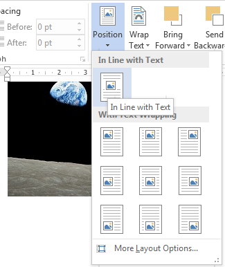
  3. Select Position from the Arrange section.
  4. Select In Line with Text.
    Image demonstrates location of the In Line with Text position option

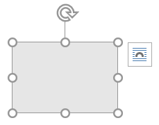
Editor’s note: In later versions of Word, you can also keep pictures in-line with text by selecting the object and choose a wrapping option from the pop-up icon.

Screenshot of right-click menu after selecting an object with wrapping options listed

WCAG 2.0 Applicability:

  • 1.3.1 Info and Relationships
  • 2.4.1 Bypass Blocks
  • 2.4.6 Headings and Labels
  • 2.4.10 Section Headings

Any documents that are longer than a few paragraphs require structuring to make them easier for readers to understand. One of the simplest ways to do this is to use “True Headings” to create logical divisions between paragraphs. True headings are more than just bolded, enlarged, or centred text; they are structural elements that order and levels provide a meaningful sequence to users of assistive technologies.

Curb Cuts: Using true headings provides several important benefits: (1) Headings are used by Word to auto-generate a table of contents (see Technique 6.5 Use a Table of Contents); (2) Headings are used by the “Navigation Pane” which is especially helpful for long documents (see Word’s “Navigation” Feature); and you can update all of the headings of a particular type at once, which keeps them consistent.

Tips for headings

  • Use the default headings styles provided (“Heading “, “Heading 2”, …, “Heading 9”).
  • Nine levels of headings are supported.
  • Nest headings properly (e.g., the sub-headings of a “Heading 1” are “Heading 2”, etc.).
  • If you plan to create a Word document that will have an automatically generated table of contents, remember that text marked with “Heading 1” will appear in the table of contents. Therefore, you may want to mark the top-level title of the document, which typically wouldn’t be included in the document’s table of contents, with the “Title” style. On the other hand, if you plan to convert to HTML, the main title is usually marked with a “Heading 1” which will be mapped to an <h1> HTML element.

To apply headings to selected text

  1. Select text.
  2. Right-click* and select Styles.
  3. Select the heading style (Heading 1, Heading 2, and so on) from the list.

To apply headings using the Styles toolbar

  1. Select text.
  2. Go to menu item: Home.
  3. In the Styles section, select the heading style that you wish to apply
    Note: You can scroll through the multiple heading styles using the arrows on the right side of the Styles section. You can also change the Style design by selecting the Change Styles button on the right.

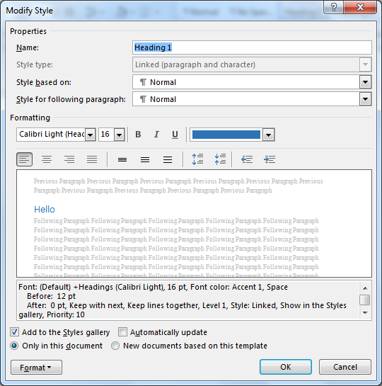
To modify heading styles

  1. Go to menu item: Home.
  2. In the Styles section, right-click* the style you wish to modify from the Styles Gallery.
  3. Select Modify.
  4. In the Modify Style dialog, make your desired changes to style characteristics.
  5. Select OK.
    Image demonstrates the modify style dialog box. The name of the style is the first textbox followed by the styles it is based on and then the numerous style setting controls.

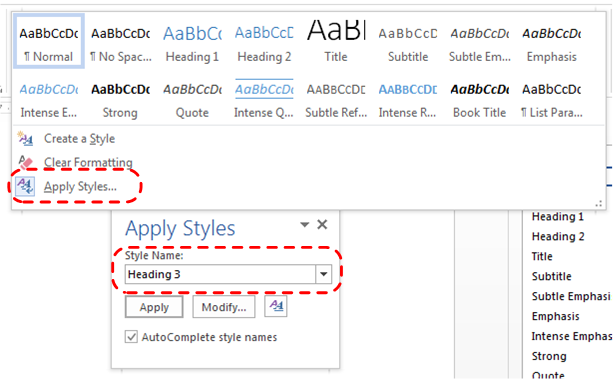
Adding heading style that is not listed

Sometimes heading levels may not appear in lists described above. For example, the list might contain “Heading 1” and “Heading 2”, but not “Heading 3”. In this case, it is still possible to apply the unlisted style:

  1. Select text.
  2. Go to menu item: Home.
  3. In the Styles section, select the arrow to expand the list of style options.
  4. Select Apply Styles.
  5. In the Style Name, enter the heading style (“Heading 1” to “Heading 9”).
  6. Select Apply button.
    Image demonstrates how the user can typle 'Heading 3' into the Apply Styles dialog.

WCAG 2.0 Applicability:

  • 1.3.1 Info and Relationships
  • 1.3.2 Meaningful Sequence
  • 2.4.2 Page Titled
Curb Cuts: Using built-in structural features is much more reliable that trying to use typography for formatting (e.g., tabs to separate table cells, repeated new lines for a page break).

6.1 Tables

When using tables, it is important to ensure that they are clear and appropriately structured. This helps all users to better understand the information in the table and allows assistive technologies (e.g., screen readers) to provide context so that the information within the table can be conveyed in a meaningful way.

Tips for tables

  • Only use tables for tabular information, not for formatting, such as to position columns.
  • Use “real tables” rather than text formatted to look like tables using the TAB key or space bar. These will not be recognized by assistive technology.
  • Keep tables simple by avoiding merged cells and dividing complex data sets into separate smaller tables, where possible.
  • If tables split across pages, set the header to show at the top of each page. Also set the table to break between rows instead of in the middle of rows.
  • Create a text summary of the essential table contents. Any abbreviations used should be explained in the summary.
  • Table captions or descriptions should answer the question “what is the table’s purpose and how is it organized?” (e.g. “A sample order form with separate columns for the item name, price and quantity”).
  • Table cells should be marked as table headers when they serve as labels to help interpret the other cells in the table.
  • Table header cell labels should be concise and clear.
  • Ensure the table is not “floating” on the page (see Technique 4. Avoid “Floating” Elements).

To insert a table

  1. Go to menu item: Insert.
  2. In the Tables section, select Insert Table.
  3. Select the Number of columns and the Number of rows you would like your table to have.
  4. Select the OK button.

To a heading row

  1. Place the cursor in the top-row of the table that you would like to make into the heading row.
  2. The Table Tools menu item should appear.
  3. Go to menu item: Table Tools > Layout.
  4. In the Table section, select Properties.
  5. Select the Row tab.
  6. Select the Repeat as header row at the top of each page checkbox.

6.2. Lists

When you create lists, it is important to format them as “real lists.” Otherwise, assistive technologies will interpret your list as a series of short separate paragraphs instead of a coherent list of related items.

To create an ordered or unordered list

  1. Go to menu item: Home.
  2. In the Paragraph section, select the Bullets icon for unordered lists or select the Numbering icon for ordered lists.

To modify list styles

  1. Go to menu item: Home.
  2. In the Paragraph section, select the arrow beside the Bullets icon for unordered lists or select the arrow beside the Numbering icon for ordered lists.
  3. Select Define New Bullet… to create a new unordered list format.
  4. Select Define New Number Format… to create a new ordered list format.
  5. In the New Bullet dialog or the New Number Format dialog, select the list characteristics.
  6. Select OK.

6.3 Columns

Use the Columns feature for placing text in columns. Note: Because columns can be a challenge for some users with disabilities (e.g., people using magnifiers), consider whether a column layout is really necessary.

6.4 Page Breaks

Start a new page by inserting a page break instead of repeated hard returns.

To add a page break

  1. Go to menu item: Page Layout.
  2. In the Page Setup section, select the arrow beside the Breaks icon.
  3. Select the type of break to add. Page break is used to start a new page with the same page layout (page orientation, headers, page numbering, etc.). Section break is used if you want to start a new section of the document with a differing page layout.

6.5 Table of Contents

Creating an index or table of contents to outline office document content can provide a means of navigating the meaningful sequence of content. The best way to generate a table of contents is after applying the predefined heading styles (e.g., “Heading 1,” “Heading 2,” “Heading 3”) as described above, to the headings that you want to include in your table of contents. After you apply these styles, you can then create a table of contents. Note: If you do not want the main title of the document to appear in the generated table of contents, mark it with the “Title” style.

To insert a table of contents

  1. Place the cursor in your document where you want to create the table of contents.
  2. Go to menu item: References.
  3. In the Table of Contents section, select Table of Contents.
  4. Select the style that you want to use.

To update a table of contents

  1. Select the table of contents.
  2. Go to menu item: References.
  3. In the Table of Contents section, select the Update Table button.

6.6 Page Numbering

Numbering the pages of you document helps those reading and editing your document effectively navigate and reference its content. For users of assistive technologies, it can provide a valuable point of reference within the document.

To insert page numbers

  1. Go to menu item: Insert.
  2. In the Header & Footer section, select Page Number.
  3. Select where you would like to insert your page numbers.
  4. Select the style of page number you would like to use.

To format page numbers

  1. Go to menu item: Insert.
  2. In the Header & Footer section, select Page Number.
  3. Select Format Page Numbers…
  4. In the Page Number Format dialog, select the page format characteristics you would like to use.
    Note: These changes are applied to the predefined page format styles. It does not create a new page format style.

6.7 Document Title

If you plan to convert the document into HTML, it should be given a descriptive and meaningful title.

To change the title of the current document

  1. Go to menu item: File.
  2. Select Info from the list in the left window pane
  3. In the right window pane, select the Title text box and enter an appropriate title.
    Note: The Title defined in the properties is different than the file name.

Editor’s note: For later versions of Word, follow these steps:

  1. Select Info, then click on Properties in the right-most pane.
  2. Next, select Advanced Properties.
  3. From there, the Title text box can be updated.
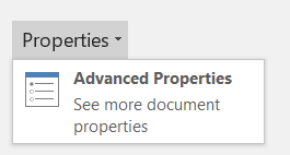
Screenshot of Advanced Properties menu

WCAG 2.0 Applicability:

  • 1.1.1 Non-text Content
  • 1.3.1 Info and Relationships

Charts can be used to make data more understandable for some audiences. However, it is important to ensure that your chart is as accessible as possible to all members of your audience.

  • All the basic accessibility considerations that are applied to the rest of your document must also be applied to your charts and the elements within your charts. For example, use shape and color, rather than color alone, to convey information.
    • When creating line charts, use the formatting options to create different types of dotted lines to facilitate legibility for users who are color blind.
    • When creating bar charts, it is helpful to apply textures rather than colours to differentiate the bars
  • Ensure that the contents are your chart are appropriate labeled to give users reference points that will help them to correctly interpret the information.
  • Use the formatting options to change predefined colours, ensuring that they align with sufficient contrast requirements (see Technique 8.2 Use Sufficient Contrast)
  • Consider providing the data that you used to create the chart in tabular form (e.g., as an appendix).
Curb Cuts: If the chart data is also provided in an appendix, it will be easier for all users to make use of the data.

WCAG 2.0 Applicability:

  • 1.3.3 Sensory Characteristics
  • 1.4.1 Use of Color
  • 1.4.3 Contrast (Minimum)
  • 1.4.5 Images of Text
  • 2.2.2 Pause, Stop, Hide
Curb Cuts: All users will benefit from content that is easier to see.

8.1 Format of Text

When formatting text, especially when the text is likely to printed, try to:

  • Use font sizes between 12 and 18 points for body text.
  • Use fonts of normal weight, rather than bold or light weight fonts. If you do choose to use bold fonts for emphasis, use them sparingly.
  • Use standard fonts with clear spacing and easily recognized upper and lower case characters. Sans serif fonts (e.g., Arial, Verdana) are typically easier to read than serif fonts (e.g. Times New Roman, Garamond).
  • Avoid large amounts of text set all in caps, italic or underlined.
  • Use normal or expanded character spacing, rather than condensed spacing.
  • Avoid animated or scrolling text.

But can’t users just zoom in? Office applications do typically include accessibility features such as the ability to magnify documents and support for high contrast modes. However, because printing is an important aspect of many workflows and changing font sizes directly will change documents details such as the pagination, the layout of tables, etc., it is best practice to always format text for a reasonable default level of accessibility.

To change the text size for a default named style

  1. Go to menu item: Home.
  2. In the Styles section, right-click* the Style you wish to modify.
  3. Select Modify Style.
  4. Under Formatting in the Modify dialog box, select the appropriate font size.
  5. Exit with OK.
    Image demonstrates location of Formatting options in the Modify Style dialog.

8.2 Use Sufficient Contrast

The visual presentation of text and images of text should have a contrast ration of at least 4.5:1.

To help you determine the contrast, here are some examples on a white background:

  • Very good contrast (Foreground=black, Background=white, Ratio=21:1)
  • Acceptable contrast (Foreground=#767676, Background=white, Ratio=4.54:1)
  • Unacceptable contrast (Foreground=#AAAAAA, Background=white, Ratio=2.32:1)

Also, always use a single solid colour for a text background rather than a pattern. In order to determine whether the colours in your document have sufficient contrast, you can consult an online contrast checker, such as the TPG Contrast Analyser or the WebAIM: Contrast Checker.

8.3 Avoid Relying on Color or Sensory Characteristics

The instructions provided for understanding and operating content should not rely solely on sensory characteristics such as the colour or shape of content elements. Here are two examples:

  • Do not track changes by simply changing the colour of text you have edited and noting the colour. Instead use Word’s “Track Changes” feature to track changes.
  • Do not distinguish between images by referring to their appearance (e.g., “the bigger one”). Instead, label each image with a figure number and use that for references.

8.4 Avoid Using Images of Text

Before you use an image to control the presentation of text (e.g., to ensure a certain font or colour combination), consider whether you can achieve the same result by styling “real text.” If this is not possible, as with logos containing stylized text, make sure to provide alternative text for the image following the techniques noted above.

WCAG 2.0 Applicability

  • 2.4.4 Link Purpose (In Context)
  • 3.1.4 Abbreviations
  • 3.1.5 Reading Level
  • 3.2.3 Consistent Navigation
  • 3.2.4 Consistent Identification

9.1 Write Clearly

Curb Cuts: By taking the time to design your content in a consistent way, it will be easier to access, navigate and interpret for all users.
  • Whenever possible, write clearly with short sentences.
  • Introduce acronyms and spell out abbreviations.
  • Avoid making the document too “busy” by using lots of whitespace and by avoiding too many different colors, fonts and images.
  • If content is repeated on multiple pages within a document or within a set of documents (e.g. headings, footings, etc.), it should occur consistently each time it is repeated.

9.2 Provide Context for Hyperlinks

Hyperlink text in your document should be meaningful when read out of context. To be an effective navigation aid, the link text should describe the destination of the link.

Consider the experience of screen reader users: Generally, screen readers generate a list of links, and screen reader users navigate this list alphabetically. Hyperlink text such as “click here” or “more” is meaningless in this context.

In order to be useful to someone using a screen reader, ensure that hyperlink text is self-describing and meaningful on its own.

To add hyperlinks with meaningful text

  1. Type (or paste in) a web address and press spacebar or “Enter” to convert into a hyperlink.
  2. Select the link and right-click*.
  3. Select Edit Hyperlink (Ctrl + K).
  4. Edit the text in the Text to display box.

If you wish to check the accessibility of your document or template (see Technique 1. Use Accessible Templates), Word offers an “Accessibility Checker” to review your document against a set of possible issues that users with disabilities may experience in your file.

Important Note: No checker can detect all types of accessibility issues. For example it can tell if alternative text is missing, but it cannot tell if alternative text is actually correct. It also doesn’t test for some issues, including colour contrast. The Office website provides more information about the Accessibility Checker, including the rules it uses to identify and classify accessibility issues. The “Accessibility Checker” classifies issues as

  • Error – content that makes a file very difficult or impossible for people with disabilities to understand
  • Warning – content that in most, but not all, cases makes a file difficult for people with disabilities to understand
  • Tip – content that people with disabilities can understand, but that might be better organized or presented in a way that would maximize their experience

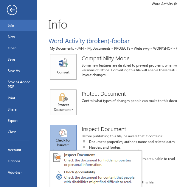
To use the “Accessibility Checker”

  1. Make sure the file is saved as a DOCX. (Note: Older DOC files are not compatible with the checker).
  2. Go to menu item: File.
  3. Select Info in the left window pane.
  4. Select the Check for Issues dropdown.
  5. Select the Check Accessibility item.
    Image demonstrates location of Check Accessibility in the File menu.
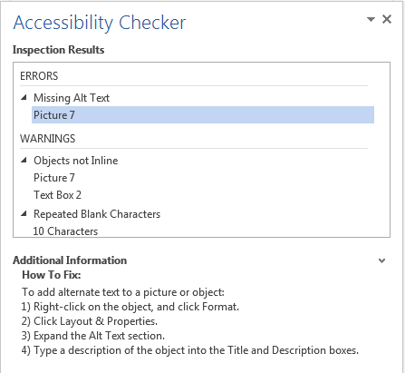
  6. An Accessibility Checker task pane will open, showing the inspection results.
  7. Select a specific issue to see Additional Information.
  8. Follow the steps provided to fix or revise the content.
    Image demonstrates location of Additional Information in the Accessibility Checker task pane.

In some cases, additional steps must be taken in order to ensure accessibility information is preserved when saving/exporting to formats other than the default.

Saving to PDF

PDF documents are not always accessible. Accessible PDF documents are often called “Tagged PDF” because they include “tags” that encode structural information required for accessibility. To evaluate the accessibility of your PDF document, see Technique 10. Check Accessibility.

  1. Go to menu item: File.
  2. Select Save As.
  3. In the File name box, type a name for the file.
  4. In the Save as type list, select PDF (*.pdf).
  5. Select the Options button.
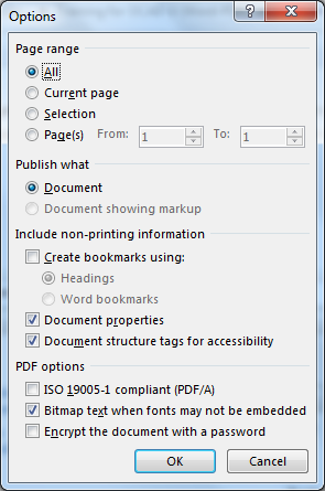
  6. Ensure that the Document structure tags for accessibility checkbox is selected.
  7. Select OK and Save.
    Image demonstrates location of Document structure tags for accessibility option in the PDF Save Options dialog.

Saving to HTML

  1. Go to menu item: File.
  2. Select Save As.
  3. In the File name box, type a name for the file.
  4. In the Save as type box, select Web Page (*.htm).
  5. Check the title in the Title text box. To change it, select the Change Title… to open an “Enter Text” dialog box.
  6. Select Save.
  7. Check the HTML file for accessibility (see Technique 10. Check Accessibility).

To clean up your HTML file

  1. Remove unnecessary styles, line breaks, etc.
  2. Remove unnecessary id, class, and attributes.
  3. Remove font tags.
  4. Remove styles in the <head> tag.
  5. Ensure the <th> tags have a scope attribute.
  6. Remove <p> tags nested inside <th> and <td> tags.
  7. Check for accessibility (see Technique 11, above).
    Note: you may wish to use HTML editors or utilities to help with this process.

Word’s “Navigation” Feature

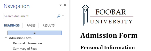
After you have populated your document with content and true headings have been applied, you may wish to rearrange the content. In order to maintain the integrity and accessibility of the altered sequence, you will need to ensure that structural information (e.g. heading levels) is adjusted accordingly. Word provides a “Navigation” mechanism which displays all parts of the document, such as headings, paragraphs, objects, etc. in sequential order. It helps you navigate, access, and manipulate the content. You can move headings or subordinate text up or down, rearranging their sequence in a way that can be programmatically determined and therefore accessible to assistive technologies.

To use the “Navigation” feature

  1. Go to menu item: View.
  2. In the Show section, select the Navigation Pane check box.
  3. The Navigation pane will open to the left of your document.

To jump to a location in a document

  1. Select one of three navigation options:
    1. Select HeadingsNote: select the heading to view hierarchical headings and content below it.
    2. Select Pages.
    3. Select the (Search) Results.
      Image demonstrates location of navigation options dialog showing Search option.
  2. Scroll through the sequential list and double-click* on the location you would like to jump to

To move content up or down in a document

  • Select and drag the content to a new location in the list.

If you are interested in what features are provided to make using Word more accessible to users, documentation is provided in the Help system:

  1. Go to menu item: File.
  2. Select Help from the list on the left.
  3. Under the Support section, select the Help icon.
  4. Enter “Accessibility” as your search term in the Help dialog box.

Authors: Jan Richards, Sabrina Ruplall

This document was produced as part of the Accessible Digital Office Document (ADOD) Project.

This project has been developed by the Inclusive Design Research Centre, OCAD University as part of an EnAbling Change Partnership project with the Government of Ontario and UNESCO (United Nations Educational, Scientific and Cultural Organization).

Partner logos: UNESCO-United Nations Educational, Scientific and Cultural Organization, the Government of Ontario and the Inclusive Design Research Centre (OCAD University)


Source: Authoring Techniques for Accessible Office Documents: Microsoft Word 2013 by the Inclusive Design Research Centre (IDRC) used under CC-BY-SA 3.0.

License

Icon for the Creative Commons Attribution-ShareAlike 4.0 International License

Understanding Document Accessibility Copyright © 2020 by The Chang School, Toronto Metropolitan University is licensed under a Creative Commons Attribution-ShareAlike 4.0 International License, except where otherwise noted.

Share This Book